You are viewing a single comment's thread from:
RE: If the liberals are right, and everything is getting WORSE
you misunderstand.

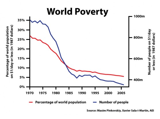
the chart merely depicts what it WAS
and what it IS.
you misunderstand.

the chart merely depicts what it WAS
and what it IS.
but if using the dollar - as in this chart - from 1970 until today.....
and the dollar has devalued massively since 1970 - then on that standard - there is no other way for the graph to go.......as it devalues, the 'poverty level' will decrease.
living on a dollar a day in 1970 is not the same as livin' on a dollar a day now..
Just sayin'...
hmmm.
math hard.
but I think you have it backwards.
math hard . i think you are correct. - in how I described it ... lmao
my logic Is correct, honest...
ok lets say (for sake of argument, and prob close to accurate), $1 in 1970 is now the same as $15 dollars today....
We need to see how many people live on $15 a day or less
That will change the numbers now in 'poverty greatly - and is far more accurate.
My logic was correct - but my initial description was woefull ! lol
I knew there was sense in there... somewhere...
my head hurts.
IT's YOUR FAULT.
I'm gonna go pout.
😂😂😂
Pretty sure those charts are adjusted for inflation.
that blows my theory out of the water then, doesn't it?
lol
have you checked...? I haven't.
The first chart clearly states that in small print something about international dollars.