Drawing Anime : Sakura Haruno
Welcome to the very first drawing of the anime Series drawing, where i take a character and gave them an armour design!
-because i had this idea in my mind and i have to test it out wether it would look cool or a flop.
-....and also because i can
________________________________
And the very first character for this series would be the ninja girl of the Hidden Leaf Village...
Why i chose this particular period is because she is in her most mature form and that would really bring out the shines of the armour that she will don in.(because she looks cooler actually)
_______________________________
A few researchs has been conducted to best suit her usual attire, but at the same time, showcasing the armour itself, and by a few, i mean a few minutes plus coffee break.
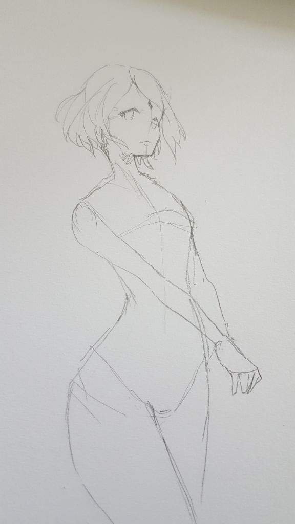
This pose was specifically chosen for Sakura not just because it looks cool but also for the fact that it can show a multitude of area that emphasize her matureness(high quality BS right here)
__ __ __ __ __
Basing on the formal attire that the post-war Sakura usually wear, i carefully arranged the order of which layer of padding that i need to put first, starting from the neck guard, shoulder pads, the main torso armour, and down to the rib guard.
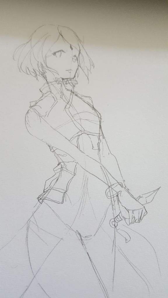
As you can compare with the design, i didnt give her a full-length arm braces, but instead, gave a shorter one, to respect Sakura's original design.
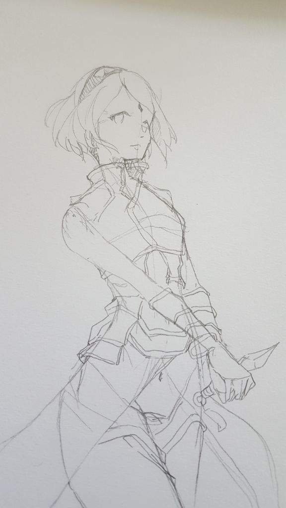
Then i move down to the lower torso part where i decided to include the side cloth (DISCLAIMER: please correct me on this part)
All the minor details of the armor was added as well for that suitable touches.
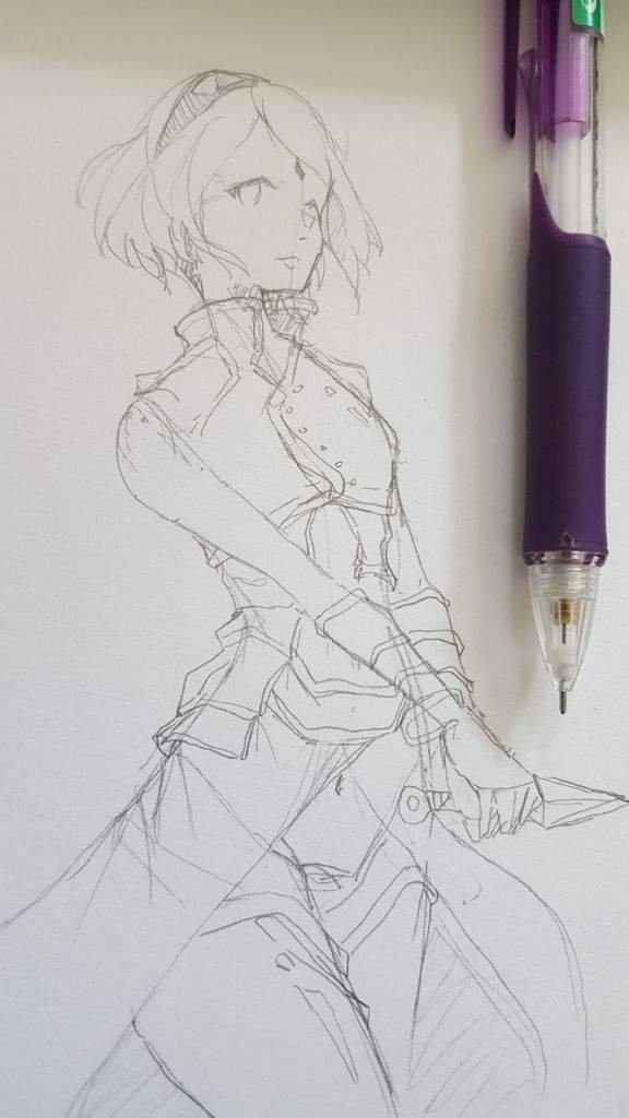
Design complete!
__ __ __ __ __
Once all the designing part is done, time to move on to the refining and lining the entire thing.I dont think explaining stuff here would be useful as you have to trace the whole thing back.
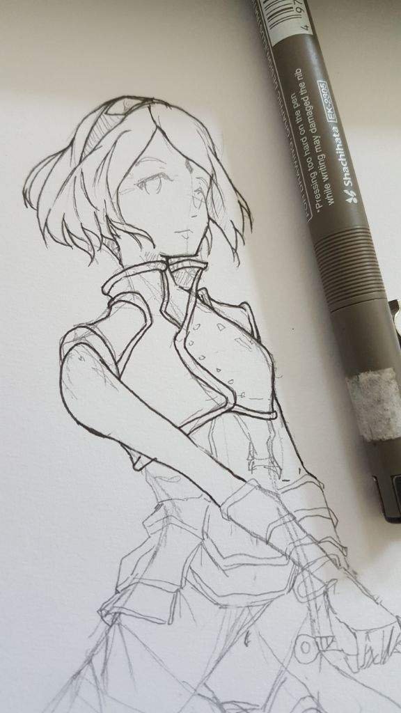
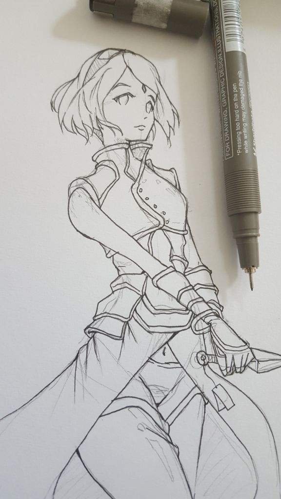
I used my typical 0.05 lineart pen for that extra crisp thin lines. Cheap, and easy to use, they're not the best, but it got the job done nonetheless.
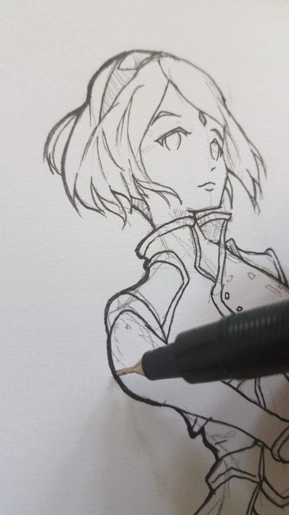
Then i pulled out a 0.2 artlining pen to further increase the A E S T H E T I C S of the piece, making it more pleasing.I also black in the spaces where i think would cast really dark shadows.
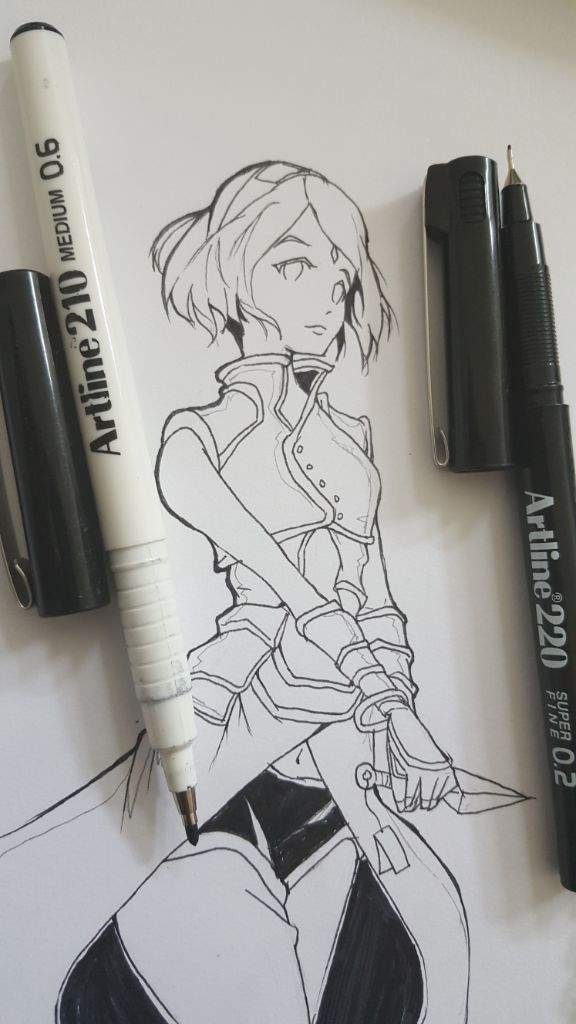
Did i mentioned that this style was inspired by one of the artist that a friend of mine recommended?(will update once i know the names of the artist)Now, to move in to the final part of the process, the colouring!
__ __ __ __ __ __
I whipped out my old colour markers and start filling in the spaces. I feel that the green colour of the eye give a bit of contrast to the overall red colour that this whole drawing about to show.
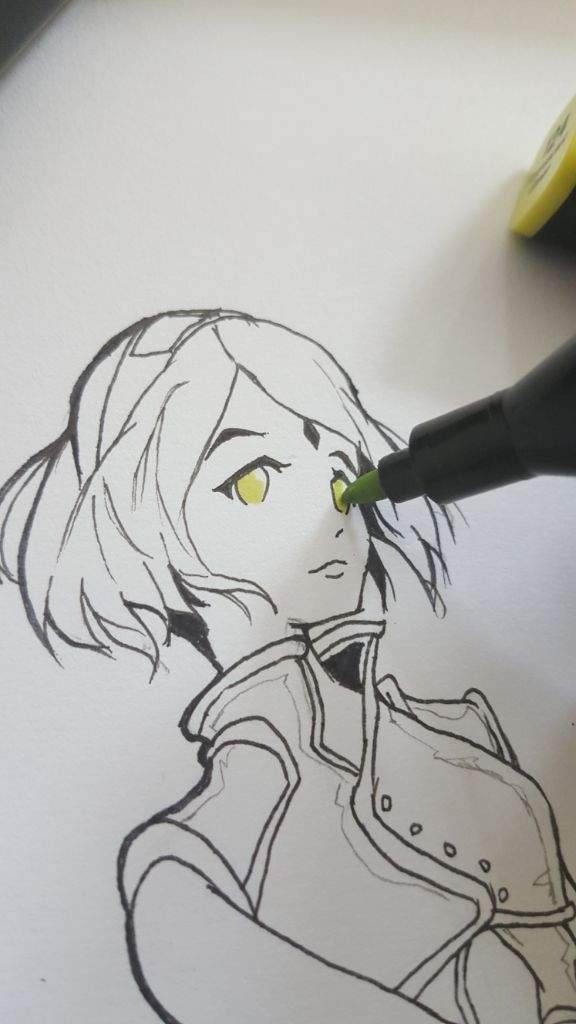
Based on the design and the style im using for this drawing, im going for the monotone colour, that is to use no shading of sorts apart from the black filled shadows.Two reasons on why i chose this style is because it is fairly quick to make from the annoyingly tedious gradient shading that most artists here chooses.
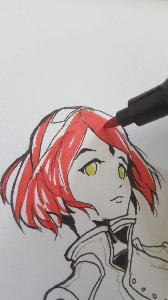
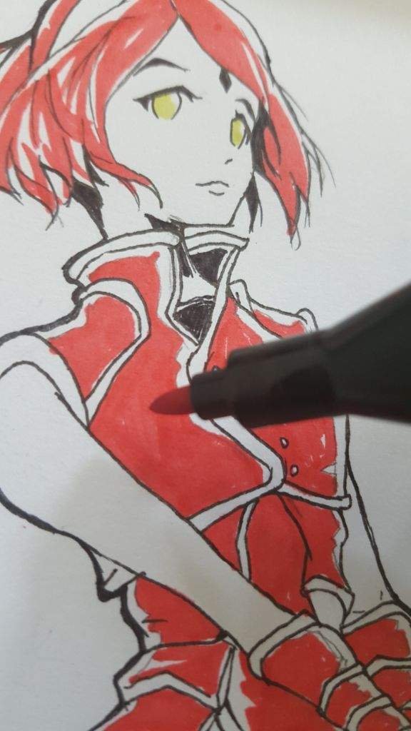
I make sure to leave out some white spaces to simulate folding and shines on the armour and clothes.
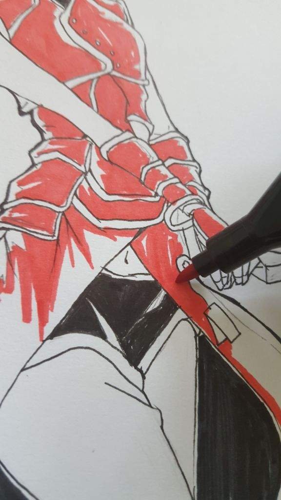
Careful colouring has to be made too because its permanent and overlining is ugly.
Details on eyes and chanted paper tied to the kunai is added.
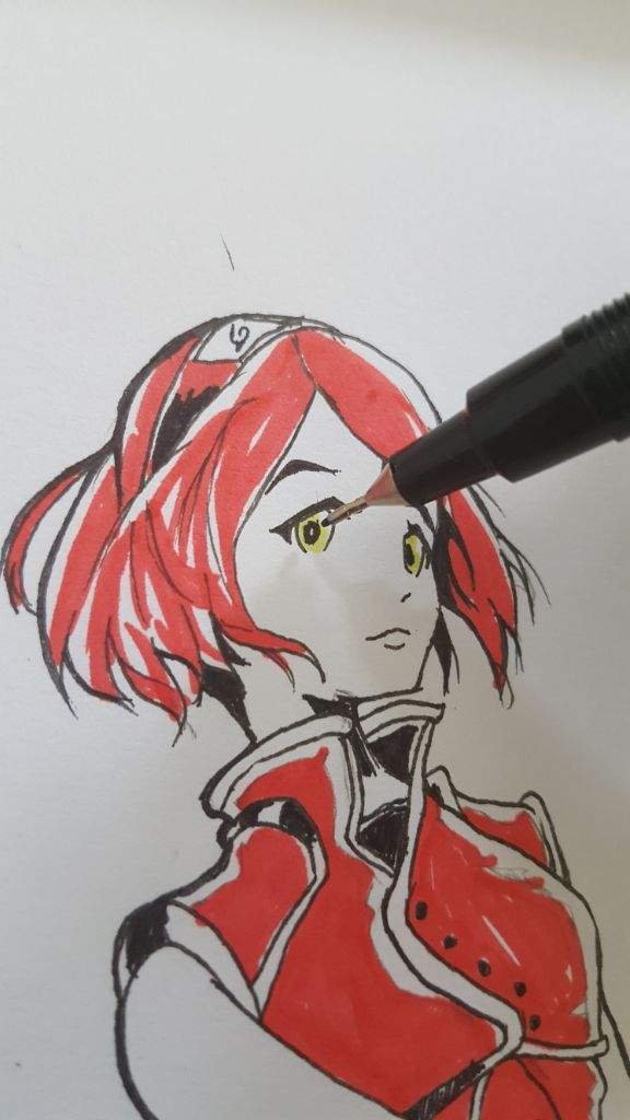
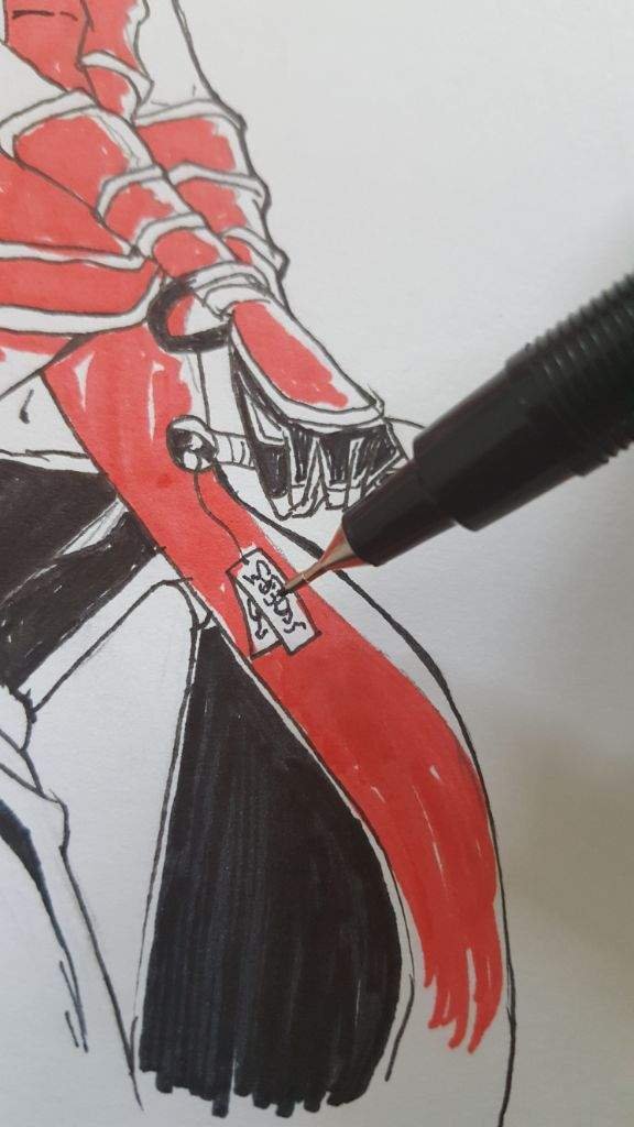
another 'final step'. I promise...
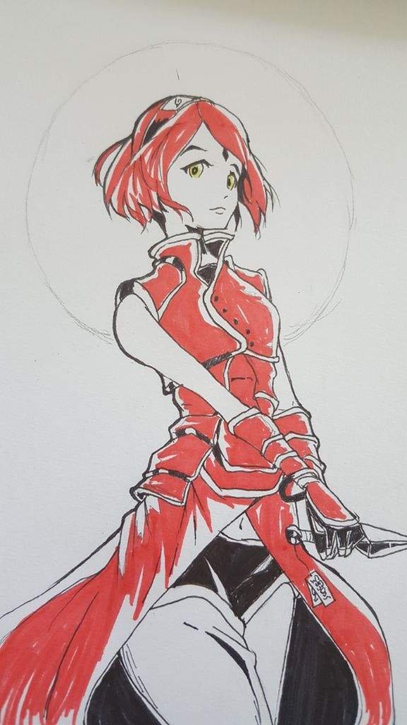
To avoid making the background seems empty, i added a big red circle behind her. Thats it. Nothing intricate because the background is not the point of this drawing lol.
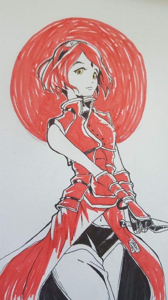
And its done!
Well done! Pretty decent character design. Love the costume! Upvoted! :)
Very nice! Always like seeing an artst's creative process. Thanks for sharing.