@daltono joins the DPorn team to help put the D back in porn
It brings me great joy to announce that I am officially going to be working with @dporn. I have been recruited to their graphics division.

New designs!
Bringing adult content to the #steem blockchain is going to be one of Steem's biggest revelations. When I saw the opportunity to be apart of this, I was all over it like a high school boy chasing his hot teacher.
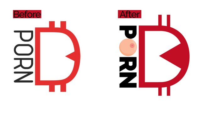
I have just completed several new graphics for #dporn, including a logo re-work. The D is even harder than before. May you be one of the first to witness our glory.
Below are some of our new designs that I just finished creating. Be sure to follow @dporn to keep up with all of our updates.
DPorn Token on Steem-Engine
The PORN token sold out within minutes of going live on Steem-Engine yesterday. Prepare yourselves for the next round which could be happening anytime now.
Be sure to check out our latest update for more details.

The D in DPorn stands for decentralized, I know your filthy mind was thinking otherwise.
▶️ DTube
▶️ YouTube
Hi, great news!!!
LOGO looks really cool 😎
You have a Twitter account as well?
Have a great day
Tom
Posted using Partiko Android
Thank you! I love how it turned out. New DPorn, new logo. Makes sense right?
I just started Twitter last week, but here it is : https://twitter.com/daltonoSteem
these graphics are so 2000s
Good job bro )
Thank you!
I believe the updated logo will do a better job of getting users hyped about DPorn taking over.
yes he is cool - I just don’t understand the purpose of the 2 strips - it seems to me they spoil everything - if you remove them - then it's more organic - my opinion - but I'm not an artist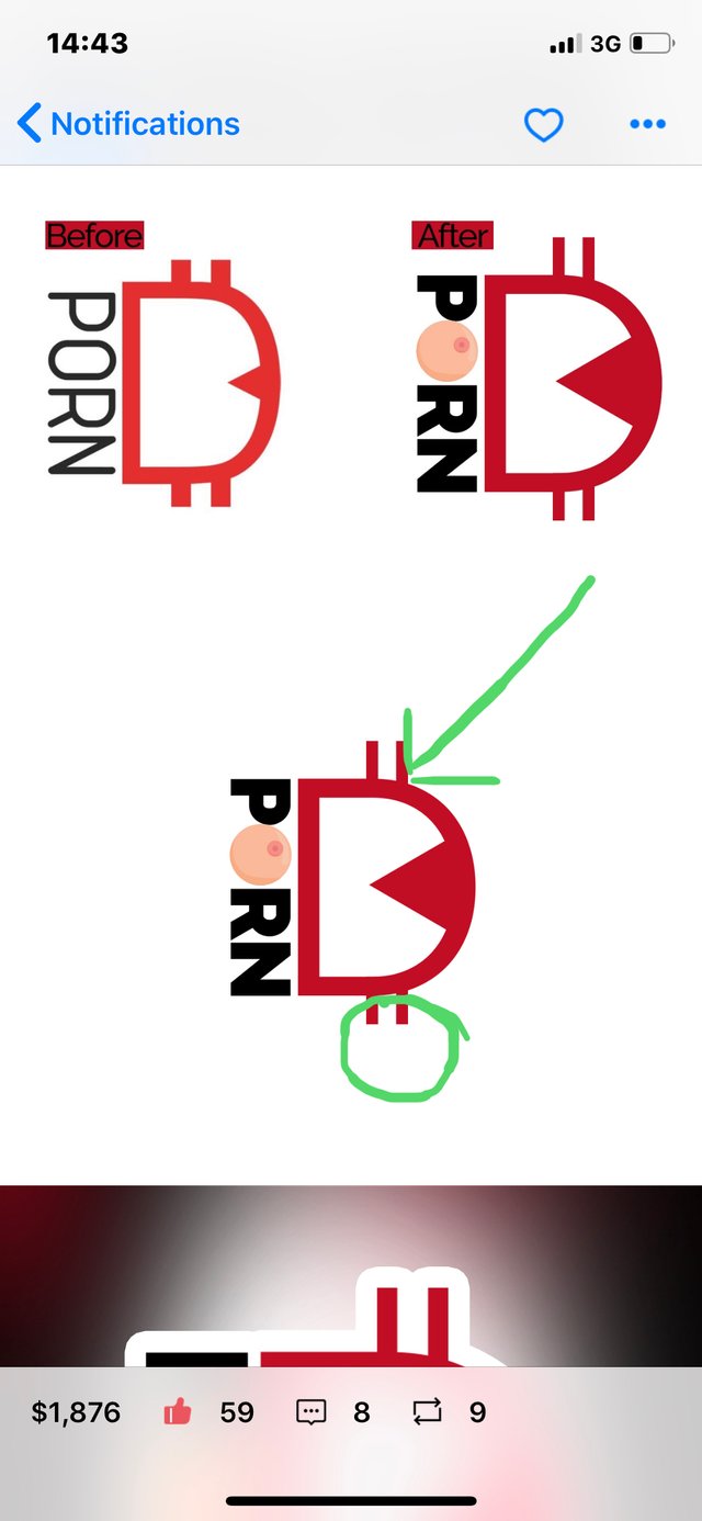
Probably to denote the money aspect. Like in € ¢ $ I guess.
Otherwise it looks like a pretty painful D for the lady 😂
🤣 ahaahkha - it’s a pity that I don’t know how to play it, otherwise I would join the team of my dreams 👻
Posted using Partiko iOS
You are correct.
What about you, do you think the lines make the design look bad?
She said she’s not a size-Queen... she prefers a proper needle-D.
Thank you for your opinion. I love receiving feedback.
The strips are to mimic the look of Bitcoin I believe.
Knowing that now, do you still not like them? I will do some close comparison of the logo with and without the lines.
Again, thanks for your valuable input.
I figured out the logo - I now understand what every detail means - but you can do a survey for example on @dpoll / I think it will be interesting and also more people will know - now I have more incentives to sway our community ⚡️👍
Posted using Partiko iOS
That’s a great idea. I’ll setup a new DPoll today sometime.
👍✅
Posted using Partiko iOS
Welcome aboard! Putting the D back Dporn sounds perfect to us.
Lets get this win!

ooo I thought you were a pornstar :)))
Haha, no not quite.
Congratulations @daltono! You have completed the following achievement on the Steem blockchain and have been rewarded with new badge(s) :
You can view your badges on your Steem Board and compare to others on the Steem Ranking
If you no longer want to receive notifications, reply to this comment with the word
STOPTo support your work, I also upvoted your post!
Vote for @Steemitboard as a witness to get one more award and increased upvotes!
wow
Posted using Partiko Android