SEC S19W3 || Animation, Transition & Transform (HTML5+CSS3)
Asalam Alikum |
|---|
Greetings Everyone! I hope everyone is enjoying their life with family and friends by the Grace of Allah Almighty. New week has started with new lessons and SEC challenges. I decided to first do the homework because HTML and CSS is my favorite part. Today the topic is about Transitions, Animations and Transform using HTML5 and CSS3 by @kouba01. So lets start homework. :)
.jpg)
Homework (Exercise 1)
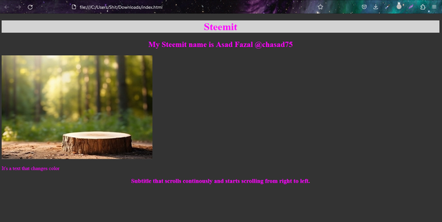
Apply a dark gray background to the entire document and fuchsia pink text color by default, center the titles |
|---|
Code
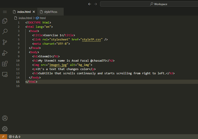
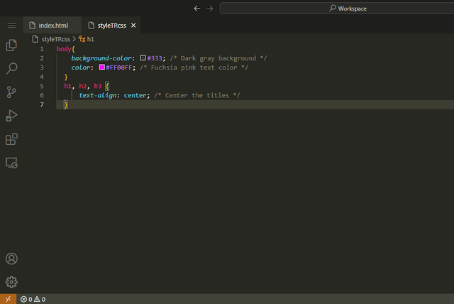
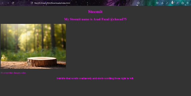
Here I applied dark gray background to entire document and fuchsia pink text color. I centered align all headings as they are the titles of the document. Why I center align all headings because in question there is written titles not title so I apply to all instead of just h1 title.
Output
Apply a light gray background When you move the mouse cursor over the page title |
|---|
Code
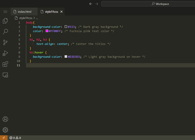
I applied light gray background to page title that is Steemit. It will only work if I hover or move mouse cursor over the title. We can apply this to any title or paragraph. HTML code is same just a little addition in CSS which I am sharing.
Output
Apply a double fuchsia color border to the image, an image width of 75% and an automatic image height and rounding of images by 50% in the top left and bottom right corners |
|---|
Code
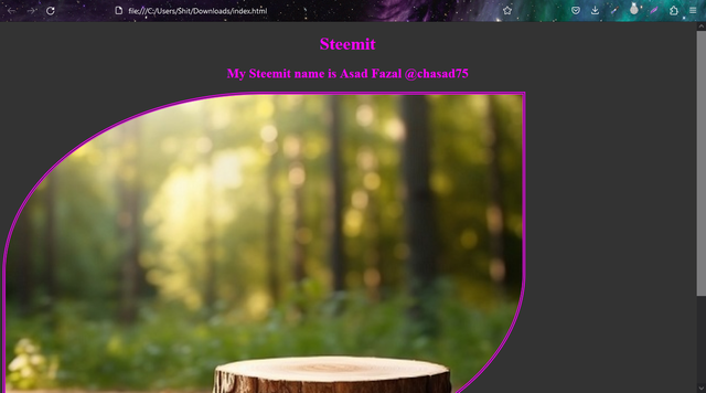
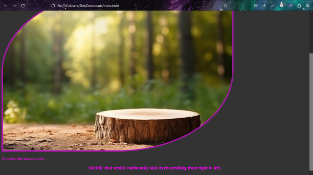
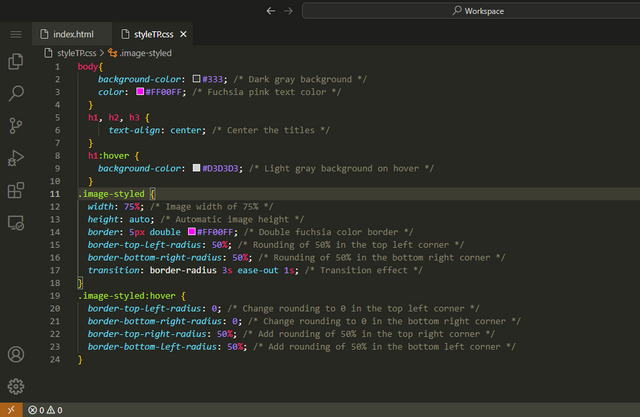
I added double border to the image and set the image width to 75% with height set to auto adjust. Then I added round border of image to 50% in top left and 50% to bottom right corners. I have shared the CSS because mostly work is done in CSS. In HTML I only added the class in img tag like this class="image-styled".
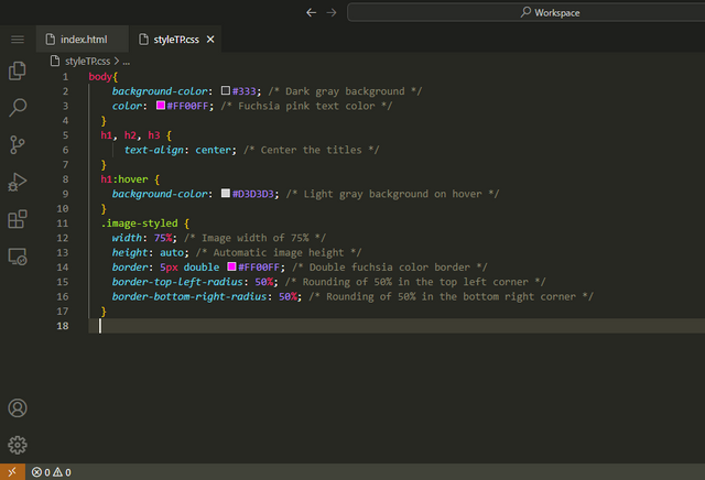
Output
When you approach the mouse cursor over an image a transition is triggered allowing you to move its rounding towards the top right and bottom left corners. This transition has a one second wait before triggering. It lasts 3 seconds and is fast at the beginning and decelerates at the end. |
|---|
Code
We will not change HTML because the work needs to be done in CSS. First in my class of image named image-styled, I added transition that will trigger after one second of wait and then It lasts for 3 seconds if you move mouse out of image. In hover class of image I added border radius for top left and bottom right to zero because when we move mouse to image, border will return to 0 mean no border radius.
Output
I can't upload video here so I upload it to my Youtube channel and here it is:
An animation is performed for the text. It consists of changing the font color and the background color. |
|---|
Code HTML
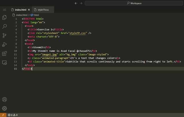
In HTML, I only added classes in p tag and last title tag h3.
Code CSS
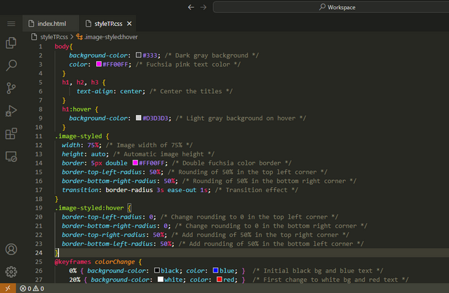
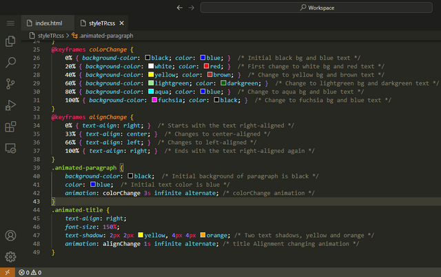
I put comments on the CSS code but let me explain a little here as well. The image styled was explained above. After that I used keyframes to control the animation sequence. I used colorChange to change the background and font colors of paragraph. After that I used alignChange in keyframe to control the sequence of title from right to center to left. In last I put text shadows yellow at 2px distance and orange at 4px distance.
Output
Here is the output video which I uploaded on YouTube channel as we can't upload on Steemit:
(Exercise 2)
Structure of Page to have Image Gallery in HTML5 and CSS3 |
|---|
Code HTML
In HTML I created a basic layout with header, navbar, section, and footer. Then I added menu links and name them with my Steemit profile. I used figure inside div for images as it is said in the exercise 2 with figcaption. In last I added footer with my steemit username.
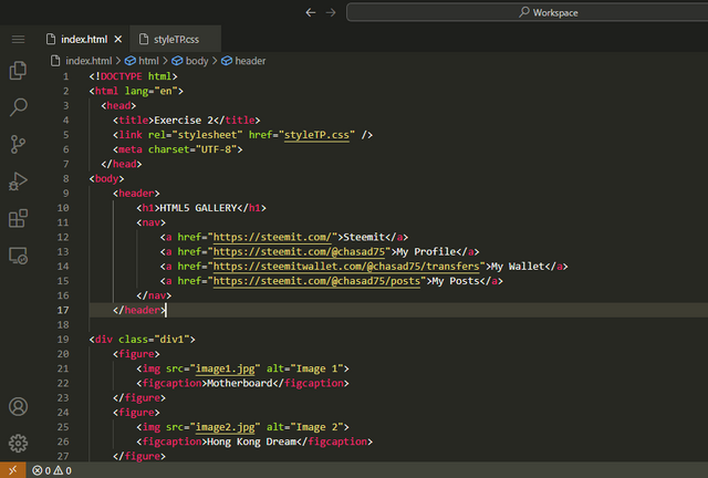
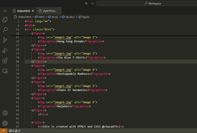
Code CSS
In CSS code, I first added layout design for basic website header, nav, section, and footer. Then I add div and figure with figimg to adjust the size and alignment of images. In last I converted all px to em by using this converter W3Schools.
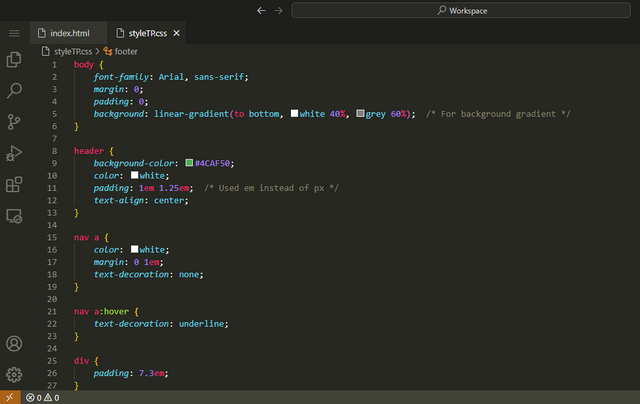
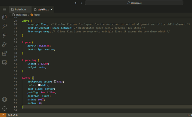
Output

CSS Shading |
|---|
Code
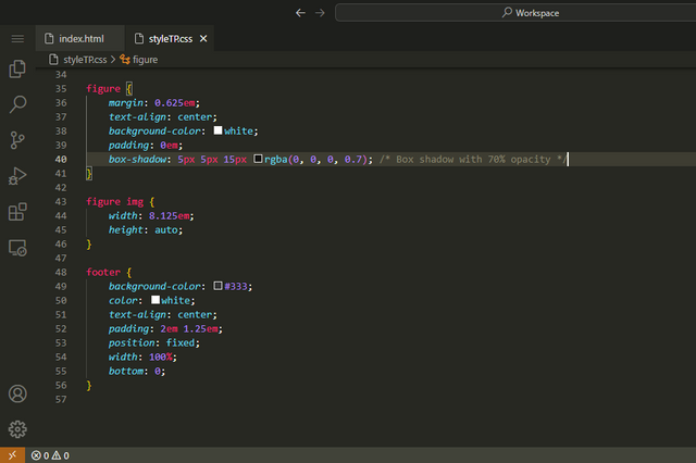
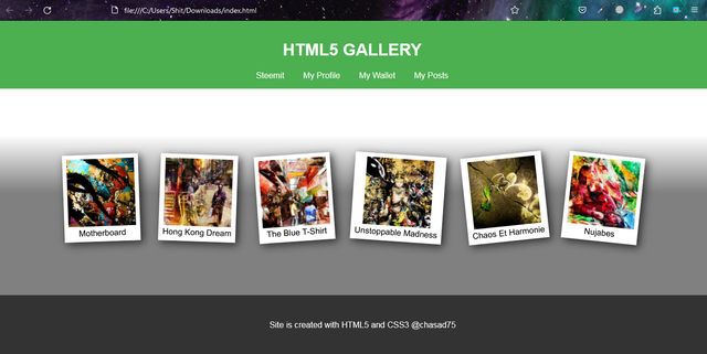
I forget to add the white background on which the image will be placed. So in this section I added background color with padding of 0.5em to figure element. After that I added box shadow property to thumbnails to obtain Polaroid effect. I set the opacity to 70% offset by 5px. Also I change the gradiant a little because it was not looking good with shadow. Below is the CSS code that I added for this step.
Output

CSS Rotation |
|---|
Code
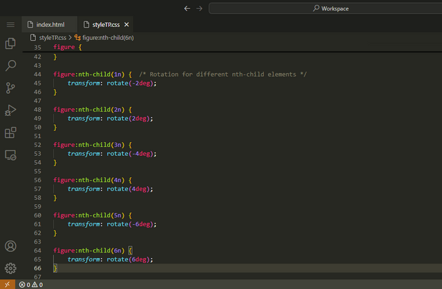
In this part I used pseudo-class of CSS3 with selector nth-child and one element for each image figure to rotate it as I want. You will better understand it by seeing the code below.
Output
CSS Animation |
|---|
Code
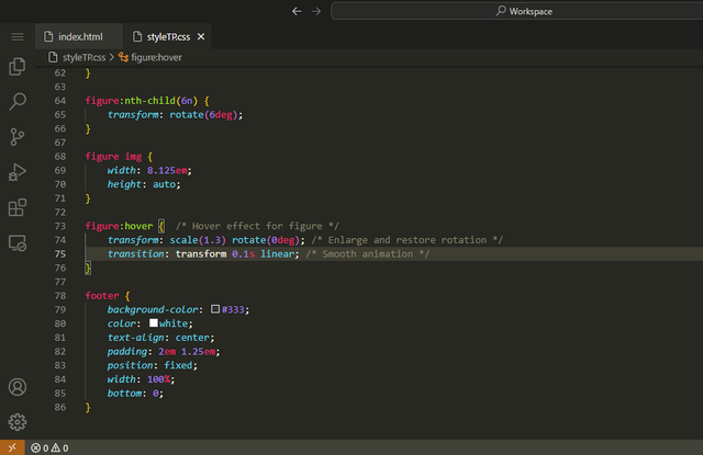
To perform the animation for smooth enlargement I used animation property: transform. You can see the addition of code in figure hover pseudo class at the end. The code is transition: transform 0.1s linear. I used 100millisecond linear animation. Please have a look at below code for better understanding.
Output
I uploaded the output video on Youtube and here is the link:
I used six my own AI generated images that I generate using Midjourney on Discord. Below is the video:
Thank You For Reading
Achievement 1

This is all from me for the "SEC S19W3 || Animation, Transition & Transform (HTML5+CSS3)" I invite @steemdoctor1, @danish578, @malikusman1 to participate in this HTML5 and CSS3 Lesson.


Greetings dear friend you done your job perfectly. I really like the way you present. Image gallery looking so nice. This is they way we increase audience on website with these kind of attractive things like rotation of images applying shadow or animation. When user have fun on article then surely they read next. These animation and transition gave the professional look to our web layout. I also try my best to perform this task. My task almost ready but with the light issue I can't upload. I wish you more success. Keep it up.
Asalam Alikum!
Thank you brother ap ne bht acha comment kia meri post pe. G bilkul aesy hi ha agr hm kuch attractive animations website pe rakhty hain to us sy users attract hoty hain... Light ka hmry mulk me bht bura haal ha... jb k production bht zyada ha aur usage ab kum ha solar lgny k bd sy... Phr b load shedding khtm ni ho rhi... Even k grid stations jo light produce hi ni kr rhy unhy muft k paisy ja rhy jo k bilkul bnd hony chahye. Khair kya kr skty mjhy b bht time lga is post ko ready krny me... All the best ap ko posting k lye 💕
Upvoted. Thank You for sending some of your rewards to @null. It will make Steem stronger.
Twitter X share link: https://x.com/asad_bin_adam/status/1815692442215088635
Congratulations! This post has been upvoted through the Steem Spark. We support quality posts, good comments anywhere, and any tags.
Thank you for supporting my content 💕 💕 💕
Thank you, friend!


I'm @steem.history, who is steem witness.
Thank you for witnessvoting for me.
please click it!
(Go to https://steemit.com/~witnesses and type fbslo at the bottom of the page)
The weight is reduced because of the lack of Voting Power. If you vote for me as a witness, you can get my little vote.
Upvoted! Thank you for supporting witness @jswit.
You have a great entry with us sir. Indeed you are highly talented with the use of of visual studio code. Your explanations and practical is self-explanatory and easy for a novice to understand. I wish you good luck.
Wa Alaikum Salam.
I really enjoyed your post. Your step by step explanations of using transitions, animations, and transforms with HTML5 and CSS3 are excellent. The way you applied hover effects to change the background color and added borders to images is impressive. I especially liked how you used keyframes to animate text color changes and text shadows.
The video links is a great visual aid you put a lot of effort into this assignment, and your passion for HTML and CSS. Keep up the great work,wish you success 💖🤗🌸💐.
Greetings my friend, you have done a great job on Animation, Transition & Transform (HTML5+CSS3). Your presentation on all the questions shows your vast knowledge on programming.
Going through the videos you added I saw the beauty in the work you have put in in this task. I wish you success in the challenge.