SEC S19W4 || Organization using CSS (box-model Display, Position, Flex)
Asalam Alikum |
|---|
Greetings Everyone! I hope everyone is enjoying their life with family and friends by the Grace of Allah Almighty. The fourth week of HTML5 and CSS3 lessons is started and today the homework is about using box-model, display, position and flex to organize a webpage. These are important points in CSS to make an attractive webpage to boost UI and UX. Today's lesson is by @starrchris and I have now started the homework. Lets do it step by step!
.png)
Theoretical Questions
Explain Difference between in-line display and block display? |
|---|
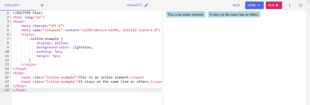
In CSS, the display property is used to make elements behave differently on a webpage. There are two basic types of display properties inline or block. If I set an element to inline it stays in line with other elements and cover up the empty spaces in a row. Inline elemnts doesnt start on a new line and only take up as much width as required for content. Example of inline elements is anchor < a> and < span>.
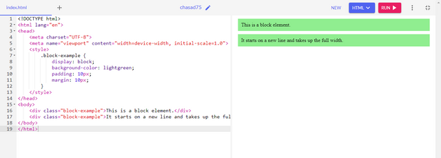
On the other hand, if I set an element to block, it will take up full width of its container and always start a new line. This means no other element can sit aside it on the same line as it covers full width of its container. They make container work in a column format one under each other. Example of block elements is < p>, < ol>, < ul>, < h1,h2...>, and < div>.
Inline Example
Block Example
What's the difference between Margin, Padding and Border? |
|---|
Margin
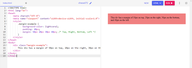
When we talk about margin, padding, and border in CSS, we are describing different ways to control space around elements. Margin is the space outside the element that is separating it from other elements on a webpage. If I increase the margin I create more space around the outside of my elements that pushes other elements farther away. We can set top, right, bottom and left margins.
Example
Border
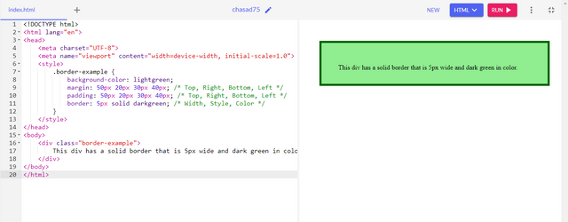
Border is a line that surrounds the padding and content of the element. It is used to add border between two containers. We can style border with different widths, colors, and styles to make this element stand out. There are different types of borders solid, dotted, unset, inset, and hidden.
Example
Padding
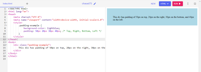
Padding is the space inside the element between the content and the border. It can be used to add space between the content and its container. If I increase padding, I will create more space inside the element making area around the content larger. It could be done with top, right, bottom and left paddings.
Example
Define Position property? |
|---|
As name implies, position property in CSS allows us to control how elements will be placed on a webpage. There are five types of position properties including Fixed, Static, Sticky, Relative and Absolute. Each of the type affects an element place differently. Lets talk about them one by one:
Fixed:
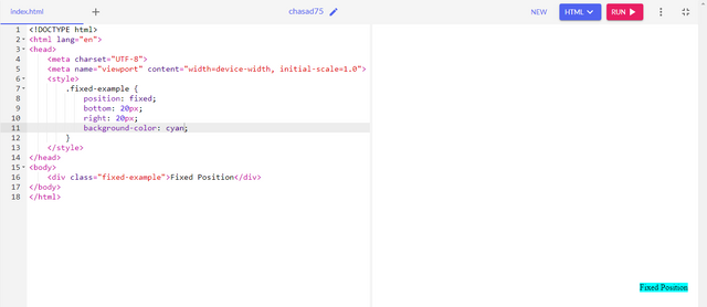
When fixed property is used, the element is positioned relative to viewport means it always stay in the same place even if page is scrolled. In webpages we fixed the sidebars or header to make them stay in their place.
Static:
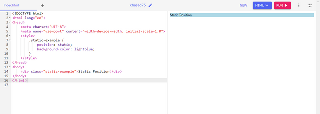
By default it is set in CSS. By using static position, element follow the normal flow of a document. The position: static; is not positioned in a webpage in special way but with the flow of the page.
Sticky:
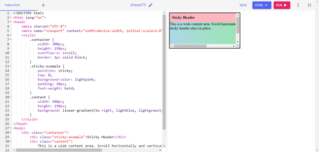
By using sticky position property we can make element sticky with the scroll. Once the scrolling is on top on the webpage it gets normal but when you scroll down it sticks with scroll. Example of it is sticky header or sidebars.
Relative:
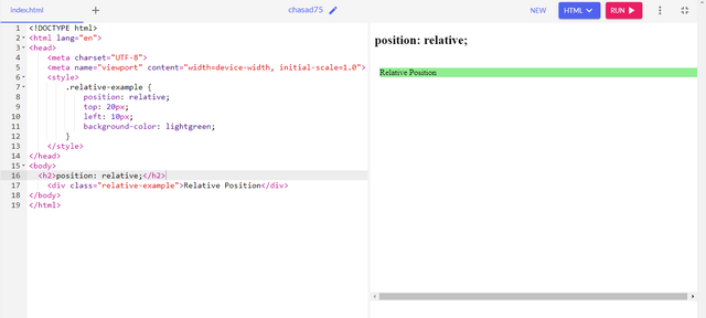
When we use relative position property, it positioned relative to its normal position. We can set top, left, bottom, right properties but it will move it away from its normal position. It helps to adjust the child container inside its parent container.
Absolute:
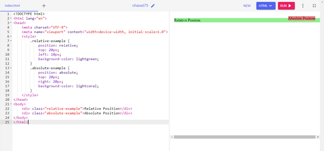
If we use absolute position property, it position relative to its nearest positioned container or ancestor instead of being fixed to viewport. If it has no nearest positioned container or ancestor it will use document body and move along the page scroll. It can overlay other elements but will not affect the layout.
Differentiate between Grid and Flex display properties? |
|---|
Grid and Flex both are CSS layout models that we use to create complex layouts on webpages but both of them have different use cases and purposes.
Flex Display
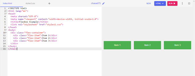
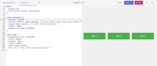
The display: flex property is used to create Flexbox container that allows flexible and efficient layout designs. Flexbox is designed for one-dimensional layouts mean it can work best with row or column. It allows us to distribute space and align items along a single axis with properties including "justify-content", "flex-direction" and "align-items". When we set display flex property, it turns that element into a flex container and its direct children become flex items.
Grid Display
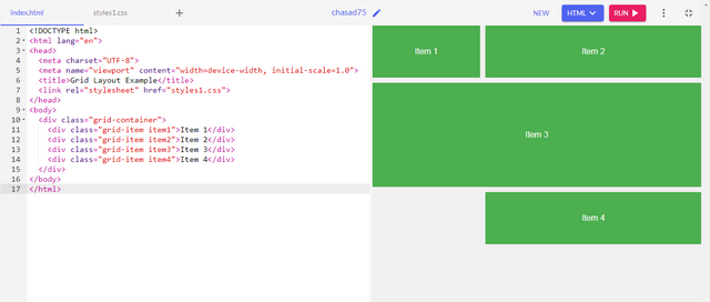
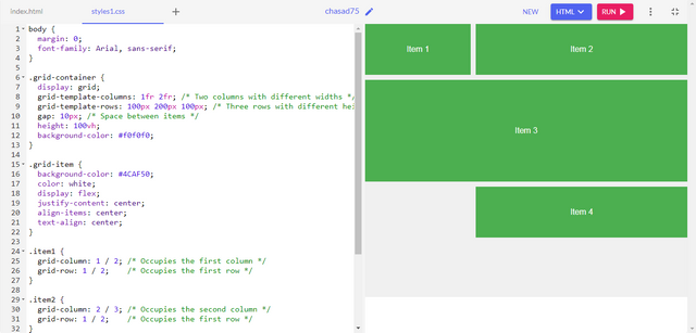
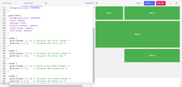
Grid display meant to work for two-dimensional layouts to handle both rows and columns. The display: grid property is used to create a grid layout allowing for complex webpage layouts with rows and columns. It helps you to position elements in two-dimensional grid and to control the size, placement, and spacing. It includes properties "grid-row", "grid-column", "gap", and many more.
Practical Questions
Recreating Webpage of @kouba01 Steemit Profile |
|---|
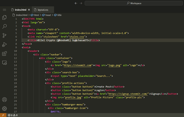
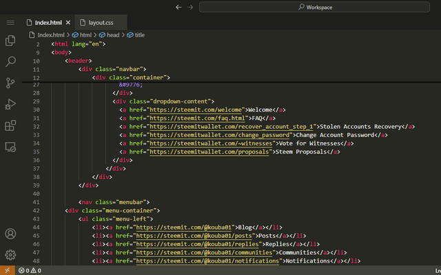
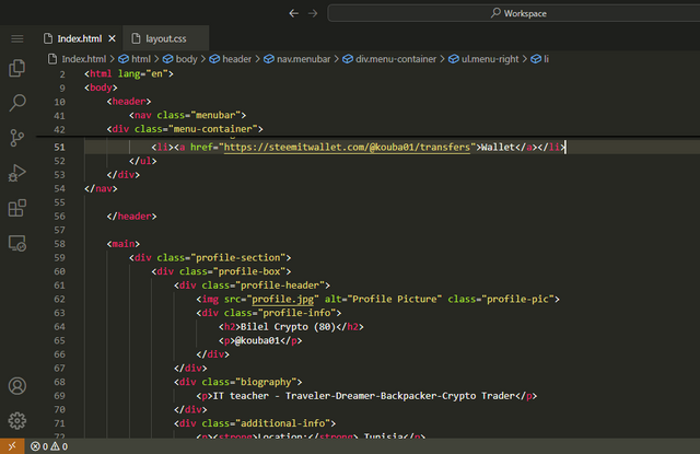
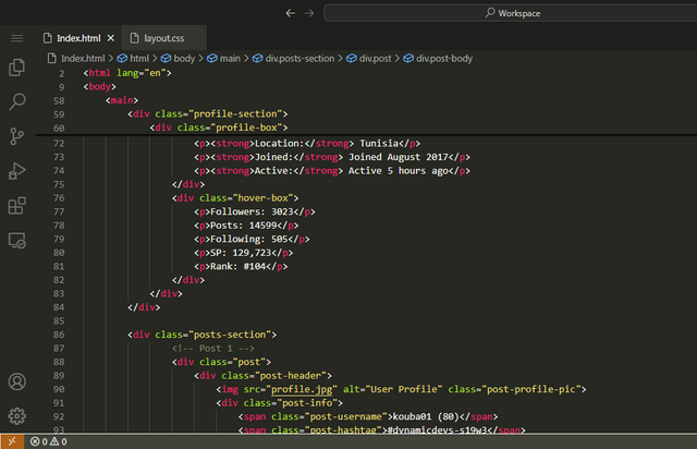
HTML Code of First Webpage
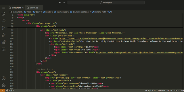
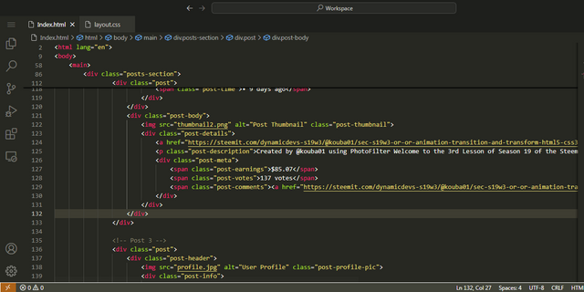
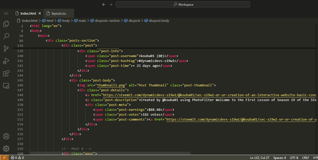
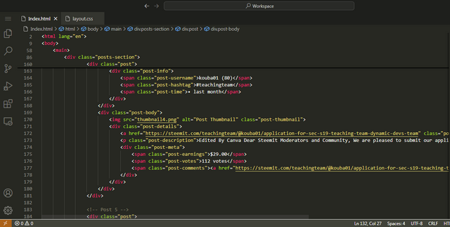
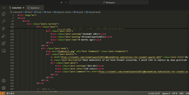
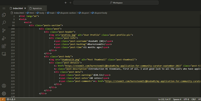
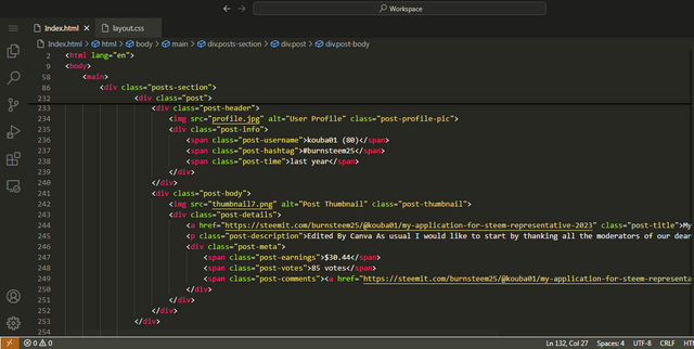
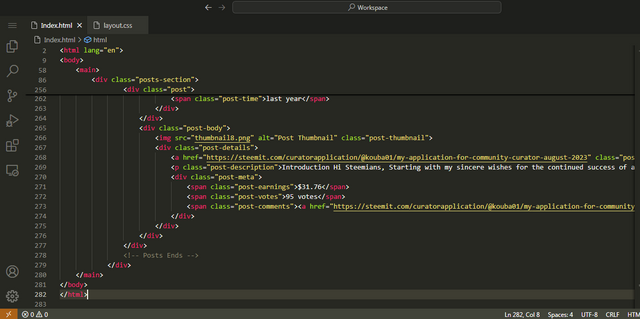
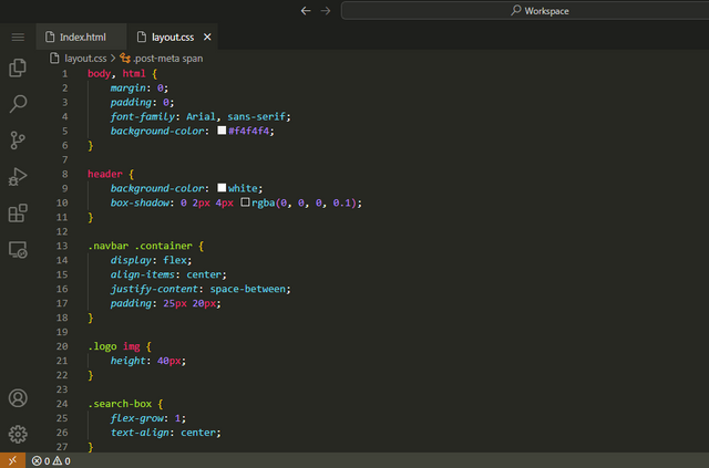
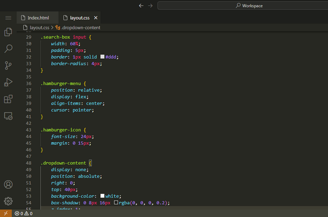
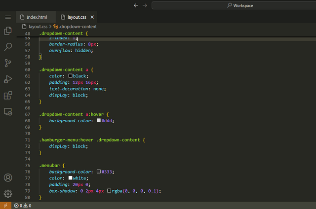
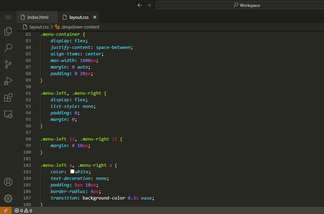
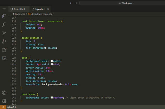
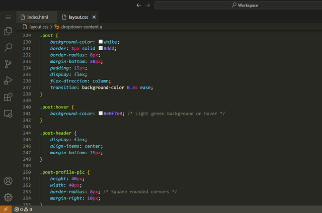
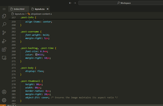
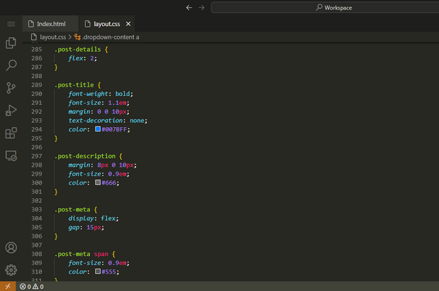
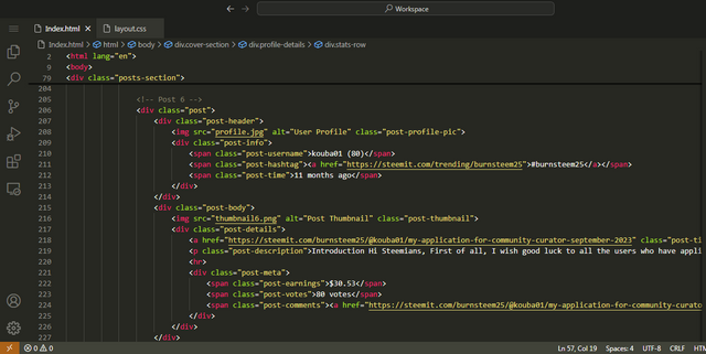
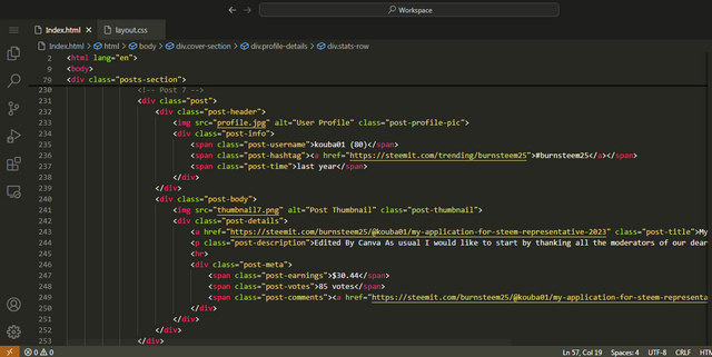
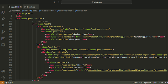
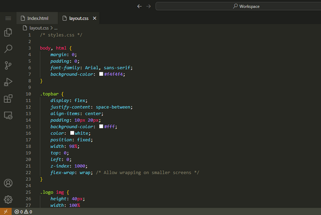
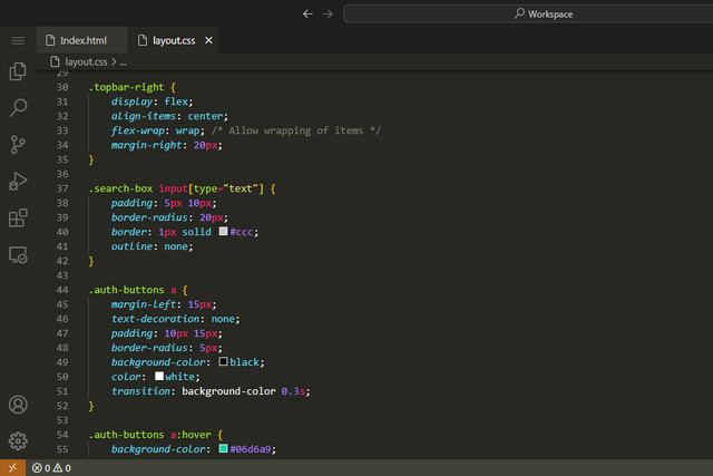
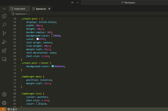
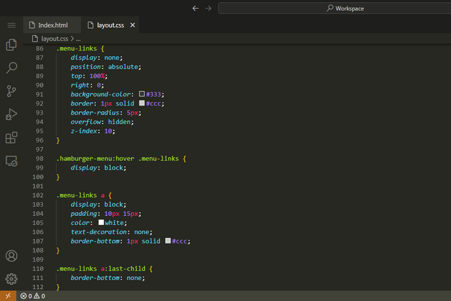
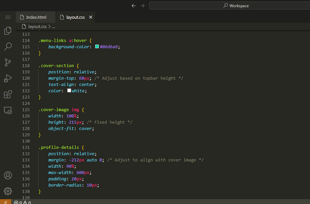
I have created this webpage using html5 and css3. I tried my best to put simple labels for class calling so it will be easy to understand the code. This is the first layout of the homework as we need to recreate on our own design.
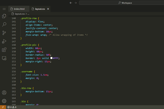
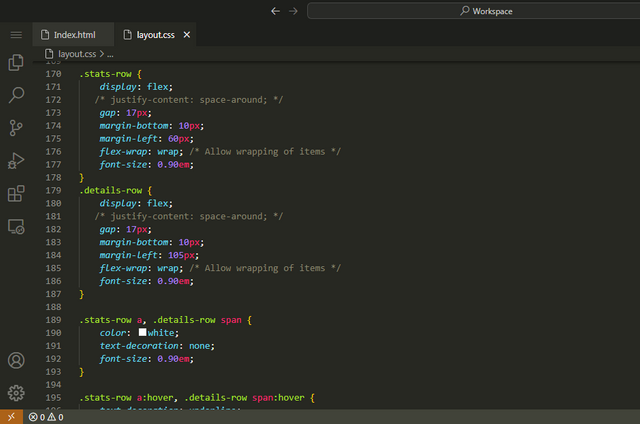
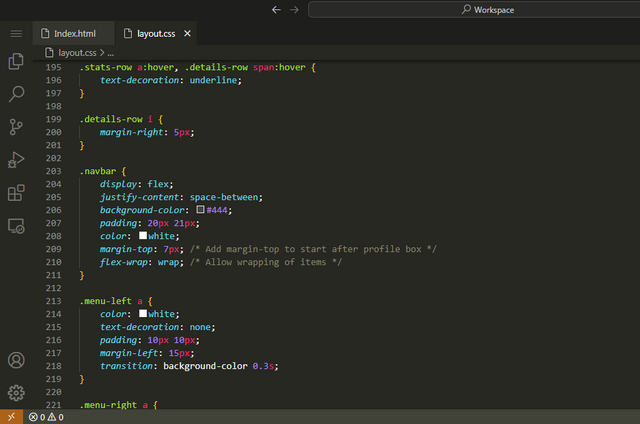
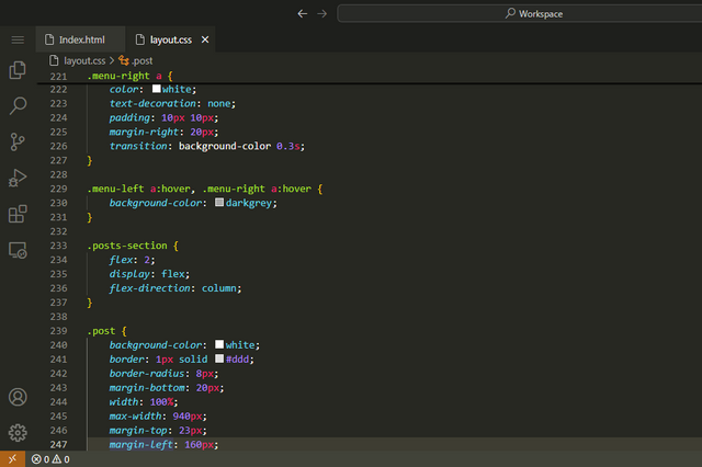
CSS Code of First Webpage
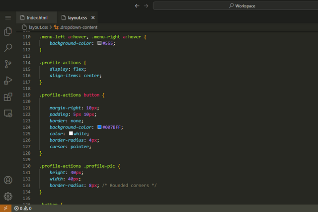
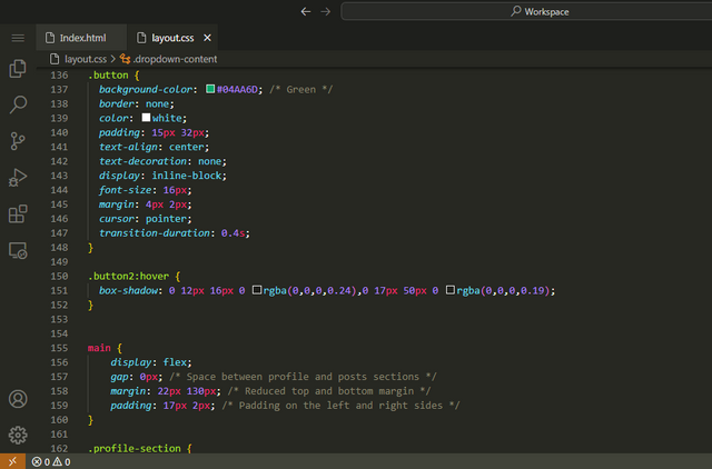
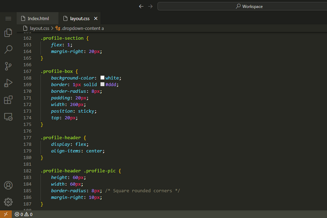
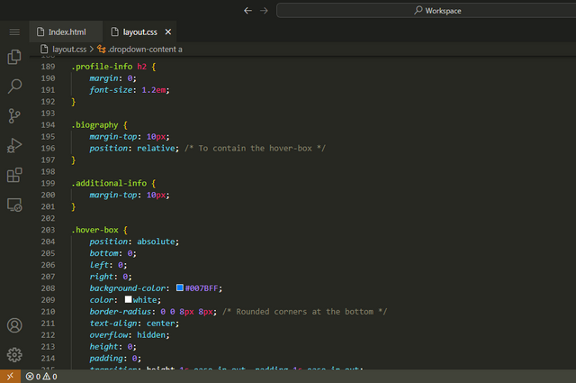
Output Video of Webpage
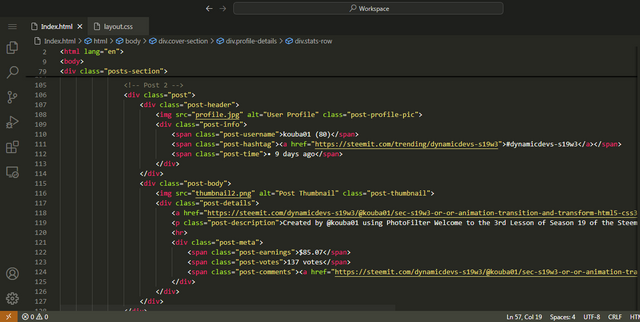
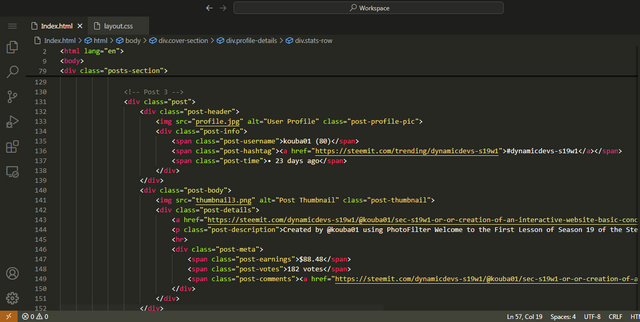
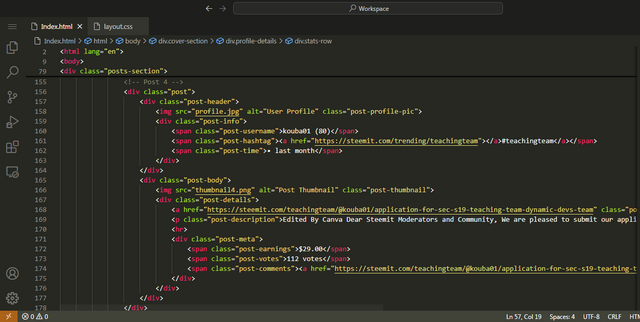
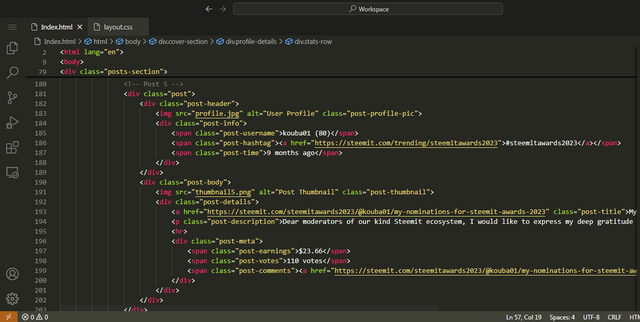
HTML Code of Second Webpage
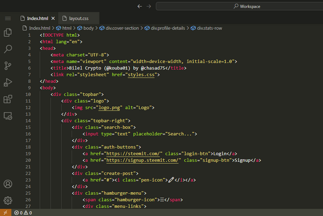
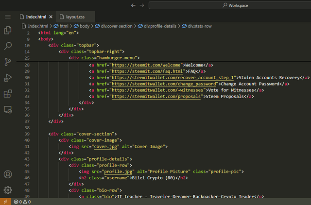
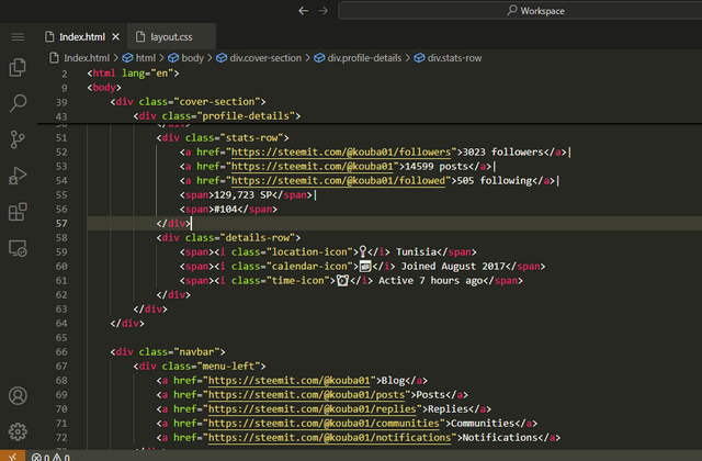
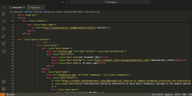
CSS Code of Second Webpage
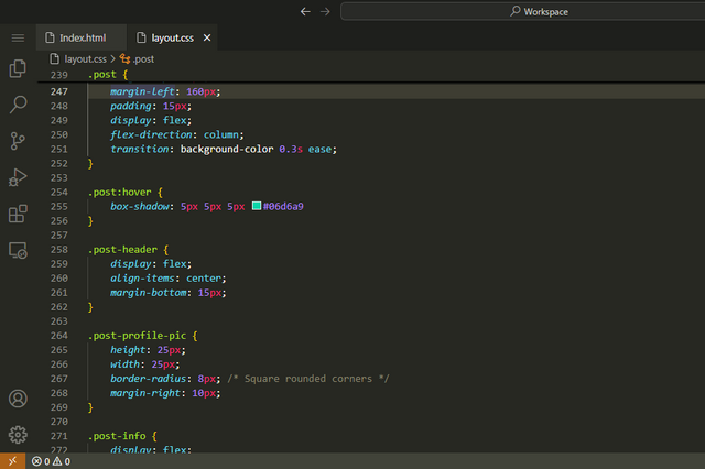
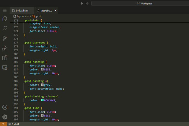
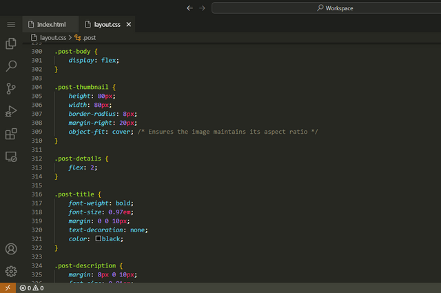
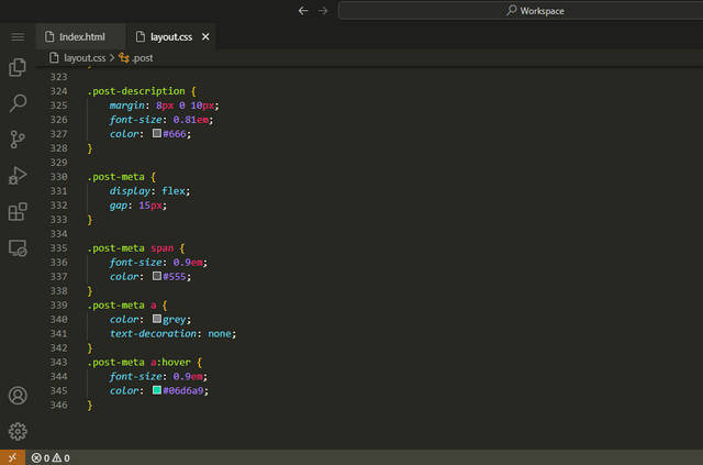
Output Video of Webpage
Thank You For Reading
Achievement 1

This is all from me for the "SEC S19W4 || Organization using CSS (box-model Display, Position, Flex)" I invite @hudamalik20, @paholags, @steemdoctor1 and @abdullahw2 to participate in this HTML5 Lesson.


Assalamualaikum bhai jan
Ap ny is task ko bari dil lagi sy hal keya hy jis ma ap ny her sawal ko bary achy tareeqy sy explain keya or on ki example b di sath ma. Webpages jo ap ny banay hen os ka ma ny personal bohat pasand keya hy. Ap ny her cheese ko deeply explain keya hy.
Lekin jo menu button laga hy header ma os ky oper courser ly ky jaen to manu baar ni kholna chaheye os ky oper click keren to side bar kholy. Ye wahan istamal hota hy jahan hum ny webpages ko mobile jesi devices py kholna ho to.
Overall ap ka kaam bohat acha hy ma ko best wishes kehta hon.
Walikum Asalam
Bht shukriya mera webpage layout apko psnd ha aur me bht khush hn is bt pe... Bilkul me ne try kia k best explain kr skon.
G wo hamburger menu me ne khud aesa kia ha q k unique layout ka kaha gya tha exact same ni to changes ki hain layout me... With javascript hamburger menu ko click pe dropdown kia ja skta ha jis sy wo stay kry ga aur me ne hover kia ha... side sy b a skta ha jis k lye hmen just toggle action perform krwana ha...
First ye ha jis me click krny pe ay ga hover pe ni:
For hamburger slidein ap yahan video dekh skty:
Ye me ne unique design ki wja sy kia tha k thora change lgy wrna ye add ho skta ha without javascript b aur javascript k st best result ata ha but hmen just html5 aur css3 krna ha.
Bohat shukriya ap ka ak tafseel ky sath jawab dyny ka ma bilkul ap sy mutafeeq hon. Good luck
Thank you, friend!


I'm @steem.history, who is steem witness.
Thank you for witnessvoting for me.
please click it!
(Go to https://steemit.com/~witnesses and type fbslo at the bottom of the page)
The weight is reduced because of the lack of Voting Power. If you vote for me as a witness, you can get my little vote.
Upvoted. Thank You for sending some of your rewards to @null. It will make Steem stronger.
Very good project you submited. Its just look mirror copy of Steem. Great job.
Thank you for supporting my content 💕💕
Very much extra ordinary brother, I am also trying to prepare my work in this task, you did lot of hard work and explained every dot as possible. Plus you used lot of photos to for us to learn what is happened and how. Thank you.
Hey chasad
good to see you participating in the contest hope you are doing good. You really recreated the good webpage as required. it's awesome that you've included a video to showcase the interactive elements. Great work! deserving