Global Warming : The extend
Global Warming : The extend

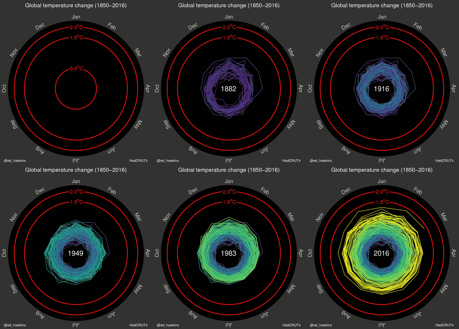
Proponents of conspiracy theories are many and some even dare to say that global warming is a fictitious phenomenon. Suffice to say that their opponents are numerous and they needed more arguments , here is a GIF showing the situation.
It's simple , we must start from the 1850s until our days in 2016 to observe the temperature depending on the month. The measure is thus the rise of said temperature on the planet. The conclusion is clear , and impressive. This time, we almost earned a degree and a half ...
Besides the ice melted , the consequences are very dangerous , climate crisis peaks and heat waves, floods, droughts, are becoming more prevalent . Obviously it is necessary to curb the phenomenon . This is why it should not hesitate to share this kind of data aggregation , understandable in a wink and to raise it to everyone.

FAQ:
1. Features you can see:
1877-78: strong El Nino event warms global temperatures
1880s-1910: small cooling, partially due to volcanic eruptions
1910-1940s: warming, partially due to recovery from volcanic eruptions, small increase in solar output and natural variability
1950s-1970s: fairly flat temperatures as cooling sulphate aerosols mask the greenhouse gas warming
1980-now: strong warming, with temperatures pushed higher in 1998 and 2016 due to strong El Nino events
2. Why start in 1850? Because that is when the HadCRUT4 dataset starts, as we don’t have enough temperature data before then to reliably construct global average temperature
3. Are temperatures ‘spiralling out of control’? No. Humans are largely responsible for past warming so we have control over what happens next.
4. What do the colours mean? The colours represent time. Purple for early years, through blue, green to yellow for most recent years. The colour scale used is called ‘viridis’ and the graphics were made in MATLAB.