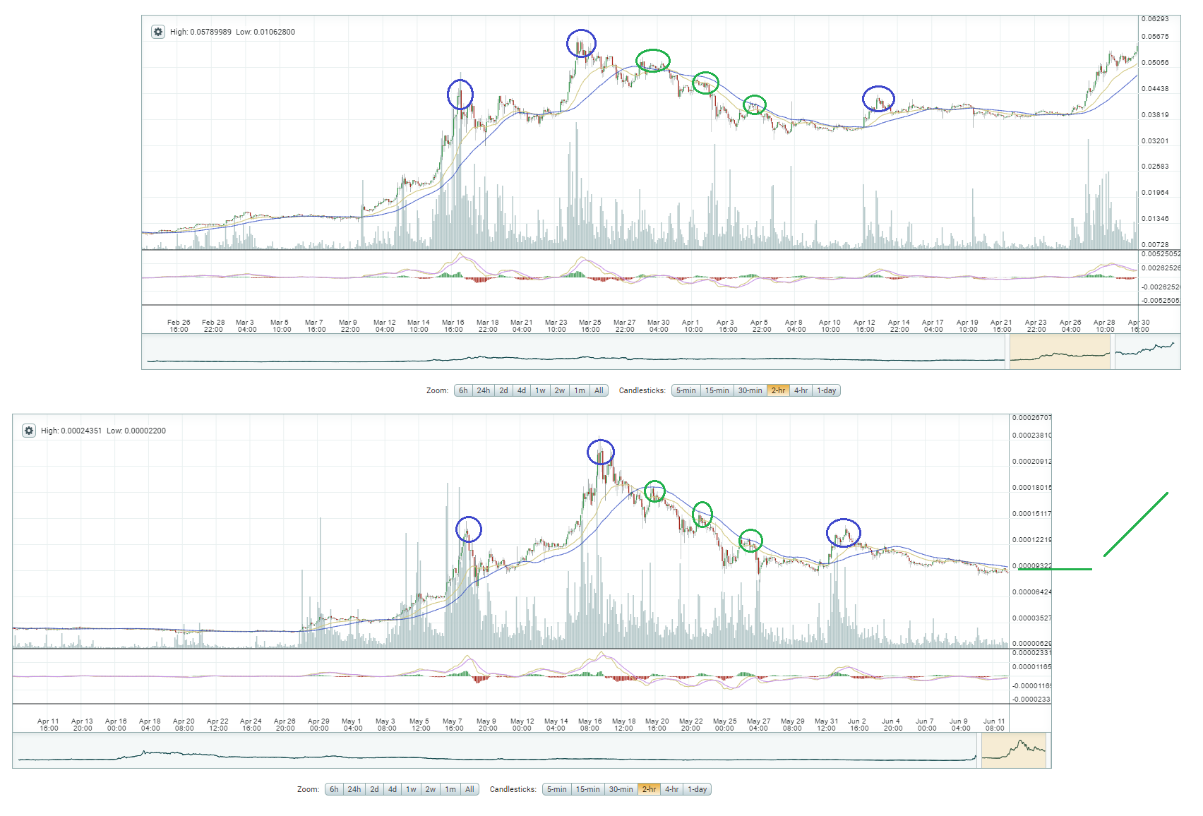
Ethereum and ripple almost identical charts
Below you can see the ethereum chart from 1 March to 1 May compared to the last 2 months xrp chart. They look quite similar.

Disclaimer:
*This is just my point of view.
*This is not investment advice.
*Only invest what you can afford to lose.
Make sure to follow for more analysis and please leave your comment below, it is very much appreciated.
Donations:
BTC: 1JEVxwzy1iD7GMBpf7xGez4cSqgdQ4ipDt
ETH-ERC20: 0x0a90265aff98ca7146f42422f2ef46545867ba27
LTC: Li2FL5Qv7pnbpJrUMSBpJ1TsZvy21LHjrL
ETC: 0x48061762c1f7771982dc2e6e4f09b8121e91c42e
ZEC: t1gGXMyn1iMLoQYqPhpSPkc6zhZAjRmXakc
XEM: NDRPDA-O7ILHQ-RAGLRG-NBFFPC-7RTXMZ-H7X3BH-IIRQ
XRP: r4pxYPiszq9HHHaFJDE8uvgLgCPW3C5Zu1
nice notice, following u
Congratulations @beltane! You have completed some achievement on Steemit and have been rewarded with new badge(s) :
Click on any badge to view your own Board of Honnor on SteemitBoard.
For more information about SteemitBoard, click here
If you no longer want to receive notifications, reply to this comment with the word
STOPBy upvoting this notification, you can help all Steemit users. Learn how here!