Call of Duty: WW2 seems almost as good as its reveal, it may be slightly downgraded but still looks gorgeous.

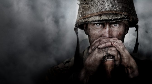
We used a pre-release screenshot for Call of Duty- WWII that some users thought those to be a pre-rendered image or something like that. Well, since we have Call of Duty- WWII on our own hands, we can now say that the final build comes truly close to those visuals.
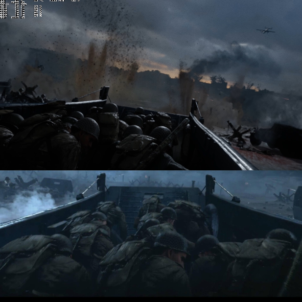
As we can see, the only thing that has been changed is the lighting system of the game. Truth to be told, the lighting seems to have taken a bit of small nutch. However the differences are not that big.

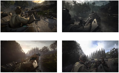
For the most part, Sledgehammer Games has managed to retain the same level of detail compared to the previous part. Below we can see a scene from the Normandy mission that looks almost the same on both PC and the trailer that was revealed. Again, the only difference we can see here is the lighting system.
The revealed trailer the lighing system was much better and cleaner and in the other levels, the lighting also has been changed.
As for now we can be described this as an slight artistic change, we also can’t ignore the piss filter that was used in the final build.

For instance, the soldiers look too much clean at the end of the first mission compared to the reveal trailer. However, we would also like to add that you can not say that there is no dirt on soldiers in the whole campaign. For some strange reason, the Sledgehammer decided to make them look more clean, which makes completly no real sense.
All in all, it seems that the lighting system of this game took a hit. Still, to Sledgehammer’s credits, the character and environments remain perfectly as detailed as those shown in the picture of the reveal trailer. So except the lighting system the game still looks absolutely gorgeous and awesome, and almost came really close to the Sledgehammer that was showcased back in April.
Darun mama
Call of duty.