Forging Frosted Factory: Fashioning Finer Form For Fulfilling Fun

I spent some time improving the new UI and I'll explain what I learned below.
Let's start with the earliest screenshot I ever took of Frosted Factory:
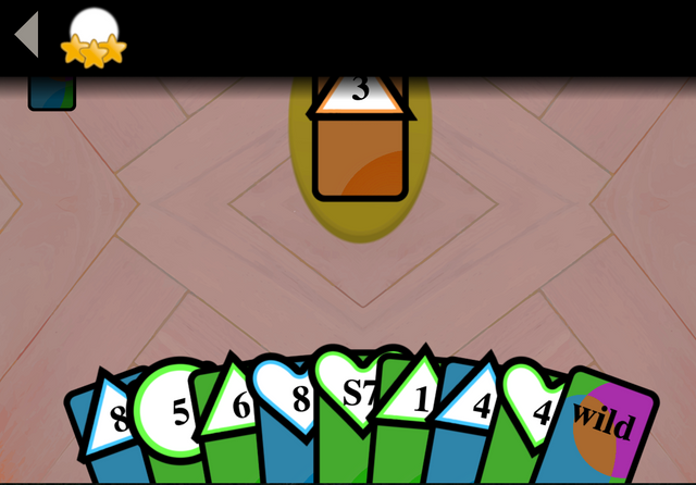
Yuck! This was the earliest design for the game. Even I knew it was bad (and I have no design experience). It had no theme- it was just a card game. I also tried to incorporate the menu into the top area to "simplify things"- or so I told myself. It was functional though- the core game loop remains largely unchanged.
Fast forward a few months- I had a menu and a first draft! It was much easier to create the final product from this stage.
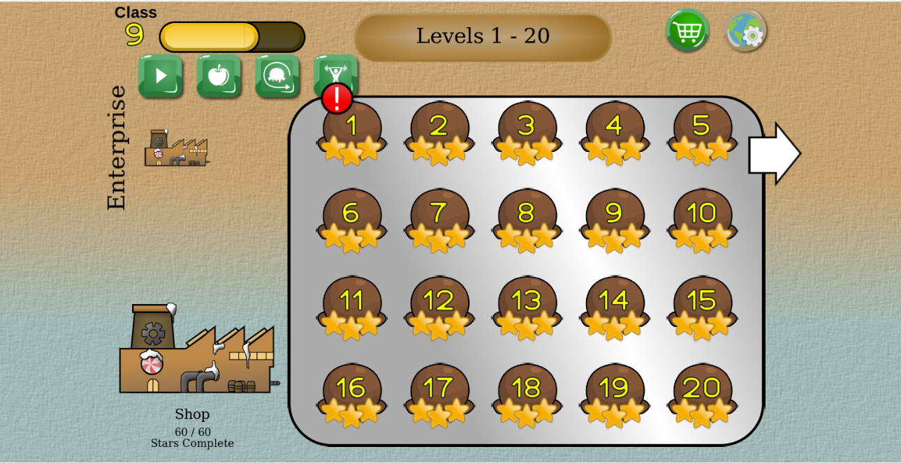
After the above image was taken, I got some help from my friend Peter (https://citrus7.deviantart.com/gallery/), he gave me some great suggestions and advice.
I had settled on the ice cream factory theme. There's something to work with now! I had all the UI I needed (a level up system, level picker, different game modes, a ice cream cart to upgrade, etc). However things were still unpolished and cobbled together. I've compiled a list of things that I still needed to change below.
Finally I ended up with this :
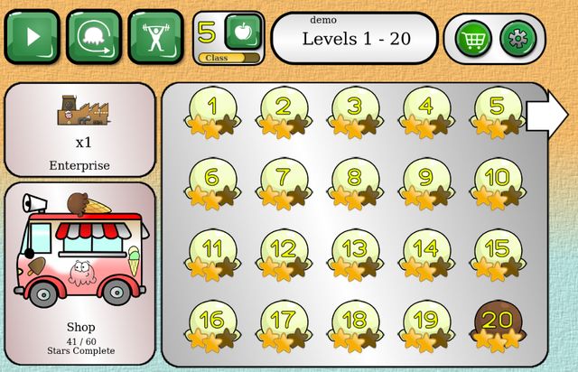
Things I learned:
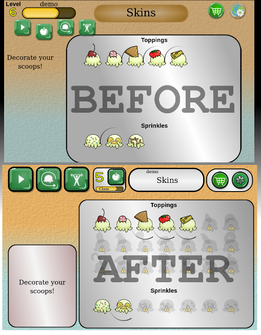
- I was not highlighting the unlockables. I thought to myself- "the player will unlock stuff as they go, what do they care if they can see what they have left to unlock". Of course this is flawed- players want to know if there's still stuff to unlock, what may be left to unlock, and want to sense progress towards completion.
So I added locks to the stuff that was yet to be unlocked- simple.
I also added outlines to shadowy future unlockable skins to show the player what they have yet to unlock. Before this, I didn't show what you were going to be able to unlock next, so the player never knew how much they had left or if they were finished.
- Again, I didn't realize players would want to see that you can make progress. I had added a level up mechanism, but they need to know that the game has many levels. Things needed to be MORE explicit.
To fix this, I simply added a title of "Levels 1-20" in the menu, instead of just "Levels". This simple change lets the players know there's more content than what is visible on the screen at the moment. It's one of the smallest changes with the biggest impact.
It was also not evident what the various parts of the screen meant (enterprise vs shop). As players progress, I added some tips to make sure players were well aware of what all the parts of the screen mean.
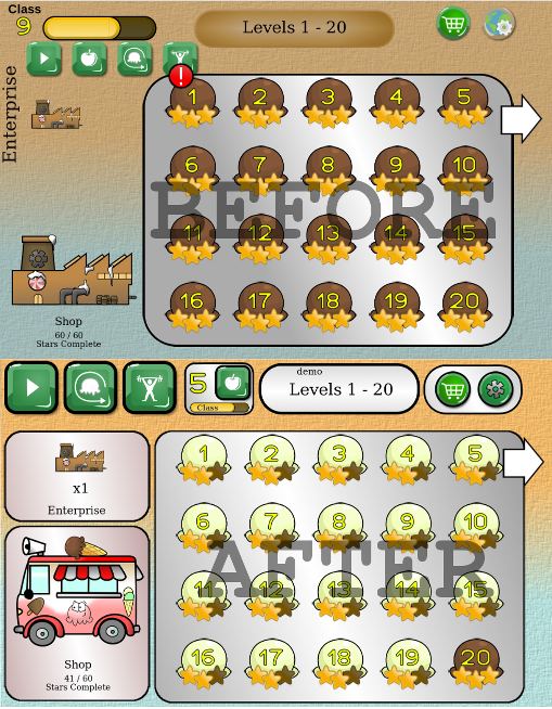
- The menu is disorderly, there are random parts that don't really seem to go well together or don't align with each-other. This makes it look chaotic- which is not good when you're trying to entice a new player.
To fix this, I cut the screen into clear sections, most have their own background image. This was the most labor-intensive change: resizing and cleaning up various parts of the UI.
I also tried to group similar items close to each-other. Before I had buttons in this sort of order: game mode 1, game mode 2, skins picker, game mode 3, etc. Obviously it should be game mode 1,2,3, then skins picker separately.
I also added a black outline to the buttons so that they fit better with the rest of the UI.
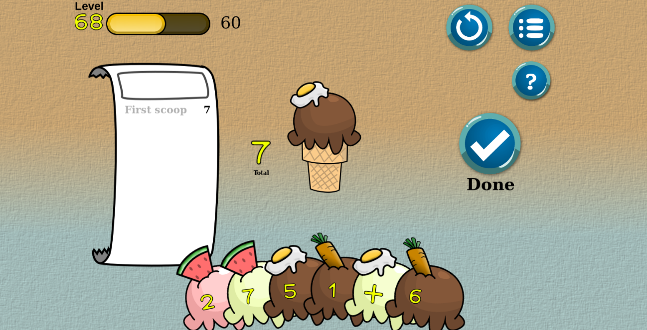
The main game loop (the gameplay) didn't change much. But I did enhance it by adding more information about progress and how to play. I also made the tutorial much easier to get through- so it won't be painful for new players.
I am a software developer so I had to learn art from scratch. For those who are curious of the full process I use to make all the art for my game, my entire process is here: https://steemit.com/gamedev/@camillott/clever-code-completion .
tl;dr
I learned that I need to:
- Tell the player EVERYTHING. Even all about the unlockables- this draws in a player.
- Tell the player EVERYTHING (even more than the above). Almost nothing should be assumed to be self-evident.
- Make sure menus are orderly. Similar buttons or areas should be grouped to make it easier on the user's eye and mind.
Last Time's Goals:
- Implement some of the design suggestions I got over Christmas. [Success!]
- Really brainstorm for keywords [Fail]
- Post at least once on twitter, facebook, and imgur. [Fail]
- 10 new followers (on any social media) [4/10 Meh]
Next Time's Goals:
- Generate all the missing levels
- Make a promotional image or video/gif that explains the game well. I can use this to get new followers.
Congratulations @camillott! You have received a personal award!
Click on the badge to view your Board of Honor.
Do not miss the last post from @steemitboard:
SteemitBoard and the Veterans on Steemit - The First Community Badge.
Congratulations @camillott! You received a personal award!
You can view your badges on your Steem Board and compare to others on the Steem Ranking
Vote for @Steemitboard as a witness to get one more award and increased upvotes!