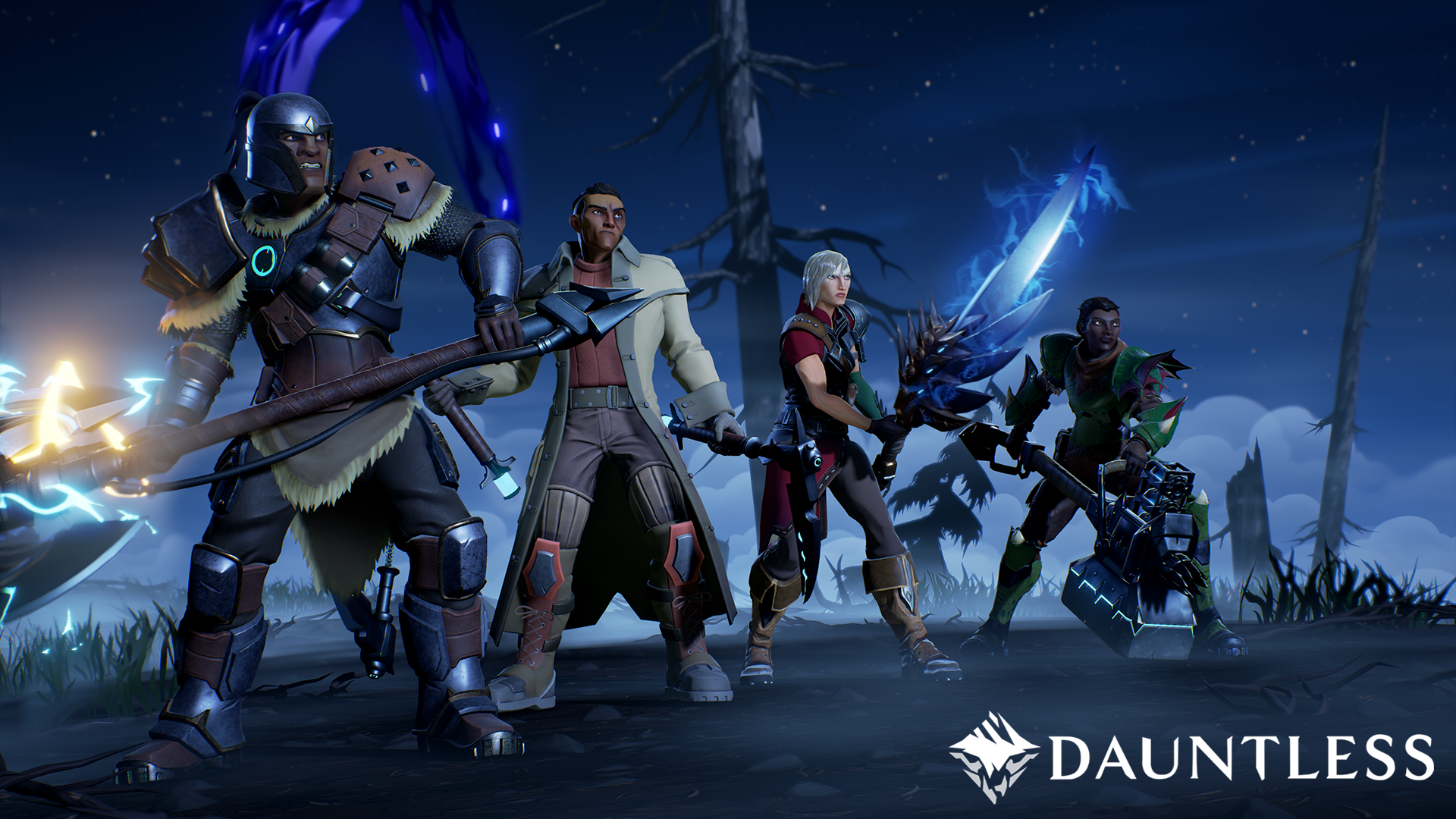
Closed Beta Access: Dauntless, praise and feedback for the devs

First off, great game. I really like the graphics, everything looks pretty. This article is primarily for devs, they asked for feedback at PAX East, so here is an extensive list from 3 days of beta testing.
Gameplay notes:
Collecting resources is cool but the shine/glaze on the collectibles should be a bit more distinct. It's hard to see them unless you know what you're looking for. Which can be okay if you want it to be more challenging. Specifically, the gripshroom is hella annoying to spot, but if that's your intention - well done.
Boss fights - Apropos challenge difficulty. Perhaps Scale a bit more on the extremes. Tier 1 I fought 2 maybe 3 bosses before moving on. Tier 2 I farmed the shit out of and made myself 4 maxed weapons and 3 fully upgraded sets of armor. Tier 3 I skipped almost entirely and now I'm farming Tier 4. I think there needs to be some way to pace a bit better so that you spend equal time at each tier.
Matchmaking seems to take a while if your solo depending on what tier you need, I've noticed that many folks seem to be skipped tier 3 entirely.
Hit boxes could be tighter. Sometimes I get hit when I thought I dodged and others the boss will miss me somehow and I'm like "well I thought I was gonna get hit there." Also an in-game guide to the weaknesses of different bosses would be a cool bit of story, but it's unnecessary fluff since we already have internet access and google searches when we get stumped.
Visuals:
When folks drop into the zone, background folks look saggy/crouched. This makes me laugh every time. Your toon always shows up in front with your homies behind you, and they're all standing in horse-stance, wide legs, half-crouched.
Interfaces look good. I'm presuming there's going to be polish on some of the ult-meters, the spear one looks unfinished as does the ax.
Queuing up for a fight should give people an option to join the queue from town and not just pull them straight in. When you're in a party a little pop-up window could read: "(GroupLeader'sName) wants to queue for (Boss or patrol), are you ready to join?"
Cells - recombine crappy ones for better ones, like combine 3 for 1 of the next level.
Hotkey for instant muting game sounds and the ability to access the setting menu from any screen with a quick tap of escape.
Extra help reviving should increase speed of revive, and the meter should glow or something indicating that extra help is being added.
Contrast on Score screen after matches needs to be better, also clearly explain what things like a bastion is. I happened to know the meaning of the word, but most gamers are going to associate it with a certain robot from a major Triple AAA title. The other ratings are much more clear and specific.
Rate your match 1-5 unclear. I've been assuming 5 is the highest rating.
When you approach a billboard, the yellow highlight is visible through character models in town.
The transition from town to boss-zone could be smoother. Perhaps a loading screen with some pretty splash art and a little loading meter on the bottom of the screen?
Overall, I've been having a blast with the game and can't wait for further development. Anyone interested can catch me on Twitch.tv/TwitchyCyre
Later Additions:
Bugginess with items on loadout screen. The numbers tend to be off, used up items are replaced on loadout with standard image of a healing potion.
Crafting needs to be streamlined, should be able to specify an amount of something to be made and it can consume all of the ingredients. Like for a common heal potion, it should just consume the ingredients for a simple potion instead of you having to make them first.
Upon Exiting a match, should be able to still type. It seems to freeze up and not allow access to the chat window.
Can't adjust sound volume while dead... or any menu options rather.
Friends list should show friends currently online.