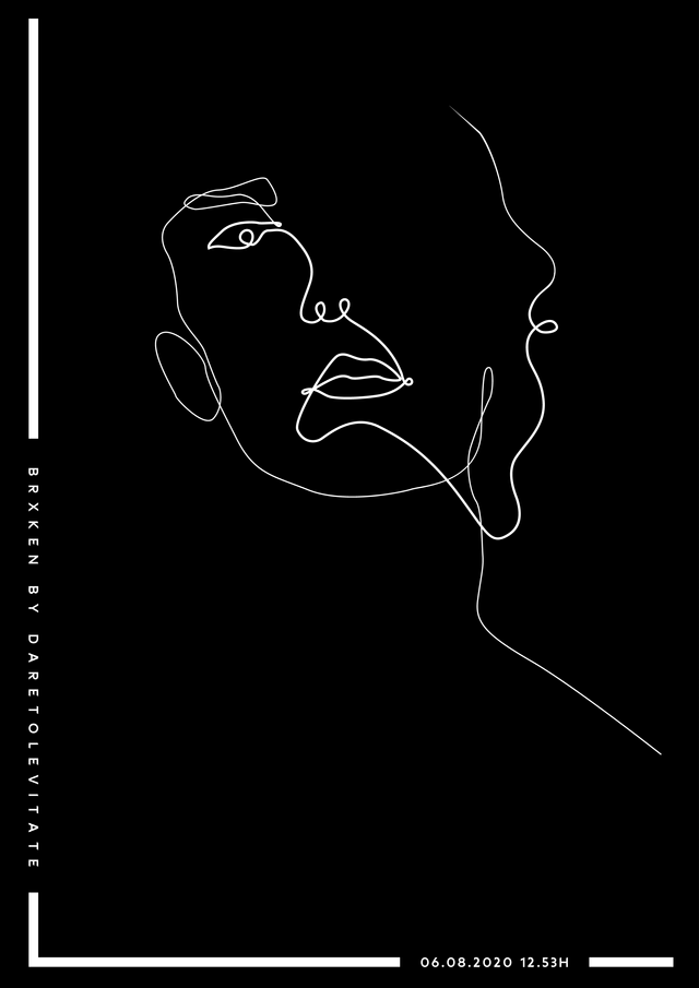
Day 8: Black and White Minimalism
You would think minimalism is the easiest type of art you could do.
Let's put it this way: The rule here is "less is more". You just can't do too much, or else it's not minimalism anymore. But nonetheless, your message should still be loud and clear.
A while ago I got the chance to redesign a logo for a local company and I went with this style. It was the first time trying it.
Thin lines, a lot of "white space", and most importantly "LESS IS MORE".
We have 22 more days to go, so f you have suggestions for themes we can work with for this 30day challenge, don't hesitate.
