"SEC20/WK1: Introduction to Graphic Design and Principles."
Hello, everyone. It's good to interact with you. This is my first update about graphic design. I've been interested in many forms of design for a long time and wanted to learn the appropriate skills.
I've done several designs for personal publications, but never professionally. Thanks to this challenge, I now have the opportunity to learn more about what I have already learnt. Thank you, @lhorgic, for this opportunity; now I can learn from the comfort of my own home using Windows. I've previously studied this topic, and this time I'd want to offer what I've learned about graphic design.
Question 1 : What is Graphic Design
Graphic designer is a job creating illustrations, typography, photography, or motion graphics for publishers and print and electronic media. A graphic designer is responsible for the appearance of a product's promotional media. His job is to convey information about a product in an attractive way by accommodating the client's wishes.
Graphic designers can not only have careers in the media, but also in various industries, especially the service industry (telecommunications, advertising, photography, education, construction, information technology) and the manufacturing industry (textiles, garments, fashion, automotive, electronics).
Graphic designers also play a role in solving problems that arise in certain areas through public service advertisements. Being a graphic designer does not have to be good at drawing, but it is better to have basic drawing skills so that it is easy to express creative ideas into visual forms. In addition, the ability to use graphic software is also needed to support the creation of illustrations.
Question 2 : Principles of Graphic Design
Design principles are actually important to be known by anyone who has a job that intersects with design. Why? By understanding the principles of design, we have a kind of basic "vocabulary" that can be used to discuss design, thus helping designers to produce the expected design. I will explain 3 principles of graphic design based on my knowledge.
Hierarchy
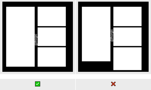
Hierarchy is a layout principle that is done by first sorting which information or elements are most important to which are not so important. A design that has a visual hierarchy can display the main points of a design and is easy to understand. Visual hierarchy is the key to attracting attention. For example, when you see the two images below, which one catches your attention first?
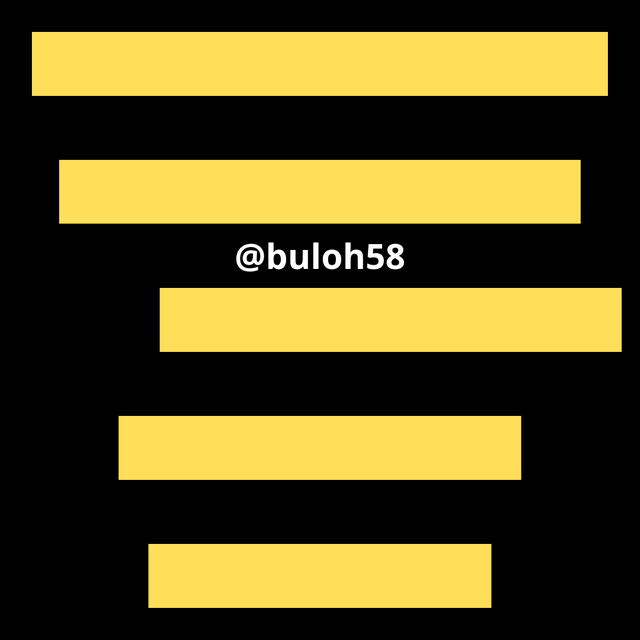
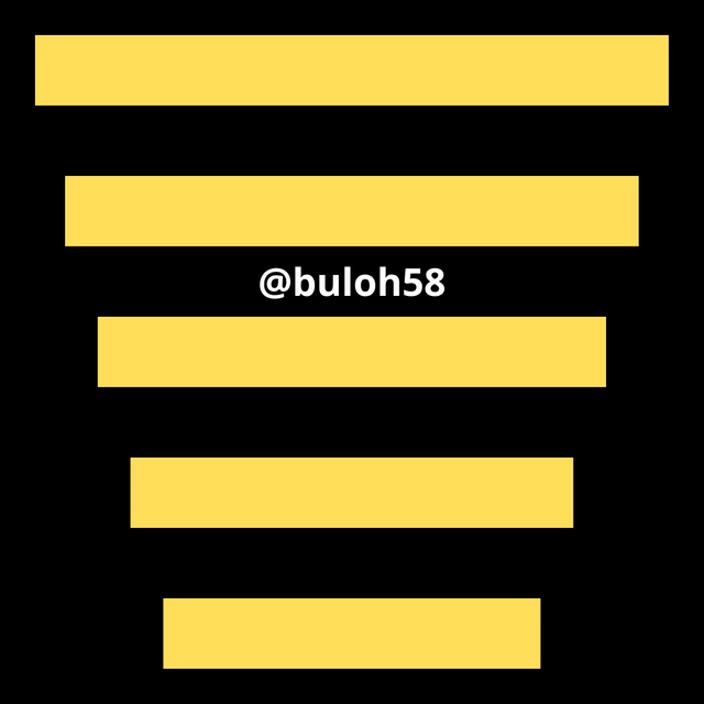
By looking at the image above, the second poster can attract your attention first because I apply the principle of hierarchy. compared to the first image that has no hierarchy so it doesn't look good. so it's important to know that larger boundary elements will attract attention first, followed by lighter or smaller elements.
From the example, visual hierarchy can actually not only be applied to posters, but also applies widely, both in flyer design, brochures, websites, and application displays. To create a visual hierarchy is not limited to playing with size and typography, but many other elements can be used to create a visual hierarchy.
Emphasis
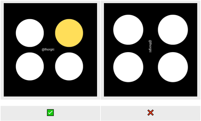
Emphasis refers to what important information you want to emphasize in a design. By giving emphasis, the important information will stand out more than other information. To determine this principle, all you need to do is ask yourself: what is the most important information that people want to know first? Is it the title of the event? The name of the speaker? Or the date and time of the event?
Balance
Balance creates stability and structure in a design. It can be symmetrical, where elements are evenly balanced on either side of a design, or asymmetrical, which uses contrast to create visual balance even when elements are not identical. For example, balance in design helps distribute weight evenly on a web page; visual elements and text may not be the same size but are arranged in a way that feels balanced.
Question 3 : Show practically how to create graphic images
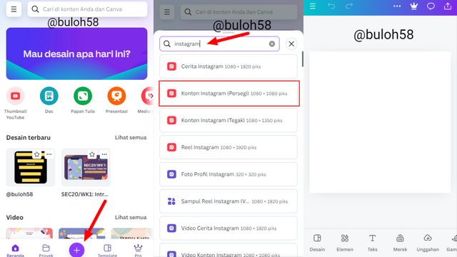
Step1: open google browser and visit Canva.com then look for the plus icon "+" which I clicked then select the size/dimension as Instagram 1080x1080.
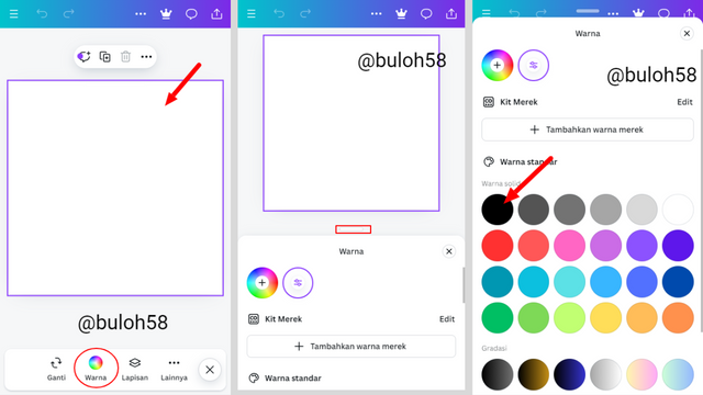
Step 2: Change the color by finding the color icon and then dragging the highlighted part (slider) on the second slide to get color variations. I chose black.
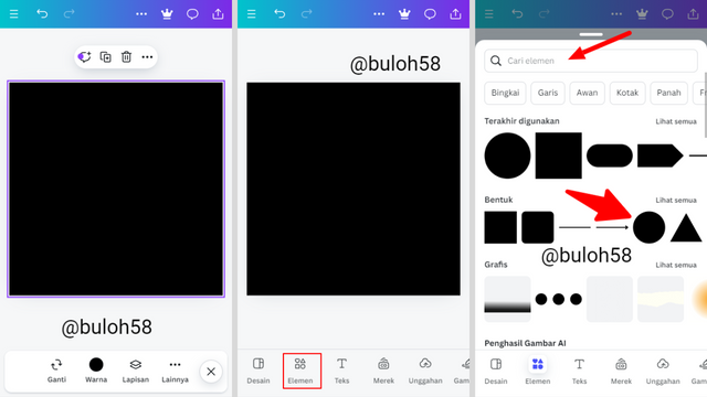
Step 3: Now the background is black. Next is to bring up the shape (circle) by clicking on the element. You can use the search bar to find circle if this is your first time doing it, then select it.
Step 4: You can see the circle shape in the background. Next change its color to white, using the method taught above.
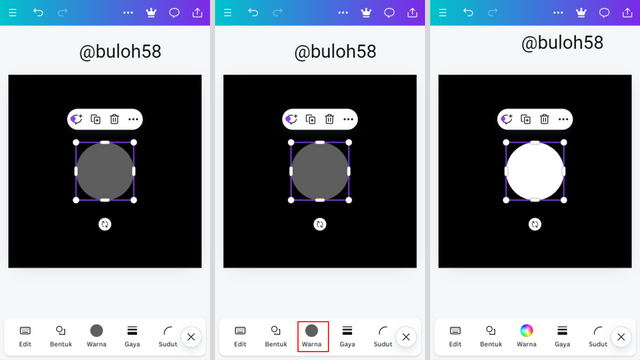
Step 5: Now we have a white circle shape as seen. The next step is to click the + box icon 4 times to duplicate the circle into four parts. After that, arrange them by dragging each one to the desired position as seen.
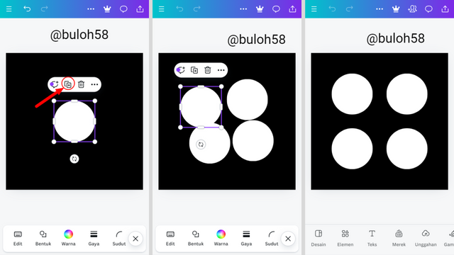

Finally I was able to complete the challenge "SEC20/WK1: Introduction to Graphic Design and Principles." To create the requested graphic design with a simple 5-step guide guided by professor @lhorgic
I would like to invite @beaidea @mcp9595 @eziko4u @financialgrows and @fulvioo
Greetings friend @buloh58
Welcome to Steemit, we are pleased that you have integrated into the platform. We hope you find a space to share original and interesting content.
I invite you to fulfill the achievements in the Newcomers community.
I recommend that you learn about the internal policies that you must take into account when publishing content on Steemit.
https://steemit.com/faq.html#What_is_considered_spam_or_abuse
On the other hand, it is important to let you know that the use of artificial intelligence is not allowed to generate content.
Hello @buloh58 thank you for participating in this week's lesson. Everyone is free to enter this contest except unverified users, a category you fall into. Kindly get yourself verified and make an entry into this week's content.
Regards
@lhorgic❤️
Please professor @lhorgic, I guess you made 2 mistakes here, this is not @ninapenda, and this account is not verified. please look : https://steemit.com/@buloh58/posts.
cc @steemcurator01
I believe it's an error. He will edit it soon.
The wrong name typed there, I believe was a mistake, that's why I told the Professor to correct it or maybe not it won't bring any differences, I guess. With all those entries, it can become quite stressful at some point and that's why I respect any Steemian who steps forward and does the teaching. The are serving good on Steem Blockchain.
The one true problem is the unverified account, created a few days ago that were obviously made to participate in the Steemit Engagement Challenge Season 20. Just check these 2 accounts: @wedus and @buloh58.
Oh so sorry about this...it's a complete oversight. Let me remedy this immediately.