SEC20/WK1: Introduction to Graphic Design and Principles
Hello everyone!
I have joined Graphic Design course by @lhorgic under the umbrella of the great Steemit Team. If you have not joined it yet and want to join then
Question 1: What is Graphic Design? Briefly Share with me your understanding about graphic design
There are different languages in the whole world and the purpose of those languages is to communicate with others effectively and efficiently. If I say that graphics designing is also a language for the effective communication with ease then it will not be wrong. Graphics designing is used to make the communication with the help of visual representations. The purpose of this communication is also just like the formal and informal languages to convey the messages and ideas to others.
Graphics designing combines different components to convert the message. It combines the typography, images, colour, space as well as a specific layout to create a design which conveys a specific. These designs also evoke an emotional response from the audience. Actually there are somethings which cannot be understood just by simple words. In order to fix this problem good graphics and the visual representation of those graphics is used. Graphics design solve the complex problems and it enhances the user experience.
Graphics designs play their role in all types of industries. These visual representations are used for the effective advertisement and marketing. Graphics design play it's role in technology and entertainment. Graphic design allows us to create logos, brochures, posters, websites, social media graphics, packaging as well as product designs.
Question 2: Pick any three of the principles of Graphic design and talk about them based on your level of understanding .
There are different principles of graphics designing. But I'll discuss the three key principles of graphics design. I have chosen these principles:
- Balance
- Contrast
- Emphasis
Here is the explanation of these three key principles of graphics design based on the level of my understanding.
1. Balance
Balance in graphic designing is an important principle. Balance demonstrates the visual distribution of different elements such as images, text and shapes in a composition. Do in the design there should be balance between all the visual elements. And one element should not overwhelm others. There are further two main types of the balance.
- Symmetrical Balance
- Asymmetrical Balance
Symmetrical Balance
In the symmetrical balance the elements are arranged evenly on both sides of the imaginary central line. It leads to stable and a formal order. In symmetrical balance a single thing is balanced on the screen.
For example: if we see this balance for a logo which is mirrored on both sides it has symmetrical balance.
.png) | 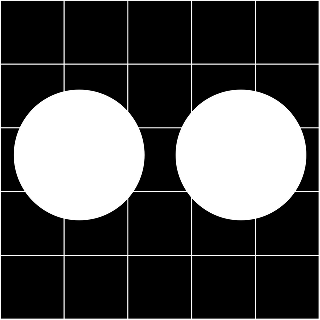.png) |
|---|
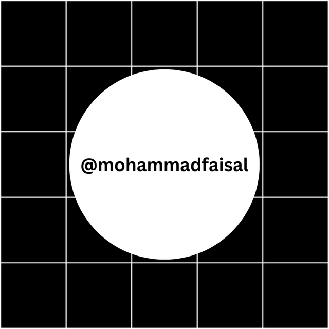
In the above design we can check symmetrical balance on the screen where the circle is at equal space from all sides of the screen. It has symmetric balance on the design page. And I have added grid lines to check the symmetric balance easily.
Asymmetrical Balance
In the symmetrical balance different elements are arranged on the screen to create a sense of balance. It forms a balance on the screen even though the elements used are not identical. It is more dynamic. It provides a sense of movement or tension while still feeling cohesive.
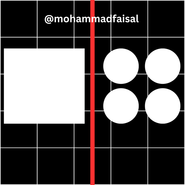
For example: A large image on the one side of the screen can be balanced by using different small elements on the other side of the screen so that everything can look balanced and cohesive.
.png)
In the above picture we can see that balance is asymmetric where at one side there is a big object and on the other side small objects have been added to balance the view.
Balance is very important principle in graphic design. It gives a proper structure to the visual representation. It makes it sure that the message is delivered efficiently and effectively to the users.
2. Contrast
Contrast is another important principle in graphic design. It is the use of the opposite elements in the design. It suggests the proper use of the light and dark colours, small and large shapes as well as thick and thin limes. Contrast makes the design look more eye-catching and attractive. Contrast differentiates the different sections of the design. In this way the design becomes easy to understand and visually appealing as well.
For example: If we place white text on the black background then it highlights the text on the black background and it becomes easy to read the text. Similarly using different font styles and font weights creates contrast between the headings and the plain text and it helps to understand the text easily.
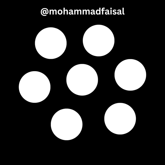.png)
We can say that contrast not only make the design visually appealing but it also makes the design easily readable and accessible. It makes the designs more effective to convey the ideas and messages associated with that design.
3. Emphasis
The emphasis principle is another key principle which emphasises the elements in the design. It highlights the specific thing to look more eye catching thank other elements. In the visual design sometimes we need to highlight some elements more than the others it is time where we use emphasis principle of graphic design.
We can use different elements like colour, text, size, contrast, shape and specific position to emphasise the design and to make it more dominant than other elements within the design.
We can emphasise the specific events by using different techniques.
- Size: We can increase the size of the specific element to make it more dominant than others.
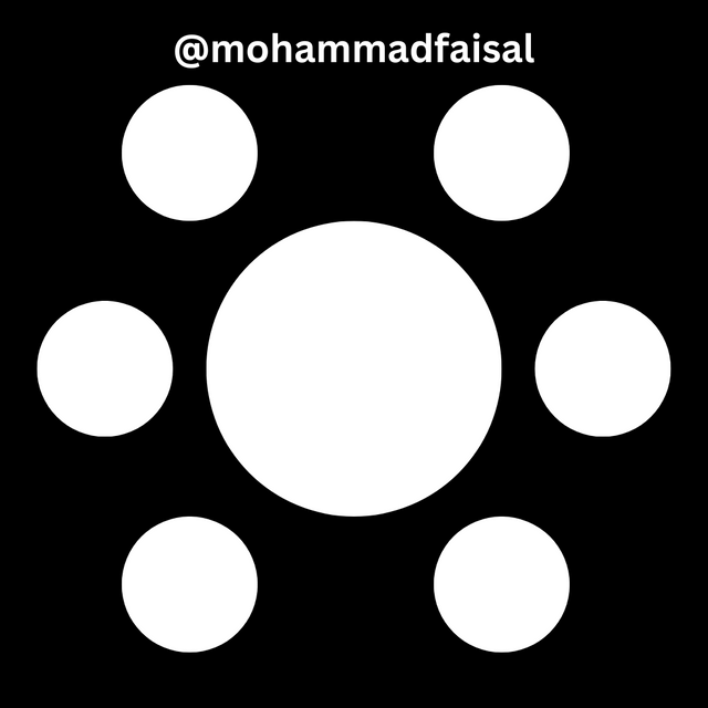.png)
- Colour: We can choose different and unique colour to emphasise the specific content then rest of the content.
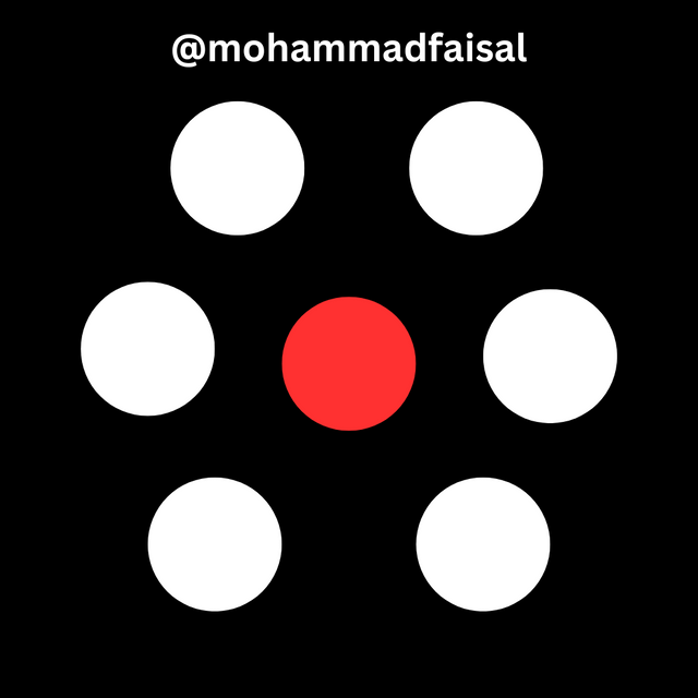.png)
- Placement: We can emphasise the elements than others by placing them at top or in center where they get more attention of the audience.
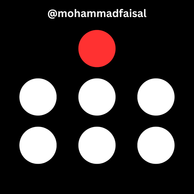.png)
For example A graphic designer is making a banner for a concert and he wants to dominate the name of the singer than other elements then he will use bigger size, unique colour and a specific placement to emphasise it than other things.
So it is how emphasise principle works.
Question 3: Practically show us how to make the graphical image below.
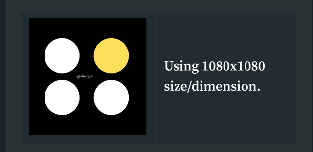
It is very easy to make the required graphical image using canva. As the professor has guided in a great way to draw such image I will also follow those steps according to my learning and previous knowledge to make that image. So let's create that.
Creating Desired Design Format

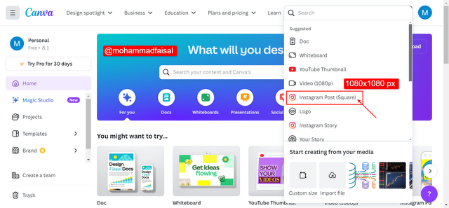 | 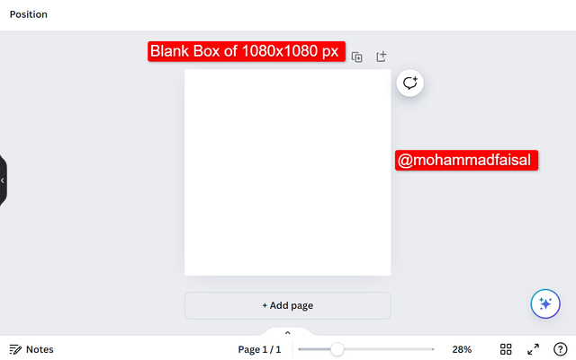 |
|---|---|
Here in the above 3 sub steps I have created a blank page of the instagram post with the resolution of 1080x1080 px. In the desktop version canva is more easy to use for me. We can create such blank page simply by clicking on the Create Design instead of + icon in mobile. Then we can choose the required design format as I have chosen Instagram post format. And the blank box is ready to use.
Choosing Colour for Design Format
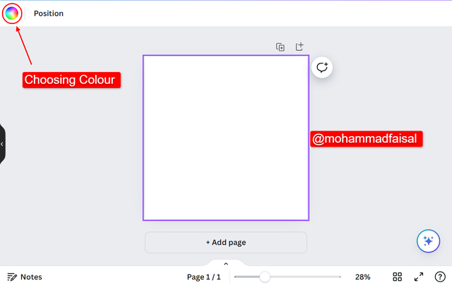 |  |
|---|---|
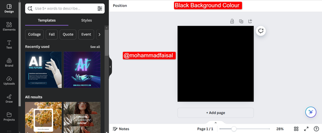
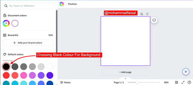
Then in order to choose the background color of the design we can follow these simple steps as mentioned in the above pictures:
- Click on Colours Icon
- Then Choose your desired colour (Here I have chosen black)
- Finally black colour has been selected as background colour.
Choosing Elements for Design Format
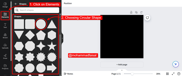
In order to insert circle shape on the design we need to follow these steps which I have shown in the above picture.
- Click on the elements. It will show all the elements available in canva.
- I chose shapes it displayed me all the shapes as you can see.
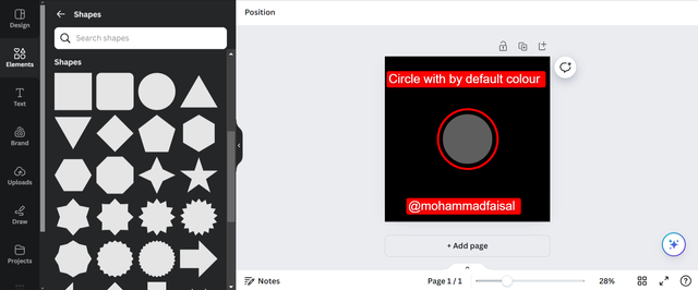
Changing Colour of The Shape
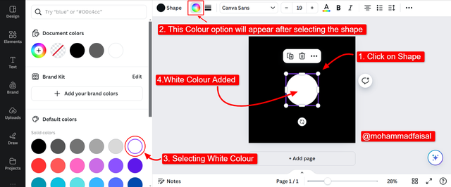
It is an easy process to change the colour of any shape in canva. Here are the steps as mentioned above in the picture:
- Select the shape
- Select the colour icon
- Select the colour from Default Colours.
- Selected colour will be added.
Replicating Elements
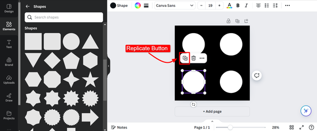
Canva offers a great feature in graphic design to replicate the elements easily. There is no need need to create the same element again from scratch. We can simply copy the current shape and replicate it. As you can see I have replicated the circle shape and there are 4 circles on the screen.
Changing Colour of the Circle according to the Requirements
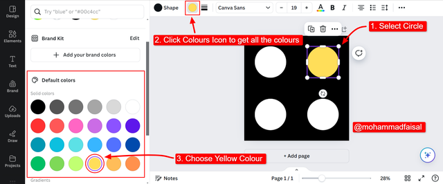
As per the design requirement there is the need to change the colour of the first circle at right side I have followed some steps to change the colour as you can see in the above picture. These steps are given below:
- I selected the shape
- Then I selected the colour icon
- I select yellow colour from Default Colours
- Yellow colour has been added
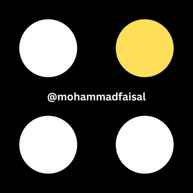.png)
Step By Step Video Tutorial To Create Circle Grid Design
In this video I have demonstrated question number 3. I have created the required design and all details and live steps are given in the above video.
Disclaimer: All the screenshots have been taken from Canva Desktop Version.
Lastly I invite @suboohi, @aaliarubab, @sualeha, and @patjewell to join this amazing course.
Hello @mahammadfaisal thank you for participating in this week's lesson. We have assessed your entry and we present the result of our assessment below.
Feedback:
• You have clearly defined Graphic design the way you best understand it, even with a practical life example.
I appreciate the effort you put into it.
• Your selection on the principles of design is nice coupled with your comprehensive explanation. You did a good job delving deeper into the principles, It also cool to see that you used corresponding visual of these principle to explain your points which is quite commendable.
• Finally, Your practical looks really nice in it presentation, well detailed and comprehensive. I hope you keep up with the energy level. Weldone.
Regards
@lhorgic❤️
It was interesting while completing all the practical tasks. I always use canva to make cover images. Have a good day 😊
X Promotion: https://x.com/stylishtiger3/status/1834486895759290419
You have analyzed this post very well with step by step skill. There are many skills to learn from you. Thank you for sharing such a beautiful post. Best wishes to you.
Thank you @max-pro 😊
Thank you for the invitation!
I absolutely LOVE Canva; therefore, I think I will enjoy taking part in this lesson and then also doing the "homework."
Congrats! You did well in your explanation.
Best wishes!
Thank you so much for your valuable feedback and welcome to participate in this contest.
Pleasure!☕