"SEC20/WK4: Graphic Design Hands - On Practical 1"
It is interesting joining this class which allows the students practice their skills and move from basics of graphic design to a professional stage. Today, I will share my task for the 4th week.
 Designed with Canva
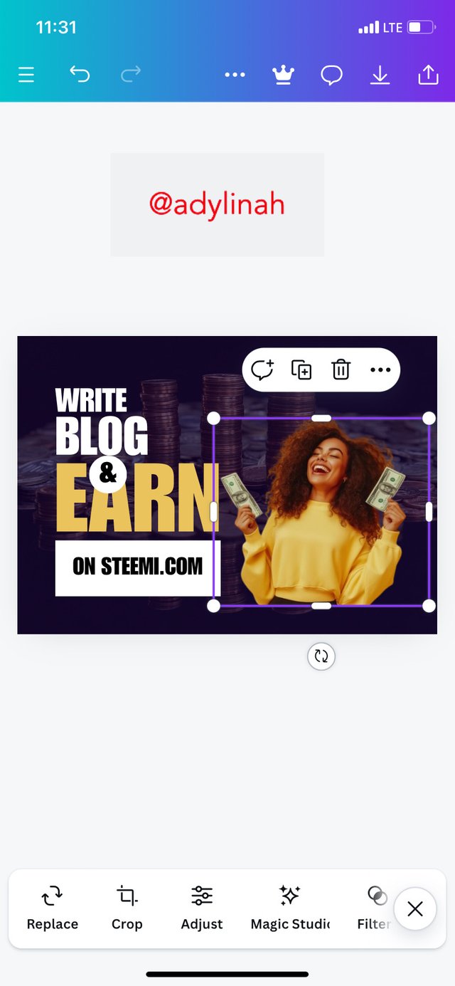
Below are the steps I took to replicate a design given by the teacher;
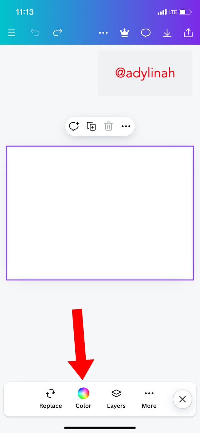
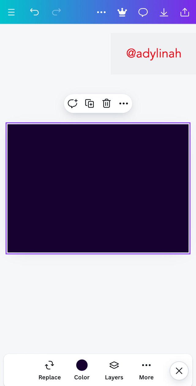
Step 1: the first step I took was to set up my workspace on Canva by selecting a preferred background color on the color icon which was a darker shade.
 |  |
|---|
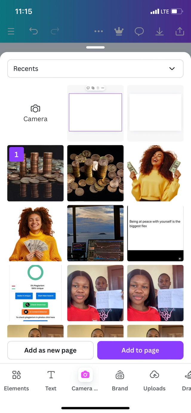
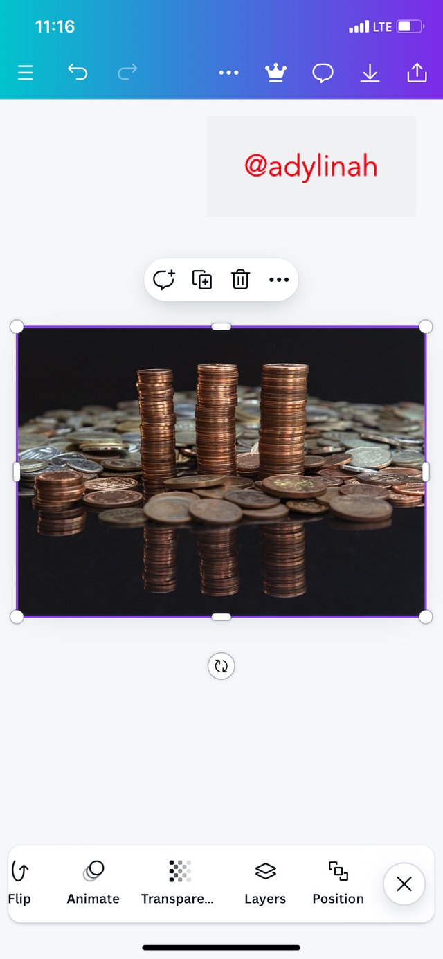
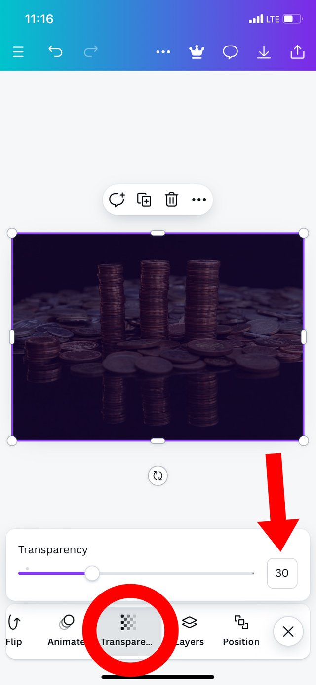
Step 2: I added the background image by clicking on camera icon and select an image from my gallery that is related to finance. I proceeded to covering all my workspace by enlarging the image before adjusting its transparency to 30% using the slider on the transparency space.
 |  |  |
|---|
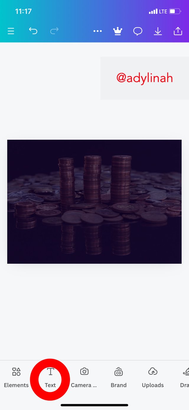
Step 3: I moved to the next step by clicking on the "text" icon, typed in the the following words;
- Write
- Blog
- Earn
 |  |
|---|
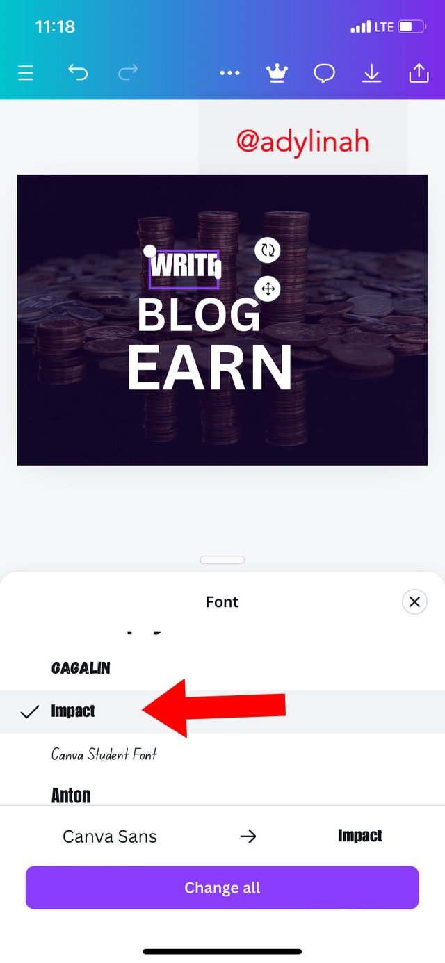
I choose the typography and formatted the text by selecting "impact" font style and also create a hierarchy with the three words listed above on my workspace.
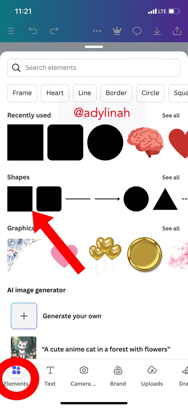
Step 4: I clicked on "elements" icon, selected square shape then create a frame under "EARN" text. I changed the color to white before adding a text on the shape; "ON STEEMIT. COM"
 | 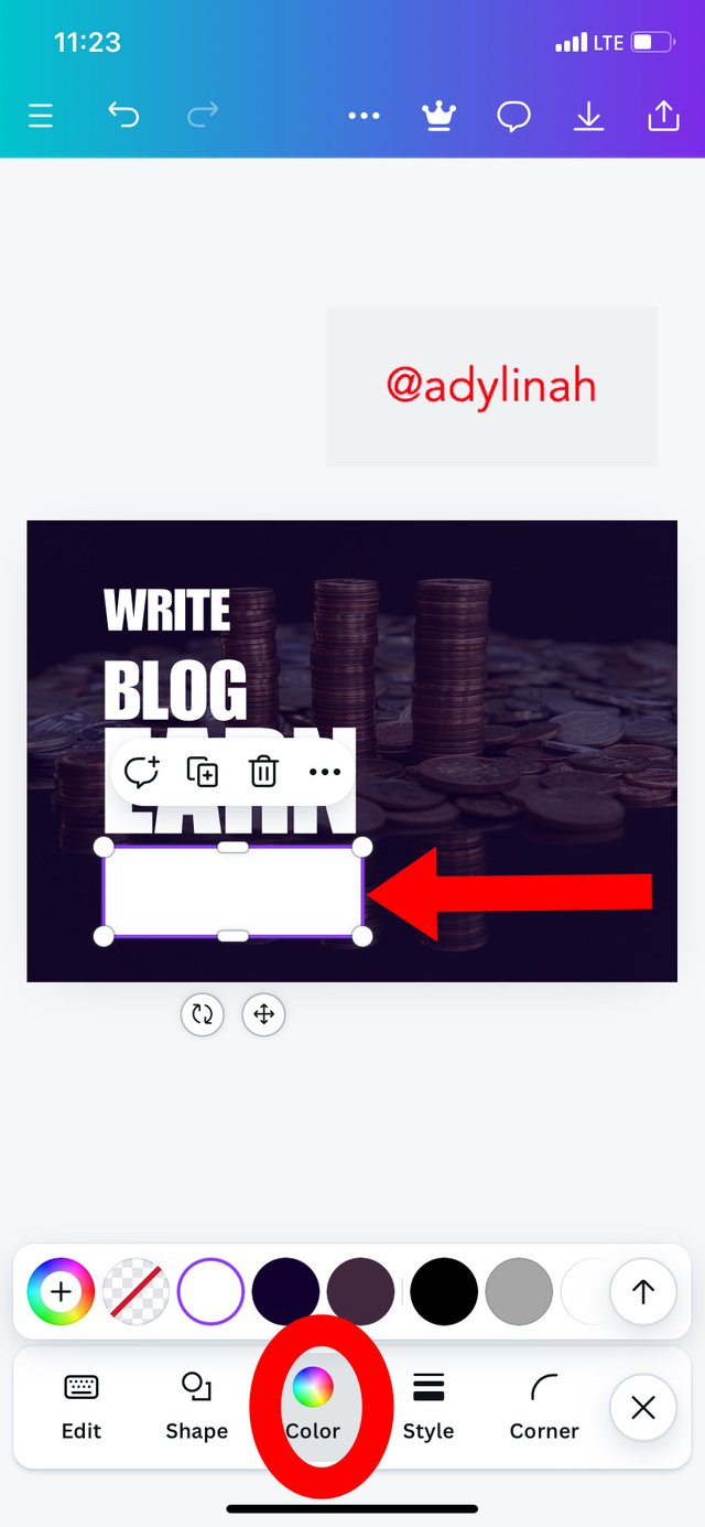 |
|---|
Step 5: This was where I applied the principle of emphasis by changing the color of "EARN" from white to yellow. The design became very attractive to the eyes and the message can easily be passed across.
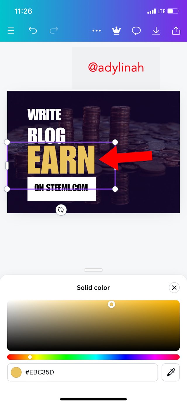 |  |  |
|---|
I went back to elements, selected circle shape, changed the color to white, add text ("&") to it and then placed them properly on letter A in "EARN".
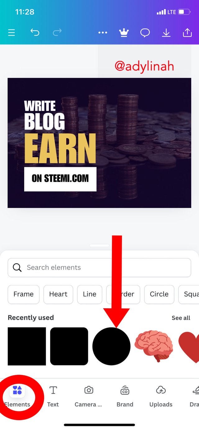
Step 6: I returned back to my photo gallery by clicking on camera icon and selected an image. I positioned it properly before moving to the final stage.
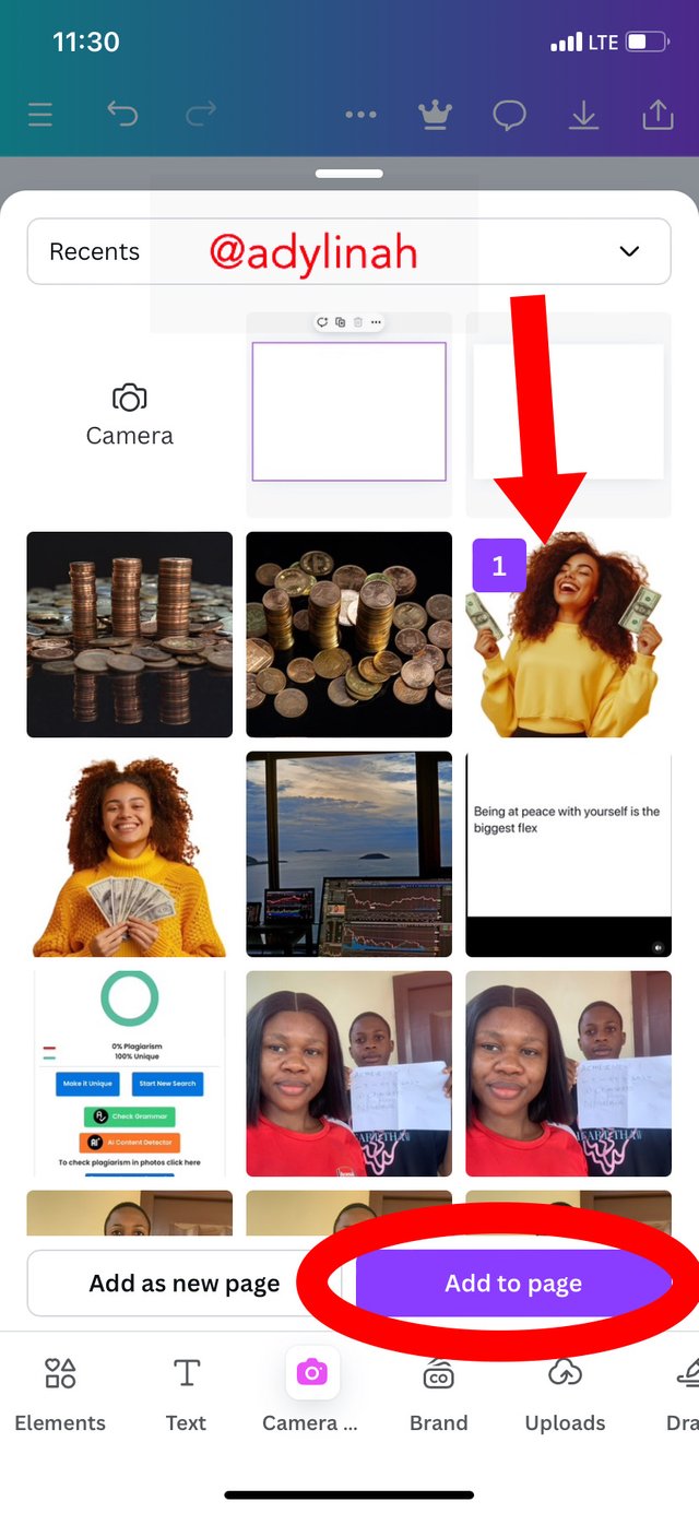 |  |
|---|
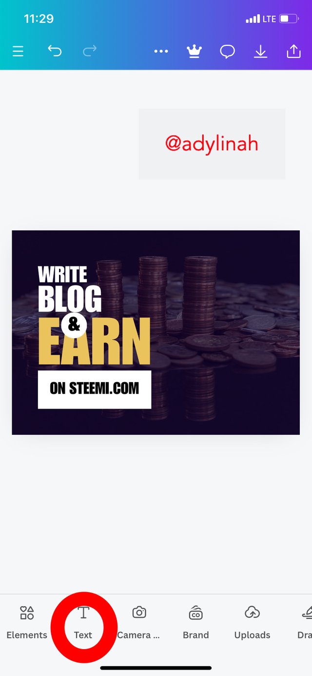
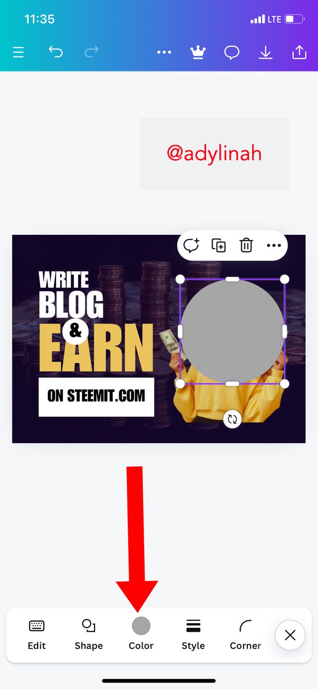
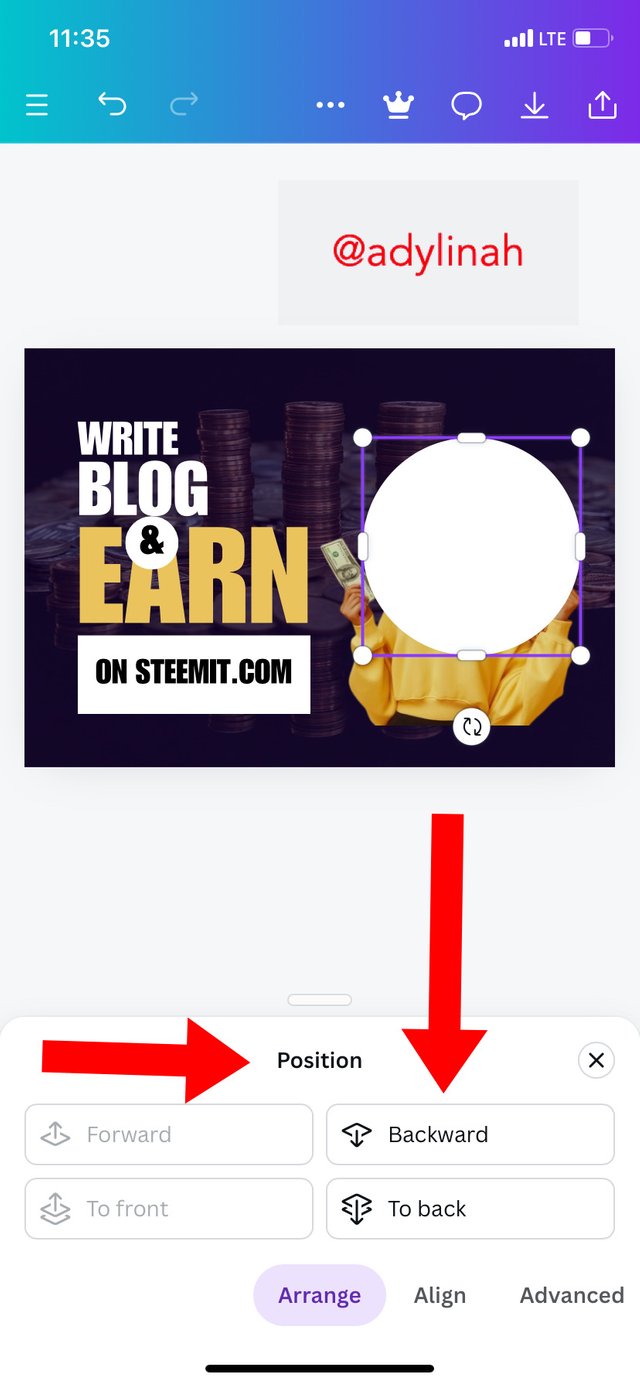
Step 7: this is the final stage of my design, here, I clicked on the elements icon, selected circle shape, changed its color to white, gave it a perfect balance between the image on the design then clicked on "position" and sent the shape to the back by simply clicking on "backward".
 |  |
|---|
At the end of my task, I observed that; the principle of emphasis and hierarchy were used in achieving this result. I am super excited about the outcome of my design. To be honest, I think this is the finest design I have ever created that turned out looking professional ( please refer to the first image for my final result).
I will invite @josepha, @nahela and @suboohi to join the graphic design class.
Many thanks for the support @anailuj1992