SLC21/WK1: Introduction to Gradients and Application.
I am pleased to participate in first week of SLC Season-21. This week we will be learnt Introduction to Gradients and Application.. So Let's start,
Discuss about Gradients the way you understand it. Also mention other types of gradients not captured in this lesson.
Gradients in Graphic design is nothing but a visual effect which is basically transition of one colour into another. A gradient involves the application and use of a smooth transition between two or more colors. It is a blend of two or more colours.
To me, Gradient is the chameleon of graphic design. Here it's better to say indecisive chameleon than chameleon because this gradient chameleon can't decide which color to stick to so it changes it's color like mood swings.(haha). Gradients are changes heppen in color mood. Or I can say gradient is like my best friend who enters a party with red dress and come out wearing blue outfit. In graphic design, when one colors gradually mix with one or more colour that is gradient. It make things look fancy and mostly keep you guessing where one color ends and another begins. It can't stick to just one color but always makes everything womderful, Creative, and awesome. It is a colour mixer and blending of one colour to another is so smooth and perfectly. I also want to mention that in our privious lesson we only use one solid colour but after achieving the knowladge of gradients we would be able to apply colour mix in our background and Typography too. Gradients are basically for background and typography. It helps to express the depth of your design and amplify our design. It also apply for 3D illustration, create logos and brands.
There are several types of gradients and this course teacher has mention the top three of them which are
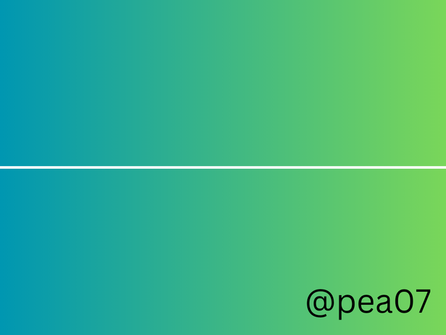
- Linear gradients - A linear gradient is a transition between two or more colors along a straight line. The most common uses of linear gradients are typography and backgrounds.
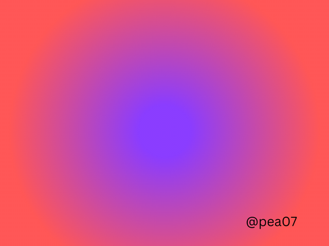
- Radial gradients - Radial gradient is the color extending radially from a central point, creating a circular or oval transition. We often use this to create a sense of focus or lighting effects.
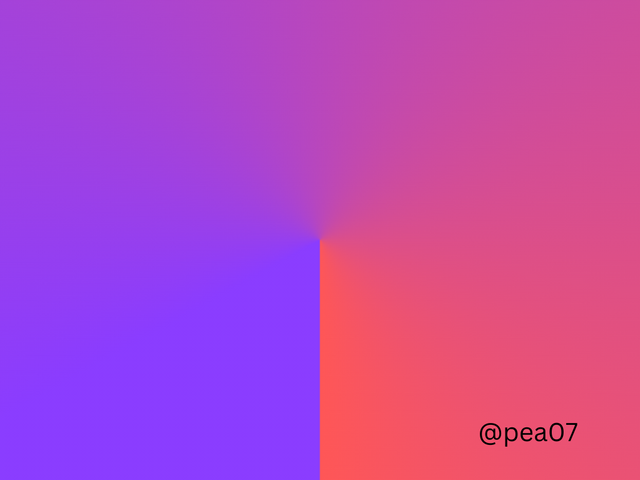
- Angular gradients - This is the kind of gradient that gives a directional effect. Angular gradients is also called as the conic gradient.
Some other types of gradients are given Bellow :
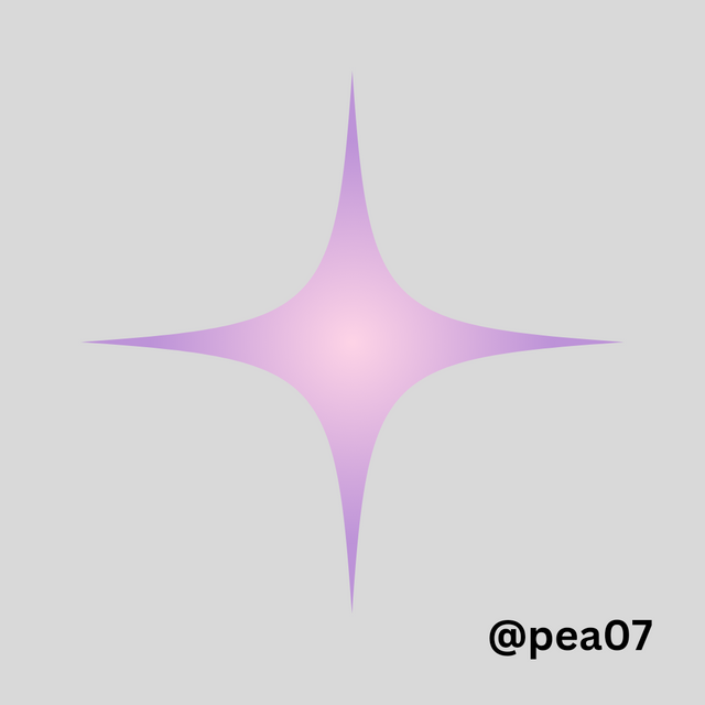
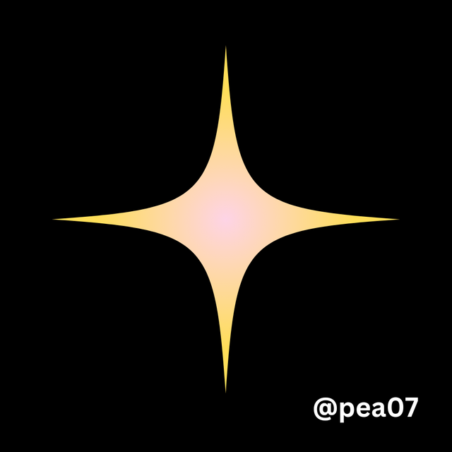
Diamond Gradient
As it's name, this type of gradient creates a diamond-shaped transition effect.
 |  |
|---|
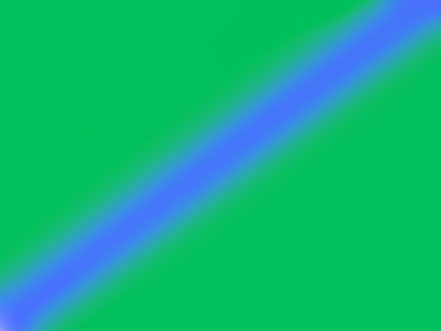
Reflective Gradient
Reflective gradient reflects like like mirror. Its a twin effect or we can call repeated effect and greatly used in symmetrical designs.
Multi-Color Gradient
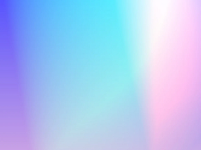
Multi means more than two so multi-colour gradient means there will be more then two colour mixture. It is more then creating something between two colours. I love multi colour gradient as I can use my three favourite colour in a design.
There are some other types of gradients too.
- Mash Gradients
- Rainbow Gradients
- Burst Gradients
- Transparent Gradients
- Noise Gradients
Create 3 gradients using the following guidelines.
a. The first gradient should be made with just one colour having different complementary shades. Ensure you reveal their hex codes.
Before start writing on this, it would like to thanks the instructor of the course because he gave us a proper guidelines about colour theory so it would be easy for me to use shades. First, I log into my Cava app. I am using Canva andriod application. Then I click on create logo and select a customized size. Here I will be using a Instagram template. So I write 1080px X 1080 px. My design canvas is ready.
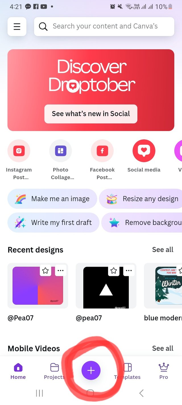 | 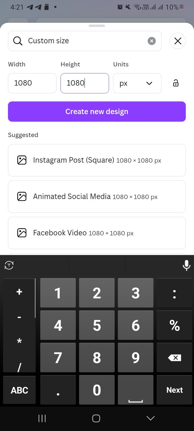 | 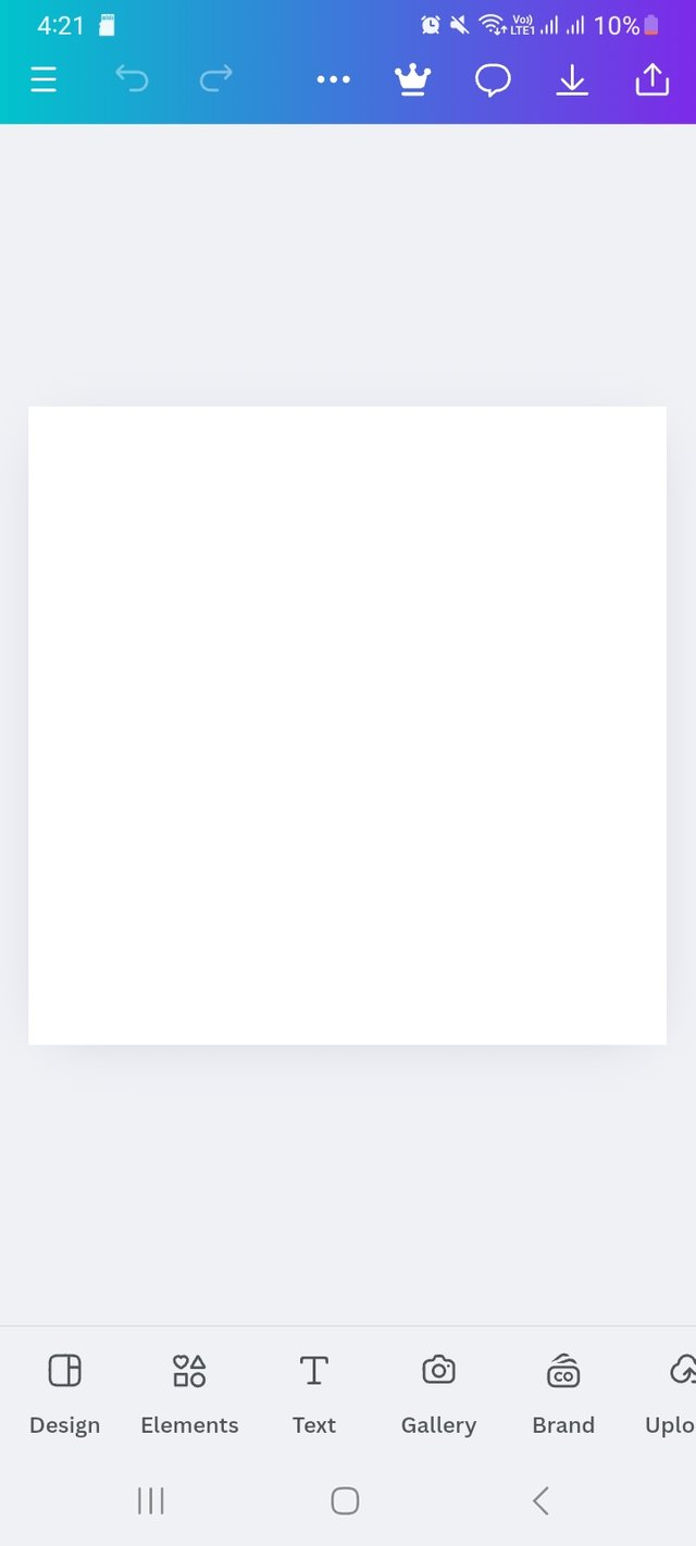 |
|---|
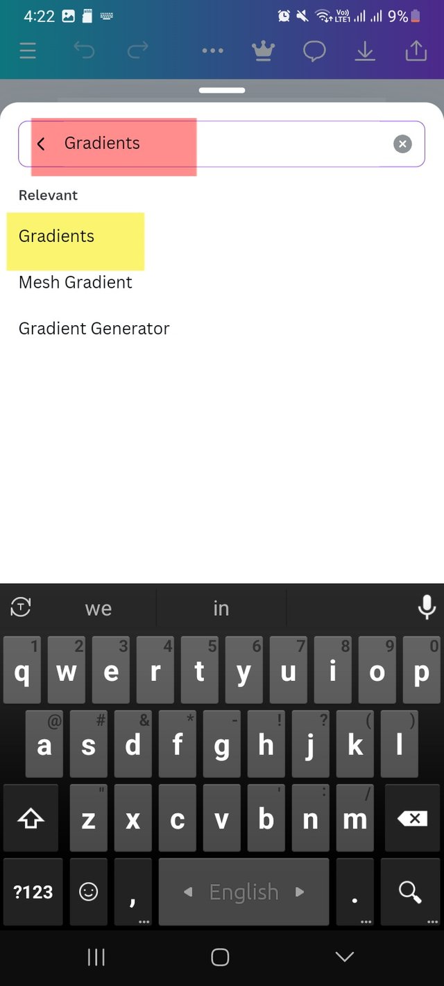
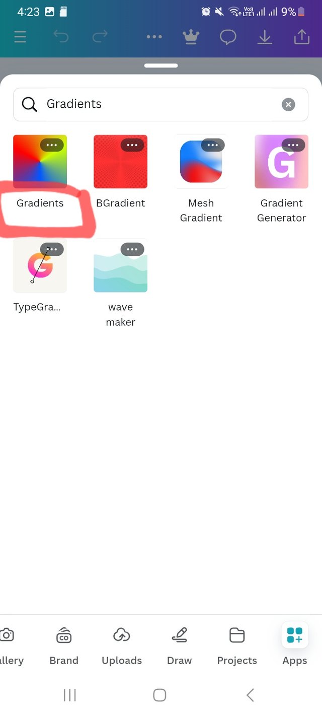
Then I scroll and click on Apps option. For the very first time I am useing this feature. I again click on search bar there and write Gradients. It took me few seconds and show Gradients.
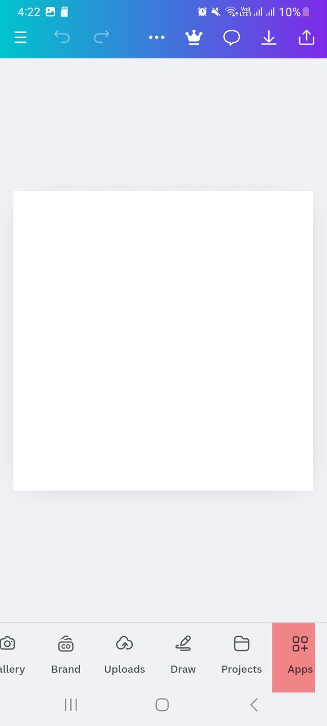 |  |  |
|---|
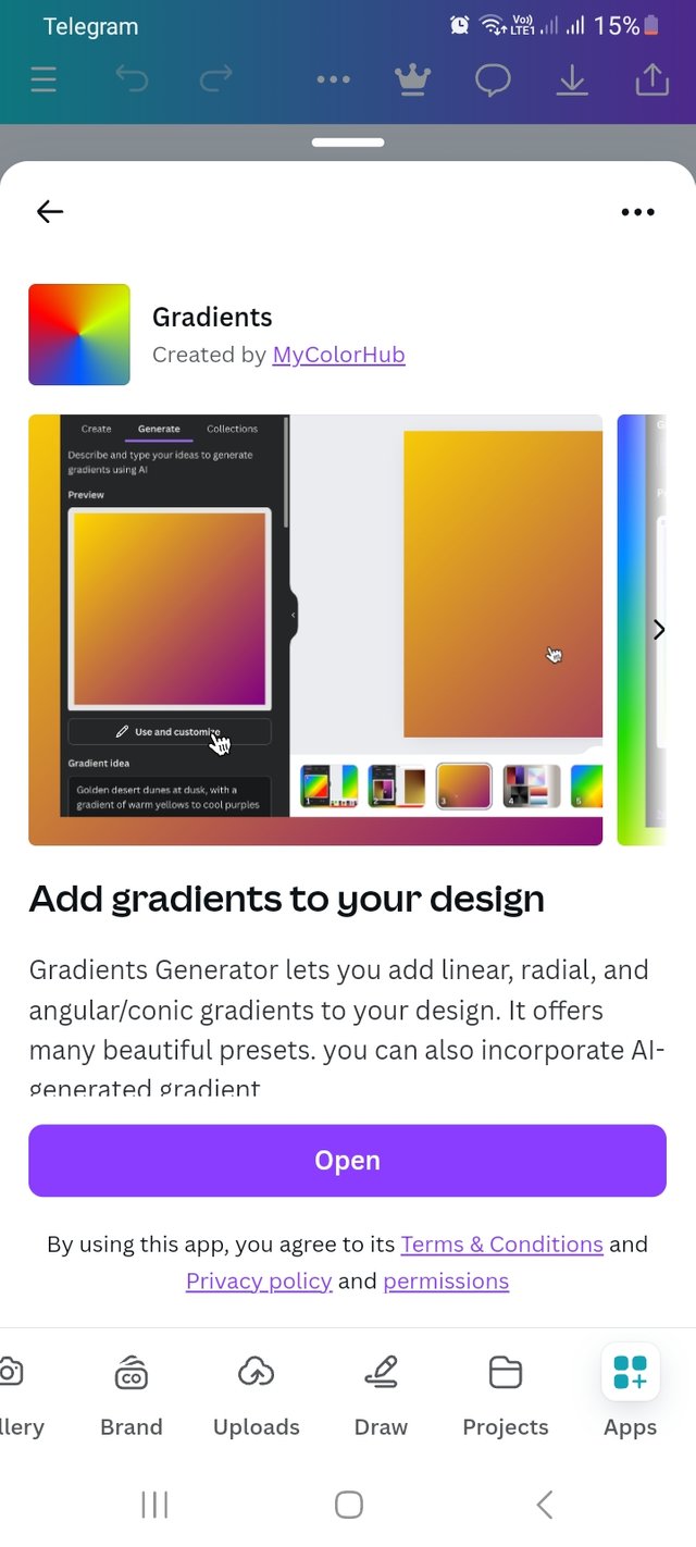
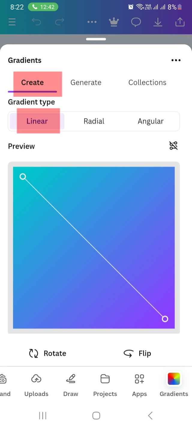
After clicking on the gradients interface, it took my permission to add gradients to design and took me a create page. Here I choose linear gradient type.
 |  |
|---|
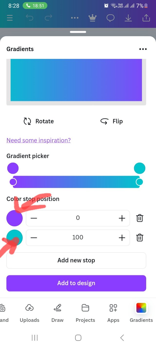
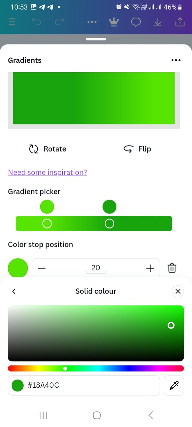
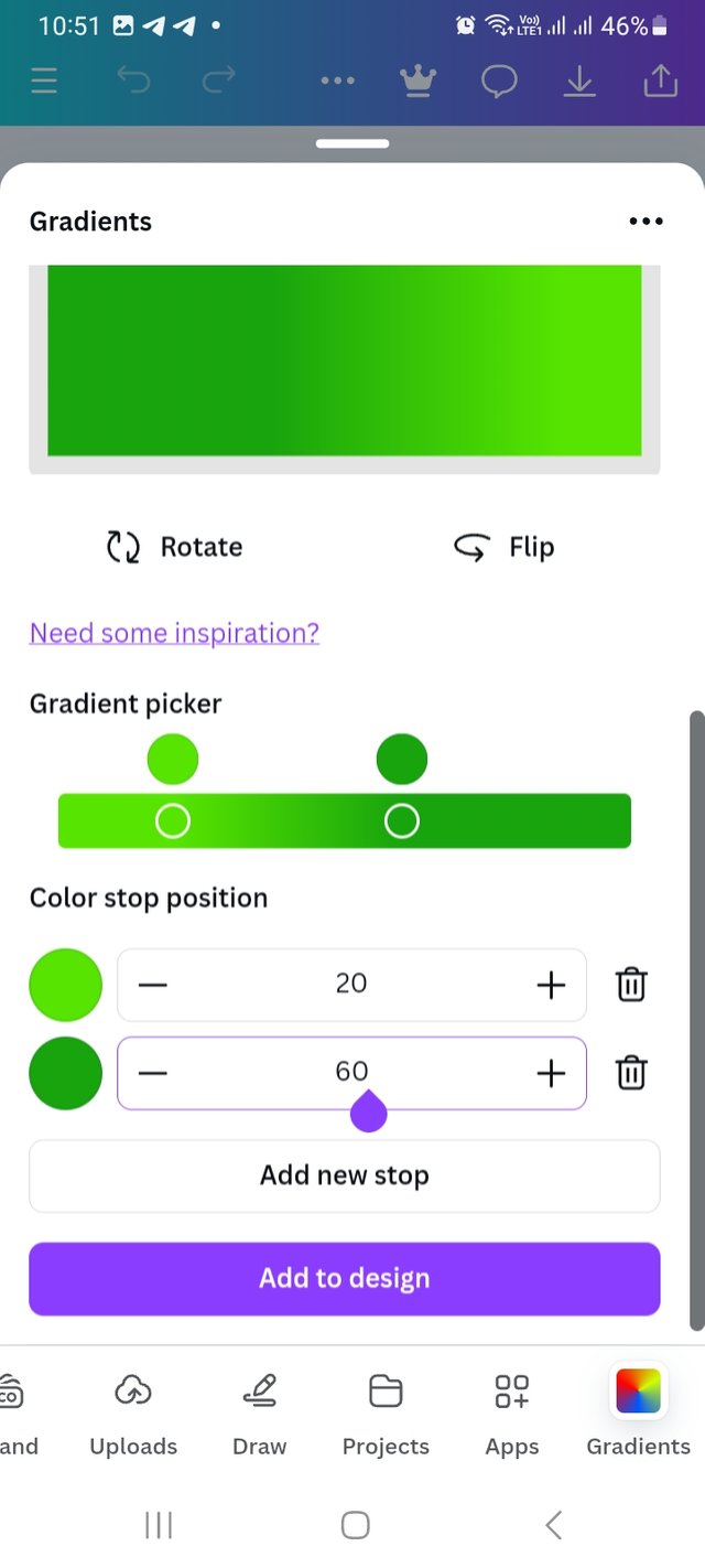
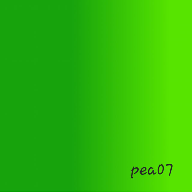
As it is a create page, I go for colour selection. Here I choose green and a complementary colour. Here I will be share the colour hex too. Here I used hex #57E500 and #18A40C colour. It looks good to me. I set colour stop position at 20 and 60.
 |  |
|---|---|
 |  |
Finally, I add it to the design and set it. It was all for this task.
b. The second gradient should be made with two different colours (hex codes) that blends so well. See your colour theory lesson on how to combine colours.
In this task we have to use different colours, which are complementary colours. Fortune complementary colour I used can be colour wheel. Here I am providing the Canva colour wheel link. There I choose two complementary colours.
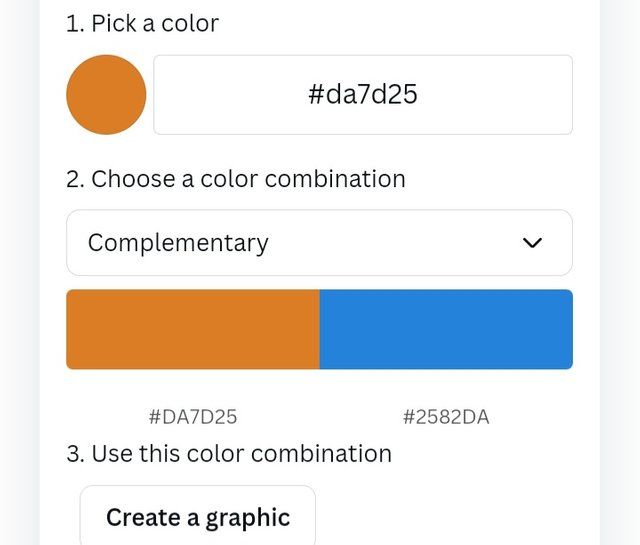
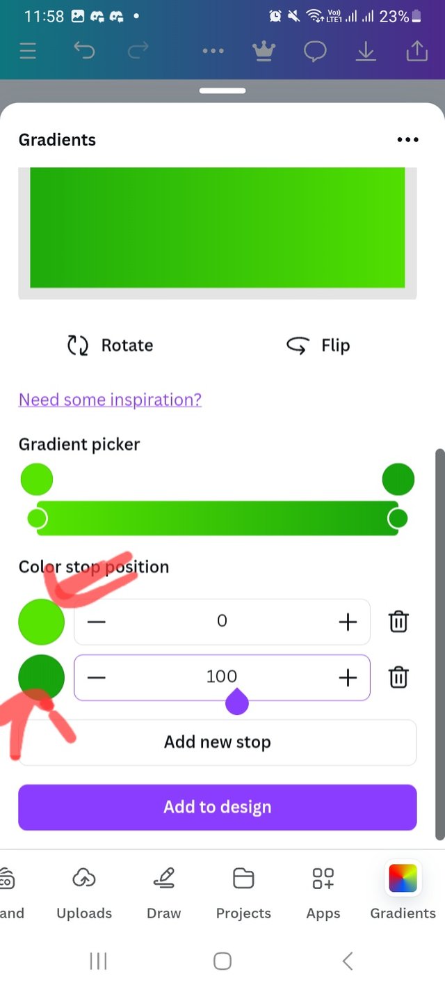
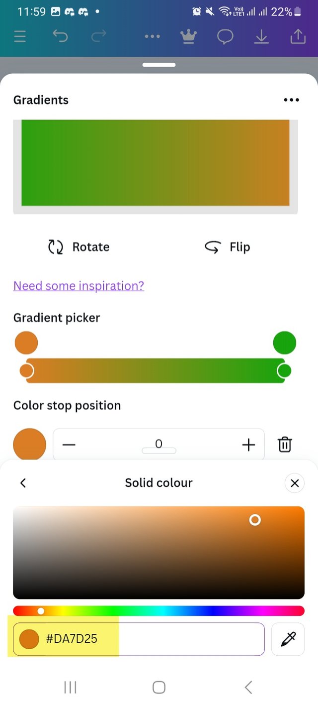
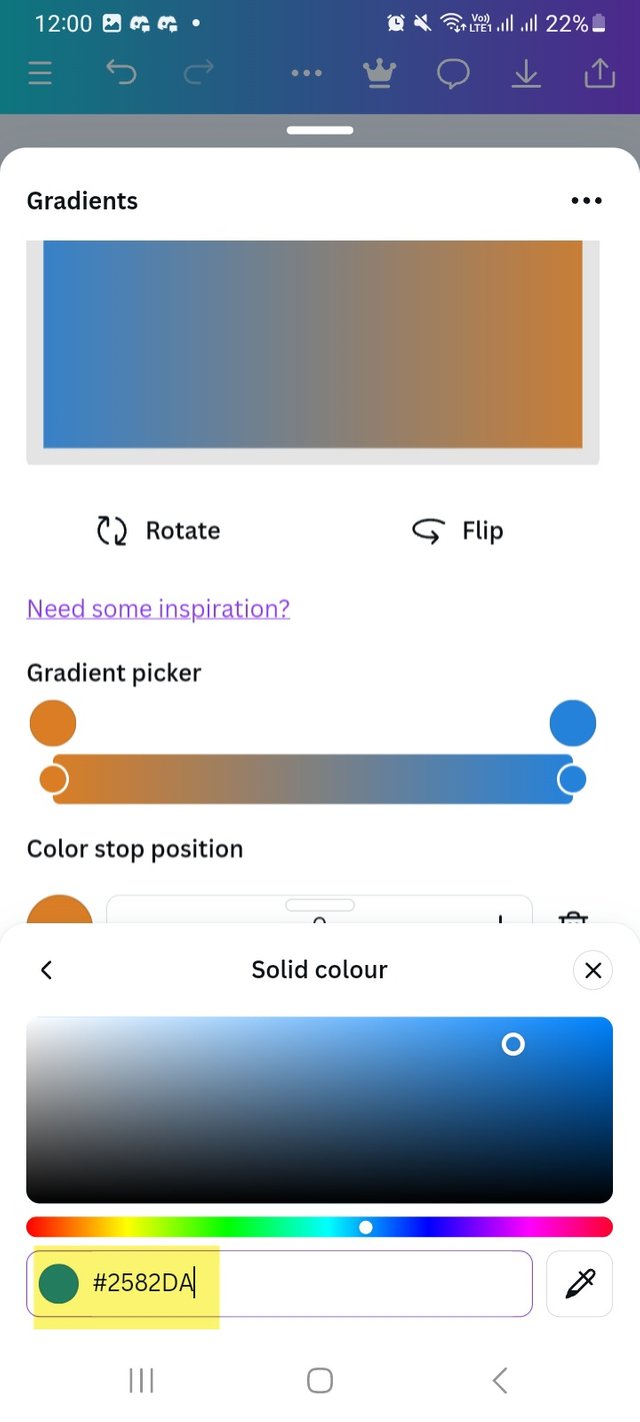
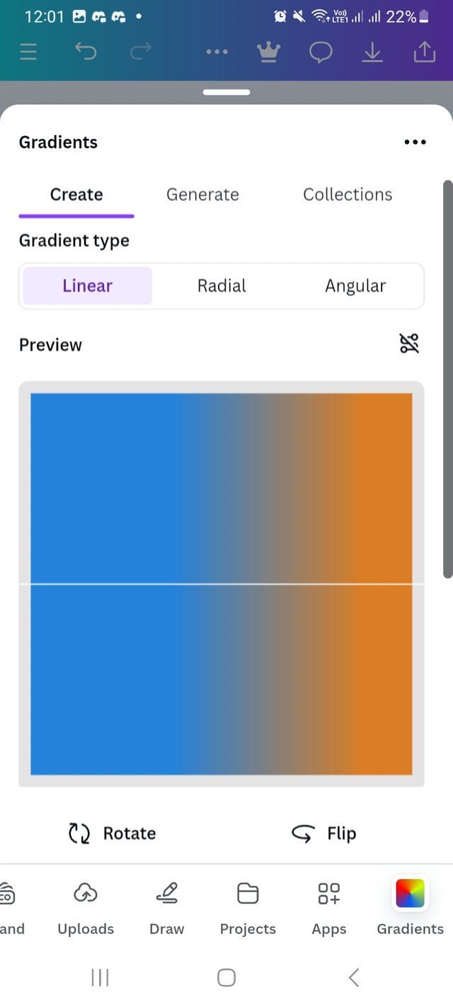
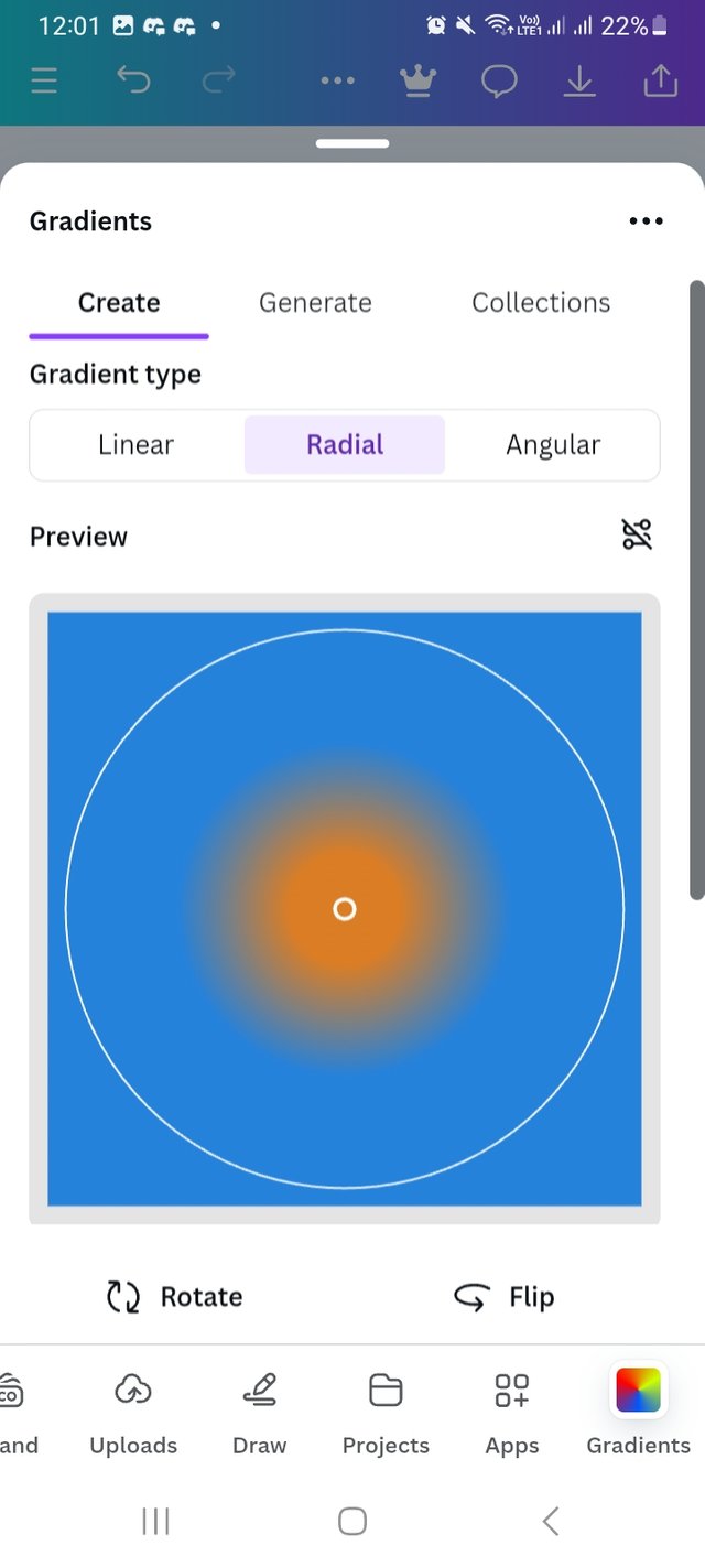
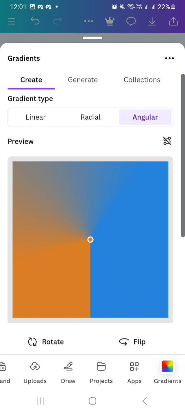
Follow the steps I shared in first task I followed untill Second last step. I start changeing the colour of my design. I click on the colour and channge it with my priviously selected colour hex. Here I used two complementary colours hex #DA7D25 and #2582DA. I place the position 20 and 60.
 |  |  |
|---|
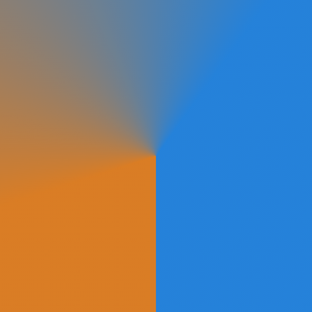
Then I checked all Radial and Angular gradient types too with my creation.
 |  |  |
|---|
Here is the final out come of my design.
 |  |
|---|---|
| Radial type | Angular type |
c. The third gradient should be made using three colours (hex codes) that blends perfectly.
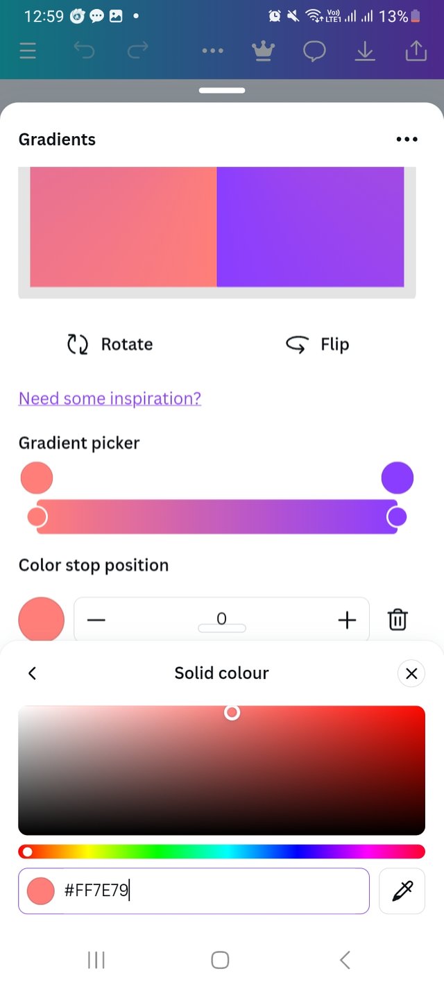
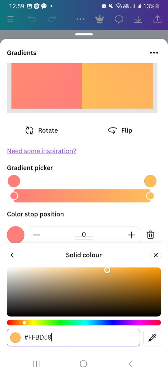
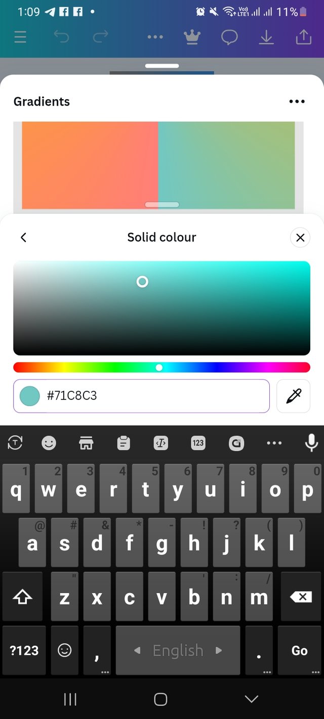
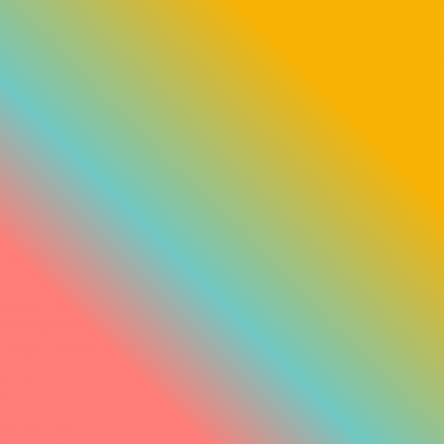
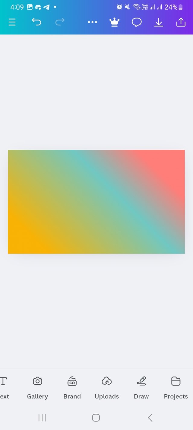
For this task I Add three colours which blend perfectly. The colour hex are #FF7E79 #FFBD59 and #71C8C3.
 |  |  |
|---|
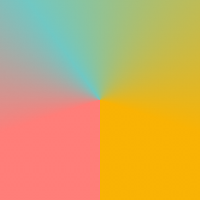
Finally I choose Angular gradient type and linear type then add it to my design. I set the position an per my preferace.
 |  |
|---|---|
| Angular type | Linear type |
Create a Text gradient using the tool shown you in this post. Ensure not to use the default colour on the app, rather use your own combinable colours.
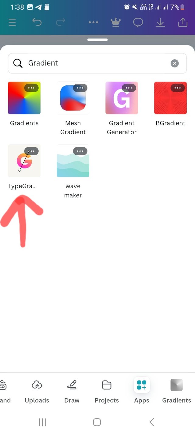
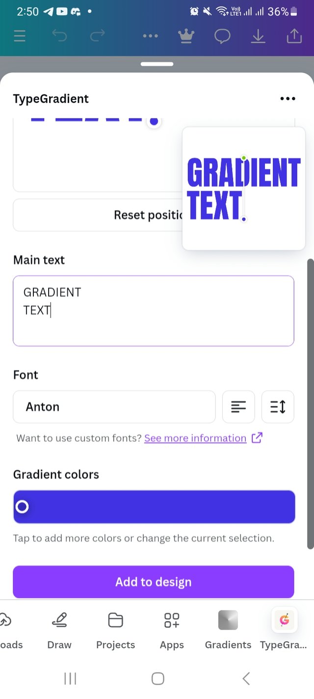
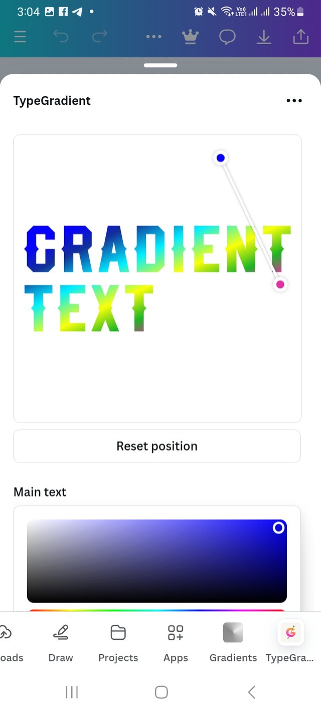
For this task, I again click on Apps option. Then click on search bar there and write Gradients. It took me few seconds and show Gradients. There I choose typegradients and open it to my design. Herw I create two color gradients.
 |  |
|---|---|
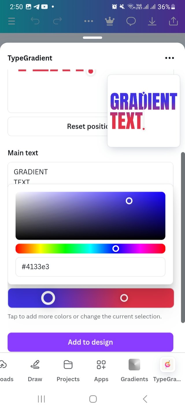 | 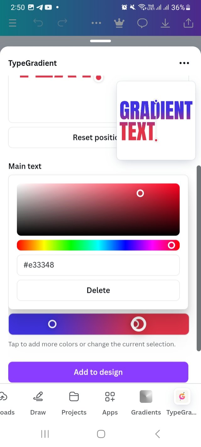 |
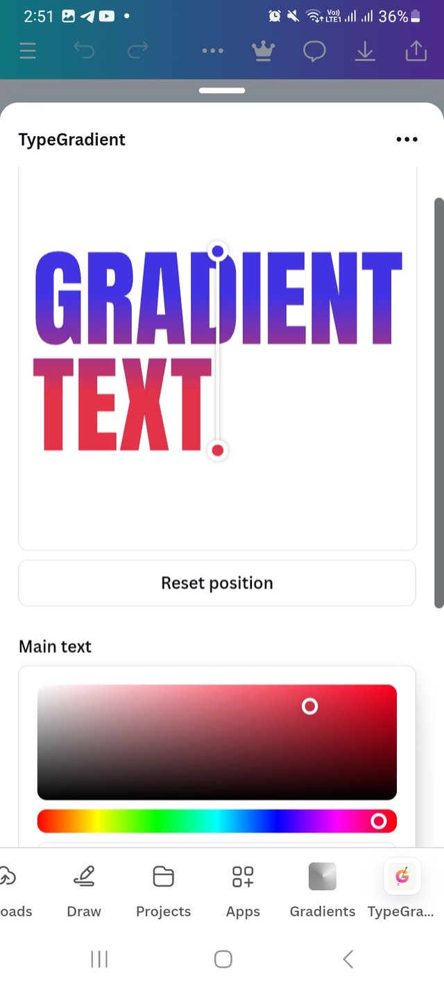 | Two colour gradient (hex= #4133e3 and hex #e33348) |
|---|
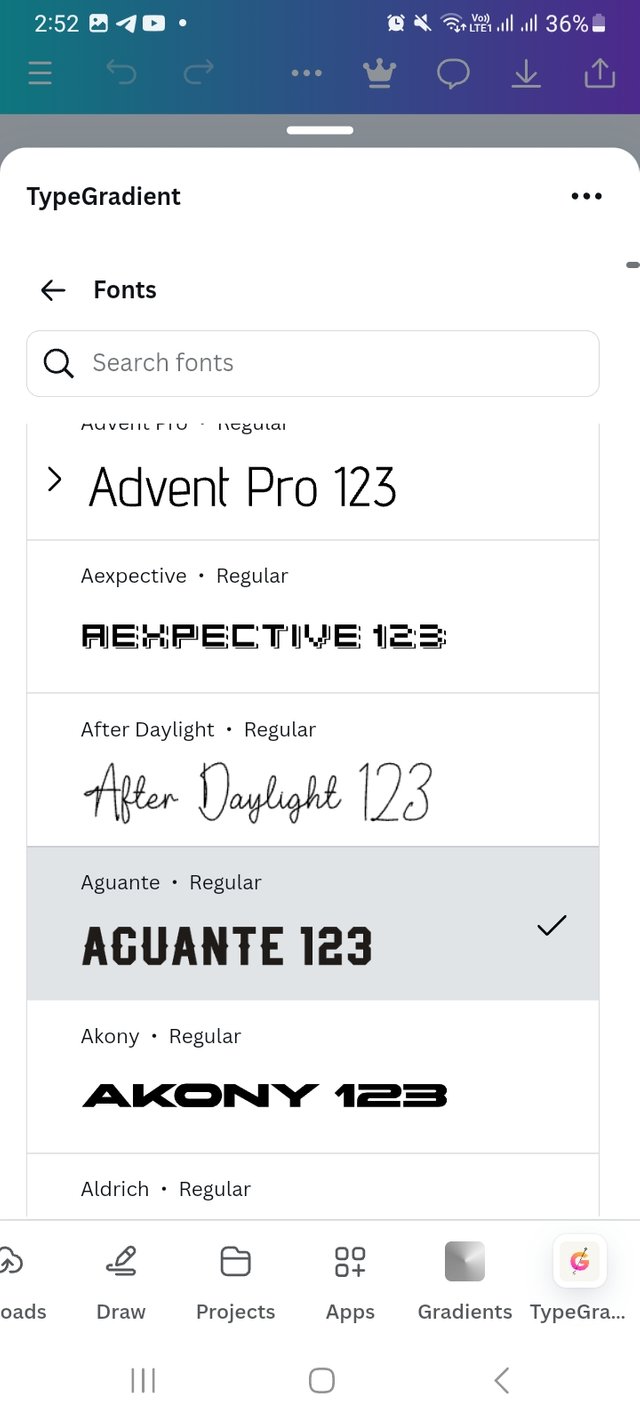
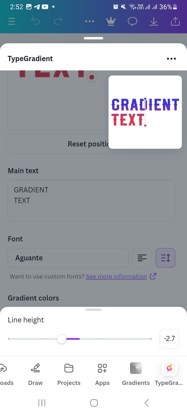
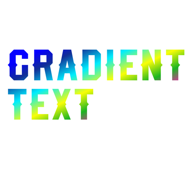
Letter I create multiple colours gradient. I enjoyed a lot working with typogradient. I change the type front into Acuante 123. I change the line hight into -2.7 to look better. And ofcourse use multiple colours for this amazing outcome.
 |  |
|---|---|
 |  |
 | Final result |
|---|
Pick one of the background gradient you made and create a beautiful flyer design with it. Ensure you do not reproduce my design, rather do something entirely different from mine.
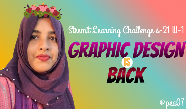
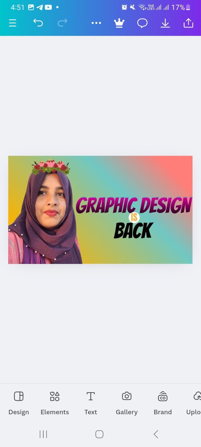
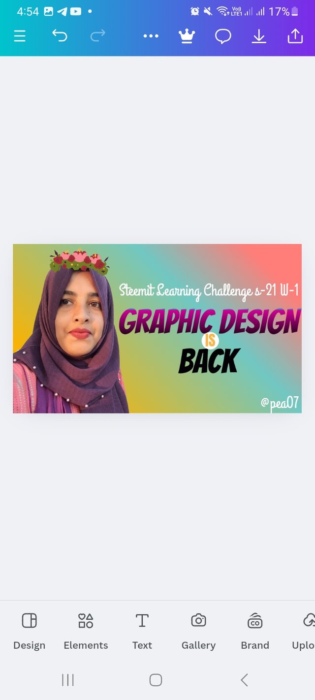
For this task, I would choose my three color hex background and choose linear gradient type. Again the The colour hex are #FF7E79 #FFBD59 and #71C8C3. I set a customized canvas for my design which is 1024px X 600px and set my preferance gradient as background. From their I choose my one of picture and set it. For beautify I add a flower crown from element option.
 |  |
|---|---|
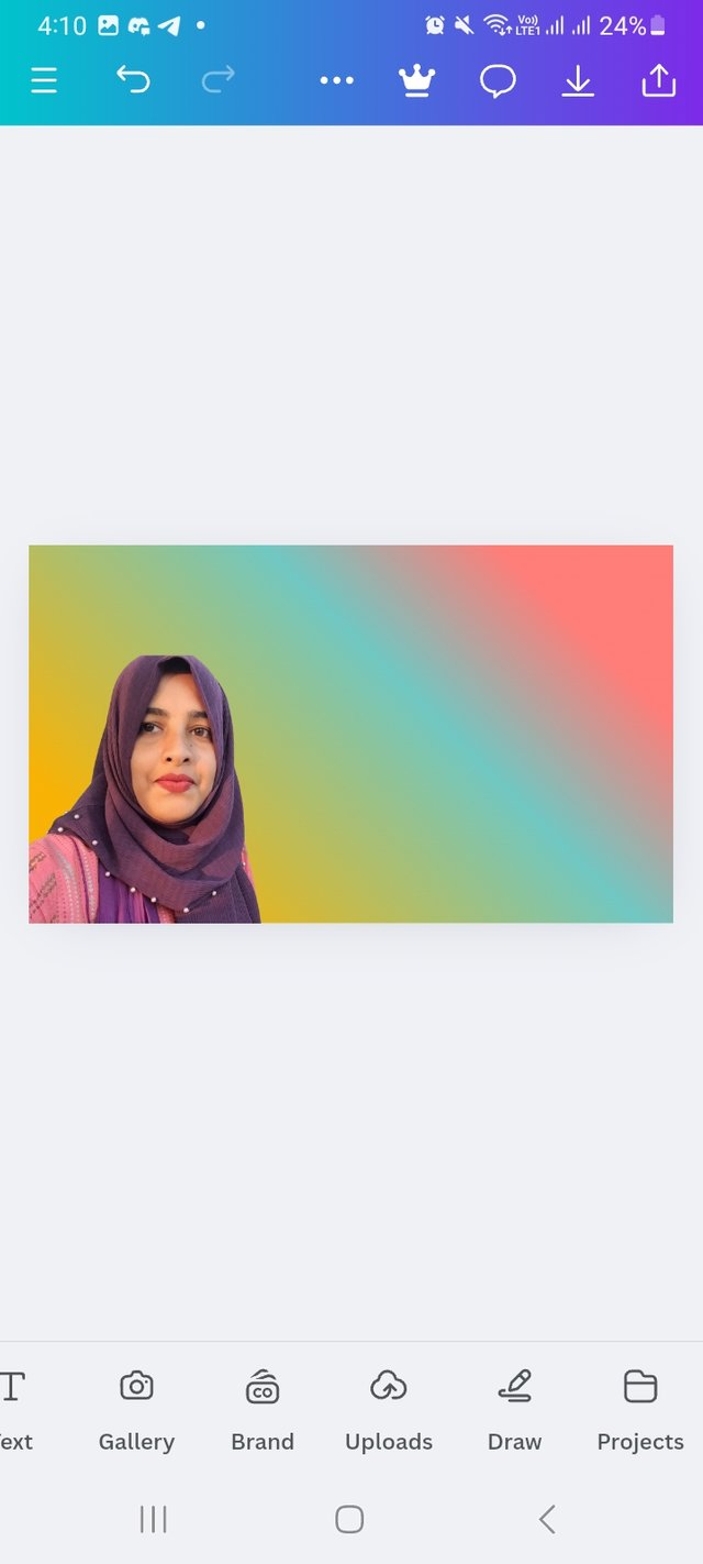 | 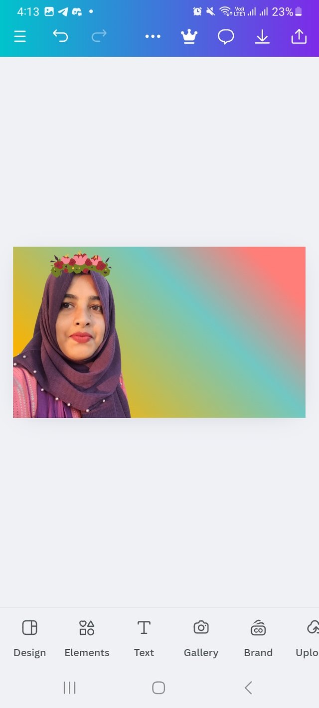 |
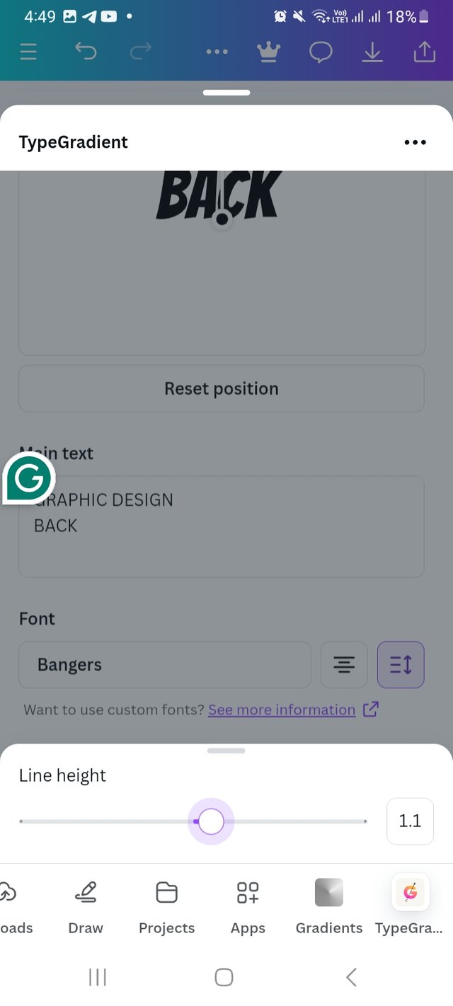
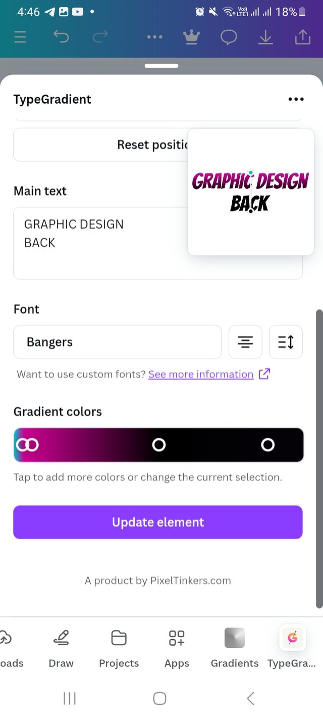
From there I click on typegredient front write the main text "GRAPHIC DESIGN BACK" I skip writting Is and I select the type front "Brangers" and line hight at 1.1.
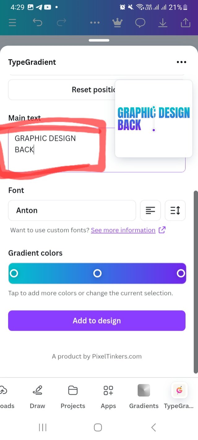 | 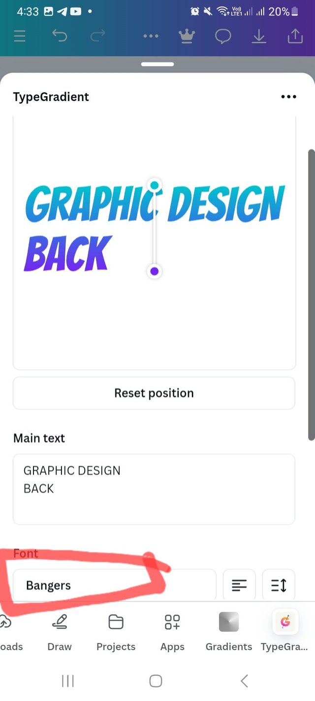 |  |
|---|
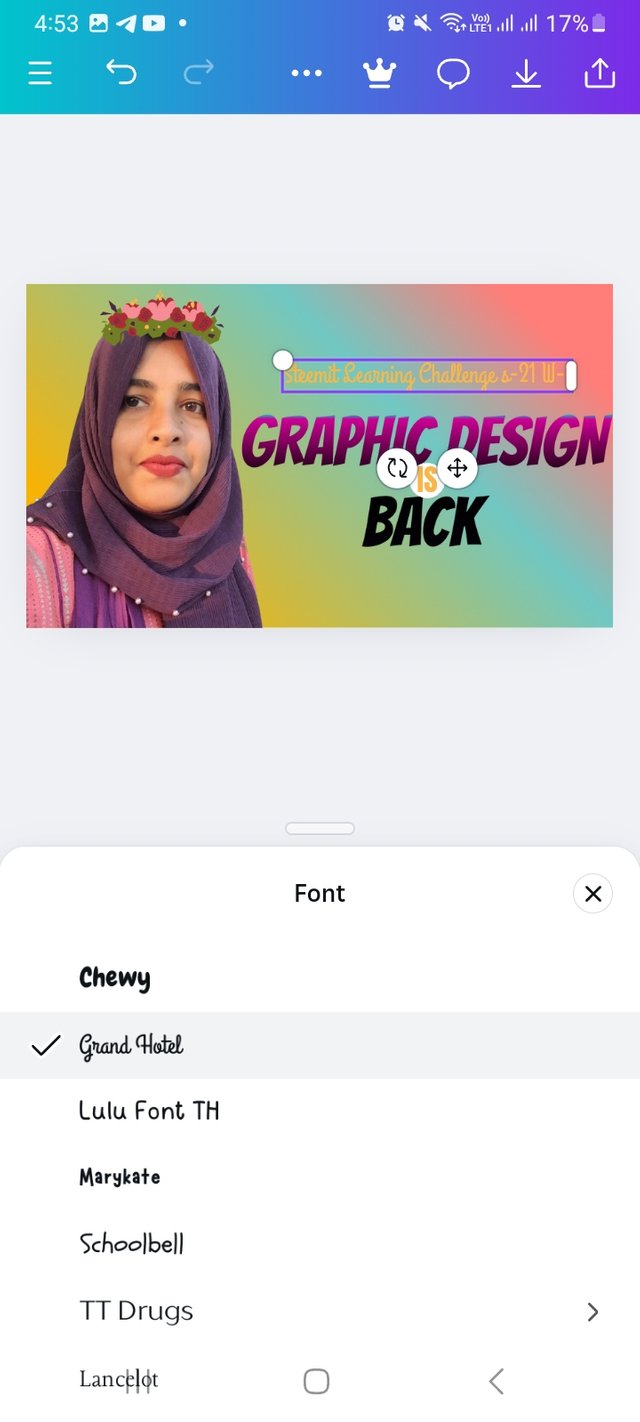
Finally I select typegradient as per my choice and place it. I do some Detailing here. I add a circle shape from element option and write Is there. After that I add a text box and wrote Steemit learning challenge s-21 w-1. I use grand hotel typefront and white colour. Lastly I add my user it at the left bottom.
 |  |
|---|---|
 |  |
 |
|---|
I am inviting my friends @waterjoe
@deepak @solaymann
Well done, you made it perfectly !!!
Good luck with this hard work and efforts ❤️