SLC21/WK2: Introduction to Logo Design
Approaching week 2 with an open mind to continue with Graphic Design Lessons for season 21 of Steemit Learning Challenge, I have been able to gained more knowledge about Logo, its principles and its do's/ don'ts during creation.
 Design with Canva
I will proceed to submit my homework tasks by showing the practical aspect of logo design which I have created;
Understanding Logo
A product, brand, company are well known through design, a visual symbol or icon called; LOGO. This gives value to the brand via its uniqueness; simplicity, timelessness, relevance and also leave the brand with an ever-green impression. What the brand truly entails can be conveyed through logo without much explanation.
The Role and Impact of Logo to A Brand
Logo plays an important role in brand recognition by being a powerful force that made the brand known by many.
This can happen through marketing, advertisement and packaging. Many can attest that we get to be familiar with apple ( iphone brand), different types of soft drinks ( Pepsi and coca-cola) and some fashion brands ( Gucci, M&M, Louis, Nike and Dior e.t.c) through their logos.
Since there are numerous businesses in the world, logo has also helped by playing the role of differentiating every brand with its uniqueness to stand out.
Additionally, logo also adds great impact to the identity of the brand by communicating it value with memorable design and makes it worthy to be trusted by the audience.
The Do's and Don'ts when it Comes to Logo Design
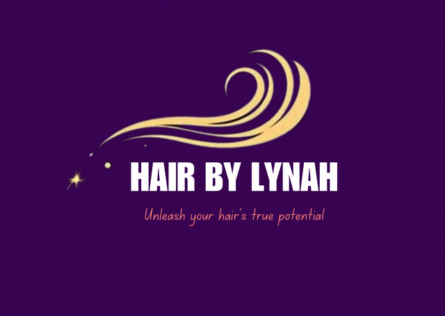
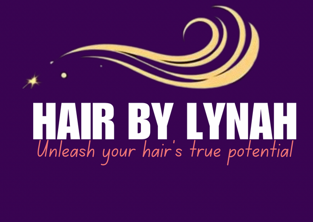
Allow the Logo Breath: making the design interface compacted and choked up with symbols, icons and bigger font size makes logo unattractive. It is best to avoid the edges. You can see from the below picture ( right ❌) where the hair strands icon is being moved closer to the edge with extremely big font size compared to the picture on the left ( ✅).
 ✅ ✅ |  ❌ ❌ |
|---|
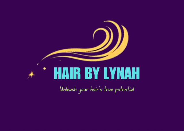
Color Combination: choice of colors and how well it is being combined is important when creating logo design. Some color combination can be so irritating to view on logo.
 ✅ ✅ |  ❌ ❌ |
|---|
Create a Readable Logo: since logo represent the brand, the design should be well pronounce and readable. Avoid the use of tiny fonts size, not readable font style and small symbols or icons that can't convey messages without stressing out the eyes.
 ✅ ✅ |  ❌ ❌ |
|---|
Appropriateness: using inappropriate symbols and icons on logo design will only keep the audience confused with so many unanswered questions in their minds. The icon used should align with the brand name and slogan.
 ✅ ✅ |  ❌ ❌ |
|---|
Simplicity: making the logo simple and attractive will definitely keep a long last memory on how the brand looks like in people's mind. Adding so many details about the brand on a logo is unnecessary. The message can be passed with just symbols or with few words.
 ✅ ✅ |  ❌ ❌ |
|---|
Balance: creating balance between the icon and text will definitely make the logo attractive.
 ✅ ✅ |  ❌ ❌ |
|---|
A Simple Logo Design
Assuming that a client contacted me to design a simple logo for her brand, I will look out first to the line of business in order to know what symbol, icon or slogan to use. Okay, let's assume she requested for hair brand logo
I will use the following steps to complete her design;
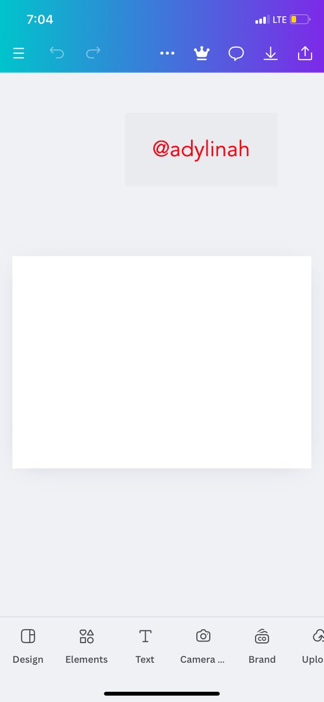
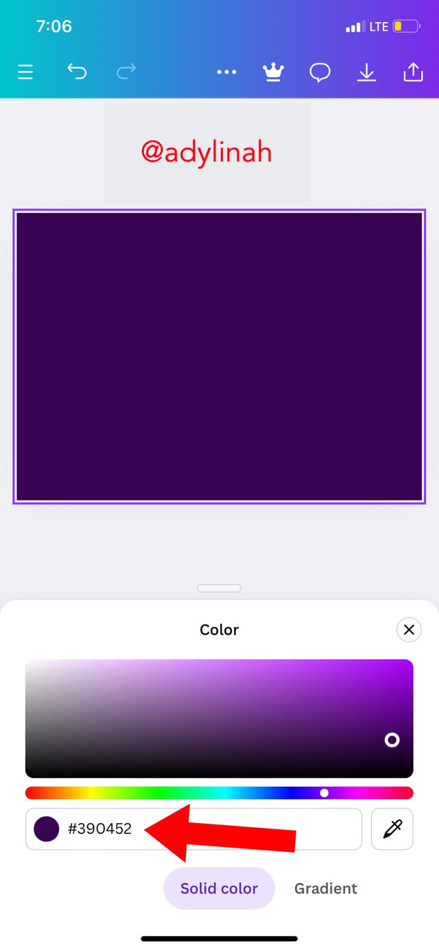
Step 1: I tried to set up my workspace, changed the background color from the default ( white) to darker shade of purple using the hex code of #390452 with the help of color wheel.
 |  |
|---|
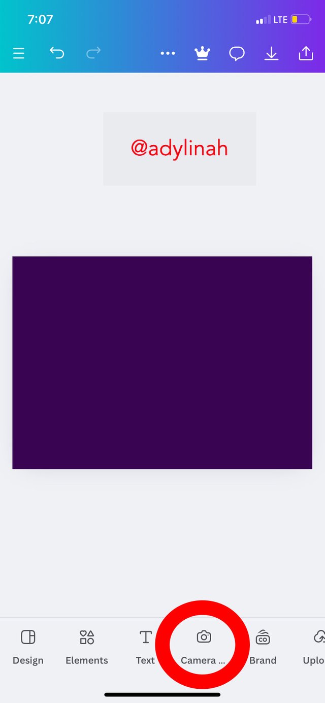
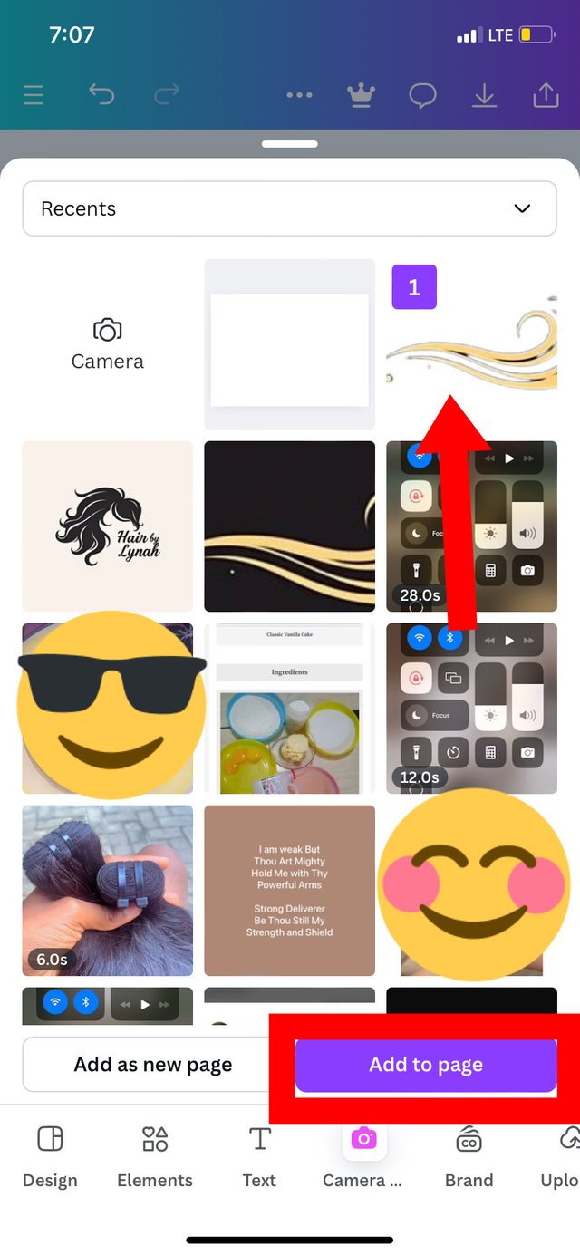
Step 2: I went to the camera icon, I clicked on it which took me directly to my gallery where I selected an hair strands icon.
 |  |
|---|
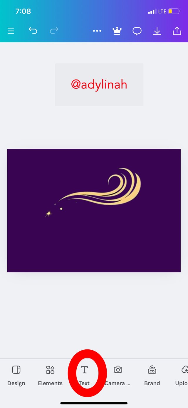
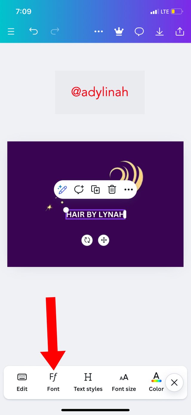
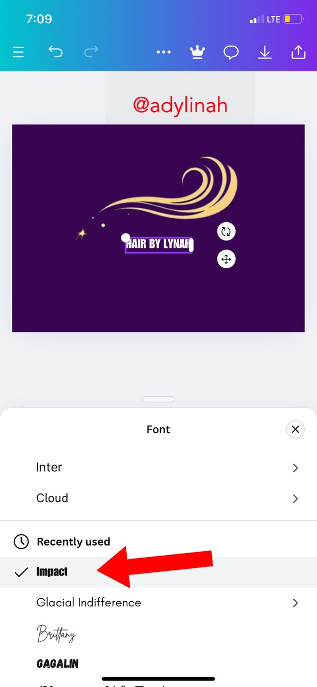
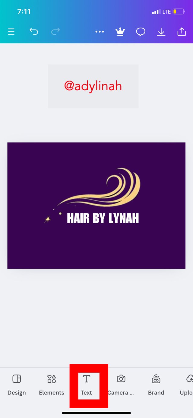
Step 3: after positioning the hair strands, I clicked on text icon then typed in "HAIR BY LYNAH" and used impact font style.
 |  |  |
|---|
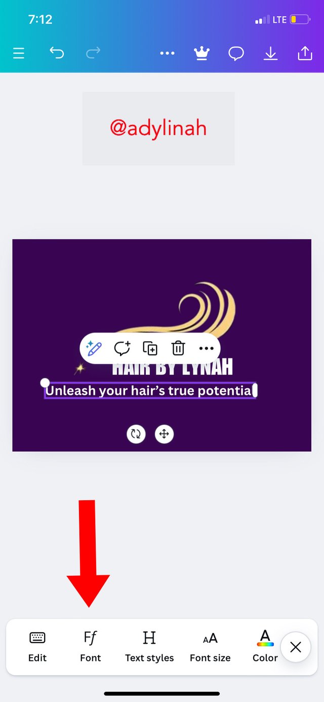
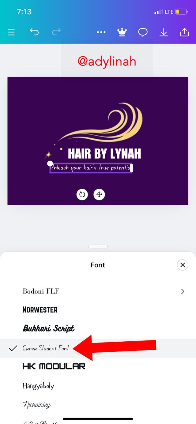
Step 4: I went back to text again, typed in "unleash your hair's true potential" before going to font and used Canva student font because I wanted the slogan to be italicized.
 |  |  |
|---|
I changed the slogan text color from white to lighter shade of read and then got the below result;
 Final result
Here's the interpretation of the logo;
Icon: hair strands
Brand name: HAIR BY LYNAH
Slogan: unleash your hair's true potential
With the slogan on the logo, the audience can easily know the type of services this brand renders.
After creating this simple logo design, I was able to play around Canva and explored different color combination ( please refer to the first photo above).
Thank you graphics design teacher for the second week lesson on logo. It was interesting scanning through the topic and I had a good experience during the practical period.
I will invite @dequeen, @ruthjoe and @mvchacin to join the class.
This is really beautiful, yous logo symbol is unique, I like the hair stands that you choose it is not common but yet it send out the message clear to your viewers.
Your colour combination is nice as well, the one you have in the comment section is the most beautiful one of all
Wishing you success 👍
Thank you for this encouraging comment!
What is graphic design without CREATIVITY?! I had to bring out my creativity into play which is why I went for unique hair strands and lovely colors. I’m glad you liked my logo!
Greetings dear friend
Thanks so much for the invitation, l will try and drop my entry soon.
Your design looks cool, settings my eyes on it quickly tell me of your creative hair business.
The details explanation given shown that your really understand graphic. I wish you success in this contest.
Thank you friend! Hope to see you in class 😊
A good logo can make a brand much stronger. The way you explain the role of logos is really inspiring. Good luck for the contest.
Thank you for your valuable comment!
I love all the procedure especially the choices of color
It is really very important to use colors that blend with the brand
A very good one