SLC | S21W 3 | Logo Design - Part 2
Hi friends,
I am Jyoti from India. Here I am going to participate in the SLC S21 W3 contest: https://steemit.com/hive-147599/@lhorgic/slc-or-s21w-3-or-logo-design-part-2 organized by @lhorgic
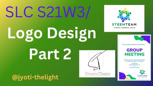.jpg)
Discuss about each of the logo types we have and then talk about conditions when such logo should be used and when not to be used for a brand. You can do a little research to aid you.
Before designing a logo, it's important to have a clear vision of what you want to achieve for your business and target audience. A logo is nit just one aspect of branding it also gives trust and growth of the business.
WordMark Logos:
The wordmark, often known as the logotype, is the most traditional and pure form of a logo. And this is simply the name of the firm or the brand.
The company's name includes a word mark. Companies with short names, such as one-word or hyphenated/combination names, are more likely to use a wordmark logo. If a corporate name has two words, they can be stacked.
Monogram Logo:

A monogram logo is made out of one to four letters or any type of shape, typically a company's initials or first letter. If your company name is too long, consider a monogram, lettermark, or logo modification.
It is utilized instead of a typical logo, transforming a company's identity into a visually appealing image. Of course, the initials are an important aspect of the logo. Your design should be both readable and memorable. If you're a newcomer, include your whole company name in the logo to increase recognition.
A brandmark logo:
A brandmark is a complete image or symbol. The brand mark can represent a real-life object such as the Apple Logo, Shell Logo, or Adobe logo. A brandmark must be pictorial as an abstract shape as above.
These types of logos don't include the company name, which is a big risk for a new business that wants its name to be known.
Abstract logo:
Abstract Logos are logos that use symbols, fonts, or colors without identifying a company or product. Examples of abstract logos include Olympic circles, the crisscross logo, and Pepsi's "swirl" logo. They may give meaningful thoughts or do not refer to anything - these abstract symbols make an identity and clear distinction.
A company can use them when it wants to differentiate itself in the market and keep its identity open and versatile. This way, customers can project their own meaning on the brand.
Mascot Logos:
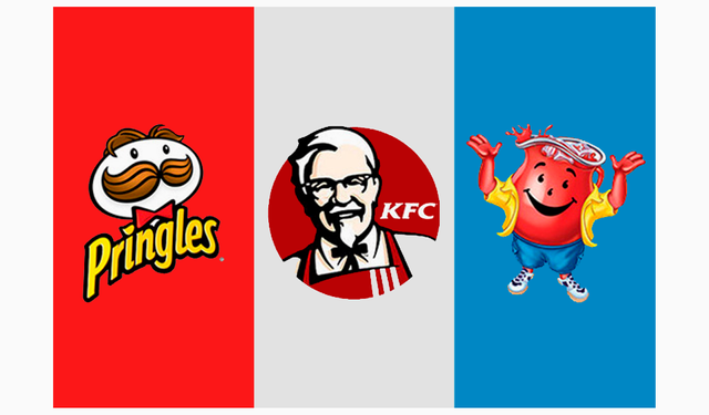
Logos have a descriptive role that acts as an ambassador for a brand. These types of logos are often fun and friendly, and give the audience a personality to relate to and make a connection with.
You will often see logos used in children's brands due to their attractive nature. For example, kellogs rooster,
Service companies, food brands and sports teams are the best users of these logotypes. But lately, we've seen more and more app and tech brands embrace animated characters to humanize their brands.
Emblem Logos:
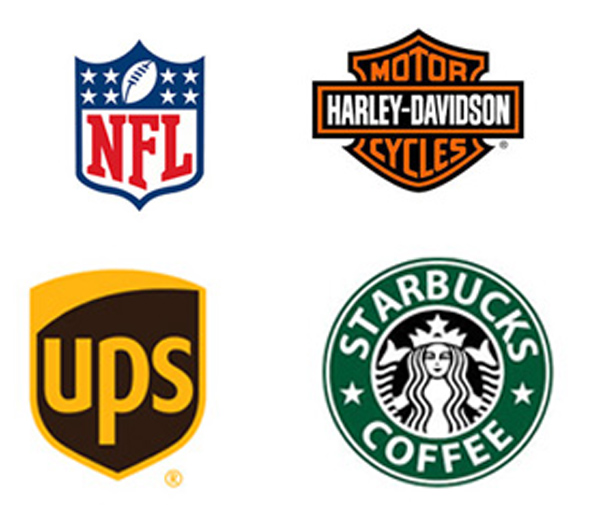
One of the oldest forms of logos is the symbol. Elements of a small logo include vintage-style text inside a container often a circle, shield, oval, or other shape-like ornamental shapes. Symbol Symbols convey authority, intensity, and stability.
Think badges, seals or crests. Symbols are considered a composite image rather than typography.

Pick any two (2) of the Logo types discussed and then practically demonstrate how to make them, showing your detailed process.
1. Abstract Logo type:
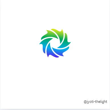
I chose two logo types to complete this task. One is abstract type and other is monogram type. Here I will explain how to create an abstract type logo first. Since we need abstract symbols to make abstract logo, first I opened Canva.
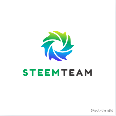
I chose 1080x1080 size screen in it. Then when I searched it, I got an abstract symbol like this. I inserted it and gave it a gradient color. Then using the text tool I typed "Steem Team" and below that I typed the tag line "STEEMIT MEMBERS GROUP" and then gave the two words separate colors to separate them.
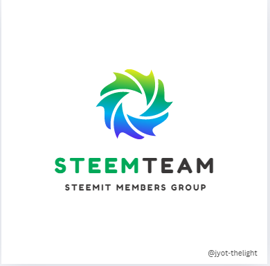
Now that our abstract symbol looks a little unrelated, I placed small CIRCLES shapes on the petals of the symbol to create the appearance of people being united. This abstract logo that I created is a community group so I wanted to create an impression of people coming together. At the same time, I have shown them rotating to show how they work together. So I created an abstract image of people working together.
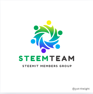
At first, I kept only the flower petals. But because it didn't seem like a sun and didn't live up to the name we had. I placed small circles on the flower petals. By that, the petals of those flowers were made to look like human beings. With that, we got a good meaningful abstractlogo.

2. Monogram Logo Type:
Secondly, I have designed a monogram logo and since the monograms must represent a letter or some form of shape, I have designed our logo with the first two letters of the words in it so first I selected a 1080x1080 screen in Canva and inserted a square outline into it and typed STEEM TEAM below that.
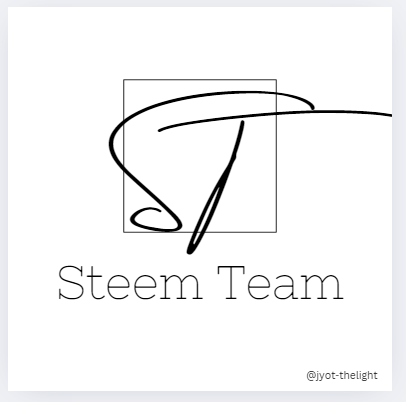
After that, I typed only the first letters of the brand name for the logo as ST. Then I converted it to a a beautiful script font and resized it to fit the already inserted square shape outline also bigger than the square shape.
After that, I selected the effect tool and selected the outline option from it gave the outline a white color and made the size a little bigger now it looks like there is a gap between the square shape outline and the letters.
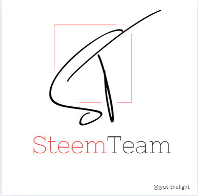
After that I gave different colors to the two words to differentiate the words and also gave one color to the square shape and one color to the initials now we have a very beautiful three gram type logo ready.

Design a simple flier for your brand and then strategically place one of the logos you made in the flier.
I am going to use the abstract logo that I have already designed above to complete this task. Thinking that a flyer should be designed accordingly, I first selected an A4 size screen in Canva. Then I inserted an abstract design into it and placed it in the top right corner and bottom left corner.
Then I added the 3 colors we used in the logo. After that, we thought that since our logo is a community group, we could design this flyer to invite a community meeting, so I typed "group meeting" and added only 2 colors from our logo.
I then added some words to the flyer. That is, to invite our group friends, I typed the sentence "You're invited to attend our upcoming" above the word group meeting and gave it a color that was in the logo. Similarly, below the group meeting sentence is the meeting agenda. I also typed the venue, time etc., and gave it a color that was in the logo.
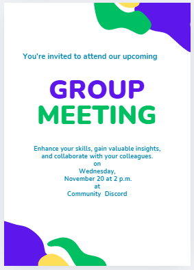
After that I downloaded the logo that we had already designed. I have downloaded it as a transparent png file while downloading so that we can put our logo in any color on our flyer. So I downloaded the transparent PNG file and then uploaded it using the Upload Files tool and inserted it into the flyer. After that I placed that logo in the lower right corner of the player.
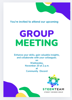
After that, I aligned the elements in the flyer properly. So that there is a design balance in the flyer, align it so that there is space above and below and play everything in the right place.
Now the "Community Group Meeting Invitation Flyer" required for our community is ready. Print this and share it with everyone. Or you can save it, download it and send it digitally to your group friends through WhatsApp or social network.
I would like to invite
to take part in this contest.
Discord : @jyoti-thelight#6650 Telegram :- https://telegram.org/dl

Congratulations, your post has been upvoted by @scilwa, which is a curating account for @R2cornell's Discord Community. We can also be found on our hive community & peakd as well as on my Discord Server
Felicitaciones, su publication ha sido votado por @scilwa. También puedo ser encontrado en nuestra comunidad de colmena y Peakd así como en mi servidor de discordia
Thank you for the support
Terima kasih kak Jyoti-thelight atas undangan Kontes nya untuk saya🤗