SLC21/WK5: Hands-On Practical
Hello everyone
I am so excited to join this contest and share my creativity with all of you In this post I will guide you step by step on how I create a professional promotional flyer using Canva. I will explain how I set up my workspace added colors and images and combined differents elements like text and shapes to make the flyer looks amazing.
I have also been experimenting with tool like canva and Photoshop which has helped me improve my design skill. I hope this post will inspired you to try new idea and explored your creativity too.
| Recreating My YouTube Logo: A Step by Step Design Journey |
|---|
For this task I recreate my YouTube logo. Actualy I originaly designed this logo an few years ago using Photoshop and Adobe Ilustrator. However today I decide to create it again from scratch Specifically for this home task. I will share all the step I follow to complete this design.
Steps to Recreate My YouTube Logo Using Photoshop
- Set Up the Workspace
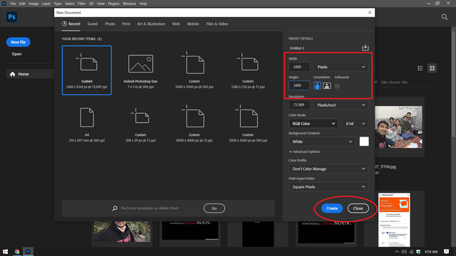
- Open Photoshop and create a new document. I chose size of 1000 x 1000 pixels With a transparent background to allow flexibility in resizing the logo.
.png)
- Add the Background
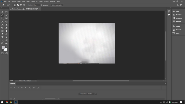
- I used a simple gradient background to give the logo a clean and modern look. This Was done by selecting the Gradient Tool (G) and applying a gradient from White to light gray.
.png)
- Positioning Elements
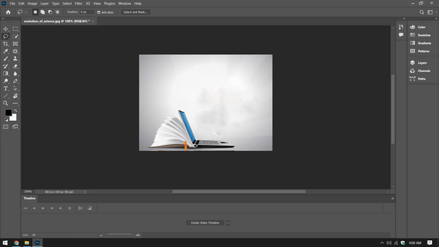
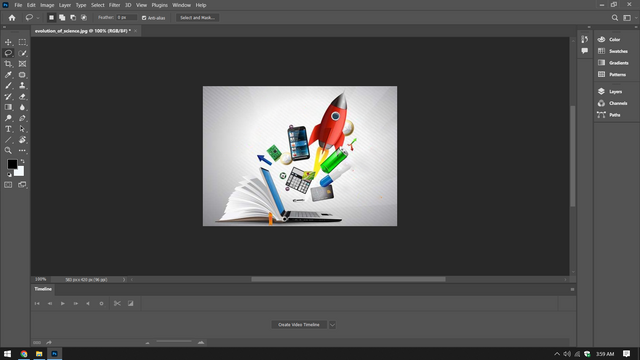
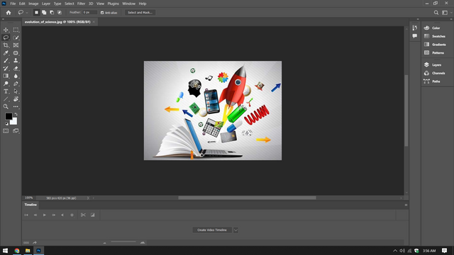
- The open book was positioned at the bottom left corner symbolizing knowledge.
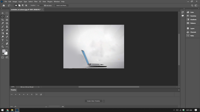
- The laptop was place in the center representing technology.
- The rocket launching upward was added to symbolize growth and innovation.
- Various colorful icons such as the light bulb battery dice and music note were place around the laptop to represent Creativity and diverse field.
.png)
.png)
- Import Icons and Shapes
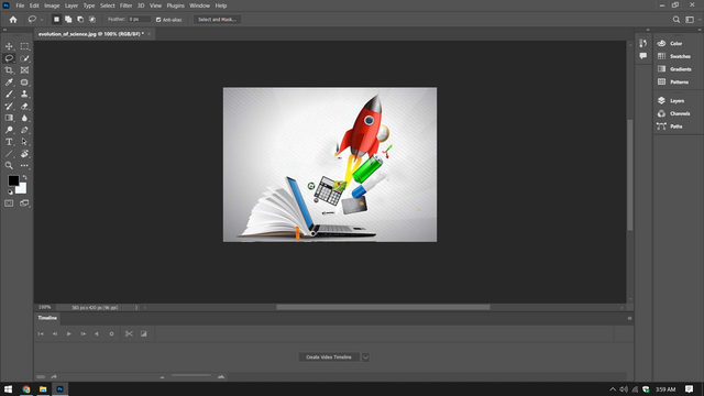
- I imported external icons (such as the rocket open book arrows and other tech related elements) into Photoshop. These were add as separate layer to allow easy adjustment.
.png)
.png)
- Layer Adjustments
- Each element was resized and rotated using the Transform Tool (Ctrl + T).
- I adjusted the opacity of some icons to blend them naturally into the design.
.png)
- Final Adjustments
- Shadows and highlight were added using the Blending Options to give depth to the icons and background.
- The overall composition was aligned to ensure the logo looked balance.
.png)
- Save the Logo
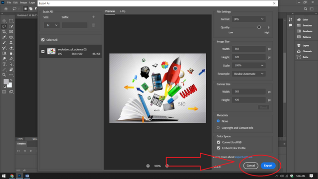
- Finally I saved the logo in high resolution Using the Save As option choosing PNG format to maintain transparency.
| Creating Professional Flyer for My Tuition Center: A Step by Step Guide |
|---|
Now I am going to create a flyer for my tuition center and will show you all the steps I follow to design it from scratch.As a tutor and business owner its essential to have an engaging and professional flyer that reflects the quality of education I offer it my tuition center. This flyer will highlight the services I provide the unique aspects of my center and how we support both students and parents. In this guide I will Walk you through each step of the design proces in Canva
Steps to Create My Flyer in Canva
Step 1: Starting the Design
- I logged into my canva account.
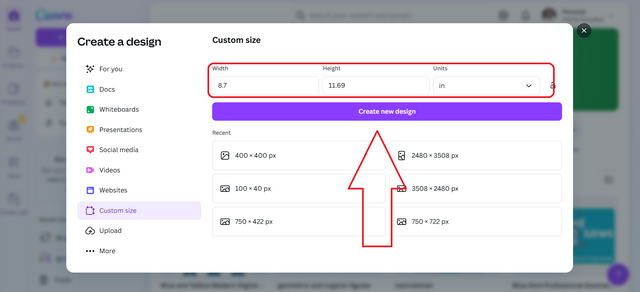
- I clicked on "Create a Design" selected custom Size and entered the dimension A4 (8.27 x 11.69 inches).
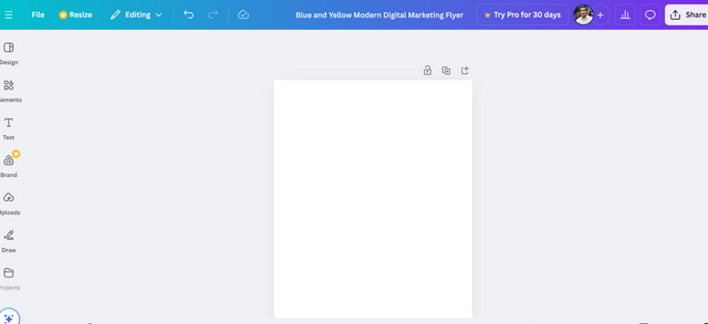
- I started with blank canvas to bring my vision to life.
Step 2: Setting the Background
- For the base design I kept the background white to maintain a clean and professional look.
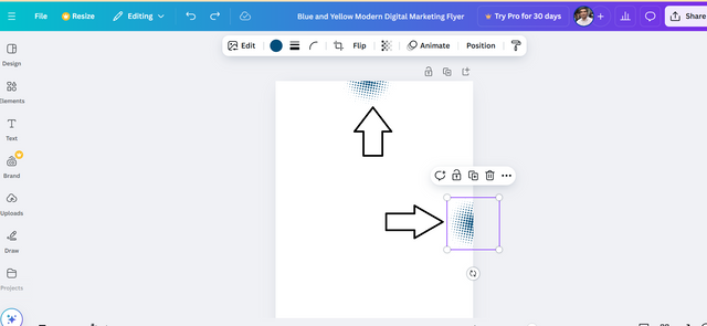
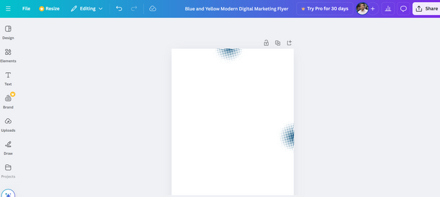
- I added a decorative blue gradient design on the edge:
- I went to Elements searched for "gradient " and adjusted its position to enhance the flyer visually.
- To make it pop I added dotted accent to the upper right and lower left corners using shapes from Canva Elements section.
Step 3: Adding the Header
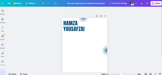
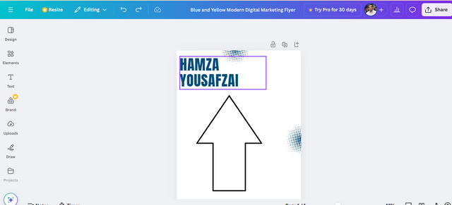
- At the top of the flyer I added a bold title:
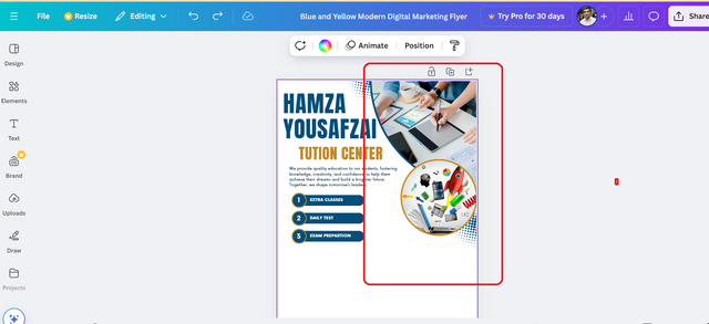
- Text: "HAMZA YOUSAFZAI"
- Font: Montserrat Extra Bold
- Size: 60 px
- Color: Dark Blue (#002D62).
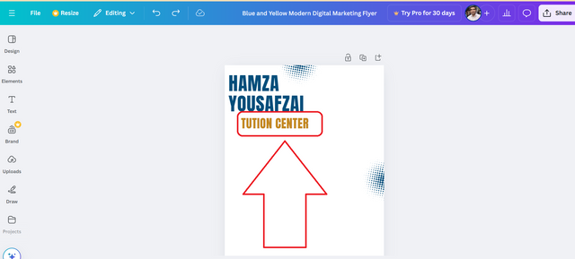
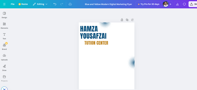
Below the title I added "TUITION CENTER" in slightly smaller font:
- Font: Poppins Bold
- Size: 40 px
- Color: Gold (#D4AF37).
I aligned both text lines to the left ensuring they were Visually balance.
.png)
.png)
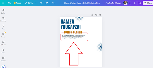
Step 4: Writing the Tagline
- Beneath the header I included a tagline to describe my mission:
- Text: "We provide quality education to our student fostering knowledge Creativity and confidence to help them achieve their dream and build a brighter future. Together we shape tomorrow leaders."
- Font: Lato Regular Size: 12 px Color: Gray (#6C6C6C).
- I made sure the tagline was centered under the header leaving enough white Space for clarity.
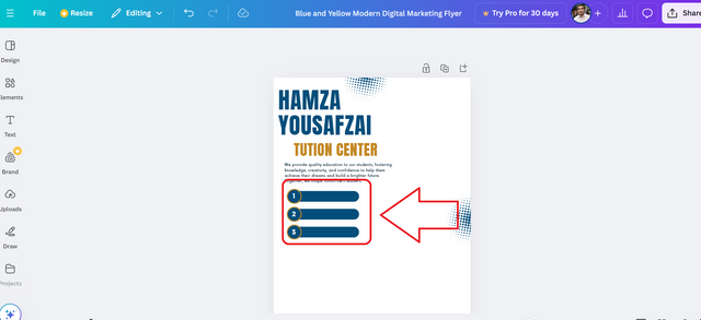
Step 5: Highlighting Services
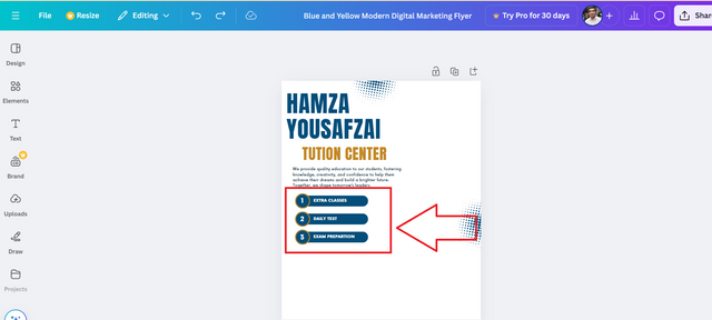
- I created a list of three services we provide to our students:
- Extra Classes Daily Tests and Exam Preparation.
- To design this section:
- I went to Elements selected circles and positioned three vertically on the left side.
- I added numbers (1 2 3) inside the circles using bold white font with a blue background (#002D62).
- Next to each circle I add the service name in bold:
- Font: Poppins Medium Size: 16 px Color: Dark Blue (#002D62).
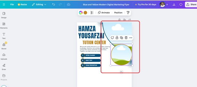
Step 6: Adding a Creative Visual
- On the right side I included a visual element to represent innovation and creativity:
- I searched for "rocket" and "education" graphics in Canva Photos section.
- I cropped the image into an circular frame to keep it clean and modern.
- I positioned the image to balance the left-aligned text making the layout visually apealing.
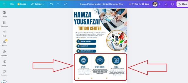
Step 7: Creating the Key Features Section
Below the main content I added three columns to highlight important features of my tuition center:
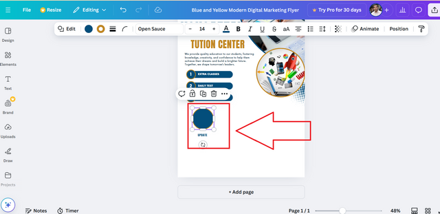
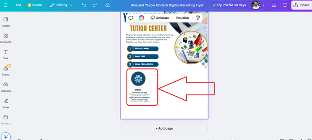
Column 1: Update
- Icon: I used a network from Elements.
- Text: "By integrating real-world information and practical skill we prepare students to excel in a dynamic and ever-evolving world. Together we shape thinker innovators and future leaders."
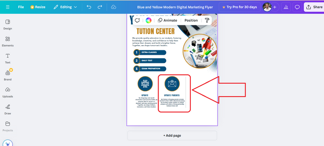
Column 2: Update Parents
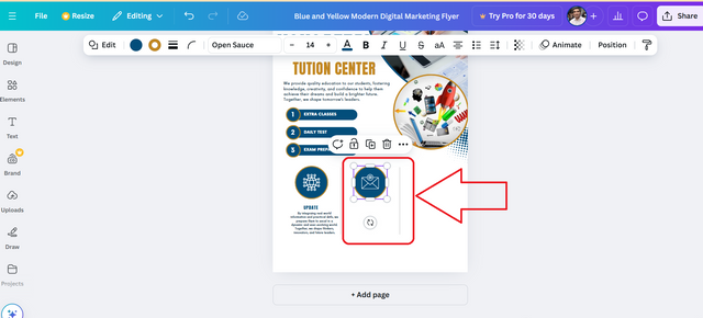
- Icon: I chose an email envelope icon.
- Text: "We believe in keeping parents actively involved in their child educational journey. By providing regular updates on student progress we ensure a strong partnership between home and school."
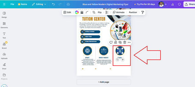
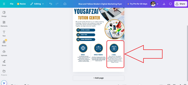
Column 3: IT Skill
- Icon: I used a web browser icon.
- Text: "We provide not only updated knowledge but also interactive in-class and online sessions to ensure a holistic learning experience for every student."
- For each feature :
- Used Poppins Regular Size 10-12 px and aligned the text under the icon.
- Made sure all columns were evenly space and centered.
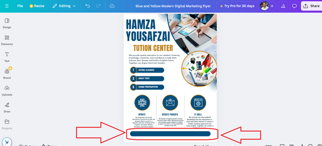
Step 8: Adding the Footer
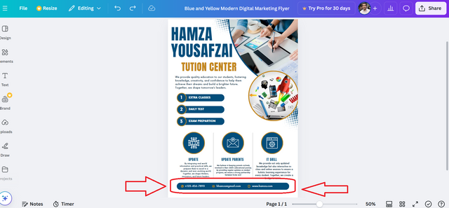
- At the bottom of the flyer I include my contact information:
- Phone: "+123-456-7890"
- Email: "[email protected]"
- Website: "www.hamza.com"
- To design this:
- I used Elements to add icons for the phone email and website.
- Placed the icons horizontally with matching text beside them.
- Used a thin blue bar above the footer to separate it from the rest of the content.
Step 9: Final Touches
- I checked the spacing alignment and consistency of fonts and colors.
- Added subtle decorative element such as dotted lines and accents to make the design more dynamic without over crowding it.
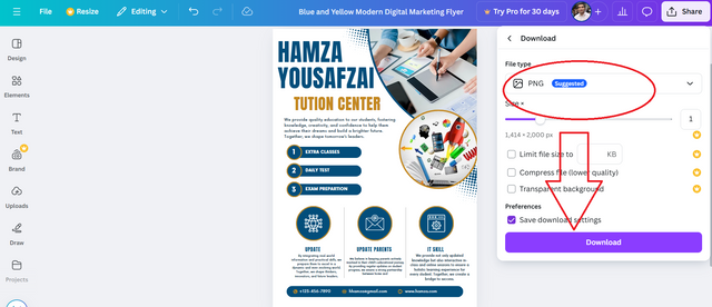
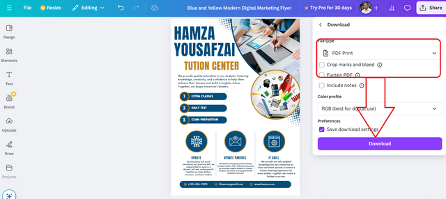
Step 10: Saving and Sharing
- Once everything looked perfect I clicked "Share" > "Download".
- I downloaded it as a PDF (Print) for high quality output and a PNG for digital sharing.
Using a Mockup to Promote My Design
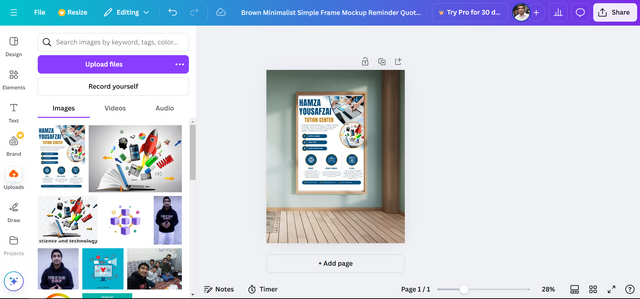
I used my tuition flyer as a mockup to showcase how it would look displayed on a wall. By placing the flyer on a clean professional wall background it gives a realistic view of how the design would appear in real-life settings.
This mockup enhances the presentation and makes the design more visually appealing helping viewers understand its practical use and impact.
.png)
.png)
.png)
.png)
.png)
.png)
.png)
.png)
.png)
.png)
.png)
.png)
.png)
.png)
.png)
.png)
.png)
.png)
.png)
.png)
.png)
.png)
.png)
.png)
Hello @hamzayousafzai thank you for participating in this week's lesson. We have assessed your entry and we present the result of our assessment below.
Feedback:
Welcome back to class dear student.
Let me start by commending you for a job weldone, the effort put in this work is quite commendable.
Am still trying to figure out which of the element in your design is a logo...I think you still need to redefine that logo of yours to make it distinct as a logo indeed. It looks like a random complementary element in your design.
Your flyer looks great, simple and beautiful. My only observation is that your "Tuition Center" element seems to be disaligned, it would have been better if it's positioned directly under the other text elements above it. Finally, your design came out super nice on your mockup. In all you have presented beautifully.
Regards
@lhorgic❤️
thank you so much for your feedback. i will improve it more