"SLC21/WK5: Hands-On Practical.
 |
|---|
Design A logo for your brand, if you already have one, this would be optional for you.
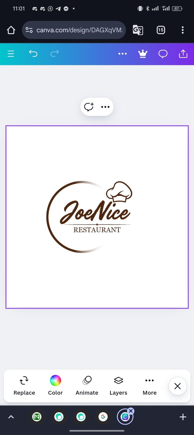
Here I already have a logo brand for a restaurant business that I have designed for a long saved in my canvas I open my canvas from the web search for it and download it to my phone as shown.
 |  |
|---|
Design a promotional flyer/banner/poster for your brand using any design app/software of your choice. Kindly be sure to be very detailed, showing every relevant detail as this could be your leverage.
Here I will be showing you how I used my logo and designed a promotional flyer for my restaurant business. Let me take you to the steps that I took.
 |  |
|---|
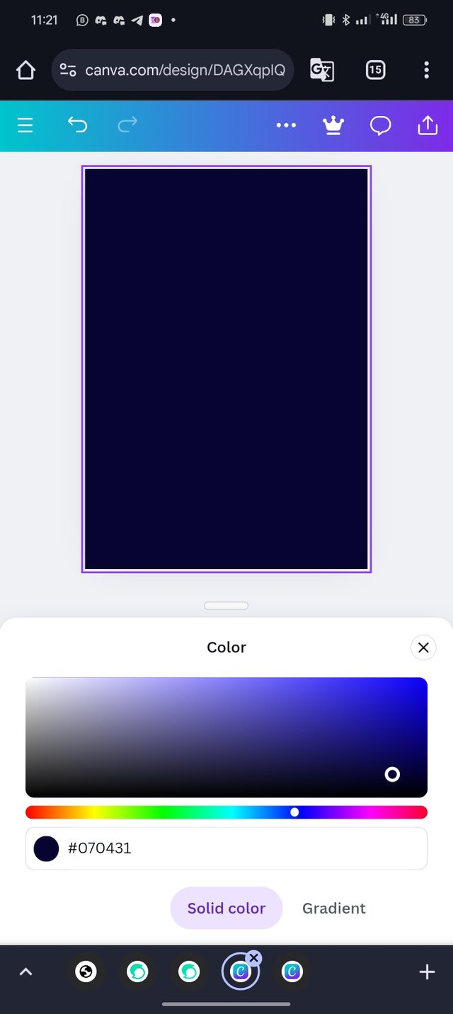
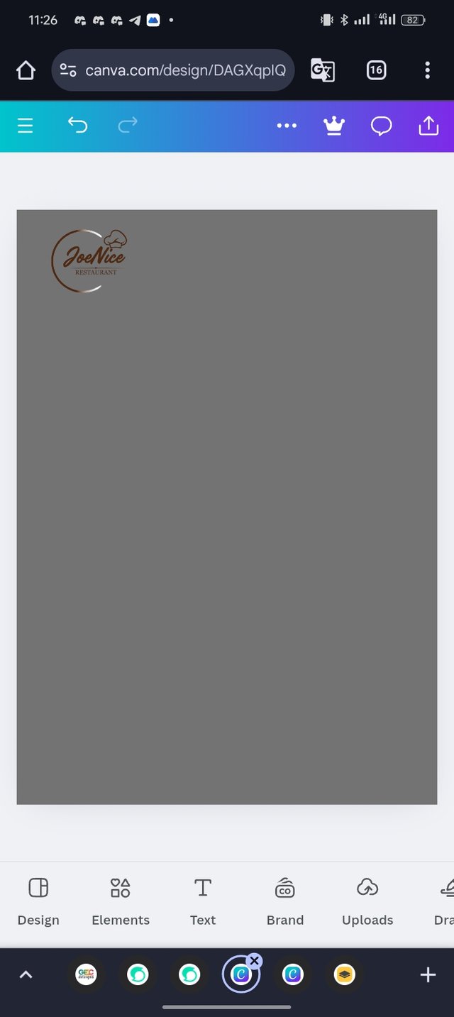
- I opened my canvas from the web chose my dimension as shared below inserted my logo and positioned it at the top.
 |  |
|---|
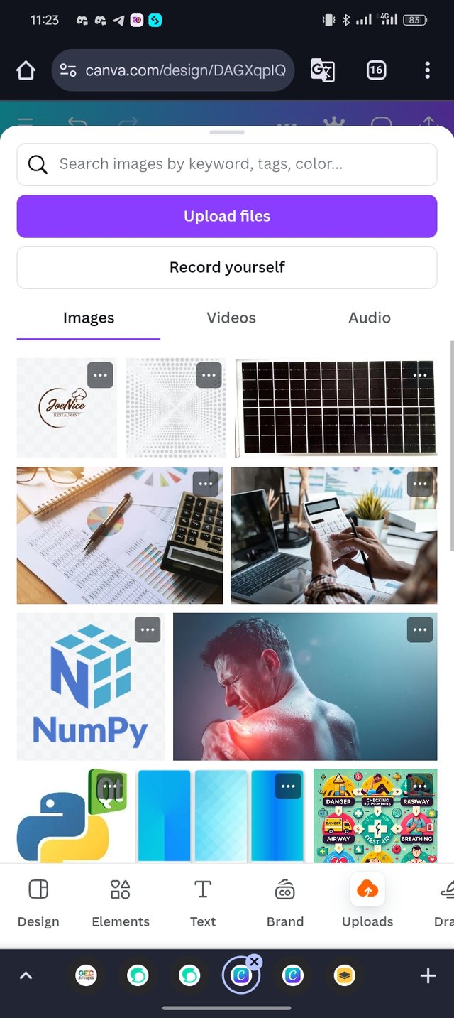
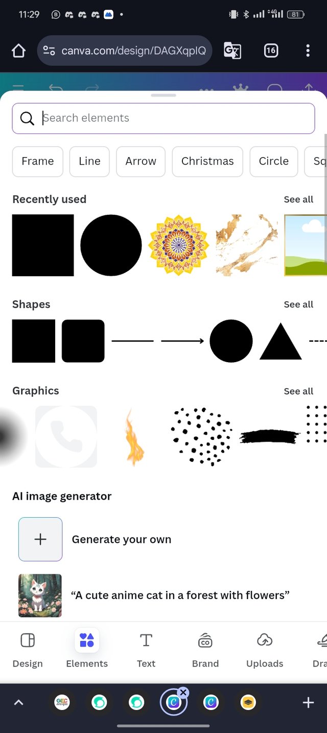
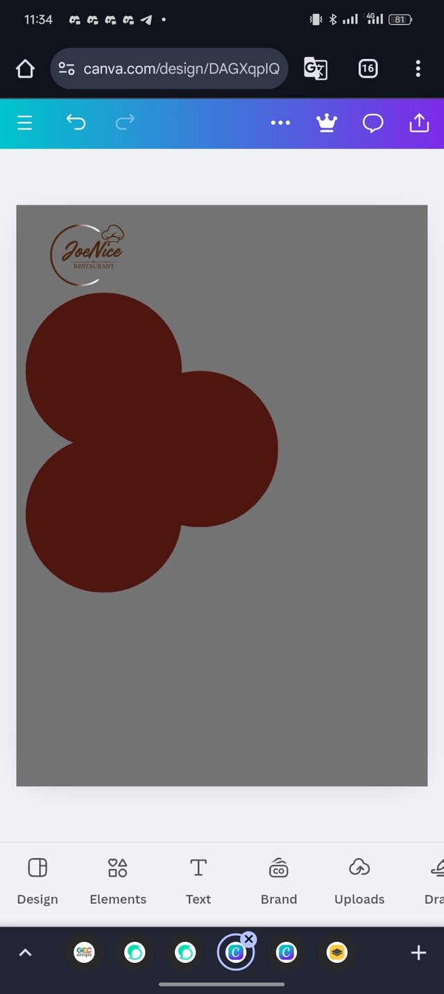
- I give the dimension color background and then click on the element select the circle elements and duplicate the elements into three (3).
 |  |
|---|
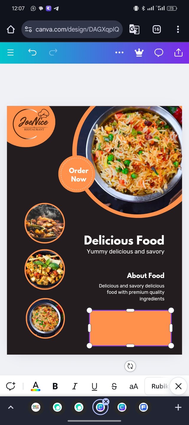
- I went to Freepik and downloaded some images about foods to my gallery which I then went back to my canvas opened my design and inserted the images one after another via the upload.
 |  |
|---|
 |
|---|
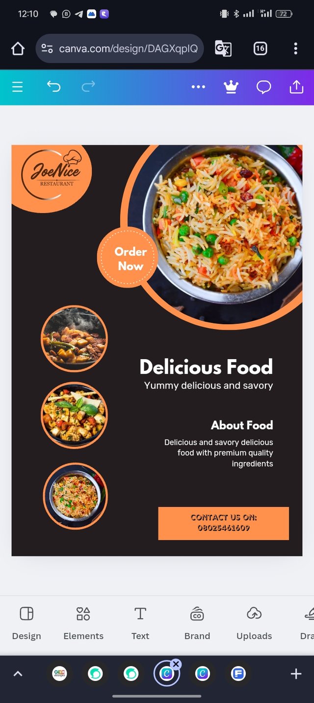
- After doing everything, I then wrote some catching words on the design which I then clicked on element and inserted a square shape element then wrote "Contact Us On 080254............."
Dedicate a section to talk about the graphics design principles engaged in making your design. You might want to revisit the lecture on graphic design principles to refresh your memory.
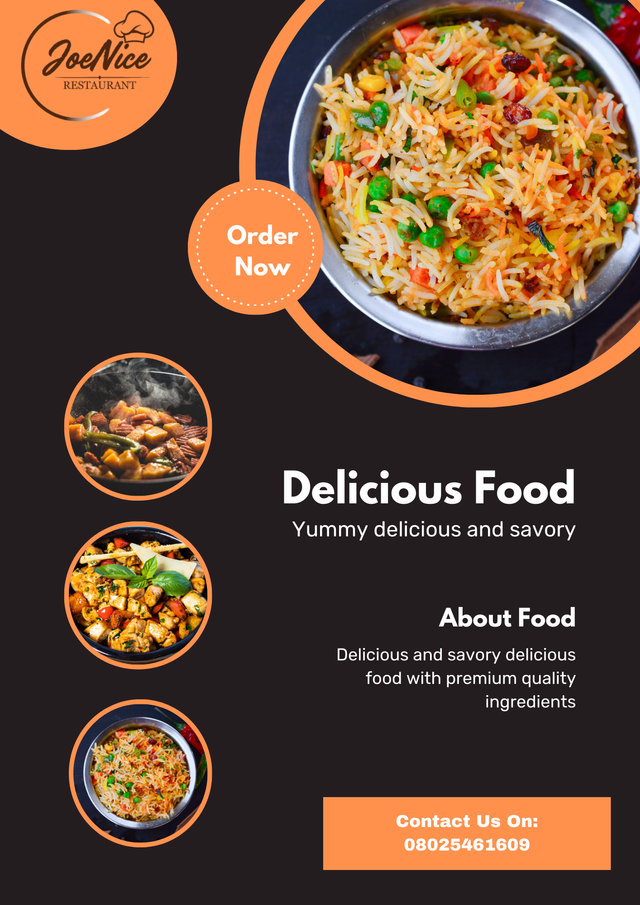
The graphics design principles that I used to make the design look appealing. Having said that below are the following principles that I used.
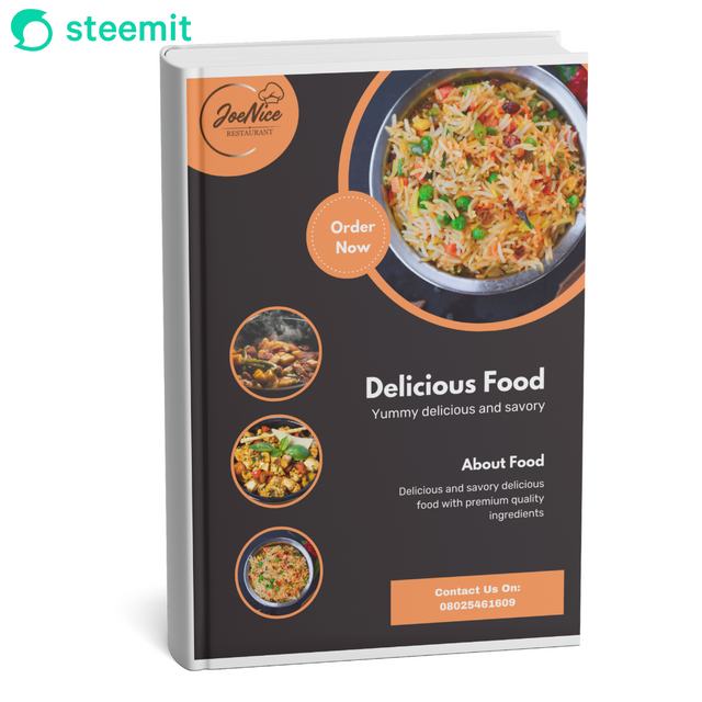
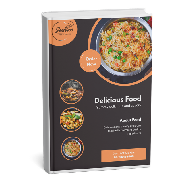
Color Contrast: I use a warm orange accent against a dark background, creating a visually striking contrast that highlights key elements such as **"Order Now" Logo, and contact information.
Hierarchy and Emphasis: Text hierarchy is well established in the design. Delicious Food is the largest as it draws the attention of people and I also support it with Yummy delicious and savory and Contact Us On to guide views focus.
Visual Balance: This is the principle that I used for text, images, and circular alignment elements to create a balanced composition. The central placement of the main dish image is complemented by smaller circular images to the side.
Typography: The font style is readable and clear with a mix of bold and regular weights to distinguish headings from supporting details.
Once again use a suitable mockup to promote your design.
- I Launch my Canva app, Go to my Apps, and search for Mockups. I Click on the mockup app as seen below to explore
 |  |
|---|
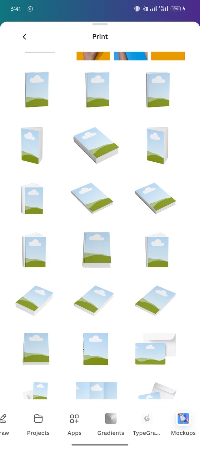
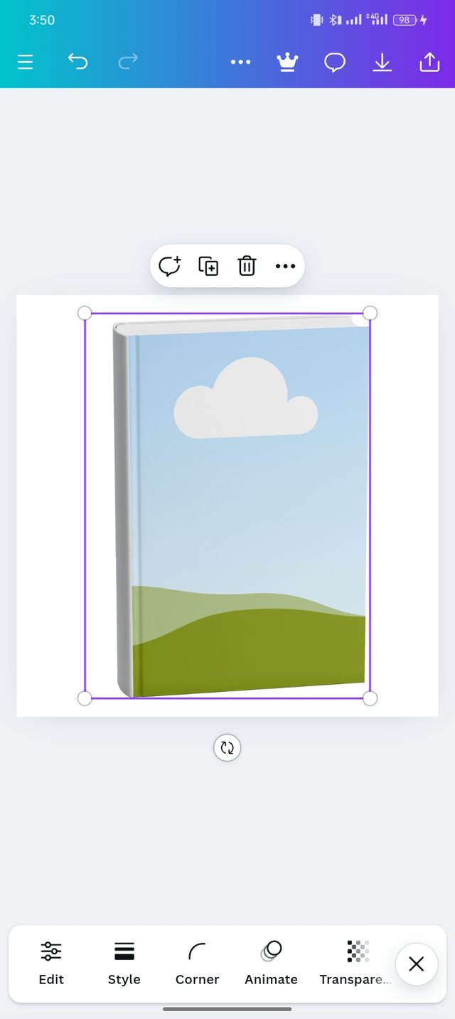
- I then look for the mockup that I want to use and select the mockup that I prefer as shown in my screenshot.
 |  |
|---|
 |
|---|
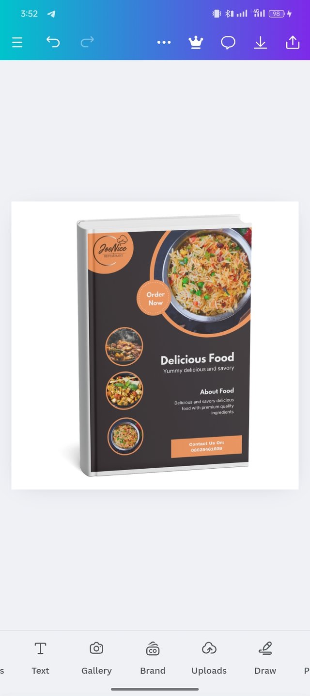
- I then selected the gallery to go to and picked the design I needed to work on. I then select forward and brought it to the page. I resized exactly where the blank picture on the book.
I am inviting; @dove11, @simonmwigwe, and @ruthjoe
Cc:-
@lhorgic
Every principle of graphics design has been brilliantly applied. Typography and Color Contrast are really commendable. Best of luck for the contest my friend.
Thanks for your support.
Aha! A book of foods!
I am getting fat!!
Thanks