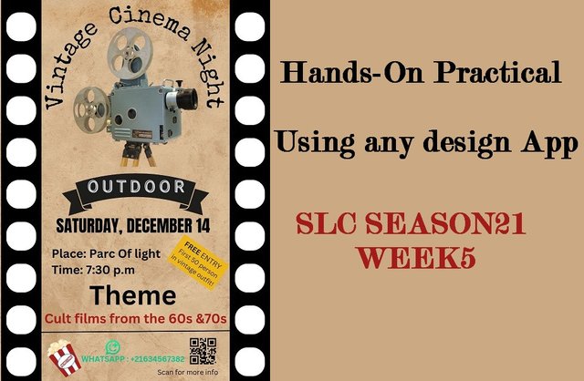
SLC | S21W 5 | Hands-On Practical Using any design App

Hello steemians,
Today, I am taking part in the SLC21 W5 - Hands-On Practical Using any Design App contest, hosted by @lhorgic. As someone deeply passionate about graphic design, I find this challenge especially engaging, as it gives me the opportunity to hone my skills while working with Canva, a platform I greatly value for its user-friendly interface and powerful features.
Design a promotional flyer/banner/poster for your brand using any design app/software of your choice. Kindly be sure to be very detailed, showing every relevant detail as this could be your leverage.
Step 1: Project preparation
I start by opening Canva on my smartphone, where I am greeted by the home page, I locate and click on the purple “+” button to create a new design, I type “Flyer” in the search bar, and I selects the Flyer A4 format (21 x 29.7 cm), which is ideal for a clear and readable design, once the format is chosen, Canva opens a blank workspace with all the essential tools like "Elements", "Text" , And “Downloads” ready to use, this allows me to efficiently prepare my project to start designing.
 |  |  |
|---|
Step 2: Adding the Background and Base Elements
I decide to give a vintage style to my flyer, so I go to the "Elements" tab and I search for an old paper texture by typing "old paper texture", I select a beige background reminiscent of aged paper and I applied as the background of my design, which creates a retro atmosphere, then I go to "Elements" and I add a black rectangle which I place in the center of my flyer, I stretch it vertically so that it covers the entire height, serving as main strip to organize information.
 |  |  |
|---|
Step 3: Adding cinematic details
To reinforce the cinema theme, I add small white rectangles along the black strip to imitate the perforations of film stock, I place them evenly, one by one, to ensure perfect alignment, once the first well positioned perforation, I use the duplication function to easily reproduce it over the entire length of the strip, this guarantees a realistic effect consistent with the visual style I want to obtain.
 |  |  |
|---|
Step 4: Selecting and duplicating perforations
I select all the perforations that I created on the black strip using the "Select Multiple" option, then I group them together to make a single element, once grouped I duplicate this entire strip and position it symmetrically from the other side of the flyer which creates a balanced effect consistent with the theme of the film.
 |  |  |
|---|
Step 5: Adding the main title and choosing the font
I click on the "Text" option to insert the title of the flyer, I look for a vintage font, like "Special Elite", which perfectly matches the retro vibe, I enter the text "Vintage Cinema Night" and adjust the size and position to make it centered, I also change the color to match the overall design.
 |  |  |
|---|
Step 6: Integration of an iconic image
In the "Elements" tab I look for an image of a vintage cinema projector to reinforce the theme, I select an image of a classic projector and place it below the title, this adds a strong visual touch that attracts viewers. attention and reflects the essence of the event.
 |  |  |
|---|
Step 7: Adding the banner and customizing the text
I select a black banner in the "Elements" tab to add it under the projector image, then I insert the word "OUTDOOR" on the banner using a light font and playing on the contrasts so that it it stands out, it highlights the essential information of the event, I also adjust the alignment to ensure a harmonious result.
 |  |  |
|---|
Step 8: Indication of date and time
I enter the text "Saturday, December 14" just below the banner, choosing a bold font to emphasize the importance of the information, then add the time "7:30 p.m" at the bottom of the flyer, with an elegant but readable font, these elements ensure that practical details are clearly visible to the viewer.
 |  |  |
|---|
Step 9: Adding decorative elements and promotional text
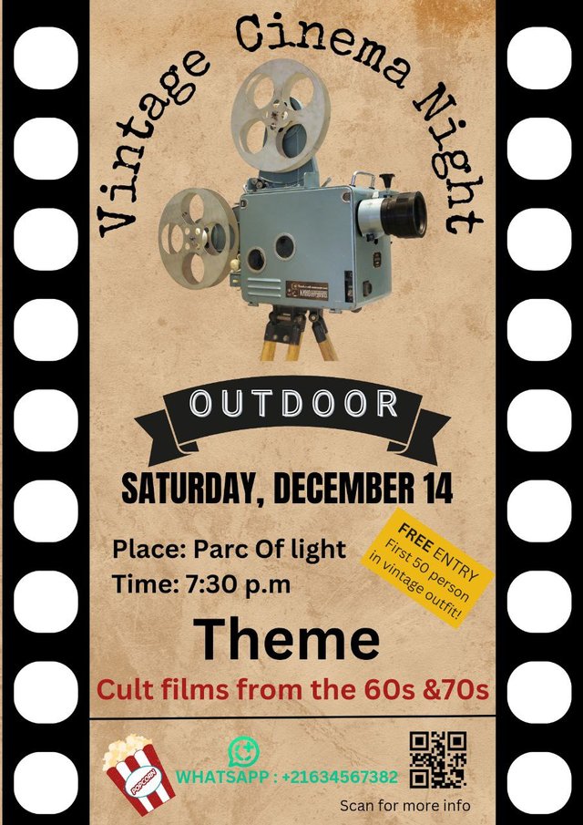
In the "Elements" tab, I find and insert a popcorn icon which I position at the bottom left to bring a fun and friendly touch, I also add a tilted yellow box with the text "FREE ENTRY - First 50 person in vintage outfit!”, which adds an attractive promotional dimension to the flyer while respecting the general aesthetic.
 |  |  |
|---|
Step 7: Adding key information
I enter the essential details of the event using the "Text" tool, specify the location, date and time by formatting the texts to make them readable and attractive, the information includes "Place: Parc Of Light" and "Time: 7:30 p.m", strategically positioned under the main title to attract attention, the fonts used are simple and elegant so as not to overwhelm the design.
 |  |  |
|---|
Step 8: Theme and style
To reflect the theme, I added the text "Theme" followed by "Cult films from the 60s & 70s", this text is placed in an eye-catching font and a contrasting color, such as red, to evoke the retro vibe, this helps establish the tone of the event while maintaining visual harmony.
 |  |  |
|---|
Step 9: QR code and WhatsApp icon
For better interaction with the public, I insert a QR code at the bottom right of the flyer via the "Uploads" tab, to the left of the QR code, I add a WhatsApp icon accompanied by a contact number, these elements make it easy to access additional information and allow participants to connect directly via WhatsApp, the layout is balanced and aligned with existing elements for a professional look.
 |  |
|---|
Step 10: Finalization and validation
Once all elements are added, I check the alignment, colors, and overall harmony of the design, necessary adjustments are made to ensure that all details are readable and aesthetically pleasing, I also make sure the flyer is ready to be downloaded or printed in the best quality.
Final Output

Dedicate a section to talk about the graphics design principles engaged in making your design. You might want to revisit the lecture on graphic design principles to refresh your memory.
When creating this flyer, several graphic design principles were carefully integrated to produce an aesthetically pleasing, functional and communicative design, here is an analysis of the main principles applied:
Balance in composition
I used the black perforations on the sides of the flyer to create visual symmetry, this approach frames the central content, while ensuring an equal distribution of visual weight on each side, making the composition harmonious and pleasing to the eye.
Visual hierarchy to guide the eye
The main title, "Vintage Cinema Night", is placed at the top with a large font size, immediately capturing attention, important details like date, time and location are arranged below with a slightly smaller size, while secondary elements, such as the theme and the QR code, complete everything at the bottom of the flyer.
Contrast to attract attention
To make the flyer dynamic, I played on the contrasts of colors and fonts, the black of the text and the perforations stands out well against the textured beige background, in addition, bright colors like red and yellow highlight the key elements, such as the theme or important messages.
Alignment for a neat presentation
The central alignment of main elements, like the spotlight, title and event information, brings a clean and professional structure, at the bottom, elements like the WhatsApp icon and QR code are aligned horizontally to balance the bottom of the composition.
Closeness to organize information
Related information, such as date, time, and location, is grouped together visually, this proximity helps the viewer associate these elements quickly and understand their importance without confusion.
Repetition for consistency
I repeated certain elements, such as perforations, colors (black, beige, red) and font styles, to strengthen visual cohesion, this repetition gives an identity to the flyer, making the design harmonious and memorable.
Use of negative space
The space left around main elements, such as the title and the projector image, gives a feeling of clarity and highlights each component, this avoids a cluttered design and makes information easier to read.
These principles complement each other to create a flyer that is not only visually appealing, but also effective in conveying information in a clear and structured manner.
Once again use a suitable mockup to promote your design.
Step 1: Setting the Canvas and Choosing Mockups
I began by selecting a blank canvas to start the design process by using the “Apps” menu, I searched for “Mockups” to give the design a professional presentation.
From the “Mockups” section, I navigated to the "Outdoor" category, selecting a digital billboard template to enhance the visual appeal of the design.
I placed the digital flyer design onto the mockup template, ensuring proper alignment to highlight its details.
 |  |  |
|---|
Step 2: Adding Key Details to the Flyer
I continued refining the flyer by ensuring all text fields, such as the event date, theme, and venue, were clear and legible.
The flyer’s text formatting, including font sizes and colors, was adjusted to ensure visibility in the mockup environment, replicating a real-world scenario.
Final edits to the design included testing its readability when applied to outdoor settings to validate its usability.
 |  |  |
|---|
Thank you very much for reading, it's time to invite my friends @cruzamilcar63, @mvchacin, @adeljose to participate in this contest.
Best Regards,
@kouba01

Great dear brother.Your design is supert and is very unique.Wishing you all the best brother.