SLC21/WK5: Hands-On Practical
.jpg)
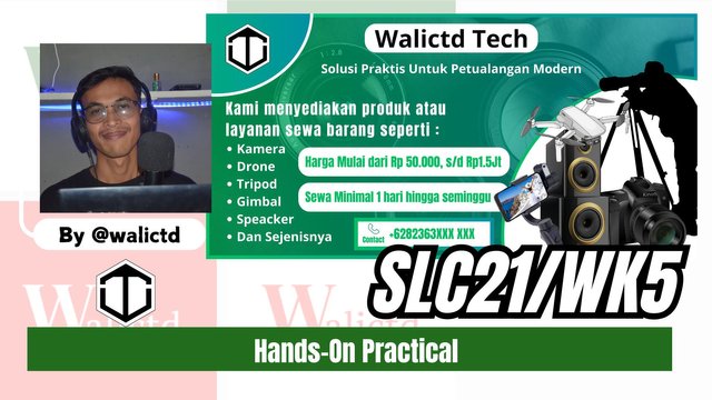
Hi friends, after reading around I am interested in participating in an amazing challenge this week. The challenge is titled: Hands-On Practical Using any design App/Software of your choice by Mr. @lhorgic following the contest link: SLC | S21W 5 | Hands-On Practical Using any design App/Software of your choice.
Previously I also invited other friends such as Mr. @irawandedy, Mr @muzack1 , sir @sisol and my friend @cymolan.
| Design a logo for your brand, if you already have one, this is optional for you. |
|---|
Because I was allowed to use the logo that was designed a few weeks ago, this time I will use another logo, the Walictd Tech logo, which is shortened to WT. With this logo later I will add it to a new banner, then I will also include it in the mockup that I will promote. Here's the logo that I designed last week:

| Design promotional brochures/banners/posters for your brand using your preferred design app/software. Make sure to be very detailed, pointing out every relevant detail as this can be your leverage. |
|---|
To design a banner from the logo that I have provided, here again I am using the web version of Canva. I just need to visit the page www.canva.com. Then I login and create the design.

Then I chose the banner size by selecting the banner.
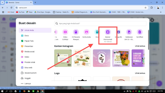
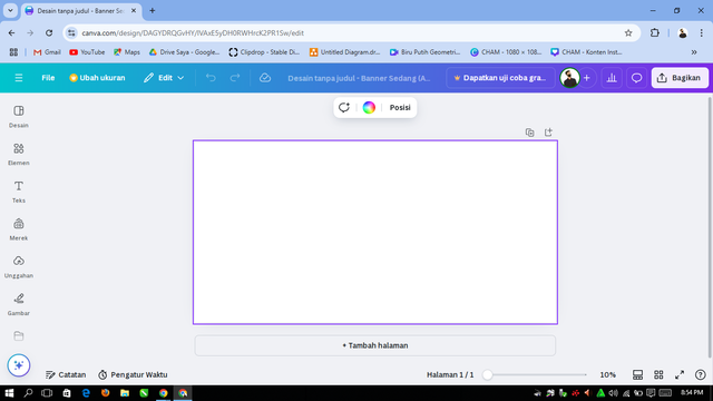
Here is the main view, after we select the banner worksheet size.
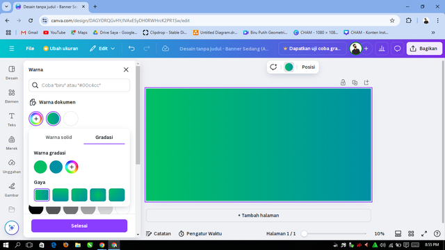
Next, we will replace the background color first to make it look more colorful.
So that the background is not too plain, here we need to add photos according to what we want, the point is still related to the theme of the banner to be made.
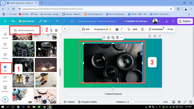
In number 1 above, it means to add a photo, number 2 to search for photos that we want to find according to our taste, in number 3 we will adjust the size of the photo with the background.
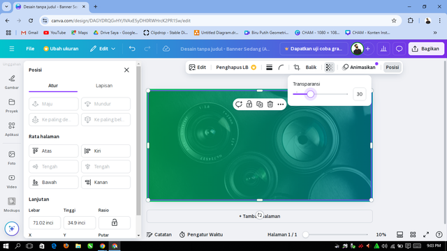
In the photo that will be the background, we will give a transparency effect at 30 so that the color does not appear too much.
Furthermore, I will add round elements to be able to take more interesting in the design. Here's the design process:
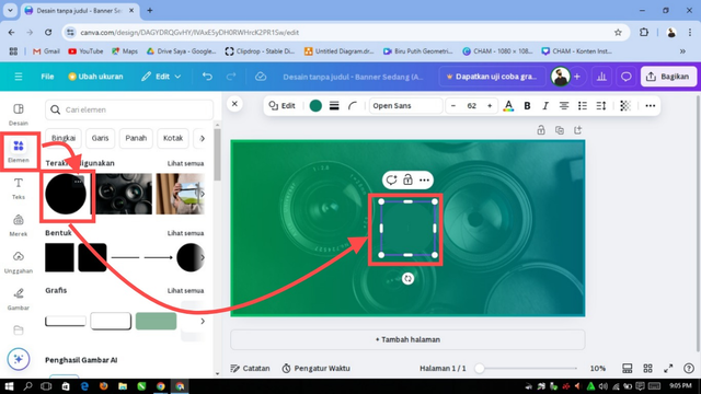
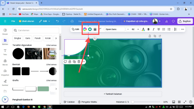
I replaced the round element with a white color, and then adjusted its location where it is better. Above the element, I will place the WT logo.
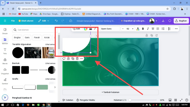
I also outlined the round elements according to the background color.
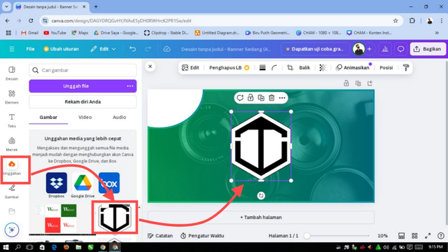
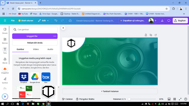
Then I will add my logo and place it in the space I have provided.
 |  |
|---|
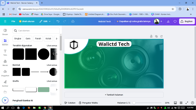
Next, I will add the name of my shop, Walictd Tech, and also add a banner title so that people are interested in our shop.
 |
|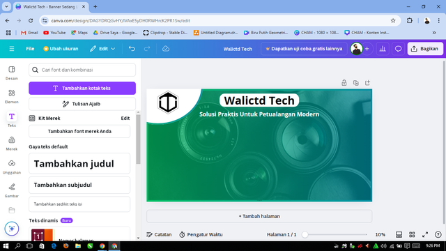
Seen above behind the writing Walictd Tech, I also added an element with the intention that his name could appear clearly. While in the title of the writing I did not give any more elements, so that the difference can be seen.
The font that I use is the basic canva font, Open sans with adjusted color and size.
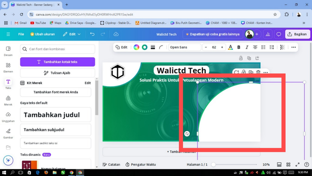
Next, I will add some items that I will rent out at the store, such as cameras, drones and the like. Previously I would place the same elements as behind the logo, but I enlarged and adjusted the location.
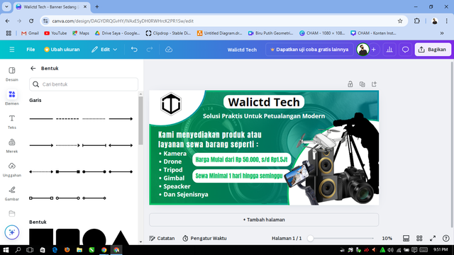
Next I will add the names of the items to be rented such as Cameras, Tripods, spreakers, drones and so on complete with the estimated price and rental time.
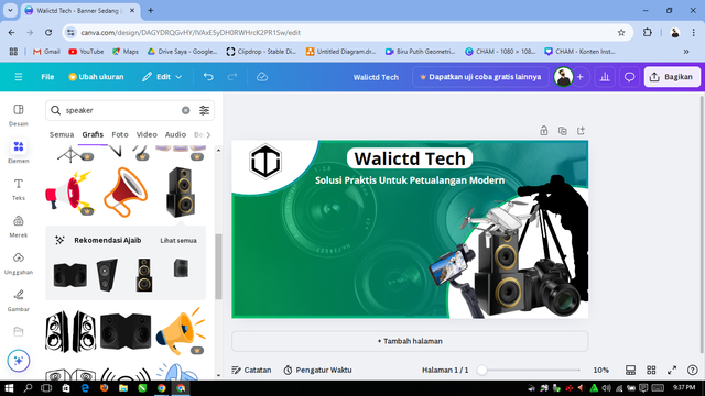
I added some images and positioned them well.
Furthermore, we also need to add an address number or number that can be contacted. Here's an example:
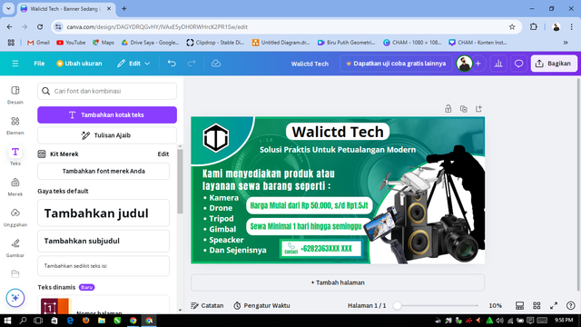
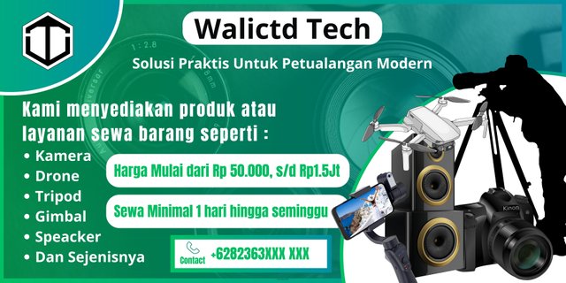
The last thing you need is to customize it and don't forget to save it.
| Dedicate a section to discussing the graphic design principles used in creating your design. You may want to revisit the lecture on graphic design principles to refresh your memory. |
|---|
Beberapa Prinsip Desain dalam spanduk ini diantaranya yaitu :
Contrast:
This design features a strong contrast with a dark background combined with a gradient green color. The few elements I added make it instantly more eye-catching and ensure the message can be read easily.Hierarchy:
The Headline text is made prominent with a large size to catch the eye first. This key message is strategically placed, ensuring the audience understands the gist of the offer right away. Service information and additional details are clearly organized underneath, providing a logical and easy-to-follow flow of information.Alignment:
Every element in this design is neatly arranged in columns, creating an organized and professional look. Icons, text, and graphics complement each other, while contact information is strategically placed at the bottom center for easy access.Balance:
The design maintains visual harmony by balancing large text on one side with supporting images and service details on the other. This combination creates a design structure that is pleasing to the eye without feeling overwhelming.Proximity:
Relevant information such as key services and contact details are grouped logically. “Kami menyediakan produk atau layanan sewa barang seperti :" is placed alongside the list of services to make it easy for the audience to find the required information without confusion.Visual Interest:
The main image is a futuristic digital illustration depicting human interaction with technology. This element not only attracts attention but also reinforces the message of modern technology at the core of the service, giving the impression of being innovative and future-oriented.
| Again use appropriate mockups to promote your design. |
|---|
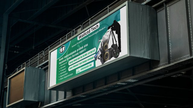
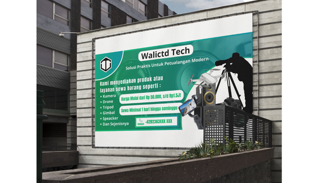
To promote my design, I will use an outdoor mockup like the following:
First I open the Canva web again, then create a new design and add the outdoor design elements. Here we will see which ones are interesting and fit the size of the banner we have designed.
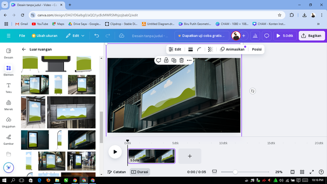
After finding the right one, then we just need to apply it to the mockup and don't forget to adjust the size so that it looks better and looks all.
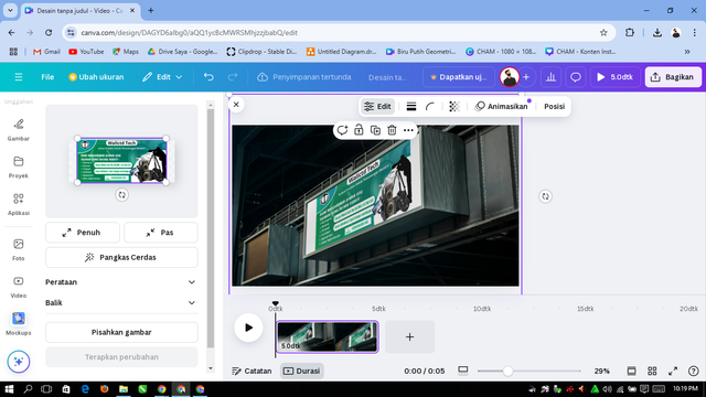
.jpg)
.png)
That's what I can share this time, thank you for your attention, please apologize if there are any mistakes.
@walictd

Hello @walictd thank you for participating in this week's lesson. We have assessed your entry and we present the result of our assessment below.
Feedback:
Welcome back to class dear student.
Let me start by commending you for a job weldone, the effort put in this work is quite commendable.
I can see you maintained your logo,it looks cools and I think it suits your brand. Your banner design is quite cool but I think it can be better especially in the aspect of aesthetics. Moreso I observed the distance between some of your text element needs to be adjusted by closing them up. You have actually done your best which is quite commendable. Weldone
Regards
@lhorgic❤️
Thank you very much for your assessment, advice and support. Success always and hopefully a blessing.
https://x.com/walictd/status/1863246342778507435
💯⚜2️⃣0️⃣2️⃣4️⃣ This is a manual curation from the @tipu Curation Project
@tipu curate
Upvoted 👌 (Mana: 4/7) Get profit votes with @tipU :)