SLC21/WK6: Summary on Lessons so Far [Hands-on Practical]
 Canvas Edit Canvas Edit |
|---|
Greetings, everyone! I hope you all enjoyed Season 21 as much as I did. It’s been an incredible journey filled with creativity, learning, and a lot of fun moments.
Graphic design is truly an art of imagination and innovation, and I must say, @lhorgic has done an amazing job guiding us through this creative world. Hats off to him! Honestly, I’ve learned so many new things from @lhorgic that I feel like a design ninja now (well, almost).
Confession time: I missed the first two weeks. Yep, life got in the way, and my schedule decided to be chaotic. But hey, better late than never, right? And oh boy, the effort @lhorgic put into those lessons made catching up a breeze.
From gradients to logos to mockups, every lesson was like unlocking a new superpower. It’s not just about learning; it’s about feeling inspired to create. Bravo, @lhorgic! You’ve made Season 21 unforgettable. Let’s keep those creative juices flowing!
Week 3rd Summary : Logo Love and Lessons |
|---|
 SLC | S21W 3 | Logo Design
 I found myself immersed in the art of logo design in week 3. Discussions enlightened me on how logos are faces of brands and are more than just pretty pictures. It is so interesting to learn that every logo type has a personality, such as wordmarks for straightforward clarity or mascot logos for fun and engagement. It was a world where fonts, colors, and shapes danced together to narrate brand stories.
The highlight for me was diving into Wordmark logos. These beauties rely solely on typography to make an impact. I learned how brands like Google and Coca-Cola thrive on simplicity and memorability. However, wordmarks can be a challenge for long brand names-they can feel like trying to cram a novel into a haiku!
Next came the combination logotypes. I felt it as though composing the perfect symphony of words and images. I find a brand such as Burger King utilizing them to further accentuate its identity through both visual and textual clues coming in unison. And what flexibility! You can disjoin the icon from the text when required—an awesome facility!
 |  |
|---|
Abstract logos are the creative wildcards, where shapes and colors break the rules to create an unforgettable impression. It is like painting your brand with freedom, yet ensuring that the result speaks volumes about your identity.
Finally, I couldn't help but laugh while reading about Mascot logos. These are colorful illustrated characters that bring warmth and believability to the name, which is ideal for kid-centric or family brand companies. But imagine luxury brands with a cartoon—they don't work!
 Promo flyer Promo flyer |
|---|
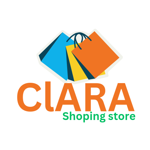
I not only learned about logos but flyer by the end of the week, but I also learned how the design decisions shape the perception of it. I even played around with Canva trying to test my skills in this area. It's been a mix of fun and challenge designing a Wordmark logo and a Combination logo.
In Week 4, We Design and Learn How to Create Mockups |
|---|
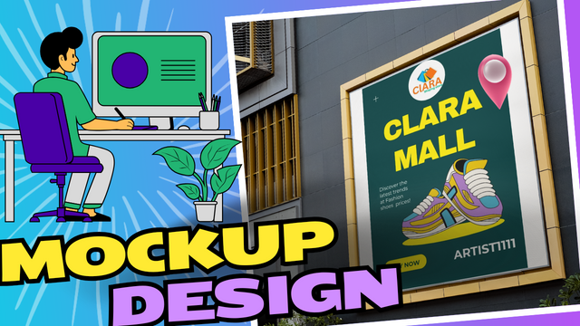 SLC21/WK4: Mockups in Design and Application
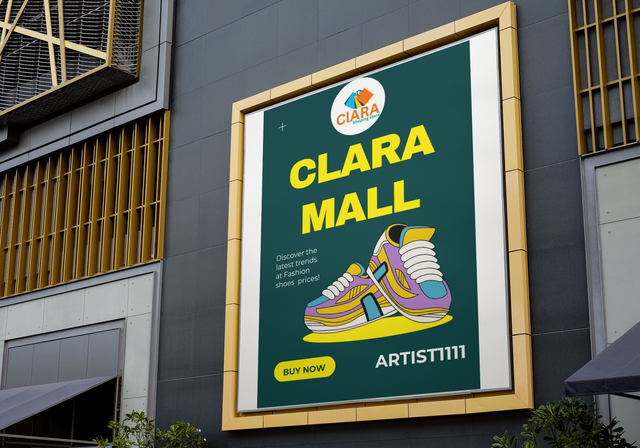
Week 4 was all about hands-on creativity and learning. Our focus was on understanding the process of designing mockups, an essential step in the development phase of any project. Mockups serve as a visual representation of ideas, allowing designers and clients to see the final product before it's fully developed.
Importance of Mockups
Mockups are very vital in filling the gap that exists between abstract concepts and tangible designs. They actually give a very clear picture of how the final design is going to look and perform. This week, we discuss their importance in saving time, minimizing errors, and even ensuring client satisfaction.
 Mockup Creation Mockup Creation |
|---|
We had experimented with different tools to create mockups - tools like Canva which make the process simpler by drag-and-drop functionality, pre-set templates, and more. The focus has always been on choosing the right tools depending on the project.
Step-by-Step Process
We started by brainstorming and sketching out initial ideas. After we had the rough sketches ready, we transferred them to digital tools to refine the design. Adding elements such as color schemes, typography, and imagery helped bring the mockups to life.
One of the challenges was to ensure consistency in the design. We overcame this by following a style guide and being very detail-oriented. Peer feedback also played a big role; it improved the quality of our mockups.
 Promo tshirt "Steem Logo" Promo tshirt "Steem Logo" |
|---|
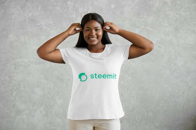
Designing mockups has real-world applications in various fields, including web design, app development, and marketing. This skill will undoubtedly enhance our ability to present and communicate ideas effectively.
Week 4 gave us a solid foundation in mockup design. It was a blend of creativity and technical learning that opened doors to endless possibilities.
Week 5: We Design and Create Flyers |
|---|
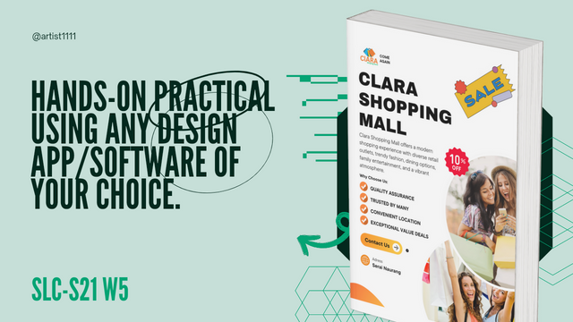
In Week 5, we transitioned from mockups to another important design element: flyers. Flyers are an effective tool for promoting businesses, events, or products, and learning how to design them properly is an essential skill. This week was all about getting creative with colors, text, and layouts to make a flyer that grabs attention.
 SLC | S21W 5 | Hands-On Practical Using any design App/Software of your choice.
Step 1: Setting Up the Canvas
I decided to use Canva for this project because it's user-friendly and offers a wide range of creative options. The first step was selecting a blank flyer-sized canvas. Using standard flyer dimensions ensures the design can be used for both digital and print media.
Step 2: Adding Main Elements
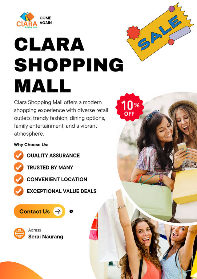
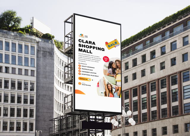
The next step involved creating a bold header. I typed "CLARA SHOPPING MALL" in uppercase with a large, bold font to ensure visibility. Below that, I included a catchy tagline to support the message. Adding a smaller subheading like "Why Choose Us" helped emphasize the flyer’s main points.
Step 3: Visual Engagement
After the header, I proceeded to the body text. Instead of the usual bullet points, I added unique graphic icons that made the flyer more visually appealing. This graphics helped to creatively highlight the key benefits, making sure the content stood out.
Step 4: Contact Information
The contact information is the most significant part of a flyer, and I highlighted this by using bold fonts and striking graphic elements for this section. The "Contact Us" emphasized made sure that the potential clients will easily find a way on how to reach them.
Step 5: Logo and Additional Graphics
Incorporating the logo was crucial, so I carefully placed it within the flyer, making sure it wasn't overwhelming. Feedback from last week helped me adjust the logo size and placement for better balance. I also added fun elements like sale graphics and a location icon to further enhance the flyer’s appeal.
 Promo Flyer Promo Flyer |
|---|
Step 6: Final Touches
I didn't want the flyer to be too cluttered, so I selected only two relevant images instead of flooding the design. This made it look balanced and lively, yet not chaotic. Balloons and other fun visuals added energy and playfulness to the flyer.
I presented the final version of the flyer using mockup templates on Canva, ensuring professional presentation. The mockup actually helped me to envision how the flyer would look on a real-life display; for example, a wall or on a digital screen. I added background, shadows, and lighting to give it an end look.
 Mockup Mockup |
|---|
Final Outcome :
Once I was content with the mockup, I downloaded the high-resolution version and prepared to share my flyer design. It was a fulfilling experience which helped me apply creativity and design principles effectively. I learned how to make powerful promotional designs that get people's attention in week 5.
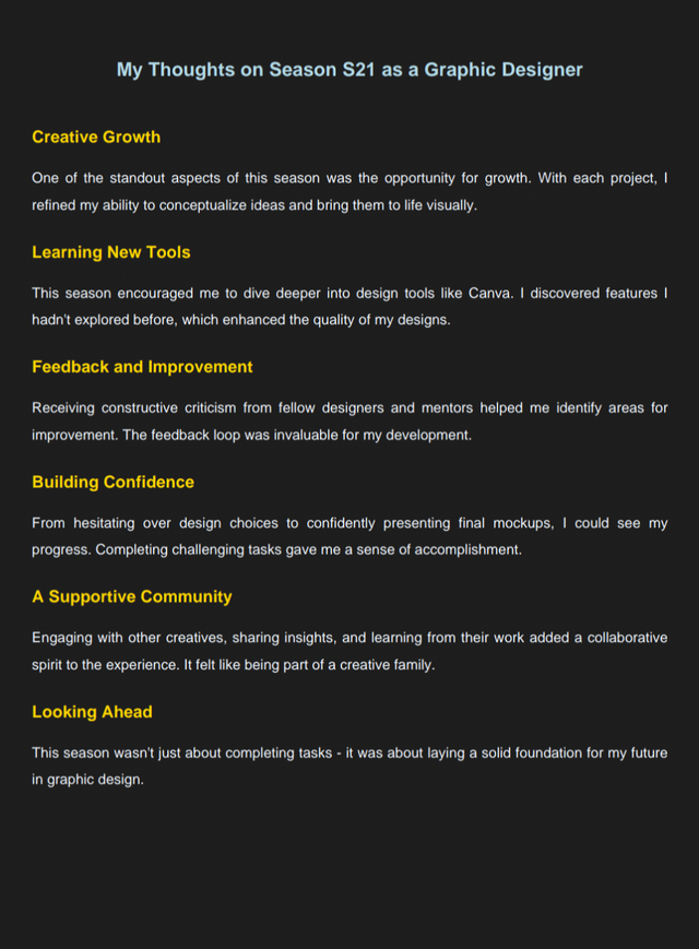
My Thoughts on Season S21 as a Graphic Designer |
|---|
 |
|---|
kind Regards
@artist1111

Adieu, folks!
May the winds of fortune
carry you to greatness!
May the winds of fortune
carry you to greatness!
I was very inspired to see such a well-organized summary of each lesson in learning graphic design. Thanks for sharing. Good luck for the contest.
Thank you for the kind words! Glad my summary inspired—organizing it felt like designing a creative treasure map!