SLC21/WK6: Summary on Lessons so far [Hands-on Practical]
Friends of steemit all greetings of success always for all of you wherever you are....
Before proceeding further on this very interesting challenge with the title: SLC21/WK6: Summary on Lessons so Far [Hands-on Practical], I invite my steemian friends @memamun, @pelon53, and @irawandedy to join this challenge.
In participating in the design SLC, from the first lesson to the 5th lesson, I did not have time to participate in any of them. However, this time, in week 6, I had free time to participate. Although I did not have time to learn from lesson 1 to lesson 5, this time I will summarize from lesson 1 to lesson 5 according to my ability. Here is my summary from lesson 1 onwards.
| Lesson 1: Gradient Design |
|---|
In lesson 1 explain about gradient in a design. Where there Mr. Lorjik has explained what the meaning of gradient is types of gradient, how to apply gradient, and practical in demonstrating gradient. The definition of gradient is the combination of one color with another color So it can be a combination of two or more colors. That is a simple understanding of the gradient. While your types are many including liner gradient Radial gradient, angular gradient, and others.
In the lesson, Lhorgic's teacher also gave procedures for applying gradients starting from the right choice of colors using gradients wisely and so on. Those were the few lessons that I was able to embrace in the first week.
| Lesson 2: Logo Design Guidelines |
|---|
In the lesson contained in the second week, there was an explanation about logos. The teacher first gives the definition of a logo then explains about the principles of logo design, and finally explains about what things a logo can and cannot be.
So here we can conclude that a logo has the meaning of a symbolic or visual identity that can be made in the form of a mixture of symbols, colors, images and text that characterizes a person's product or brand or type of institution that will be added to the logo.
There are several principles that are applied in designing a logo, starting from simplicity, easy to remember original, modern but timeless, has balance and completeness and the last is flexibility.
There are also practical tips in designing a logo, for example playing around with capitalization, and fonts. Furthermore, it also gives balance to our tagline, and also has to choose a good color that is easy to read, and so on. Here is an example of the logo I designed:
.png)
| Lesson 3: Logo Types and Applications |
|---|
In this third lesson, it explains many things about logos ranging from introductions to types of logos, and also determining the logo to be designed. The types of logos discussed there are 7 logos ranging from World mark logos, monogram logos, trademark logos, abstract logos, mascot logos, emblem logos, and combination logos.
So not much more about the definition, I have practiced myself thanks to the lesson and produced two types of logos below. The logo is about education where I am struggling as an educator and as an elementary school principal. Here I tried to design 2 logos entitled private lessons, the first I designed a private lesson which I shortened to LP and I made the LP as an alley logo called a monogram logo. Furthermore, I also designed a Combination logo which combines les privat writing with a little education emblem, this type of logo is called a combination logo.

| Lesson 4: Mockup Design |
|---|
In lesson 3, it explains a lot about mock-ups, which is a visual representation that may be very in-depth about such a product that will be released into the real world, then make up becomes a place before displaying to the field, or often referred to as demoing.
In addition to explaining the meaning of mockups, there are also types of mockups such as print mockups, device mockups, and so on. Not only that, the latter also explains the importance of mockups including for visualizing the final result and for creating a unified team, as well as attracting investors. Here I practice the mockup of the logo that I have designed above.


| Lesson 5: Hands-On Practical |
|---|
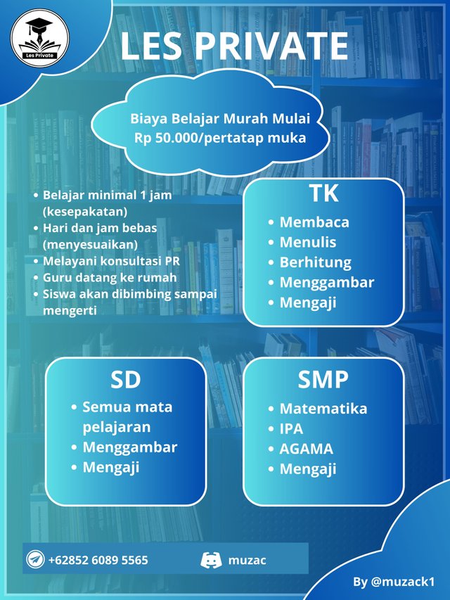
In the fifth lesson there was an assignment to practice directly how to use applications and other devices to design a brochure or banner. Here I again used the Canva application to design a brochure according to the theme that I had given to the Les Private logo. In the process, it provides several kinds starting from adding a logo adding what will be the lesson, the level that the lesson will be given, and the price of the meeting. Lastly, I also added contacts such as telegram and discord so that people can contact the brochure that I distributed immediately. May 3 days is just an example, not the original.
After designing a great brochure, I also took it and applied it to the outdoor mockups available in the canva app. Here are two mockups that I applied and promoted the brochure that I had designed.
.jpg)
.jpg)
That's a little conclusion and immediately practice one by one from lesson one to lesson 5. Hopefully it can all fulfill as specified in this 6th lesson. Please apologize if there are any shortcomings, thank you for your attention.
regards
@muzack1
Hello @muzack1 thank you for participating in this week's lesson. We have assessed your entry and we present the result of our assessment below.
Feedback:
Welcome back to class dear student.
Let me start by commending you for a job weldone, the effort put in this work is quite commendable. You have done a nice summary of the lesson and this you did practically which is quite commendable.I want to also salute your courage for staying through the lesson and for taking every form of correction in love and patience. I hope you would maximize all of these lesson and use them to your profiting. Thanks for staying through.
Regards
@lhorgic❤️
Thanks you for verification and support my post
Sebenarnya ini topik yang menarik pak, tetapi saya telah absen beberapa pembelajaran sebelumnya sehingga ketinggalan jauh.
Mungkin dipembelajaran berikutnya saya akan berpartisipasi pak.
Terimakasih atas undangannya... Good job mas bro...