SLC21/WK6: Summary on Lessons so far [Hands-on Practical]
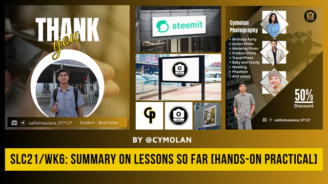 Edit di Canva
Assalamu,alaikum to all Steemians, hopefully we are always in good health and fine. On this occasion tonight I would like to take part in a learning challenge that is quite extraordinary. Our teacher @lhorgic organized a wonderful contest where some important topics will be discussed in detail here. Here I will give detailed answers to some questions according to my own understanding.
Lesson 1: Gradient Design
Although I did not have time to follow lesson one to lesson five, but I have read and studied one by one, I can finally conclude that this first lesson discusses gradient.
As we know that the gradient is a smoother combination between several colors, so it can be two or more colors. So that the gradient can make a more beautiful and detailed impression on our design. To make a more complex gradient, then we must first know how to combine colors well, so that the transition of the two colors feels natural. By giving something creative, of course, making gradients can be utilized in various types of designs. Therefore, I will practice directly how to make a gradient on the background of a thank you design as follows:
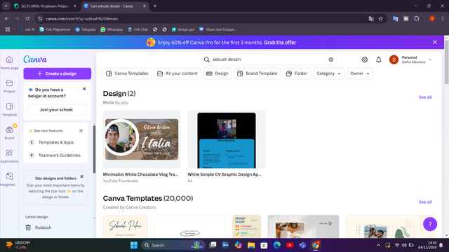
First, I immediately open the Canva application, either from Google or through a direct application that has been downloaded, but here I use Canva Web. After opening Canva and being on the main page, immediately click on the writing “Create a design” which is located in the left corner of my laptop as I shared in the picture below.
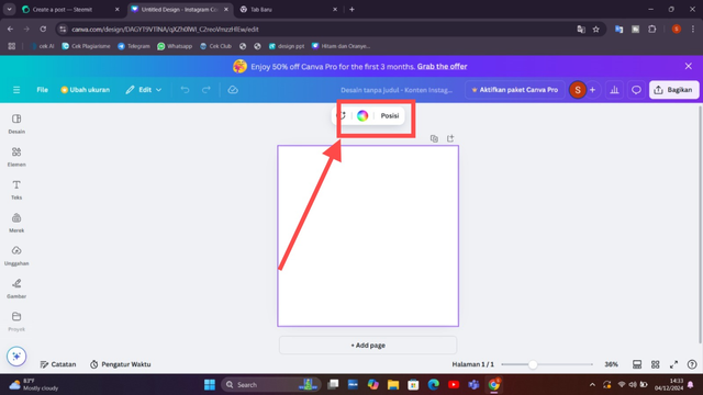
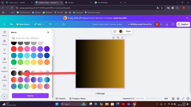
After entering the next stage then here will appear the background on the main display, so we will give the background a gradient color to follow the first lesson. The method is very easy, namely by selecting the color menu, to bring up the color menu then we will first click on the worksheet which is still empty white. Well, there will appear the color menu above the sheet written position.
Well, here on the left side, various types of colors have appeared after we will choose for the worksheet or background. We need to remember not to make the wrong choice, because here there are two kinds between gradient and Solid color, so pay close attention to the difference. The gradient is located at the bottom while the solid color is above the gradient. Here there is freedom in choosing the color you like, so I will choose my own favorite color and for the readers can also be free in choosing their favorite color.
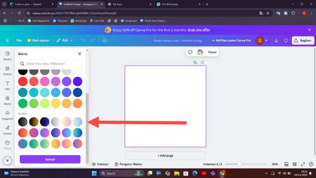
I chose the orange color combined with black, on the left side is black and the right side is orange. this is also the color that I like and you can see later after completion. To be able to understand clearly, friends can look at the direction of the arrow in the image that I have shared below. And we can also adjust the color levels as needed.
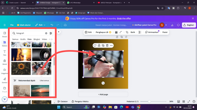
After that, in the next stage, I will add an image for the background as a transparent later. For images, it is free according to what we like, so here I will add a Photography image because I like photography. The trick is to click on the element menu then search for the type of image you want to take and after finding it pair click to move it into the background. Or you can also take it directly from the cellphone galary.
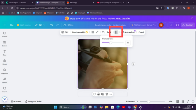
Once the image is on the worksheet, I adjust it to the right size and give it a transparent effect. Select the transparent menu by clicking on the image then a few menus appear and select the transparent column in the image below that I have shared. Because I don't like to overdo it, I only put the transparency around 39.
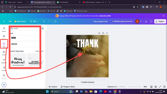
Well, then in the next stage I will give a word of thanks to Mr. @lhorgic who has given us a lesson. After selecting the text and adding the thank you text, then I adjusted the text size and color. I have given a white color to the ''THANK” text and an orange color to the ‘you’ text.
Next I will add a photo, before adding a round element first for the background of the photo. To take a round element, click on the element menu and various shapes that we need will appear, here I only use one of them which is round.
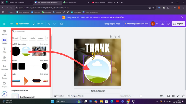
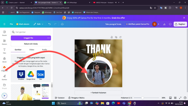
After taking the round element, then adjust it to the background of the sheet that we have provided. And the next step is then we enter the photo on the round element by clicking on the upload menu on the left. After finding the image you want to enter, then adjust it again.
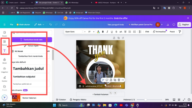
Next I added text to make my discord and Steemit names. For that as usual I put an element behind it as a background. Then just select the text and adjust it along with the color. Because my background color is like that so I use a white text color to make it look appropriate and beautiful.
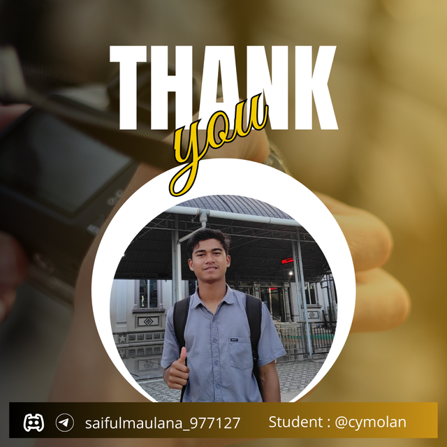
After going through the steps above, I finally finished making a twibbon to say thank you to Mr. @lhorgic who has given lessons until this sixth week. Friends can see the finished result below.
Lesson 2: Logo Design Guidelines
A logo is one of the visual backgrounds that reflects the core concept and unique character of a product or business. As for the main elements in creating a logo, such as images, symbols, text, and colors, all of which must be planned as well and creatively as possible, in order to convey product messages more clearly and effectively. The strong link between a product and a logo is very important, where the logo there functions as the first appearance on a product that attracts the public. In order to create an attractive logo, it is necessary to integrate creativity, have a clear message and attractive promotion.
Here's an example of a logo I created with Canva:
In the logo above, it shows that the logo will move in the field of photography which can be marked with a camera symbol and I deliberately gave the name CP, which explains that it means Cymolan photography.
Lesson 3: Logo Types and Applications
In this third lesson we get knowledge about many types of logos. With so many types of logos, it certainly has its own character and functions according to what is needed in a product, business, business, institution, group and so on. Among the many logos, one of them is the Wordmark logo which is the only type of logo based on typography. This type of logo is characterized in the form of a letter design of the name of a product that is attractively designed. Apart from the Wordmark logo, there are also other simple logos such as the Monogram logo which is usually used as the initials of a product. Not only that, the Brandmark logo is also a unique and simple logo, which relies on an icon or image as a visual representation of the product, making it symbolic and easily recognizable. So from many types of logos it has its own uniqueness and its own function.
Here is an example of a CP logo that is the initials of a photography community name; Cymolan Photography. So a logo like this is called a Monogram logo.
Lesson 4: Mockup Design
In this lesson we are taught to know more about mockups, honestly I just found out that this is called a mockup. After reading the material provided by Mr. Lhorgic, I can know that the definition of mockup design is a realistic representation aimed at a brand with the aim of being a tool for testing functionality and presenting the impact of the project effectively, another term is testing before implementing the real thing (demoing it). With this Mockup, of course, it makes a clear picture of seeing the design results so that you can imagine how it really is. By applying this mockup, making a presentation on a product design will be updated, because people or a group know firsthand how the final appearance of a product, including its design. Here I show you a Steemit logo exhibited through Mockup:
Lesson 5: Hands-On Practical
Designing the perfect banner is a creative process of combining visual materials and brand promotion that can reach out to the public as a whole. In society, banners are one of the most important promotional tools that can capture the public's attention in conveying a message about a brand or business. A design is designed with a detailed process to find more effective results from the combination of visual elements such as images, colors, appropriate fonts. With the process of combining creative to attractive banners, it will give the brand message an effective combination to convey the brand clearly to the public. By applying the right design principles, banners can be an effective medium to promote products or services to potential customers.
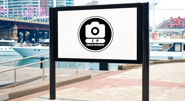
Here I will design a banner using the logo I have designed above, then I apply the banner in an outdoor mockup:
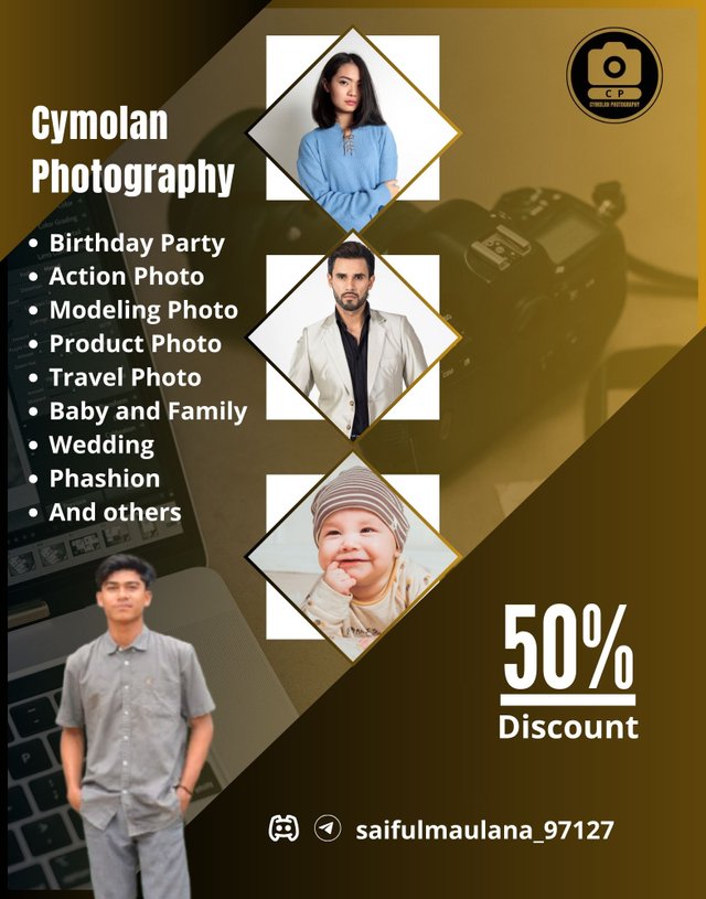
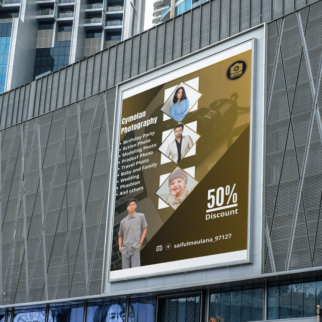
Maybe that's what I can conclude from lesson one to lesson five. Hopefully in this lesson I can apply all the design knowledge given to everyday life. thank you for all the material and knowledge that has been given by Mr. Lhorgic.
Here I will invite several other Steemians such as Mr. @muzack1, Mr. @pelon53 and Mr. @irawandedy.
By @cymolan
Hello @cymolan thank you for participating in this week's lesson. We have assessed your entry and we present the result of our assessment below.
Feedback:
Welcome back to class dear student.
Let me start by commending you for a job weldone, the effort put in this work is quite commendable. You have done a nice summary of the lesson and this you did practically which is quite commendable.I want to also salute your courage for staying through the lesson and for taking every form of correction in love and patience. I hope you would maximize all of these lesson and use them to your profiting. Thanks for staying through.
Regards
@lhorgic❤️
Terimakasih banyak atas verifikasinya pak @lhorgic
💯⚜2️⃣0️⃣2️⃣4️⃣ This is a manual curation from the @tipu Curation Project
@tipu curate
Upvoted 👌 (Mana: 4/7) Get profit votes with @tipU :)