Basics to Trade Cryptocurrency II - Steemit Crypto Academy |S6W3| - Homework Post for Professor @nane15

Hello Steemians, Welcome to another interesting week in the Steemit Crypto Academy. Today's lesson was delivered by professor @nane15 on "Basics to trading cryptocurrency". This is a continuation of the previous before the trading contest. In this lesson, some basic features of trading in the market were discussed which includes Charts, Candlestick chart, understanding timeframes, Support, resistance, etc. I will be performing the homework task in this post.

Understanding Charts, Candlesticks and Timeframes
In the financial market today, there are many tools available for traders to make trading decisions in the market. The fundamental analysis has its limitations as it doesn't reveal the demand and supply in the market. Also, there is no way past prices can be analyzed to predict future price prices. Technical analysis is no doubt a very important analysis available for retail traders to predict future prices. Let's look at some of the technical analysis tools available in the market today.
Chart
The chart is the graphical representation of the activities and events on a crypto asset. This includes the demand and supply of assets driven by the psychology of traders. The chart enables traders to identify key levels and also understand the current trends in the market.
The chart forms the basis of technical analysis to analyze and predict future prices. Traders spot different price information like chart patterns, support and resistance levels, price reversals, etc, to make trading decisions. There are so many types of charts in the financial market today. This includes a line chart, candlestick chart, bar chart, Heikin Ashi, Hollow candles, etc.
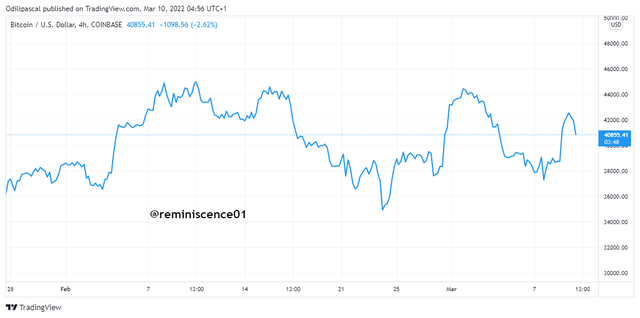
The line chart is the simplest form of a chart in the market. Most traders use the line because of its simplicity and ease of use. Traders can understand price direction by a mere glance at the line chart. The line chart is drawn by connecting the closing prices at a time interval using a dynamic. An example of the line chart is shown below.
Another important type of chart is the Japanese Candlestick Chart. The candlestick chart is the most used chart by traders in the financial market today. Though the line chart is simple, it doesn't reveal key price information like the opening, closing, and high of price. Also, it is difficult to determine the momentum in price which is triggered by the psychology and emotions of traders. The candlestick chart is an amazing way to understand price movements and interactions between buyers and sellers in the market. An example of the candlestick chart is shown below.
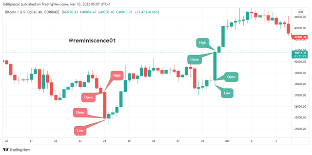
We have the candlestick in the screenshot above. We can see the formation of the candlestick represents the momentum of price and also demand and supply in the assets. The size of the candles determines the volatility and volume within a period. The chart above is a 4hr chart which means that each candlestick is formed at the end of every 4hrs. With this, traders can understand what happened between buyers and sellers in that period.
From the chart above, I have identified the anatomy of the candlestick. Looking at the chart, we can identify a bearish candlestick (red) which shows that sellers dominated price in that period. Also, we have the green candlestick(green ) showing that buyers dominated price during that period.
The bullish candlestick shows that price closed above the opening price within a period showing buying interest in the asset. Also, a bearish candle signifies that price closed below the opening price which signifies that sellers dominated the market. The candlestick chart is doubt a very important technical analysis tool in the market today.
Timeframes
The understanding timeframe is key in the crypto market and this depends on the trader's strategy. Before we explain this, let's understand the importance of the timeframes in technical analysis.
The timeframe represents a defined time a trading activity took place in the market. This can be monthly, weekly, Daily, 1hour down to one 1minute. Using the candlestick chart, for example, the formation of a candlestick represents the trading activities within the timeframe. Looking at the chart below, we have the daily timeframe.
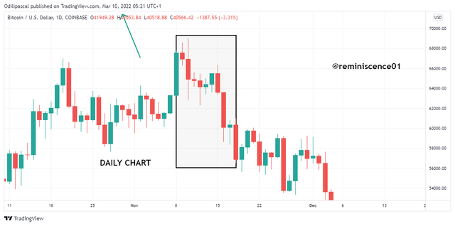
From the chart above, we have the Dialy timeframe. This means that each candle on this chart represents the trading activities and interactions of traders at the end of each day. I have selected a range of 12 candles which signifies trading activities in the past 12 days on this asset. Looking at the chart, we can see that the price has been bearish in the past 12 days. The timeframe analysis plays a major role in understanding the direction of price movements.
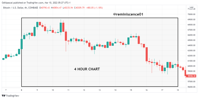
The chart above shows the 4-hour candlestick chart of the range in the past 12 days. We can see some noise and irregular movements on the 4-hour chart. But on a daily, we have a clean which helps to understand price direction better. Choosing a timeframe depends on a trader's strategy.
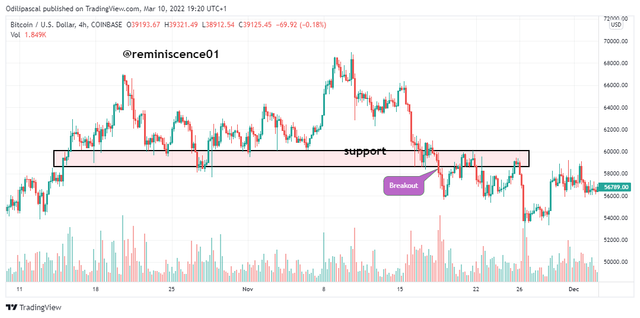
Identifying Support and Resistance on the Chart
Support and resistance levels are important levels traders look out for before making any trading decision. Support and resistance represent areas of high buying and selling interest in the market. Support and resistance levels serve as entry and exit points for traders in the market.
Aside from that, price reversals or breakouts are expected when it gets to these levels. This depends on the demand and supply of the asset. The support and resistance levels are drawn by connecting previous highs and lows of price drawn into the future. Let's look at some of the examples.
Support Level
The support level is seen as an area of buying interest in the market. This can be after a long bearish movement, the traders are booking profits out of their selling positions. This slows down price to trigger a buying momentum in the market. Price is expected to reverse when it gets to the support level. But this is not always true. During a strong bearish trend, price can break the support for a continuation of the bearish trend. An example of the support is shown below.
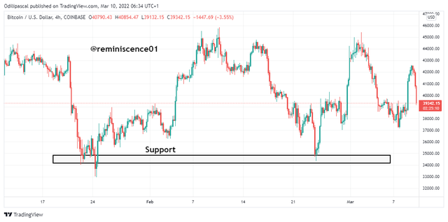
Looking at the chart above, we can see how price found support and came back after some time to retest the support again. The second time, price was rejected again and we expect price to reverse to the upside.
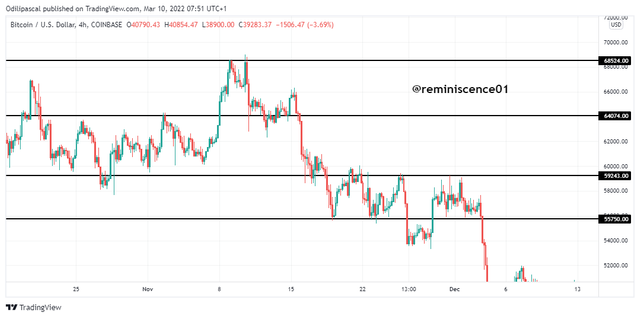
Resistance
The resistance level serves as an area of selling interest in the market. This area serves as a profit-taking area for traders. Price is expected to get rejected on the resistance after a long bullish run. Sometimes, during a strong uptrend, we tend to see price break the resistance level for a continuation of the bullish trend. Traders always stay alert to spot reversal patterns before taking a trading decision. An example of the resistance level is shown on the chart.
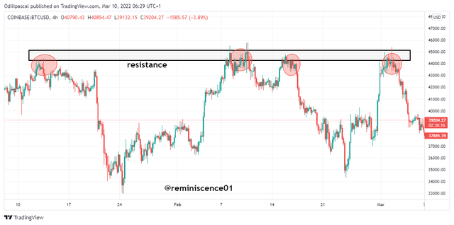
From the chart above, I have identified a resistance level on BTC/USD. We can notice how price bounces off the resistance level times each time it hits the level. This level is a strong resistance trader can capitalize on for sell positions.
Fibonacci Retracements, Round numbers, High volumes, Accumulation and Distribution zones.
Fibonacci Retracements
In a trending market, price moves in zigzag patterns creating highs and lows as it progresses either upward or downward. There are major impulse moves and retracement moves that are in opposite direction to the original trend. The retracement is a result of profit-taking by traders and an opportunity to enter the market at a low price. How do we identify these reversals to the original trend after retracement?
Fibonacci retracement tool is a technical analysis tool that helps to identify reversal points in the market. The tool has several levels where price is likely to reverse after a retracement. For an uptrend, the Fibonacci tool is drawn from a previous low point to a recent high. An example is shown on the chart below.
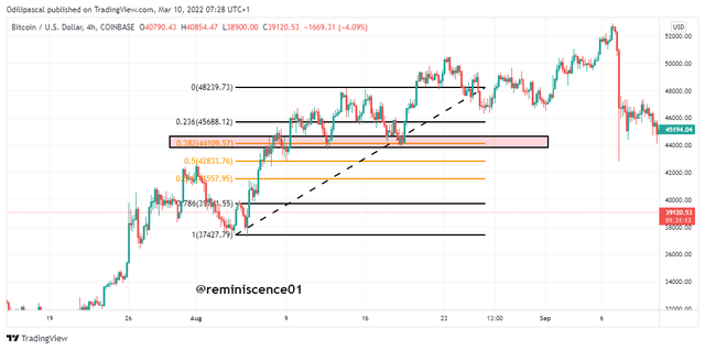
From the chart above, we can see price reversed at the 0.382 level of the Fibonacci. Understand that price can still break this level and find support on other levels.
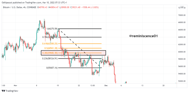
For a bearish trend continuation, we can draw the Fibonacci retracement from the previous high point to a recent low point. An example is shown on the chart below.
Round Numbers
Most traders think about an easy way of identifying key levels on the chart, especially when placing stoploss and take profit positions. We know that profit-taking and stoploss positions are exit points in the market that triggers price reversals in the market. Most traders prefer to choose a stoploss or take a profit level of 410 than 411.86. Due to the emotions and psychology of traders adopting similar round numbers, we tend to see price reactions on these levels as take-profit positions triggered.
From the chart above, we can see how price reversals at round numbers on the chart. This is a strategy a trader can adopt in setting stoploss and take profit positions at support and resistance levels.
High Volume
The volume indicator plays a vital role in the market. There's a direct relationship between price and volume and every trader has to focus on the volume indicator to determine price volatility. In the accumulation and distribution phase of the market, we tend to see price range with low body candlesticks. This is accompanied by low volumes showing that there's low volatility in the market. After price has gathered momentum, we tend to see increasing volume signifying momentum push price for a new trend.
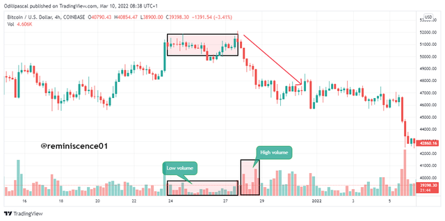
From the chart above, we can see during the distribution phase of the market, we see price range without any direction. This shows low volatility which is discounted on the volume indicator with small volume bars. After the distribution phase, price broke out of the range for a bearish trend. This breakout is reflected on the volume indicator as see increasing volume.
It is required to pay attention to the volume indicator during the accumulation and distribution phase to identify momentum in price before taking a buy or sell at these levels.
Accumulation and Distribution Zones
The market can either be in a downtrend or an uptrend. These trends are a result of the accumulation and distribution of prices. The accumulation phase of the market is seen as a profit-taking area for the big investors on their sell position. At this point, the market slows down to accumulate liquidity and bullish signals for a potential uptrend. What happened at the accumulation is that, after a bearish run, big players take profits from their sell positions by closing their trades. After that, they start opening buy positions which slow the market creating a range and bullish reversal signals. This bullish reversal signal creates excitement for buying interest in the asset. More buyers come into the market which creates high bullish volatility for an uptrend. This can further be illustrated in the chart below.
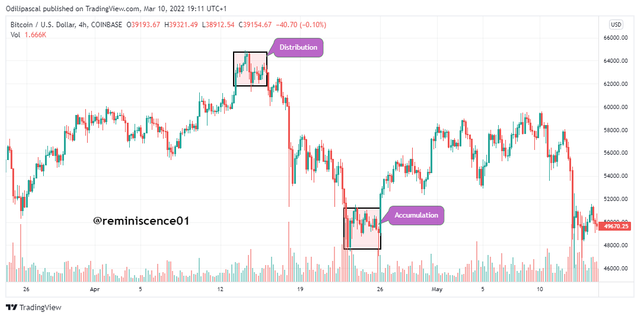
On the other hand, the distribution level represents an area of selling interest and profit-taking from buy positions. After a bullish run, there is a loss of momentum and volatility as we see price ranging without any direction as a result of selling interest in the market. Price declines as more selling pressure enter the market. This is accompanied by increasing volume as explained in the previous section.
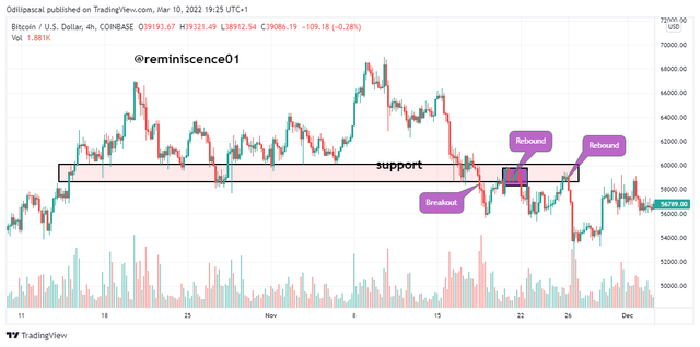
How to correctly identify a Rebound and a Breakout
Trading support and resistance level are quite difficult. This is why these areas are often used as exit points. The reason is that, when price gets to this level, it can reverse back down or break the level to continue the original trend. Also, when price break this level, a trader can be tricked into a false breakout and this can lead to losses. In this section, we will be identifying a breakout and a rebound that confirms a broken level.
From the chart above, we can see a breakout of a support level. Price retested this support level multiple times until more selling pressure entered the market to break the support level for price to continue going down.
After price broke the support level, we can see that price came back up to retest this level turned resistance. This is known as a rebound as it confirms the break of the support level. After the rebound, price is expected to reverse back down. Only then can a trader execute a sell trade. If price doesn't reverse after the rebound, then the breakout is seen to be invalid. An example of a rebound is shown on the chart below.
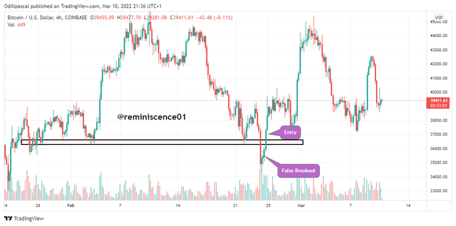
False Breakout
From our explanation above, it is difficult and risky to trade at support and resistance levels as price is mostly manipulated at these levels to generate liquidity by the big players. Normally, it is expected that price reverses at key levels. Most retail traders place sell orders at resistance and buy orders at support levels. Stoploss for these orders are placed above and below the levels. Then we see price break out of a level to hit the stoploss placed above and below these levels.
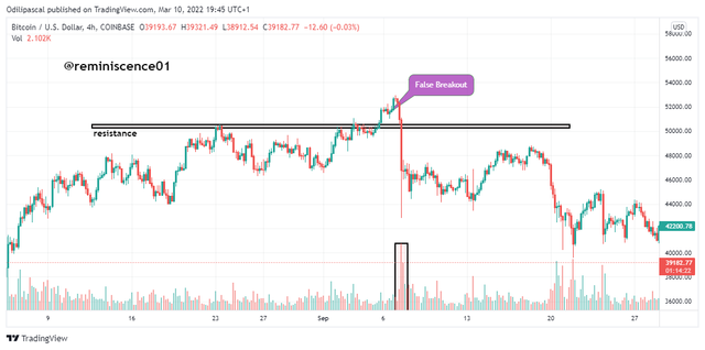
This breakout will force the retail traders out of their positions to open a buy trade in the direction of the breakout. After that, we see price reverse back into the broken level forcing them out of the market again.
An example false breakout has been shown on BTC/USD chart above. Traders can avoid this false breakout by waiting for a rebound before executing a position.
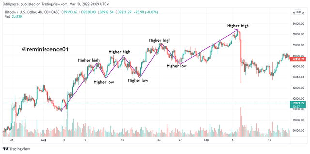
Understanding Trends Trading following the laws of Supply and Demand
Understanding trends is essential in the market. Normally trends occur due to supply and demand in the price of an asset. During the accumulation state, we see price in a neutral direction ranging. When demand exceeds supply in the market, price breaks out into an uptrend forming higher highs and higher lows. This uptrend is accompanied by increased volume in the market. An example is shown below.
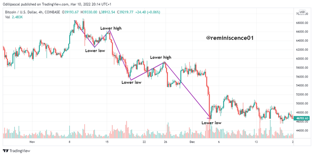
Similarly, a downtrend occurs after the distribution phase when supply exceeds demand in the market. Price is seen to be creating lower highs and lower lows with increasing volume. An example is shown on the chart below.
How to place entries and exit orders following the laws of Supply and Demand
Final retracement following Elliot waves(a, b, c).
For this strategy, we will have to confirm the end of a trend and then draw the corrective waves of the Elliot waves theory. The corrective waves confirmed that the previous trend has ended and a new trend is kicking off.
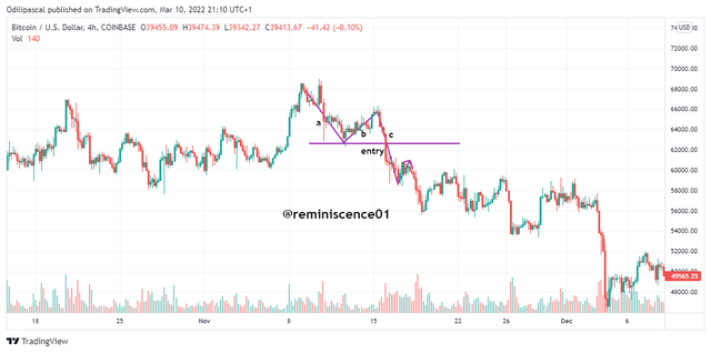
To confirm this, corrective wave c must have less trading volume than 'a. Wave 'b' is seen retracing higher than the previous low before the formation of wave 'c'. These corrective waves form the beginning of a new trend with a higher low for a bullish trend and a high for a downtrend. Entry for this trade is seen at the previous low of waves 'a. Stoploss for this position is placed above the recent high of wave 'b' with a 1:1 or 1:2 risk-reward ratio.
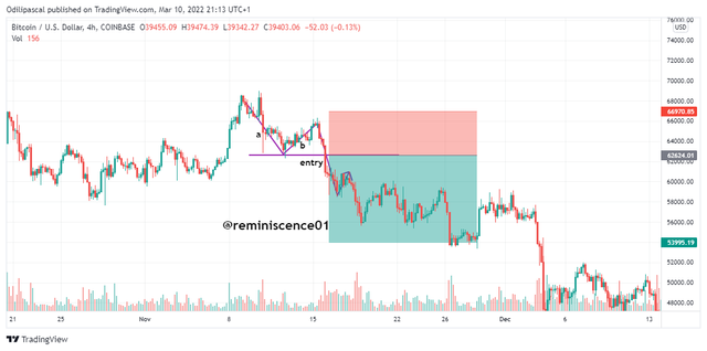
Image Source: Tradingview.com
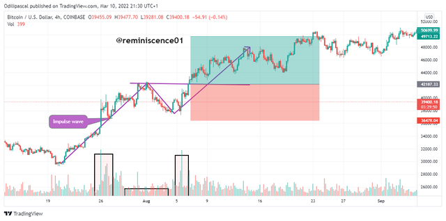
Entry after Pullback
During a trending market, price creates higher highs and higher lows as it progresses. We have the impulse wave which is in the direction of the original trend and also the retracement which is in opposite direction. This retracement serves as an opportunity to enter the market before the next impulse wave. The retracement is accompanied by low volumes while the impulse wave is accompanied by high volume.
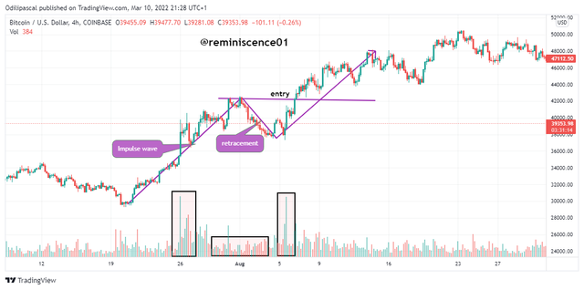
For this strategy, an entry is seen as price reverse back after retracement at the break of the previous high for an uptrend and a previous low for a downtrend. Stoploss for this position is placed below the current previous peak formed by the retracement with a 1:1 or 1:2 risk-reward ratio.
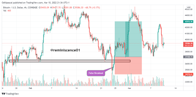
Market Trap
In this strategy, we can take advantage of the false breakout by the big players. Price is being manipulated to trap retail traders to generate liquidity. This is seen where price breaks out of a level and after a short time, we see price close back below or above the level. We can enter a position as price reverse back into the level after a false breakout. This can be seen in the chart below.
Just like in the previous sections, stoploss for this position is placed below the key level of support or resistance with a 1:1 or 1:2 risk-reward ratio. An example is shown on the chart below.
Demo Trades on a Crypto Asset pair
In this section, I will carry out a real transaction on the Binance exchange. The trade analysis will be carried out on Tradingview.
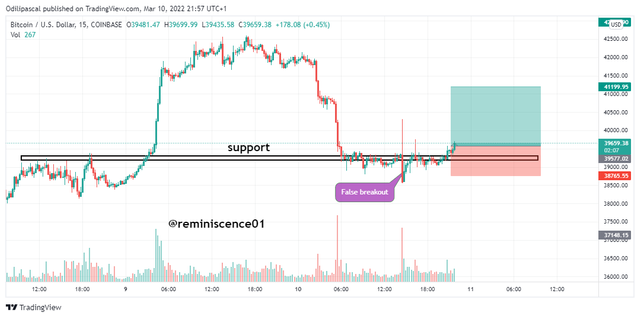
BTC/USD
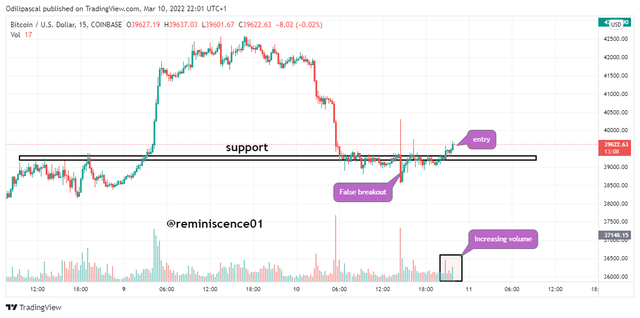
Looking at BTC/USD 15mins chart, I noticed a false breakout of a support level. Here, I will be taking advantage of the market trap strategy. Price broke a support level with a bearish candle. After that, price reversed back and was ranging on the support. At this point, the volume was low which shows low momentum to support the bullish movement. I wait for an increased volume as price started moving. Then I took a buy trade with stoploss placed below the support level. Take profit is set at a 1:2 risk-reward ratio. This is shown below.
Conclusion
In this study, we have discussed some important trading tools with emphasis laid on key levels in the market. Trading is simple if we can have basic knowledge of trading and simple strategies. Traders need to focus on identifying key levels and how price react when they get to these levels. Also, stoploss should be placed at strategic positions are explained in this lesson.
Thank you professor @nane15 for this amazing lesson.