"SEC20/WK2: Colour Theory and Application."
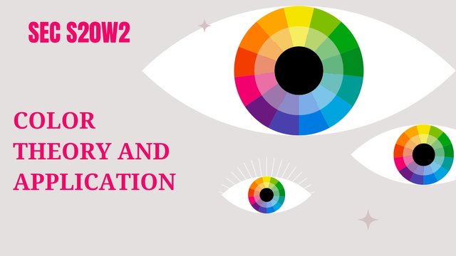
Color theory is a most charming realm in which art, psychology, and physics converge. Now this is my understanding about Color theory;
Color Wheel
Color wheel is a round presentation of variety of colors that shows their relationships.
• Primary colors used in color theory are Red, Yellow, Blue because they can't be created after mix up with other colors.
• Secondary colors include Orange (Red+Yellow combo), Green (Blue+Yellow combo), Purple (Blue+Red combo) so these are secondary as they can be created by mixing two different colors.
• Tertiary colors are Yellow-Green, Blue-Green, Red-Orange etc that can be made up by mixing some other colors.
Color Harmony
Color harmony defined as visual appealing alignment of diverse colors.
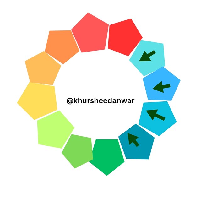
- Analogous: Almost similar colors like Blue, Green, Yellow-Green.
- Complementary: Directly opposite colors like Blue, Orange.
- Triadic: Colors with proper equal spacing like Blue, Yellow, Red.
Color characteristics
• Hue:Real color like Red, Blue
• Saturation:Intensity of color like bright, dull.
• Value:Lightness or darkness like light, medium, dark etc.
Color emotions
Colors may impart emotions and convey meaning:
- Red is a sign of passion, energy
- Orange is a sign of creativity, enthusiasm
- Yellow is a sign of happiness, optimism
- Green is a sign of growth, harmony
- Blue is a sign of trust, calmness
- Purple is a sign of luxury, creativity
Color Theory Application
It's applications is in different fields;
- Art and Design
- Branding and Marketing
- Interior Design
- Fashion
- Packaging
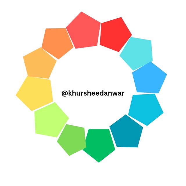
Analogous Color Scheme (Harmonious)
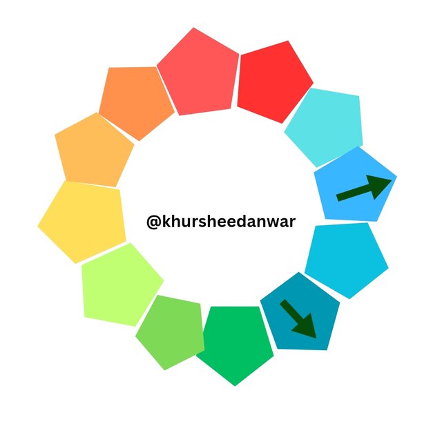
In this color scheme colors seems to be next to each other at color wheel like Blue, Green, Yellow-Green.It is a color scheme which gives a much cohesive look.If there are backgrounds or textures then this scheme is suitable.It involves same lightness and saturation while choosing colors.
 |  |
|---|---|
| ✅ | ❌. |
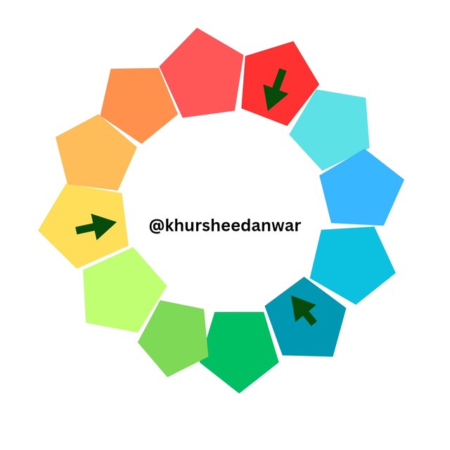
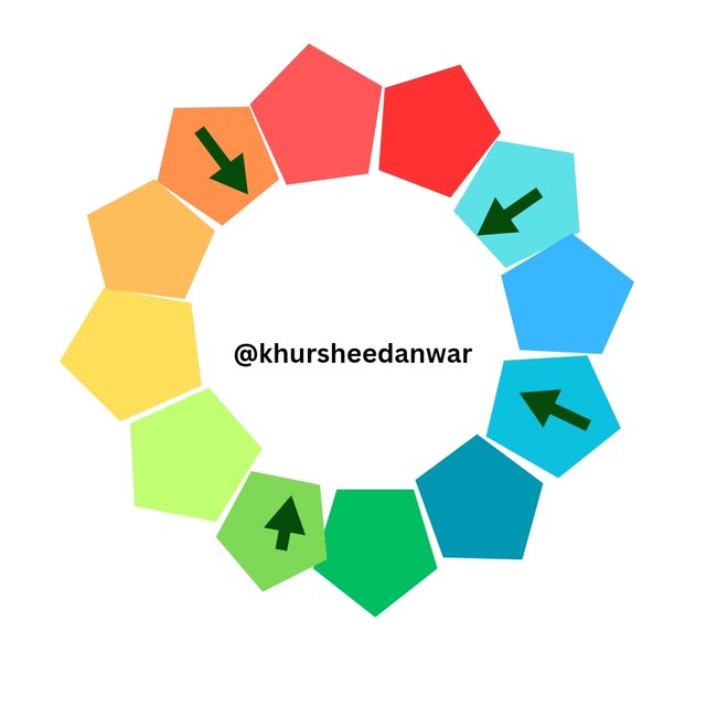
Triadic Color Scheme (Vibrant)
This is a color scheme in which color usually seems to be spaced from each other in a equivalent way at color wheel.As an example you can take Blue, Yellow, Red.It looks very balanced but vibrant also.This scheme is perfect for logos and branding etc.
 |  |
|---|---|
| ✅ | ❌ |
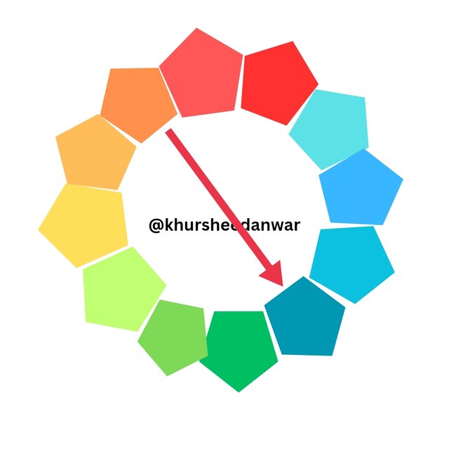
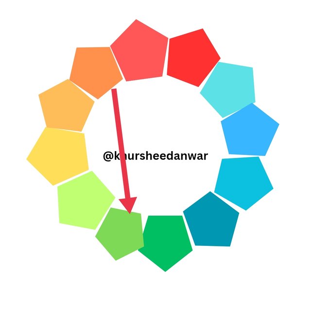
Complementary scheme
• Directly opposite colors.
 |  |
|---|---|
| ✅ | ❌ |
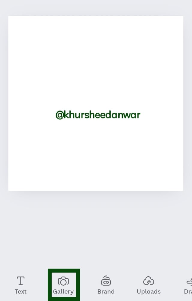
• I opened canva app and select a 1080×1080 dimension Instagram blank post.
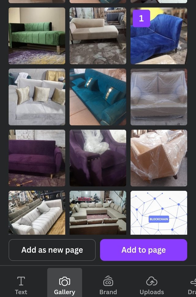
• At bottom I locate gallery option.I click on it.
 |  |  |
|---|
• I saw different pictures of my gallery.I choosed 1 from them randomly.Then I clicked on Add to page.
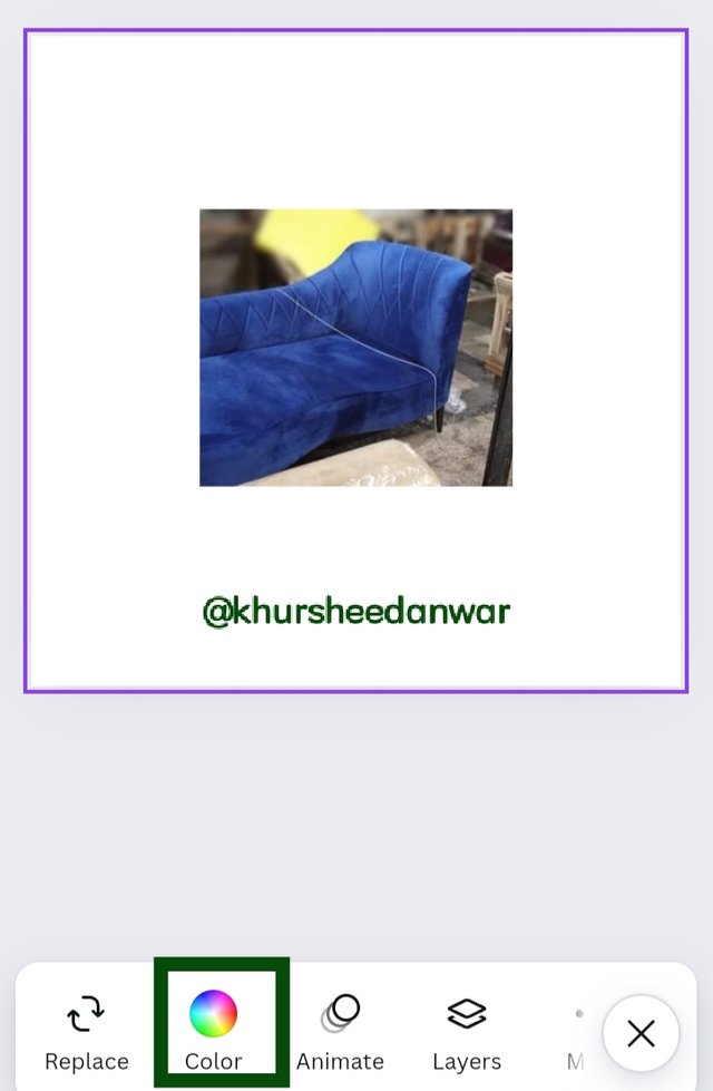
• That selected image then moved to blank post.Then I select whole post so that I may have color option.
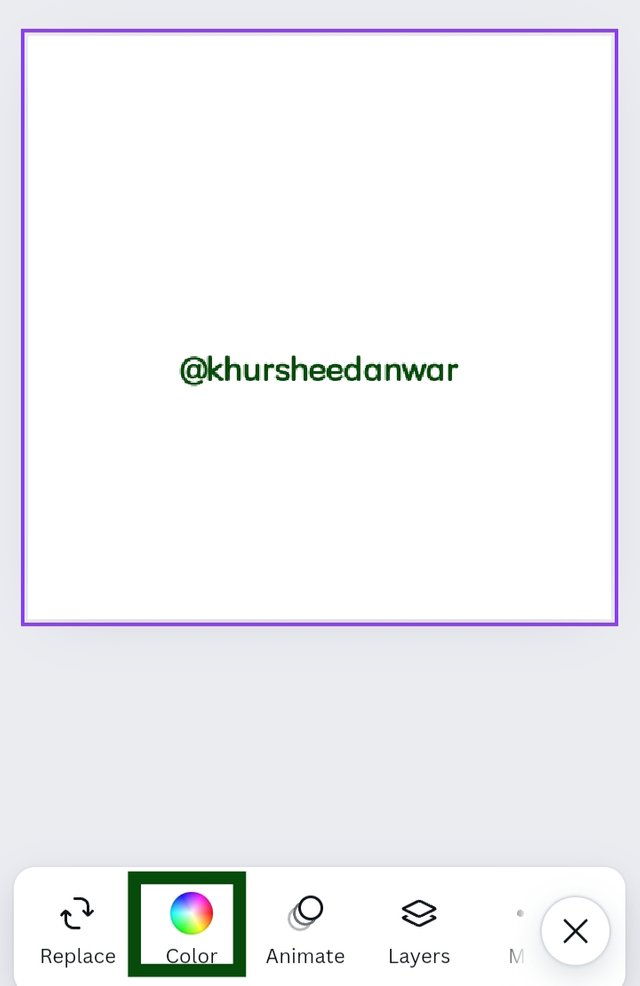
• Finally I saw color icon and click on it.
 |  |  |
|---|
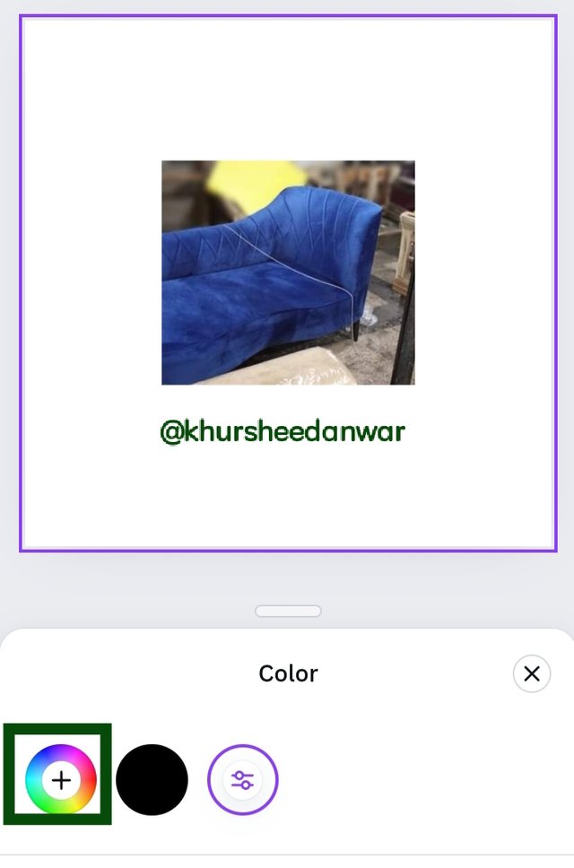
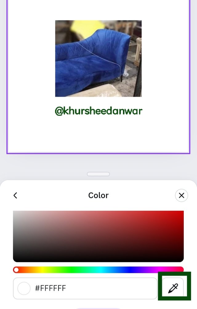
• I click on color icon and then color wheel was opened.At bottom of very next page I saw a marker like icon so I click on it for searching 🔍 🔎 hex code.
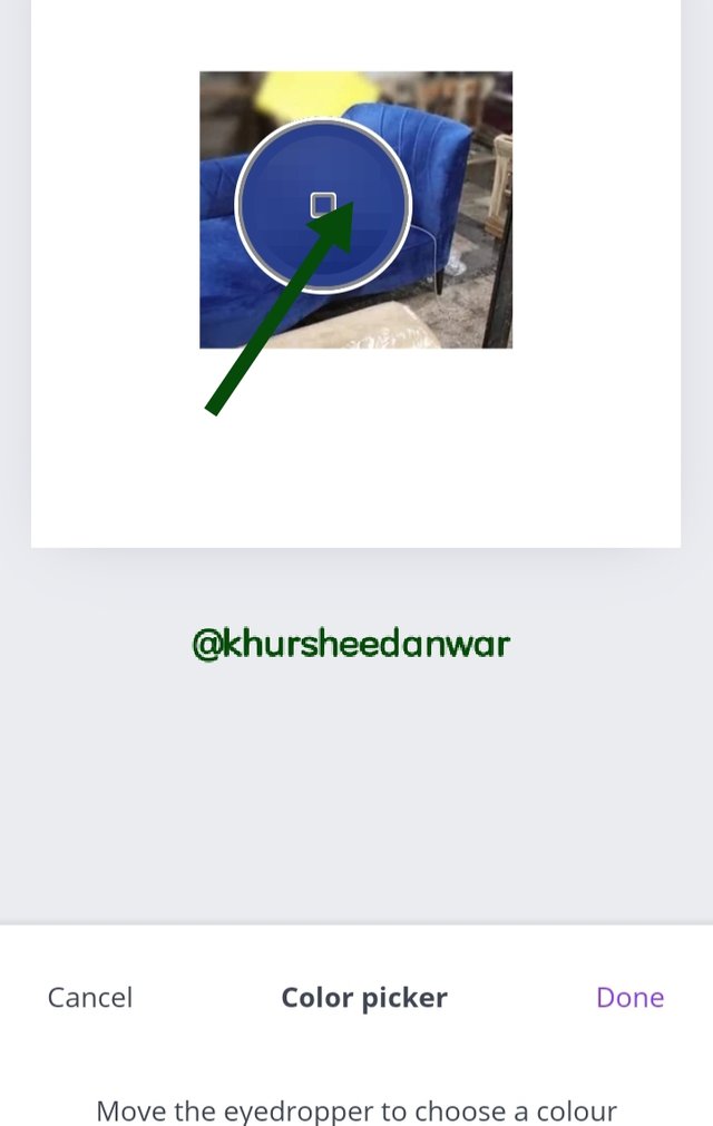
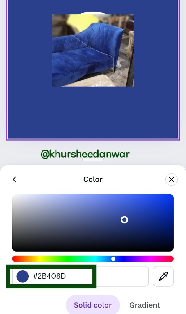
• I saw a magnifying glass like sign at my imported image so I moved that sign to dark blue color and then I click on done option as seen in image.
 | My final hex extraction |
|---|
• After I was done with it,I finally successfully got my hex code of dark blue color which was 2B408D.
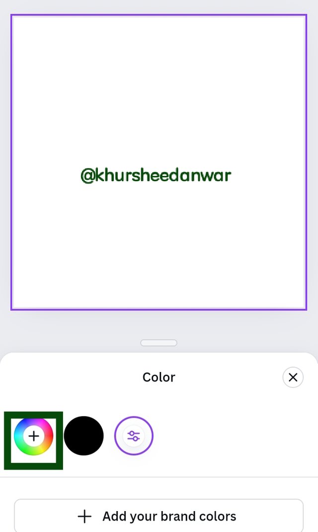
• I opened canva simply and again selected Instagram blank post.I select it and then I saw colors option.
 |  |  |
|---|
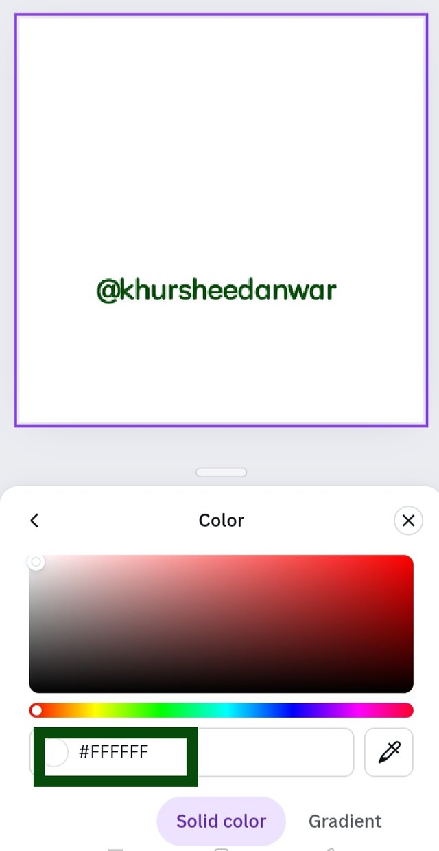
• After that I click on color icon and locate color wheel.
• After locating color wheel already there was a randomly generated hex code which I removed by erasing the text.
 |  |  |
|---|---|---|
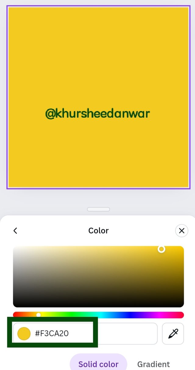
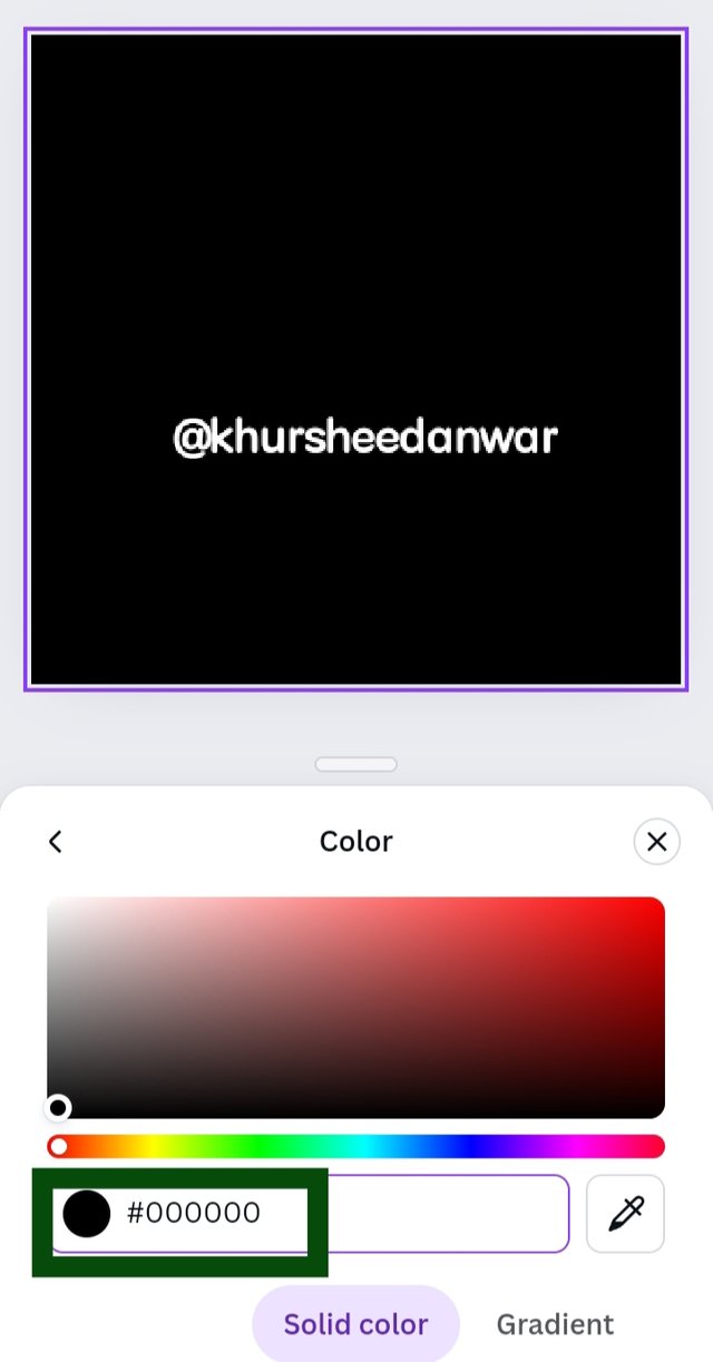
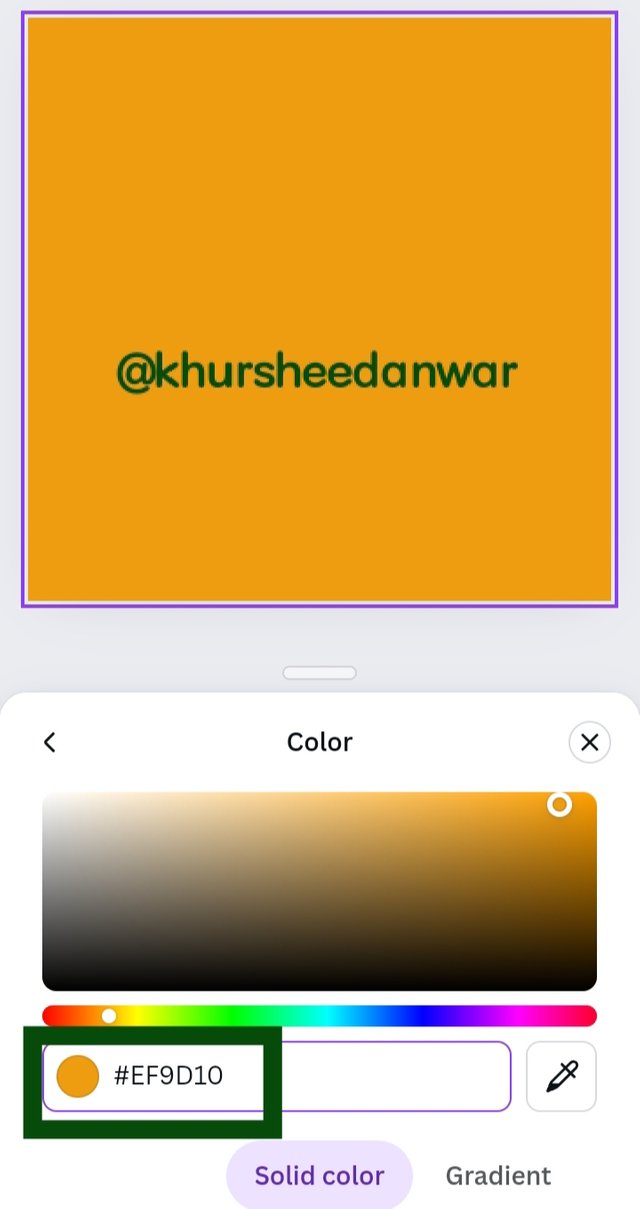
| #f3ca20 | #000000 | #ef9d10f |
• One by one I put hex codes and take screenshots.
• First I put there #f3ca20,then #000000and at last #ef9d10f and I got yellow,black , orange colors respectively.
I want to invite @mile17,@patjewell,@simonnwigwe to participate
Since you do not respond
I like to know why you @sahar78 as an administrator don't answer and prizes are not paid to the winners in knack4buzz @hive-135004.
cc @yancar @wakeupkitty @khursheedanwar
Dear @wakeupkitty.pal !
About which contest prize you are talking? Because I have checked and see that weekly nominations prize and photo story diary contests are paid through community account! Regarding @sahar78 contest(It is not expired yet)
Please lemme know if still any prize is pending!I appreciate you!
Thanks!
she just said she paid but @yancar still waits to. It might be a good thing to transfer it to him so he can pay for a month. Note the film contest will end tomorrow.
Your post has been upvoted in the steemexclusive tag. Subscribe our community for any post related to lifestyle.
Take part in the contests going on this week in our community.
@tipu curate
;) Holisss...
--
This is a manual curation from the @tipU Curation Project.
Upvoted 👌 (Mana: 0/7) Get profit votes with @tipU :)
Your post has been rewarded by the Seven Team.
Support partner witnesses
We are the hope!
¡Saludos amigo!🤗
Hay una línea muy delgada entre la armonía y contraste de colores por ello, conocer esta teoría nos impedirá cruzar ese margen ya que, sin querer queriendo muchas veces cometemos ese error de dejarnos llevar por la atracción que sentimos hacia ciertas tonalidades.
Te deseo mucho éxito en la dinámica... Un fuerte abrazo💚
Hello @khursheedanwar thank you for participating in this week's lesson. We have assessed your entry and we present the result of our assessment below.
Feedback:
• You have clearly defined Colour theory the way you best understand it and I appreciate the effort you put into it.
• Your selection on colour scheme is nice.Good to see that you clearly demonstrated how much you understand the use of those scheme which is quite commendable. However your example for analogous colour is a bit overboard. By definition, you're to select three on the colour wheel and not 4.
• Finally, Your practical looks really nice in it presentation, looking very organized and comprehensive. In all you did a good job, I hope you keep it up. Weldone.
Regards
@lhorgic❤️
The use and theory of color is so beautifully explained that it becomes highly relevant for creative work. Good luck for the contest.