SLC21/WK3: Logo Design - Part 2
It feels so good to join the class for this week and I welcome you all to this publication. This is logo design part 2 and I hope to make it fun for us.
 |
|---|
Discuss about each of the logo types we have and then talk about conditions when such logo should be used and when not to be used for a brand. You can do a little research to aid you. |
|---|
WordMark Logos
This is a typography-based logo that makes use of customized or modified font to represent a brand.
Conditions for use:
WordMark logos are appropriate for brands that has a strong, unique name or a name that is easly rememberable. They are images or mental pictures for brands that desire to establish a derf, professional identity.
Conditions for not using:
WordMark logos may not be appropriate for brands that had a long or convoluted name, or for brands that want to relay a extra playful or inventive image.
Monogram Logo
This is a type of logo that uses a coalescing of letters, mostly the initials of a brand or person.
Conditions for use:
Monogram logos are appropriate for brands that require to establish a derf, classy identity. They are optimal for fashion brands, luxury brands, or individual brands.
Conditions for not using:
Monogram logos may not be appropriate for brands that have a lengthy or complicated name, or for brands that want to relay an extra playful or creative image.
Brandmark Logo
A Brandmark logo is a type logo that makes use of symbols or icons to represent a brand.
Conditions for use:
Brandmark logos are appropriate for brands that desire to establish a derf, recognizable identity. They are optimal for brands that require to relay a particular message or value.
Conditions for not using:
Brandmark logos may not be appropriate for brands that have a weak or unexplicit message, or for brands that desire to establish a much professional or classy identity.
Abstract Logo
Abstract logos are logos that represent a brand utilizing a non-representational symbol or shape.
Conditions for use:
Abstract logos are appropriate for brands that desire to establish a unique, strong identity. They are optimal for brands that desire to relay a sense of creativeness or innovation.
Conditions for not using:
Abstract logos may not be appropriate for brands that desire to relay a particular message or value, or for brands that require to establish a more classy or professional identity.
Mascot Logos
This is a logo type that represent a brand with the use of a mascot or character.
Conditions for use:
Mascot logos are appropriate for brands that needs to establish a friendly and approachable identity. They are optimal for brands that desire to relay a sense of amusement or playfulness.
Conditions for not using:
*Mascot logos may not be appropriate for brands that need to convey a sense of seriousness or sophistication, or for brands that need to form a more classy or professional or identity.
Emblem Logos
An Emblem logo is a type logo that utilizes symbols or icons enclosed or confined by text or a container.
Conditions for use:
Emblem logos are appropriate for brands that need to establish an intense, traditional identity. They are optimal for brands that need to send a sense of tradition or heritage.
Conditions for not using:
Emblem logos may not be appropriate for brands that need to relay a sense of simplicity or minimalism, or for brands that need to establish an extra modern or innovatory identity.
Combination Logos
A Combination logo is a type of logo that makes use of a coalescing of text and symbols or icons.
Conditions for use:
Combination logos are appropriate for brands that want to establish a strong, versatile identity. They are ideal for brands that want to convey a sense of balance or harmony.
Conditions for not using:
Combination logos may not be appropriate for brands that need to form a more simple or minimalist identity, or for brands that want to relay a sense of innovation or boldness.
In conclusion, every logo type has its vigor and frailty, and the choice of logo type is dependent on the brand's values, target audience, and message.
Pick any two (2) of the Logo types discussed and then practically demonstrate how to make them, showing your detailed process. |
|---|
For this question, I will be an Emblem logo and a combination logo.
Emblem Logo
Step One: I choose a shape (shield) that best suits my design concept.
 |
|---|
Step Two: I put lines in the shape I have made to give it another look.
 |
|---|
Step Three: The third thing I thought of and implemented was to put the initial of the brand name in the shape. This gave me a nice look
 |
|---|
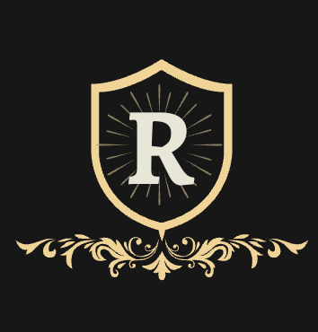
Step Four: I put a flowered design at the base of the shape to further beautify it
 |
|---|
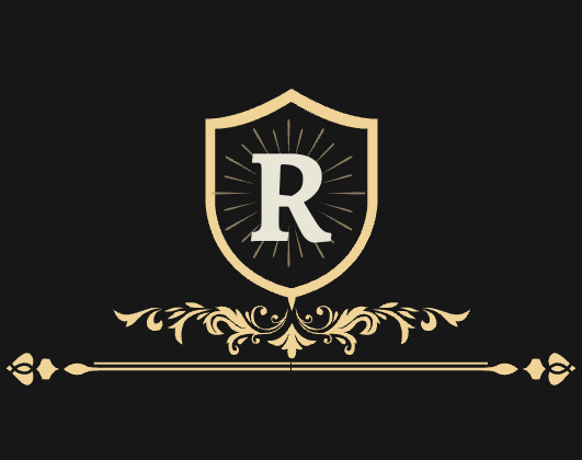
Step Five: Thereafter, just below flower at the base, I added straight lines with some little touch of design at the both ends. I guess it gave it different look and a reason to go further.
 |
|---|
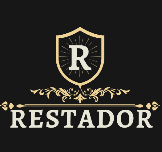
Step Six: I put the brand name just below the designed lines. I guess that's the most suited place for me to have placed it. The design continues...
 |
|---|
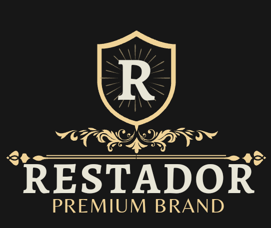
Step Seven: I added a little description of the product that portrays it as a superior quality brand.
 |
|---|
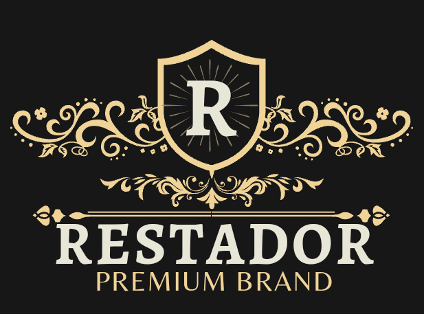
Step Eight: I thought of another touch I would give to it and that was to add a flowered wing-like design to the both side of the shape. This really gave me a nice look and the guts to think of more touches as one step offers me an idea for the next.
 |
|---|
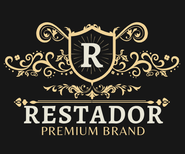
Step Nine: The next thing I thought of was to add another wing-like flower design at the two edges of the shield and a little touch at the center top edge. After this I envisioned another concept which was to put a crown on the shield and that was it.
 |
|---|
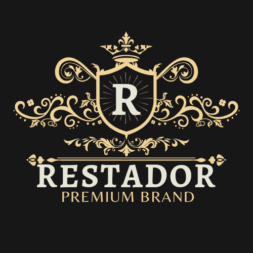
Puting a crown on the shield appeared to me that there is no further thing to design. So this is what I came up with for an emblem logo.
 |
|---|
Combination Logo
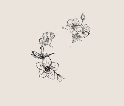
Step One: Based on my concept or what I have in mind to do, I created some flowers and put them in positions that suits my concept.
 |
|---|
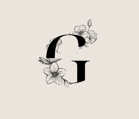
Step Two: Since it is a combination logo, I put the initial of the business name between the flowers as I envisioned.
 |
|---|
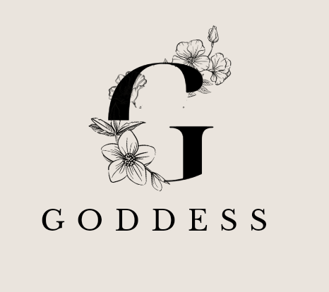
Step Three: I added the brand name just below the initial and the flowers. It gave me a perfect outlook.
 |
|---|
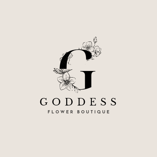
Finally, I added a description of the business and it gave me what I have here.*
 |
|---|
Design a simple flier for your brand and then strategically place one of the logo you made in the flier. |
|---|

Thanks for reading, I am inviting @roselove, @databae and @lovelystar
Enjoyed reading your blog and your logo design is beautiful. You presented it step by step.
Thanks for engaging
Dear User!
Endeavour to share your post on X (Twitter) channel with the tags #steemit #steem $steem.
Exception for those where media isn't in use*
Noted