SLC21/WK1: Introduction to Gradients and Application.

Hello teacher,
As a good student, I will be doing my homework tasks which were given by our Teacher @lhorgic. You have made the lecture look super easy and understandable and I understood everything you did, which I also took practical steps towards.
This week's theme is on gradients and their practical application. I love designing so I'm definitely on this one.
As a science student, I have come across the word gradient in my school days. This was mostly used in my physics practical, we know gradients as a rate of slope or inclination of a physical quantity. This was just a physics understanding of Gradients but bringing it to graphics design, that physics understanding plays a crucial role here.
Gradients are gradual changes between colors, either two or more colors, which transition smoothly. Gradients makes a gradual and less noticeable change between colors. Imagine I wanted to merge two different colors, it will be very easy to know that these colors were merged because you will easily find the border between these two colors.
I will be mentioning types of Gradients as requested in the homework.
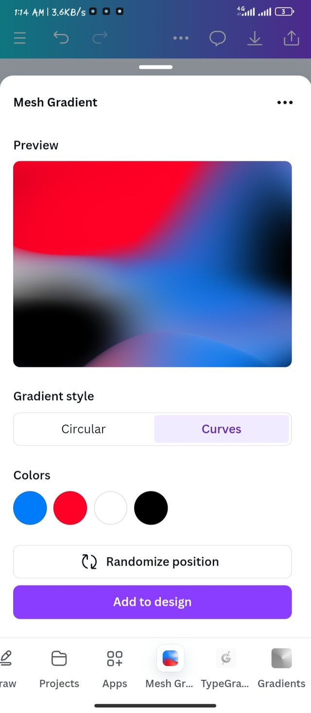
- Mesh Gradient
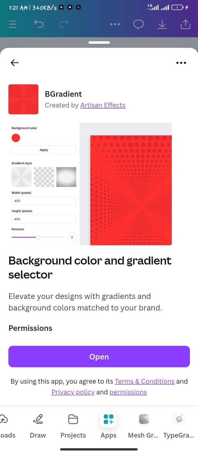
- B Gradients
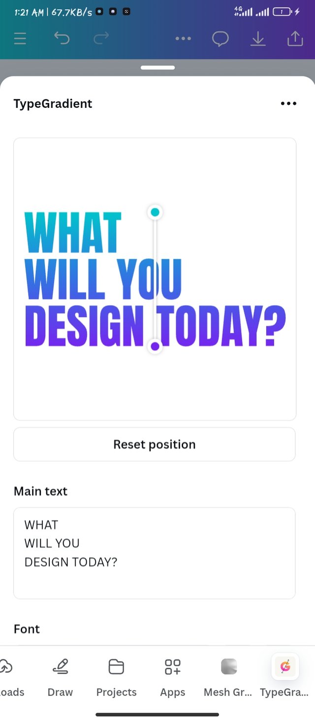
- Typegradient
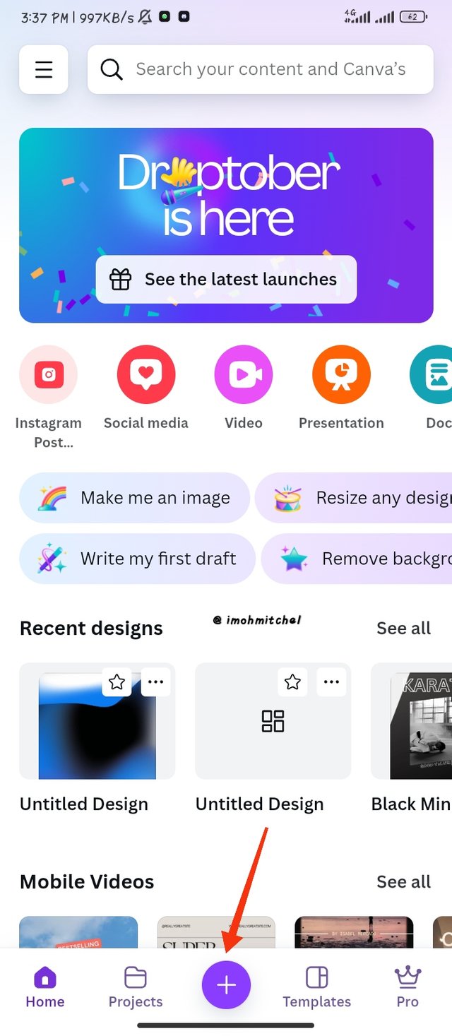
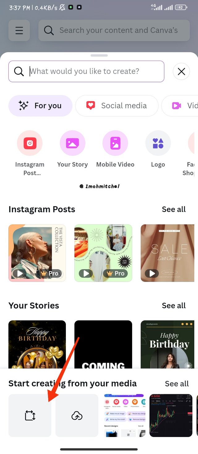
Steps : To create gradients in canva mobile app, I opened my canva and I immediately click kn the plus icon as i have indicated with a red icon, this plus icon will help me get started with my workspace.
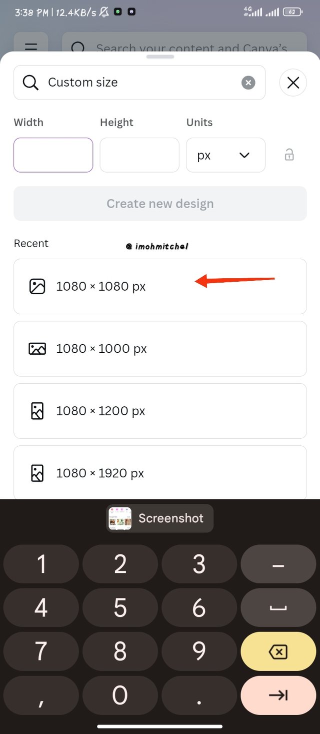
The second step which is in the frame is that I clicked on the crop icon shape tool to make a custom workspace.
I quickly used the 1080 x 1080 for my workspace
 |  |  |
|---|
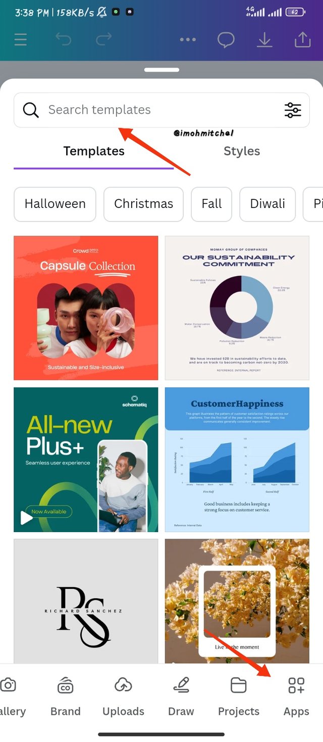
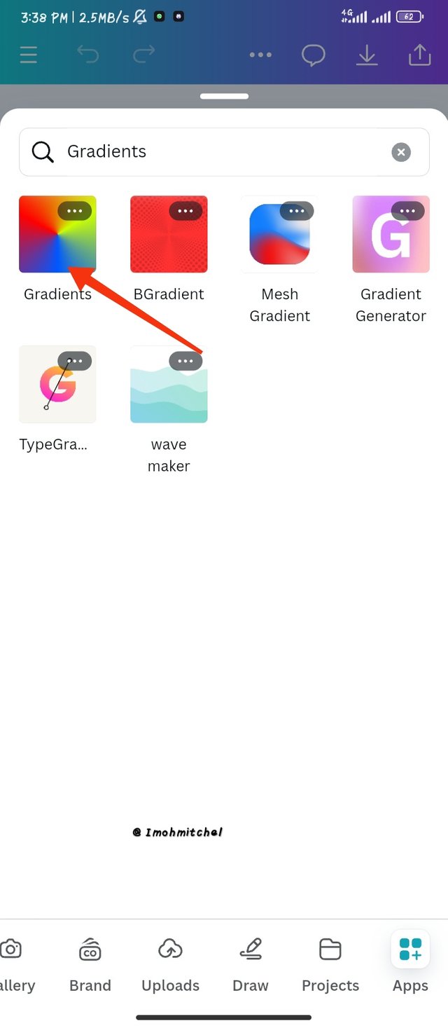
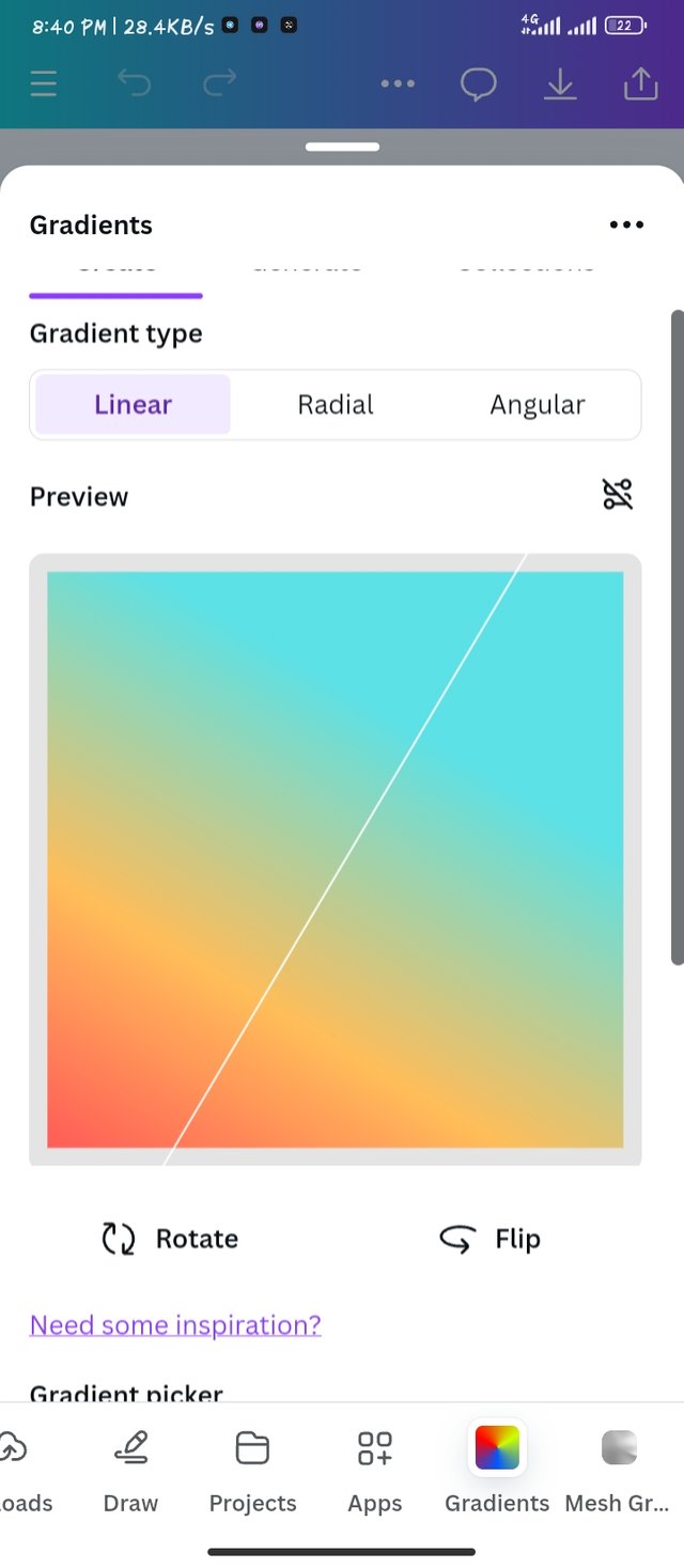
- As my workspace was ready I went to apps then I click on the search bar, I typed in "Gradients" which brought in the next page as shown in the second frame. I clicked on the first gradient to make my Gradient colors.
 |  |
|---|
- Step 1
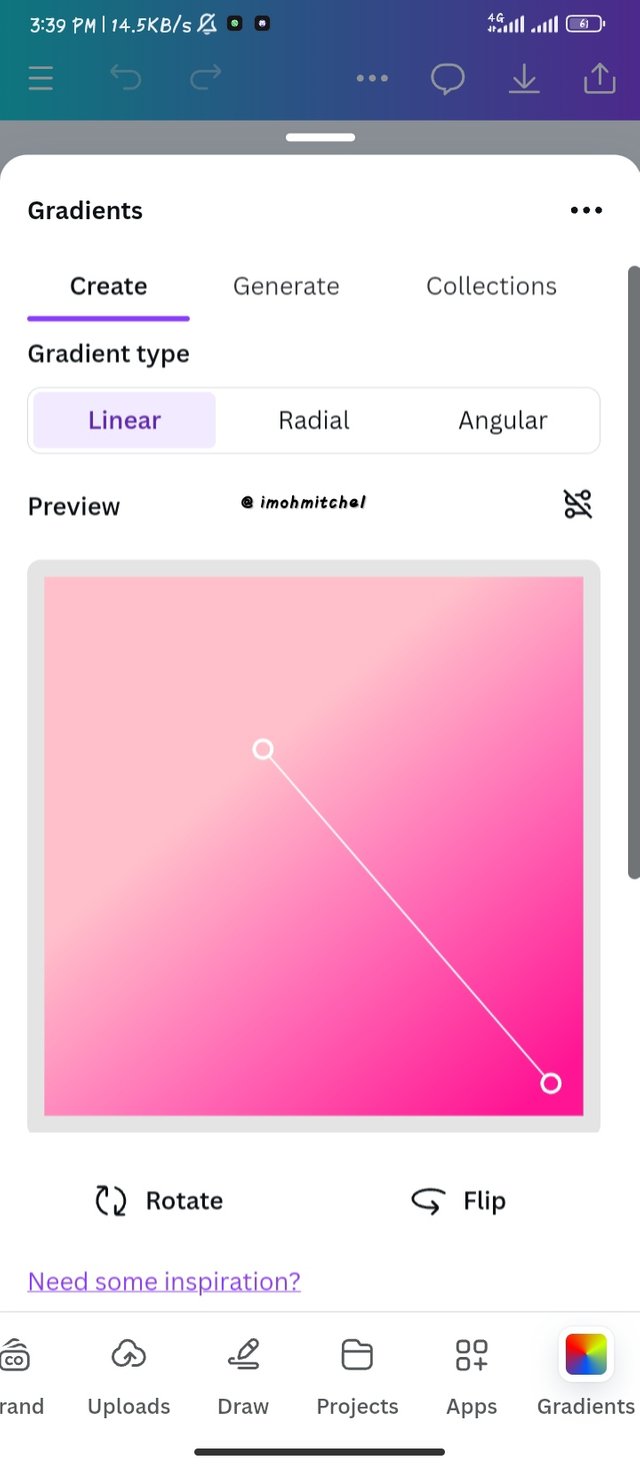
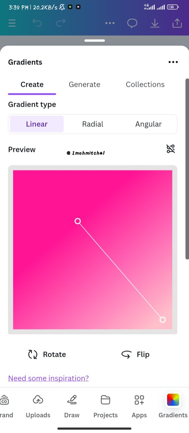
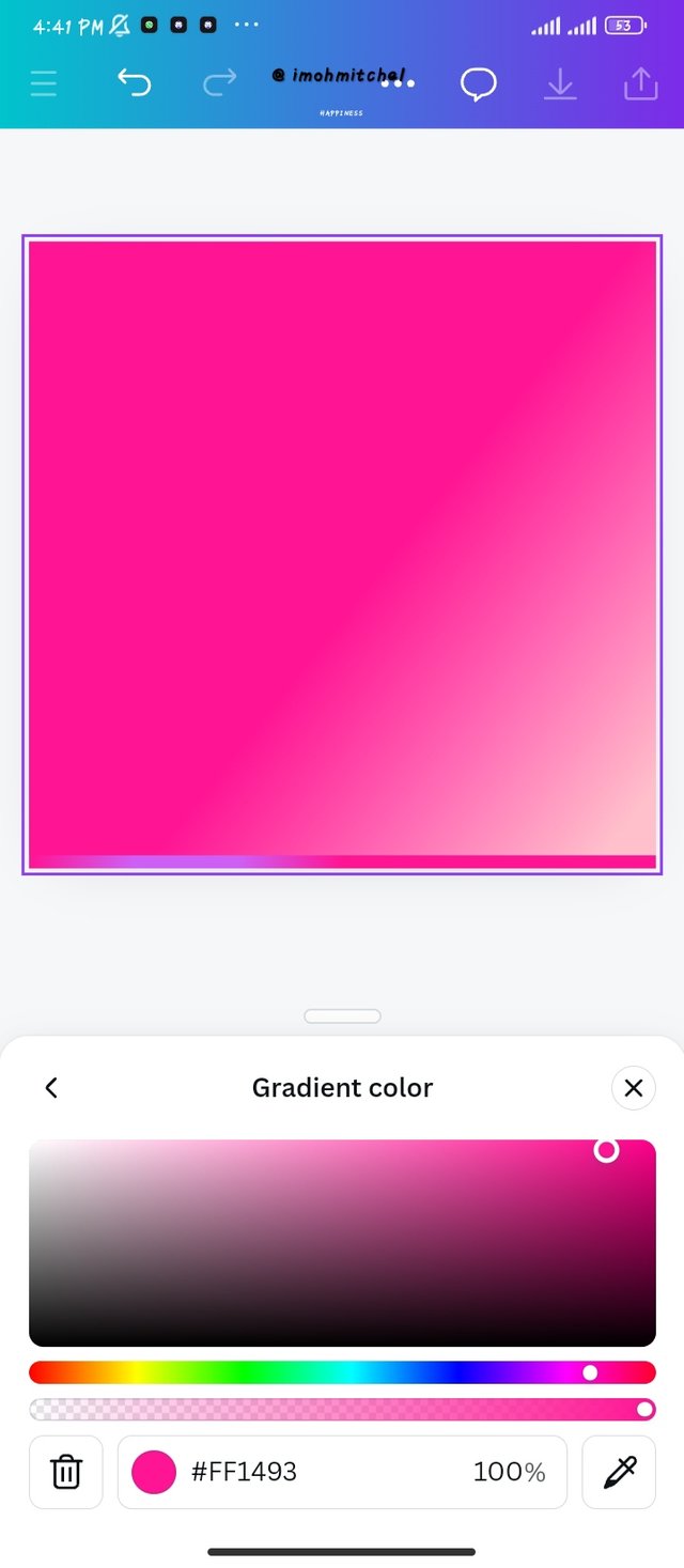
- Creating my gradient with one color, I clicked on the pink color, using the linear gradient type and I also made a flip in the second frame which just flipped the colors by changing its position. Here is my color hex for the pink color #FF1493.
 |  |  |
|---|
- Step 2
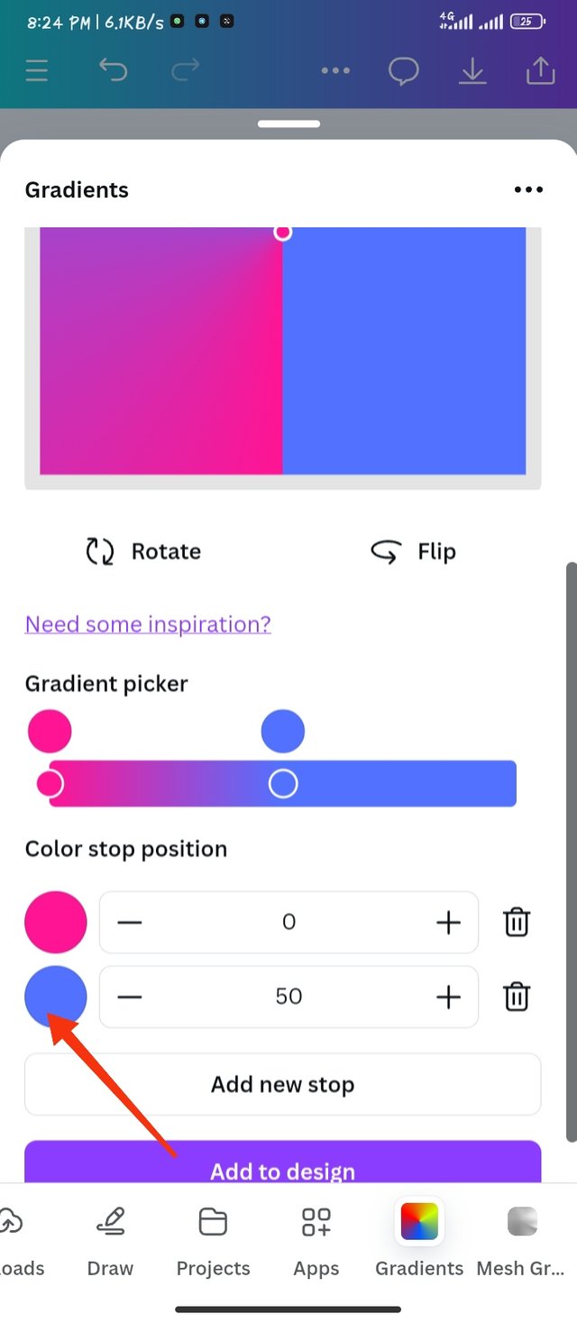
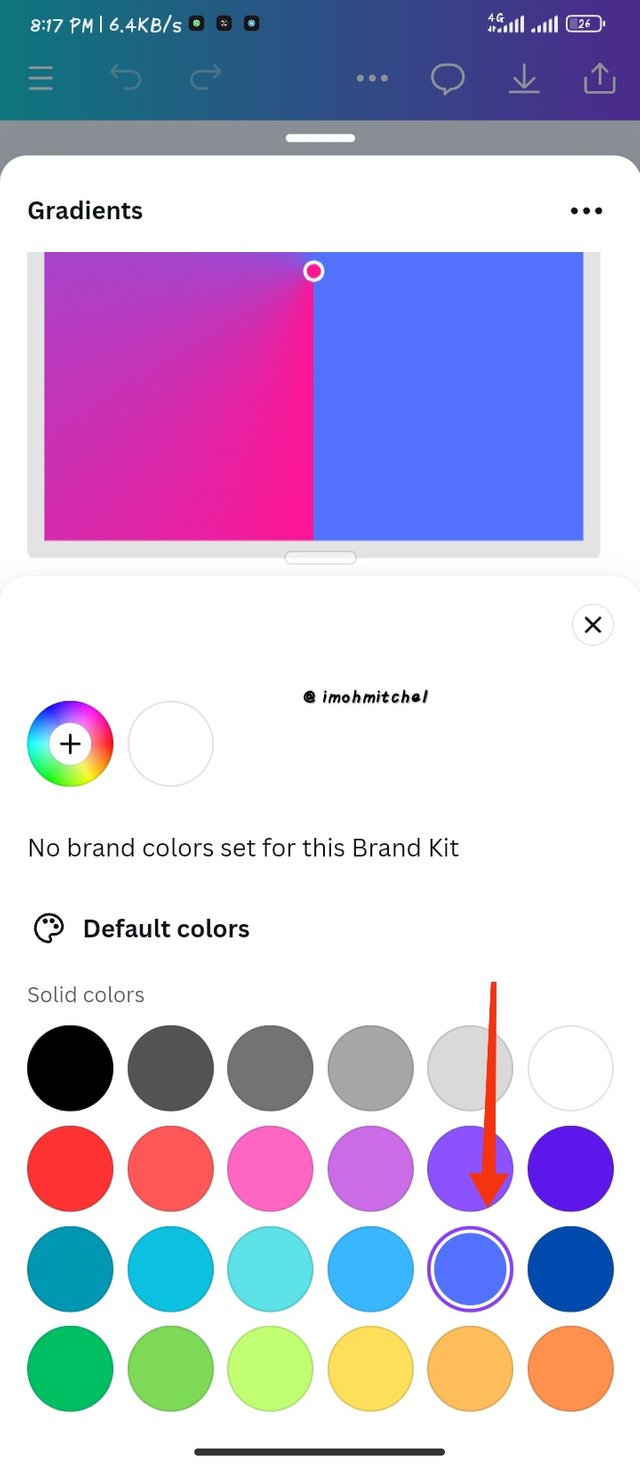
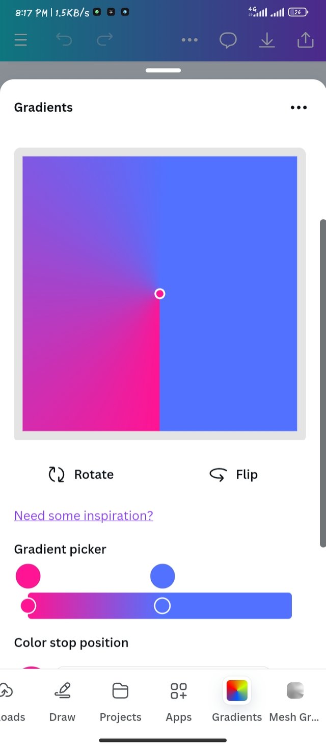
creating two colors in Gradient is quite simple, firstly you will click on one of the colors as shown in the first frame.
lists of photos will appear as shown in the second frame, as you can see I selected blue color which will now be applied to my Gradient. The Gradient type I changed to here is my angular gradient. This is a two color gradient now moving to three colors.
 |  |  |
|---|
- Step 3:
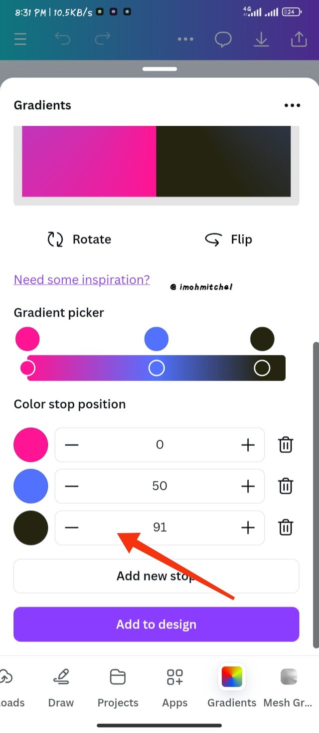
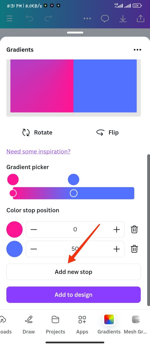
To create a 3 color Gradient, I click on the "add new stop" to add another color.
click on the color icon to give you options to many colors you can choose from.
I didn't like the color combination so I changed it to the 3rd frame
using these colors I was able to bring out something nice using these three colors.
Color hex
#76ebeb for the sea green
#e5c51d for the yellowish gold
#873732 for the deep red/brown
 |  |  |
|---|
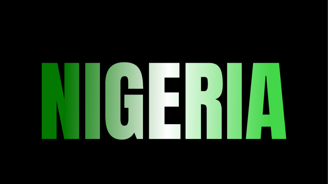
Task 3: Creating a text Gradient
using the same method we took to get our first gradient I took this same method, but clicked on the typo gradient.
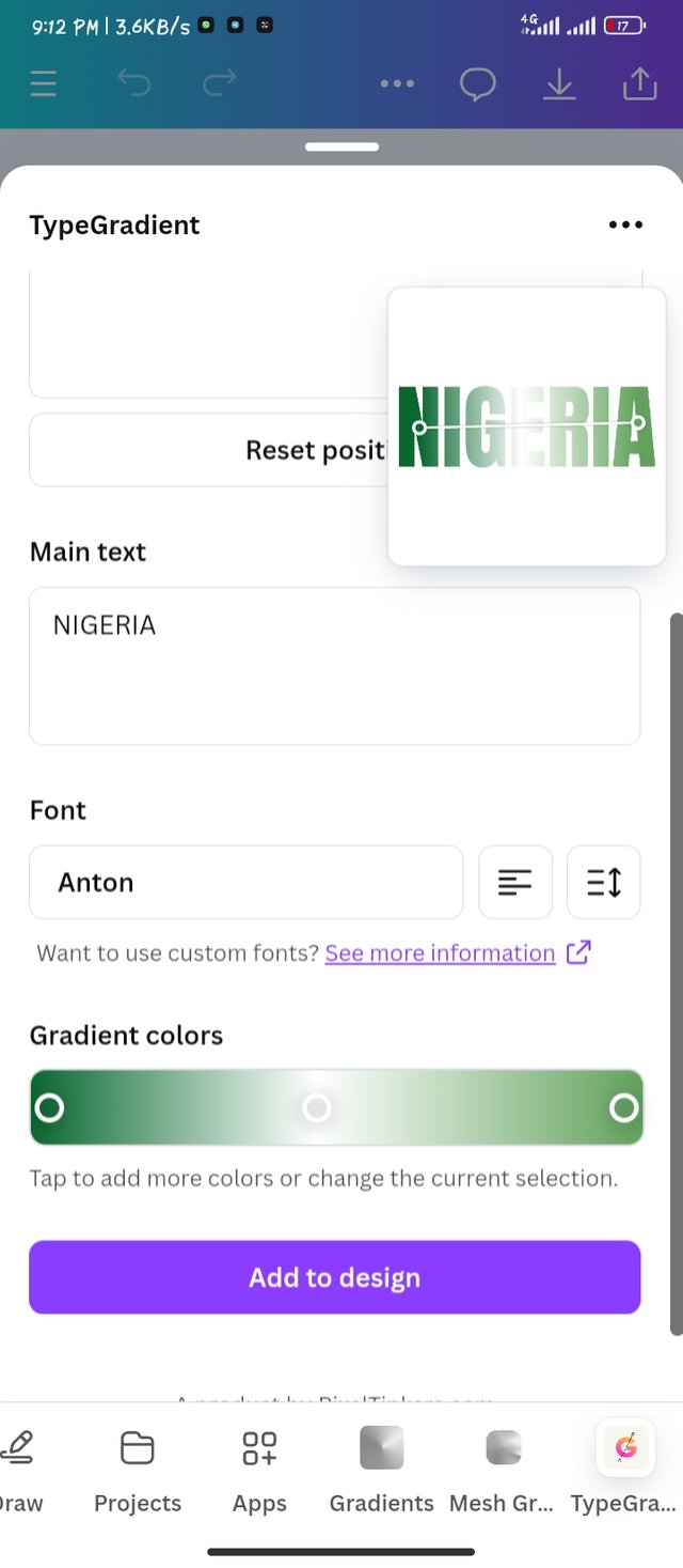
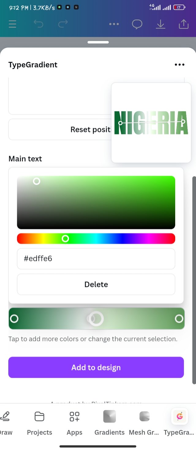
In the box there, I typed in Nigeria and went down as I selected the color.
I made a 3 gradient colors, which I used a green white green to signify the Nigeria's flag.
 |  |
|---|
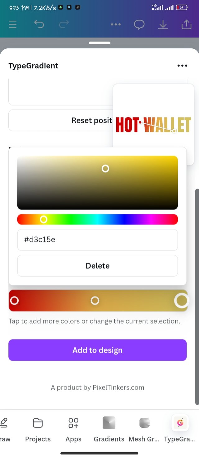
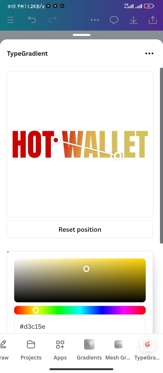
I took this same procedures to get the Hot wallet text. I cleared out the Nigeria text and typed Hot wallet
over to color tool down, I picked the Red color which went down to orange and light yellow. All these shows the level of hotness of a material. It really suited my text.
 |  |
|---|
Here are the final results which I was able to come out with. I used a pure black background to make the text standout and also silent noise.
 |  |
|---|
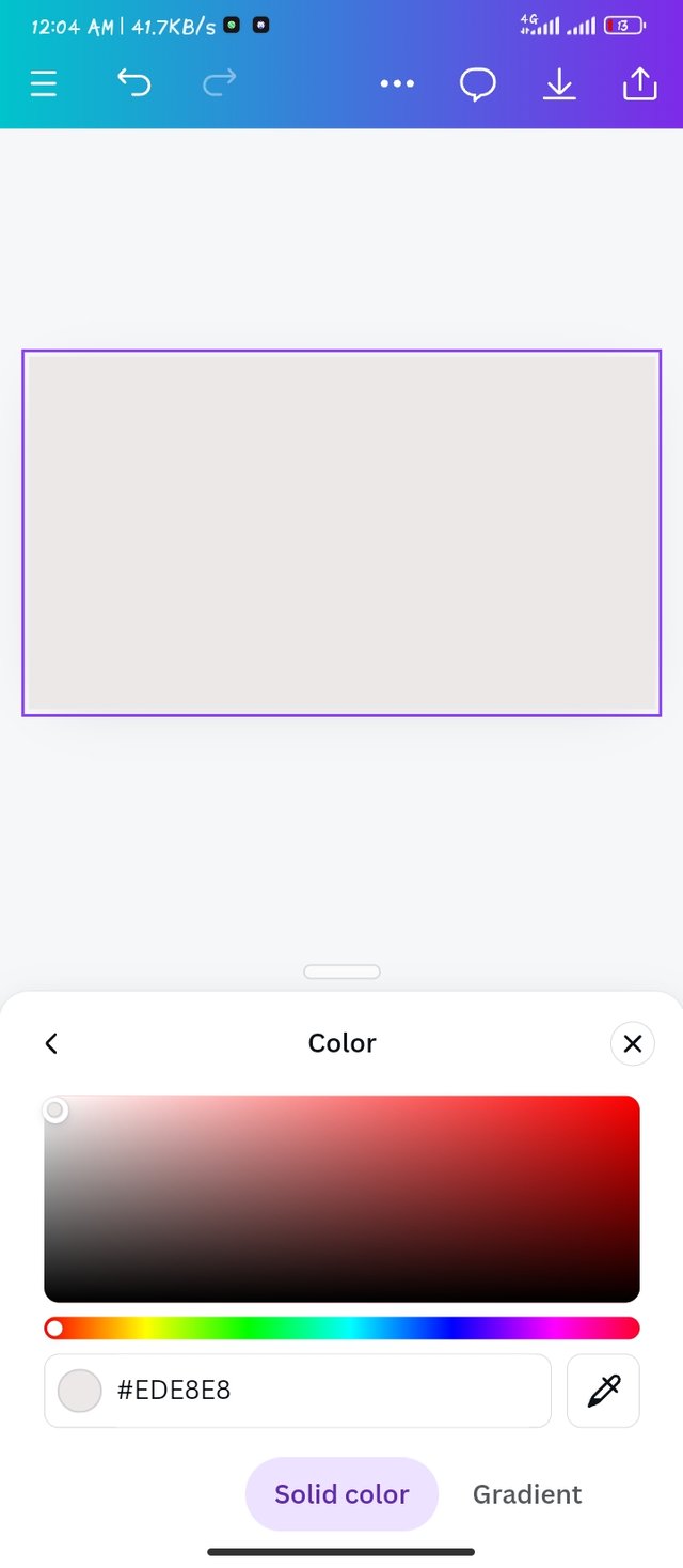
With my empty page I made custom size of 1080 x 1080
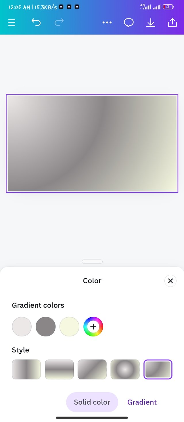
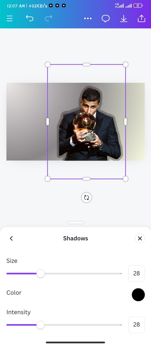
I selected the angular gradient, using a grey color and reducing its saturation. I got the lightly yellow color by reducing its saturation ( #f6f8e0)
I brought a picture of Rodri to the design workspace and I added some shadows to it.
 |  |  |
|---|
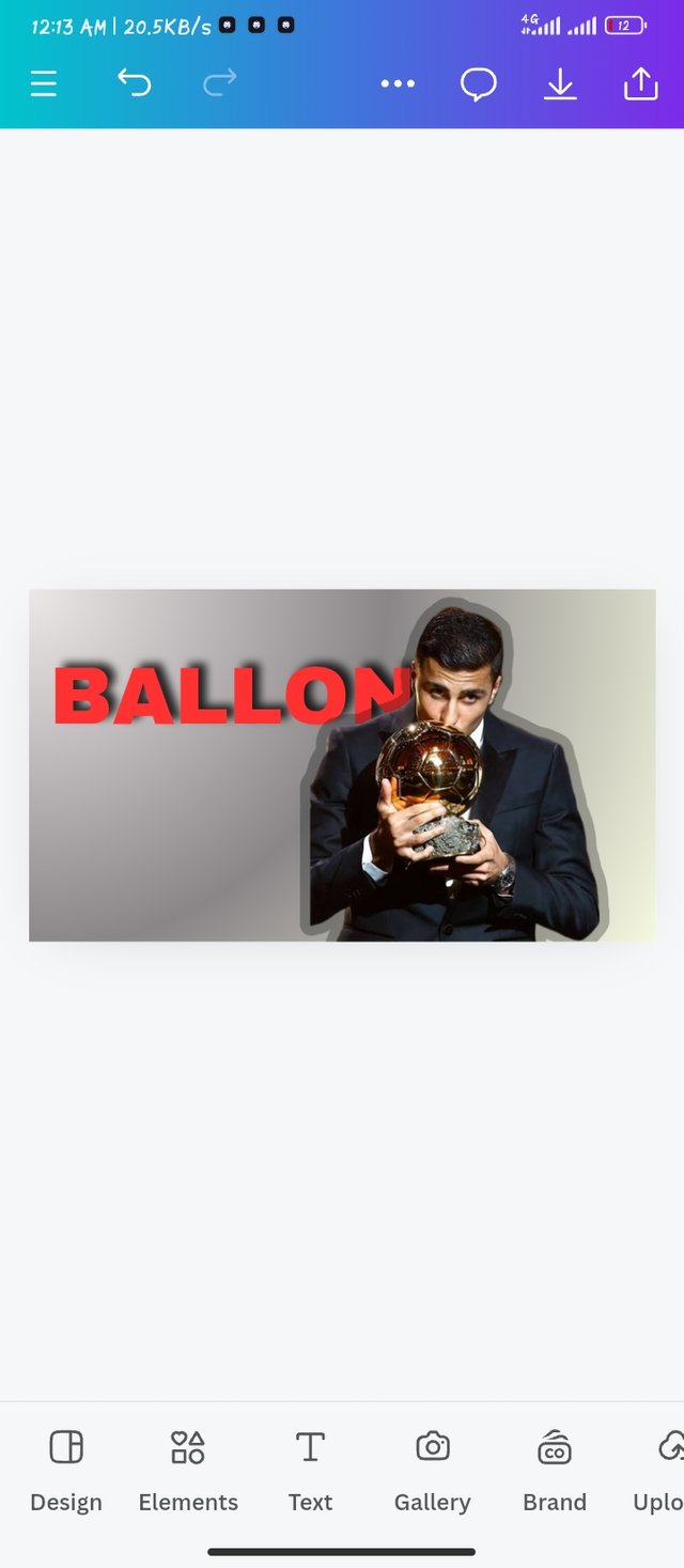
Adding the written text BALLON to my design, making it bold and taking it backwards.
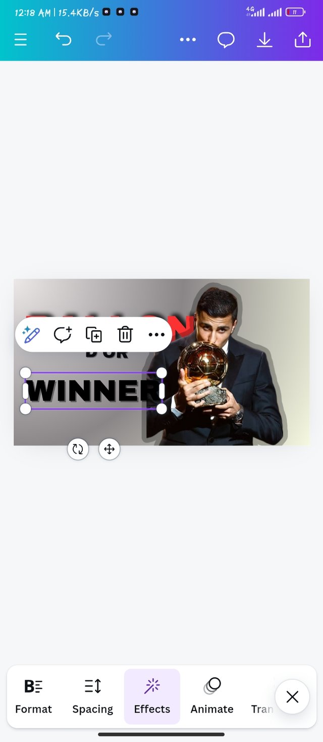
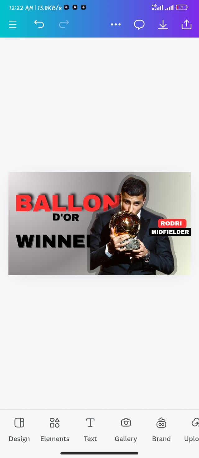
I added winner and D'OR to my graphics and also added a name and his role to the picture.
I had a picture of a gallon D'OR which I made transparent in my design.
 |  |  |
|---|
As simple as it is, I came out with this wonderful graphics with just an Angular Gradient.

I would love to invite my friends @johnmitchel, @bossj23 and @simonnwigwe to take part
https://x.com/imohgeorge4/status/1851424348604686668?t=wKBnMKfMZubI6XKZD8o_4Q&s=19
My Twitter share
I just love your graphics and colour combination. It makes a whole lot of sense especially the steps you share. You make it possible for anyone to create this.