Practical Lesson One

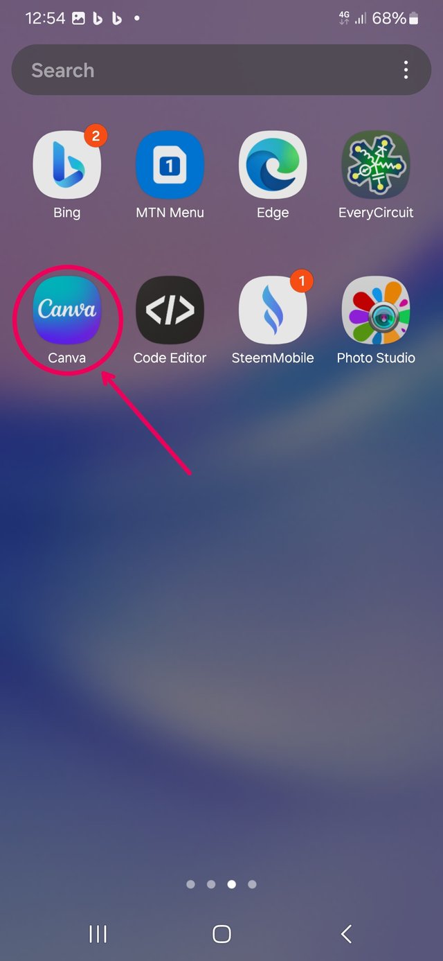
loading Canva.
I started by loading the Canva app, then, I selected Instagram post for size.
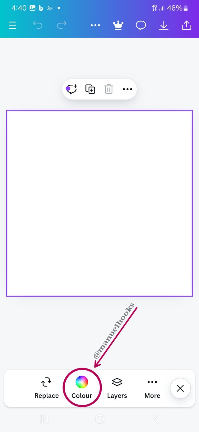
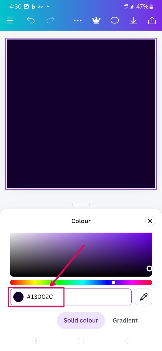
I selected the blank canvas and went for colour and to cut very close tho the sample colour, I used 13002C as my colour hex insted of the 13002B as was in the sample. I made sure it was a solid colour.
 |  |  |
|---|
| Loading Canva | background colour | specifying colour |
Sourcing Imagine
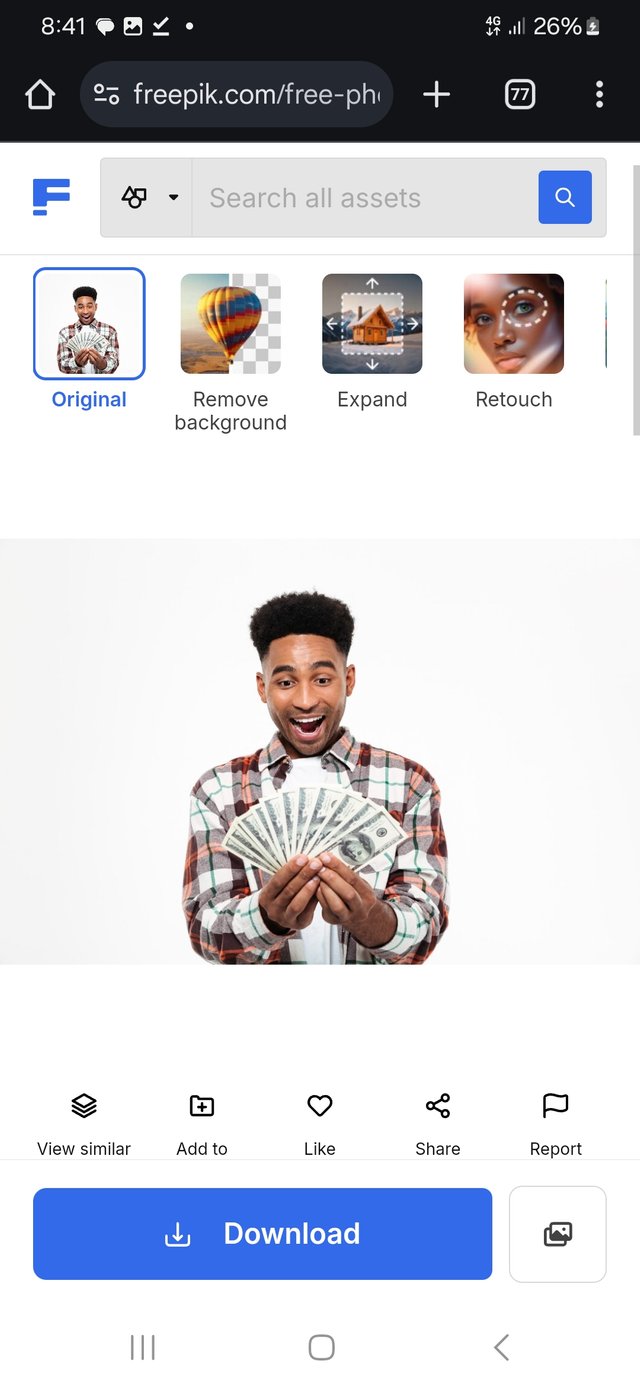
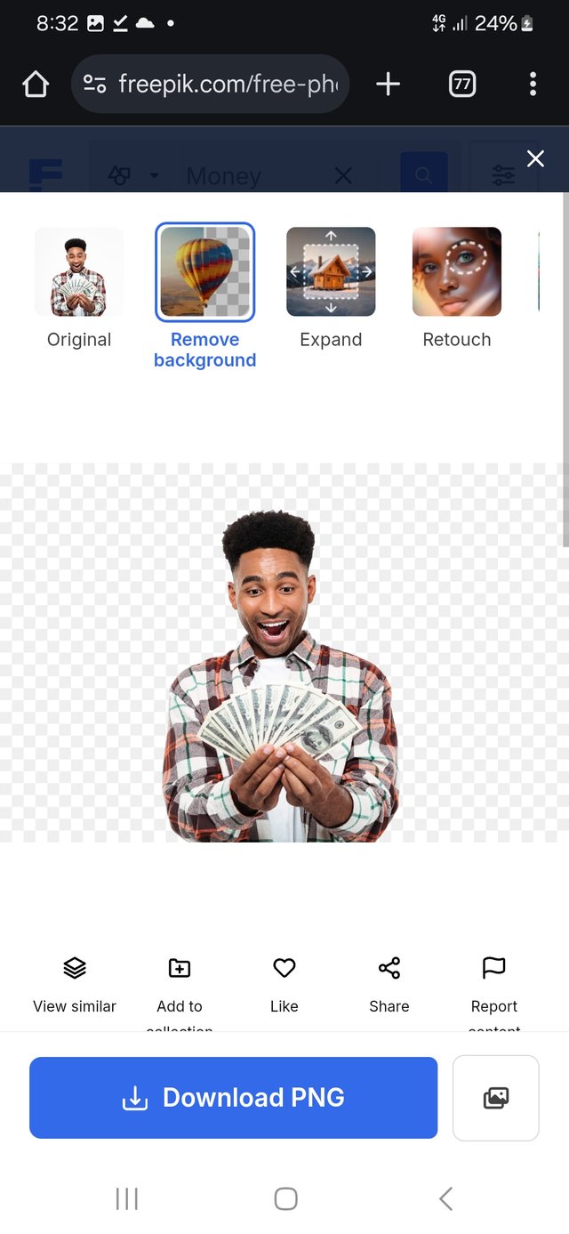
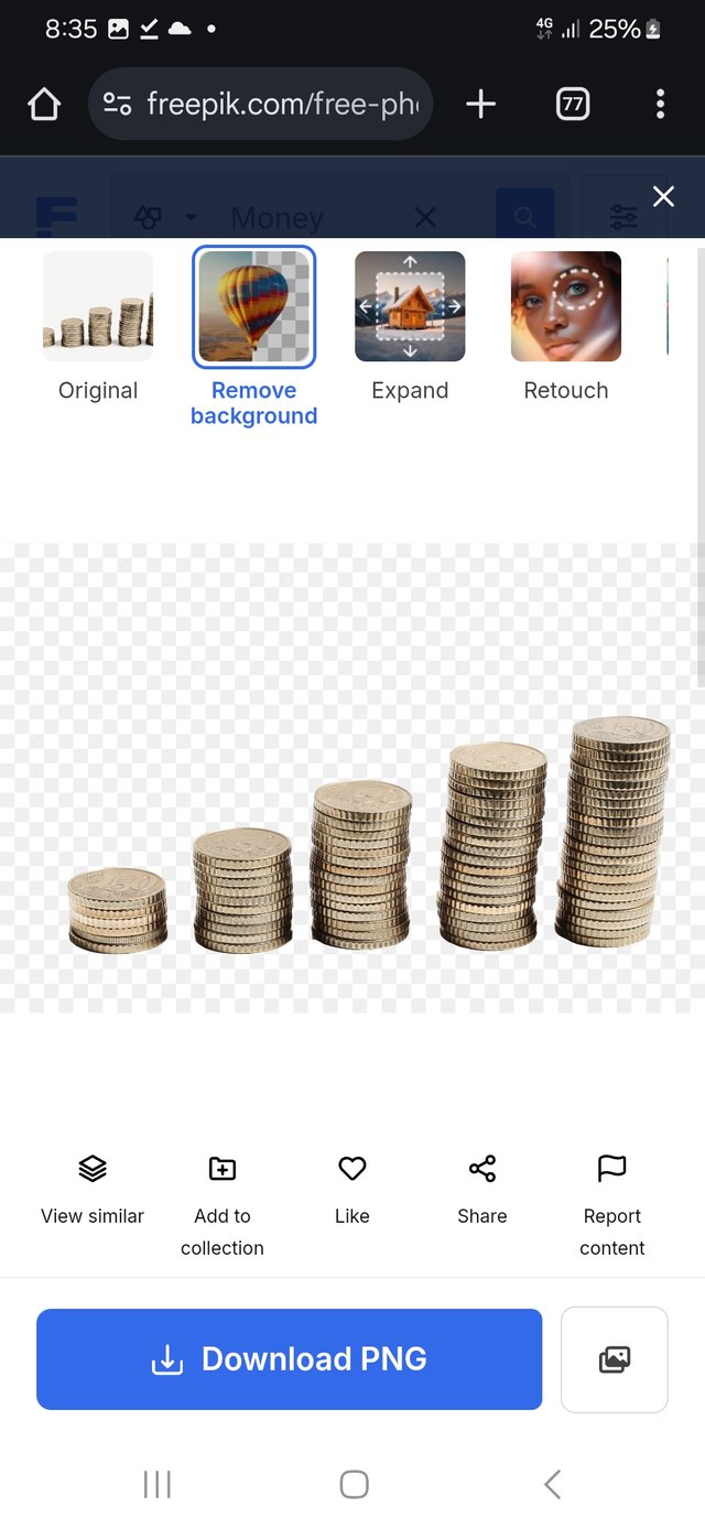
Going over to www.freepik.com, to source for useable photos, there I got the main character and the background image. I also use the opportunity to relove the background from the images and save them as a PNG formats.
Editing the background
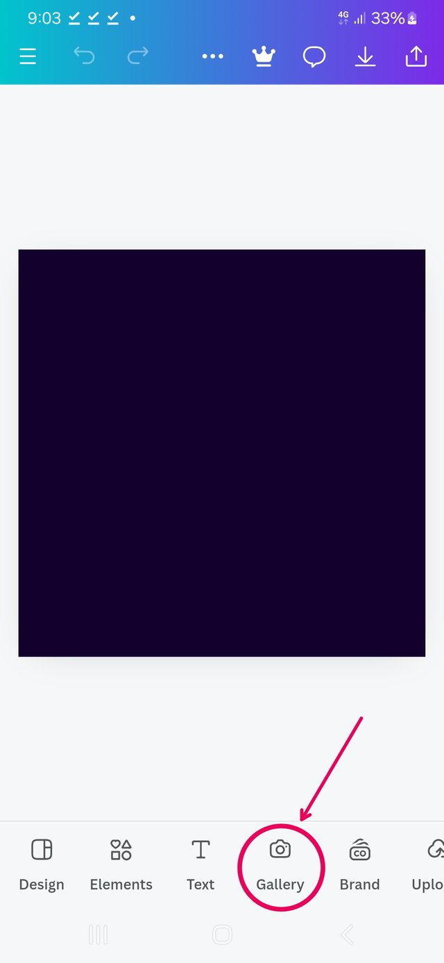
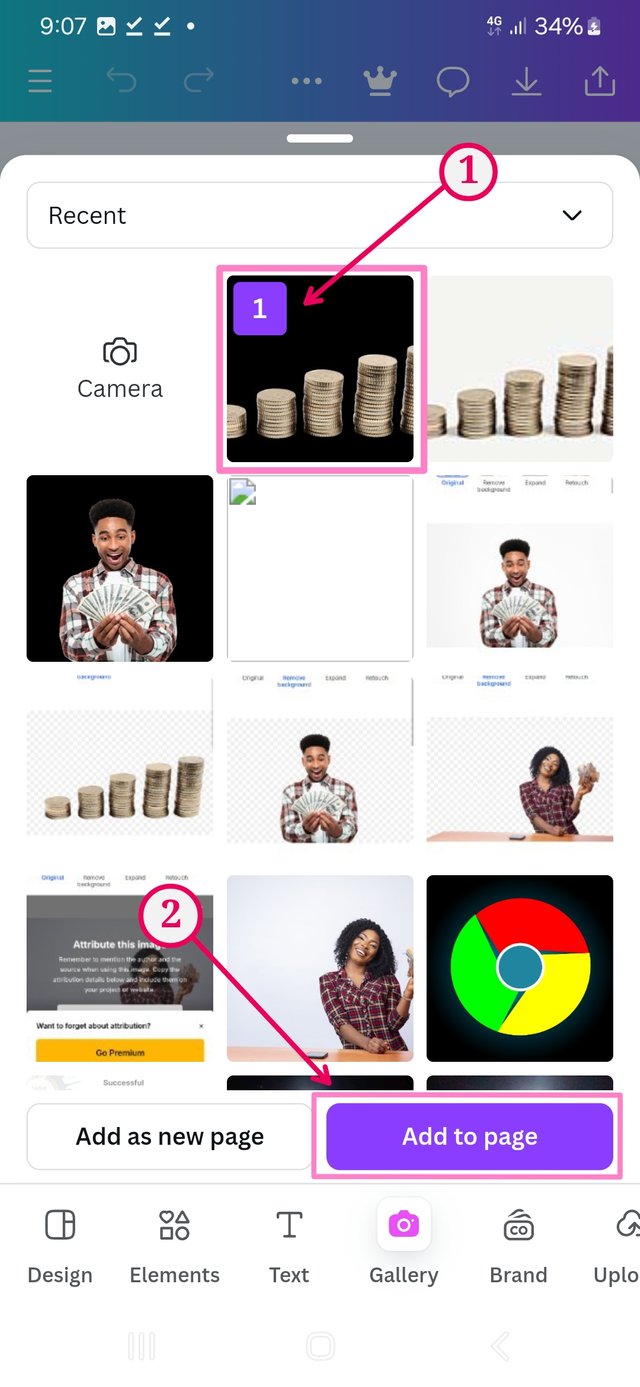
Select the background, I went to galary. Select the picture to add to the background and adding it to page.
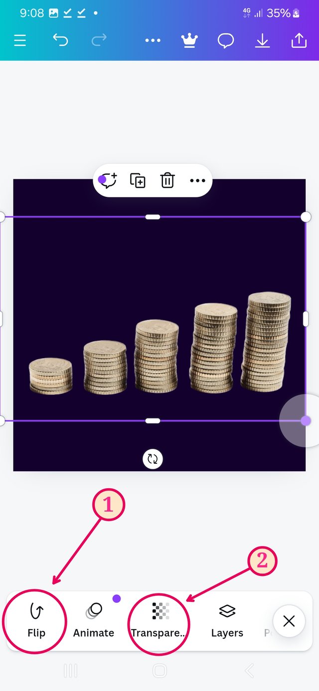
I had to horizontally flip the picture such that more coins would be to the left. then used transparency on it so it attracts less attention.
 |  |  |
|---|
| Select gallery | select picture | flip adjust transparency |
Introducing the main character
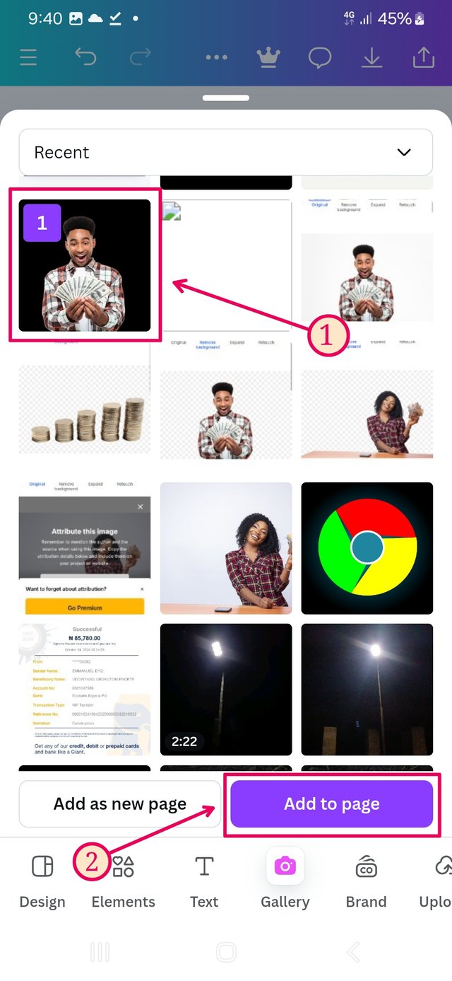
Going back to the gallery, but this time, I am picking the main character.
The one with png format has a seemingly black surrounding.
Select it and add it to page.
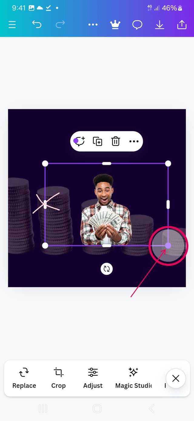
Use the round resizing handles at the coners to adjust the size. The rectangular resising handles can distort the image.
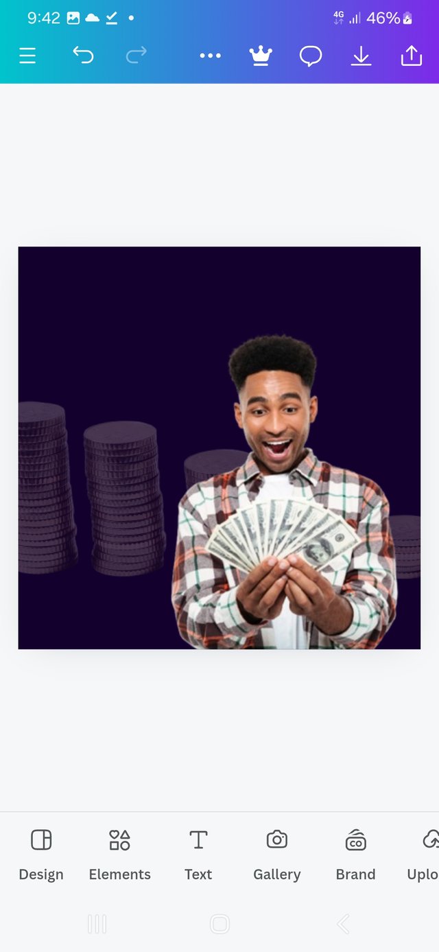
I had to move it from the center, placing it at the bottom right corner.
 |  |  |
|---|
| Inserting picture | adjust position | preferred position |
Bringing in the white Circle
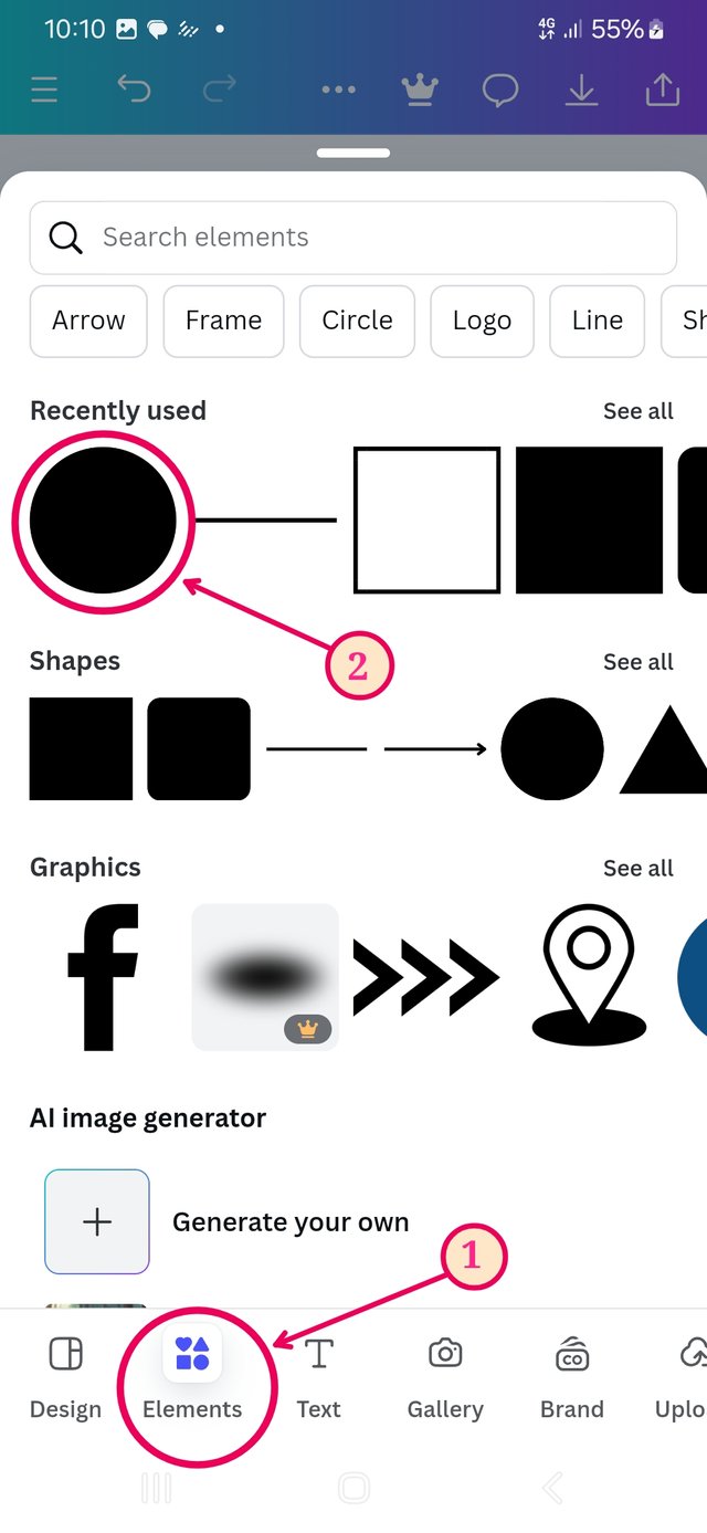
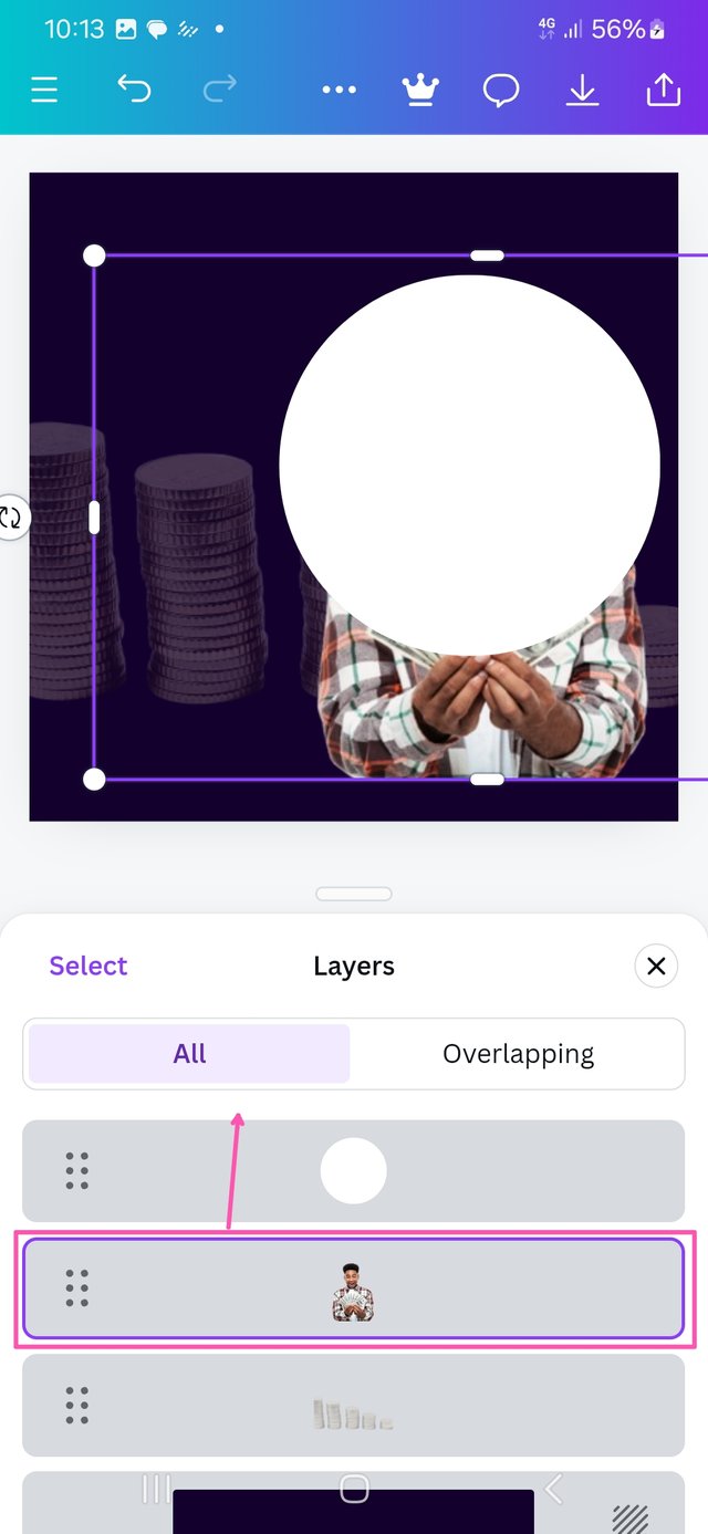
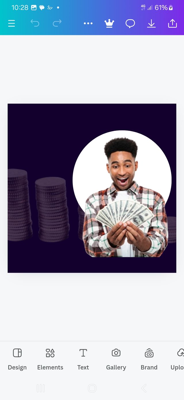
Going to elements, from there, select circle, which obviously covers the main picture and will have to be moved behind by changing the position of its layer. I used the dragg-up method, bringing the main image to the front.
 |  |  |
|---|
| insert elements | adjust layer | Circle positioned |
Text entry
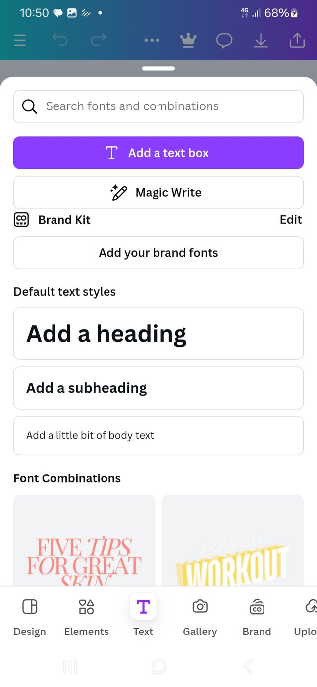
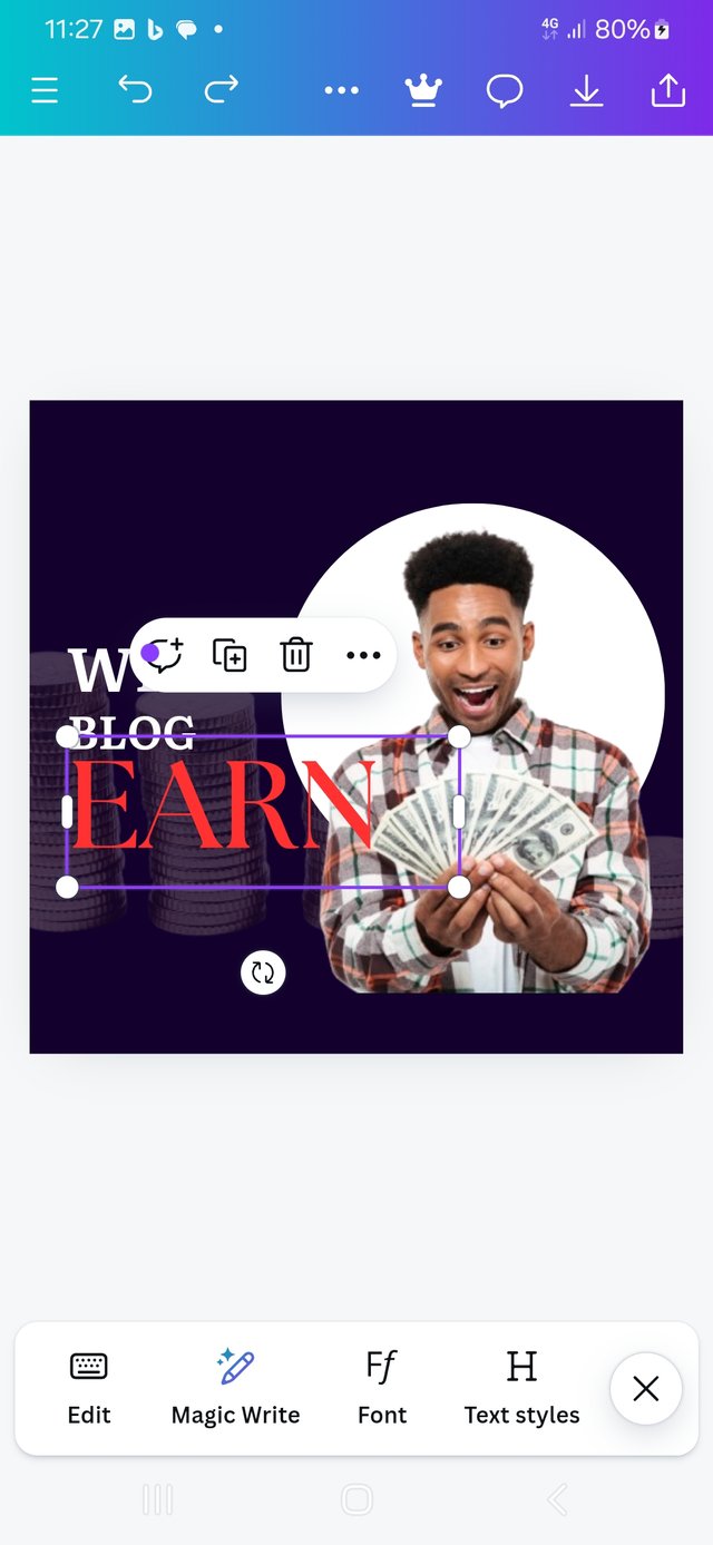
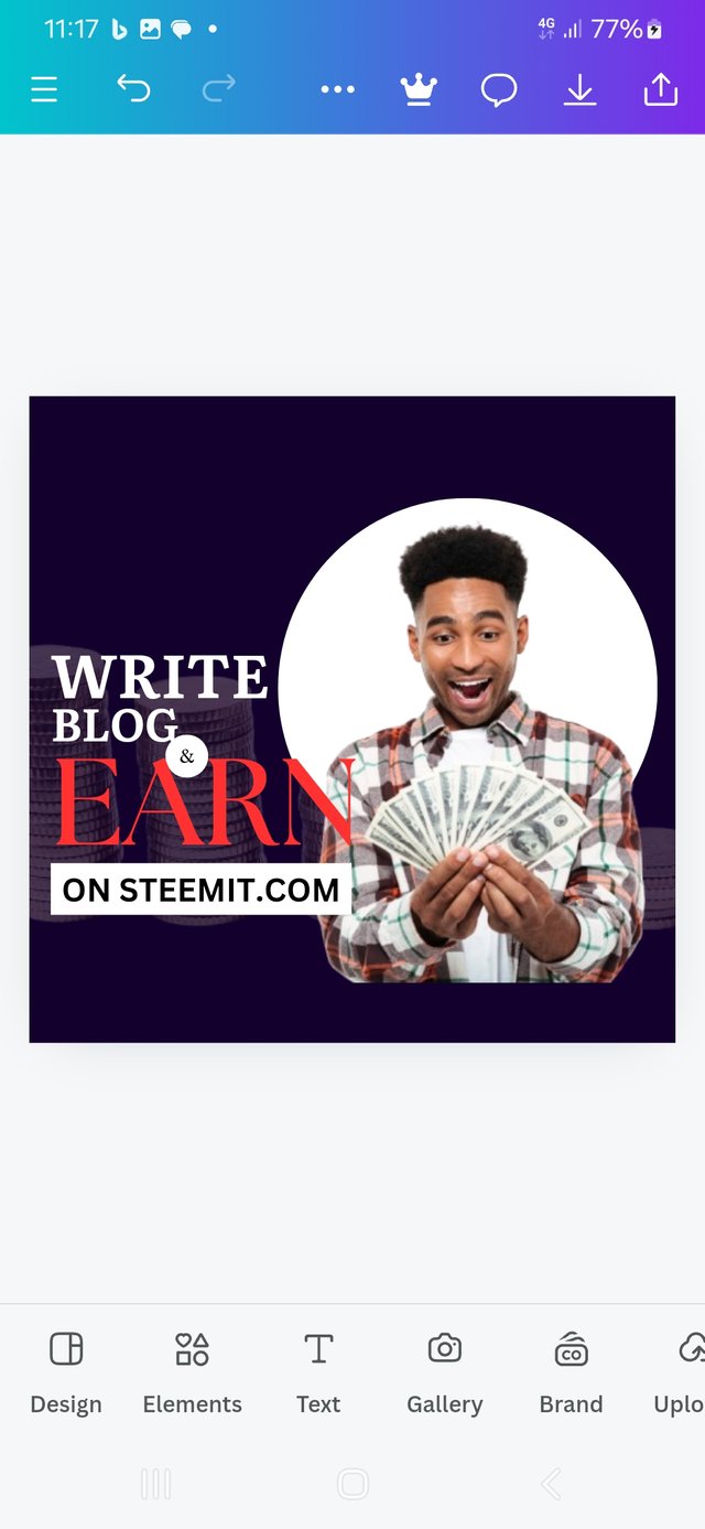
It is time to enter the text, applying contrast with colour and hierarchy based on size.
I selected red for its hot-happy feeling, and it contrasts well with the background and the white circle and surrounding texts.
Putting "on steemit.com" as black in a white background makes it stand out.
 |  |  |
|---|
| inserting text | formatting | finishing |
Final Outcome

At the end of this activity, I felt like the character in the graphic.
Conclusion
This week's lesson was not a walk in the park. It was thought enough to have me sitting at the edge of my seat. I am happy I took it to this point. Yes it was though, but was also very interesting and motivating. @bela90, @udyliciouz and @okere-blessing to join us in exploring the exciting features of the canva app. Many thanks to my instructors for a job well done and to steemit for this oppotunity.
 Friday, October 4. 2024




Your design is amazing, you can use the right dimension from the beginning with the need for cropping using the below 👇
With this, you can choose a landscape background of 1280 x 780px. Or any other ones you need. You can do better! Success
https://x.com/manuelhook41759/status/1842523567151296541
Upvoted. Thank You for sending some of your rewards to @null. It will make Steem stronger.
I love your short caption under your screenshots. This makes your content unique. I will try to do this in my next content /presentation of graphic design. You have Started with a bit larger dimension but at the end you make it perfect. I also make this mistake (although its not a mistake) and seek help from our teacher. Its good that you managwd it yourself. Good luck.
Getting the correct size on steemit have not been easy at all. I am still learning and the interface on Canva is still new to me. But at some point, i will get a mystery of it.
Your observation was correct. I had to crop away the excesses.
Greetings friend @manuelhooks,
I appreciate the effort you put into the design. But you have created a different form from the original design with your creativity. But if you can maintain the aspect of size/dimension properly, your entire presentation would be perfect. I hope you succeed in this challenge. best wishes