SEC20/WK4: Graphic Design Hands - On practical 1
Greetings friends
It is another day to attempt the graphics tasks.

So, I began this section by using the already-made image provided by @lhorgic as a format for my design since I didn't know the dimensions. Uploading the original image and then scrolling out a new page will give me a similar dimension as the image provided by the content creator.
 |  |  |
|---|
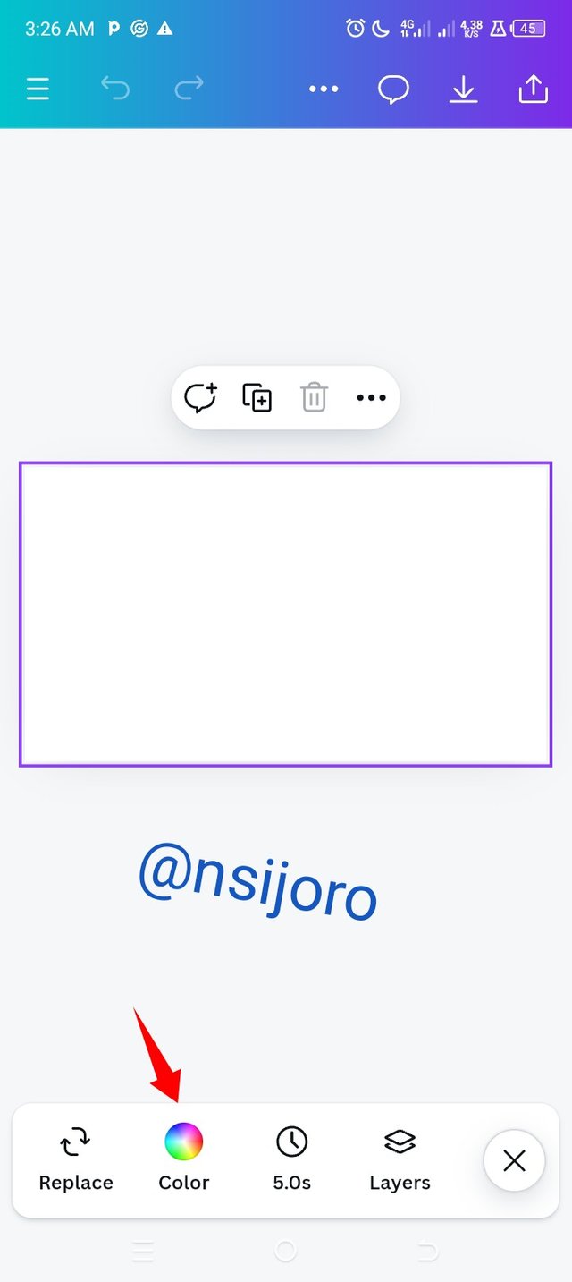
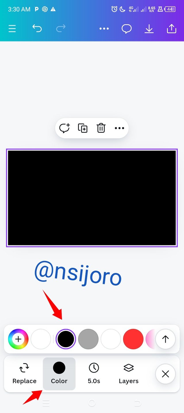
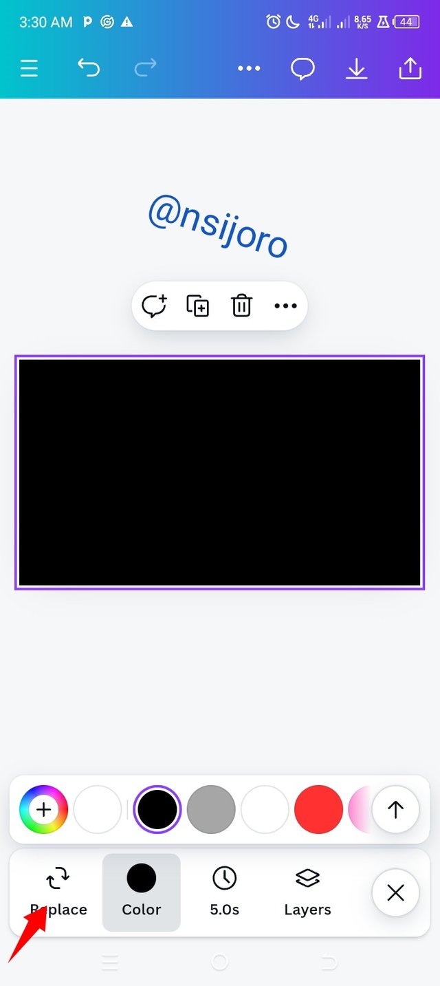
- After getting the background dimensions, The first thing I did was change the background colour to black and then I reduced the transparency to 30%
 | 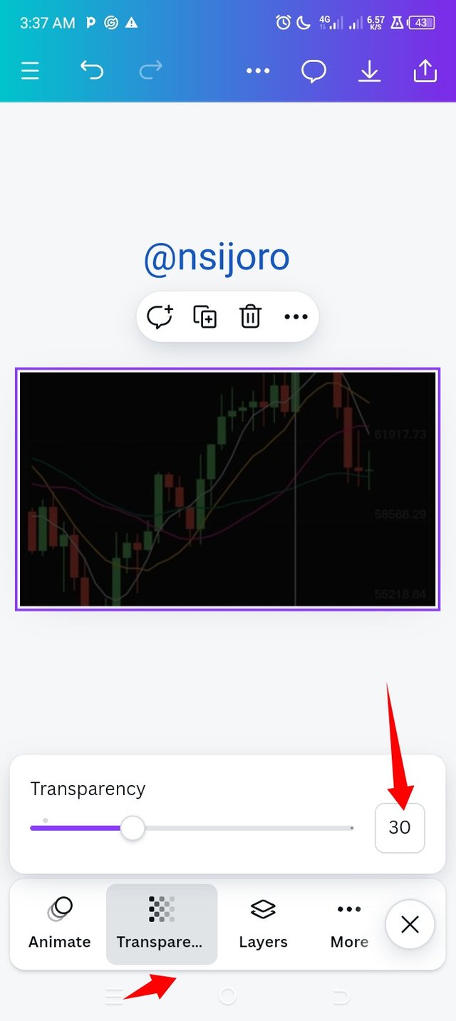 |  |
|---|
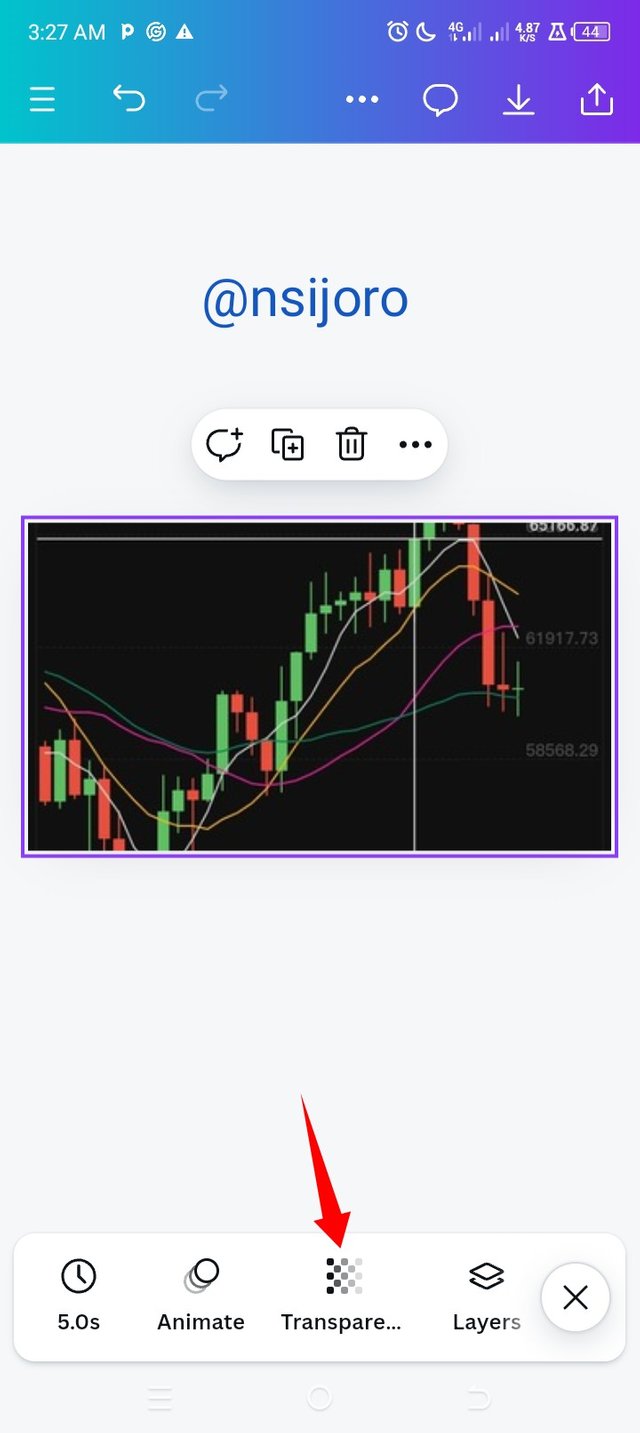
- After this I added my image, when I did this I noticed my image overlapped my black background and the transparency wasn't effective, so where I had my toolbar below I scrolled to the right clicked on position and moved the image to the back, then the image I inserted had the transparency in effect.
 |  |  |
|---|
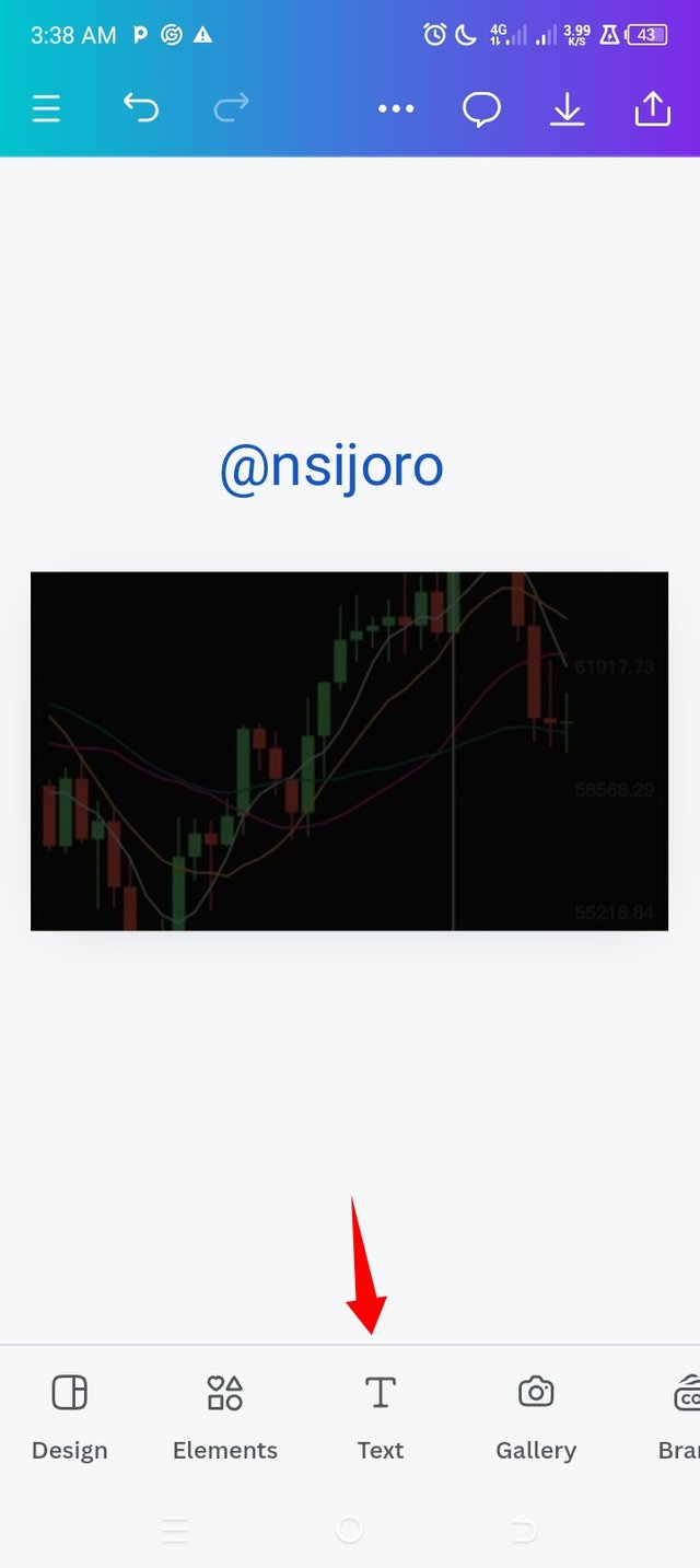
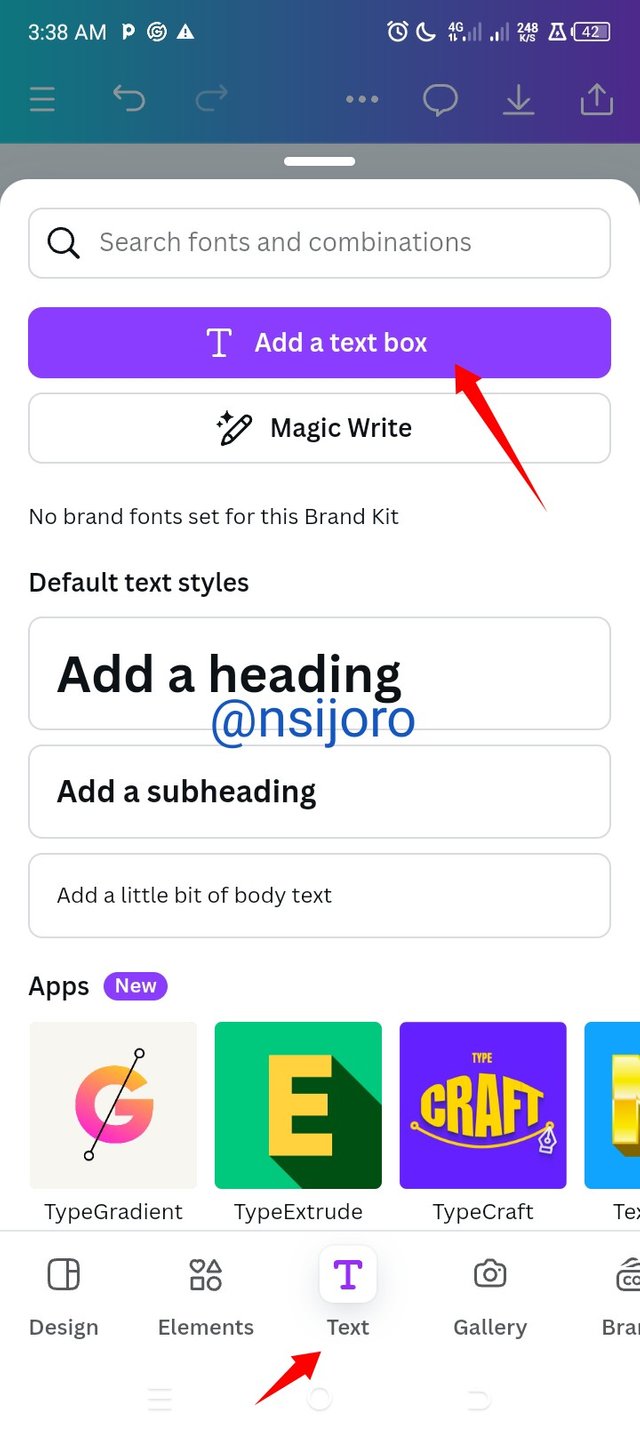
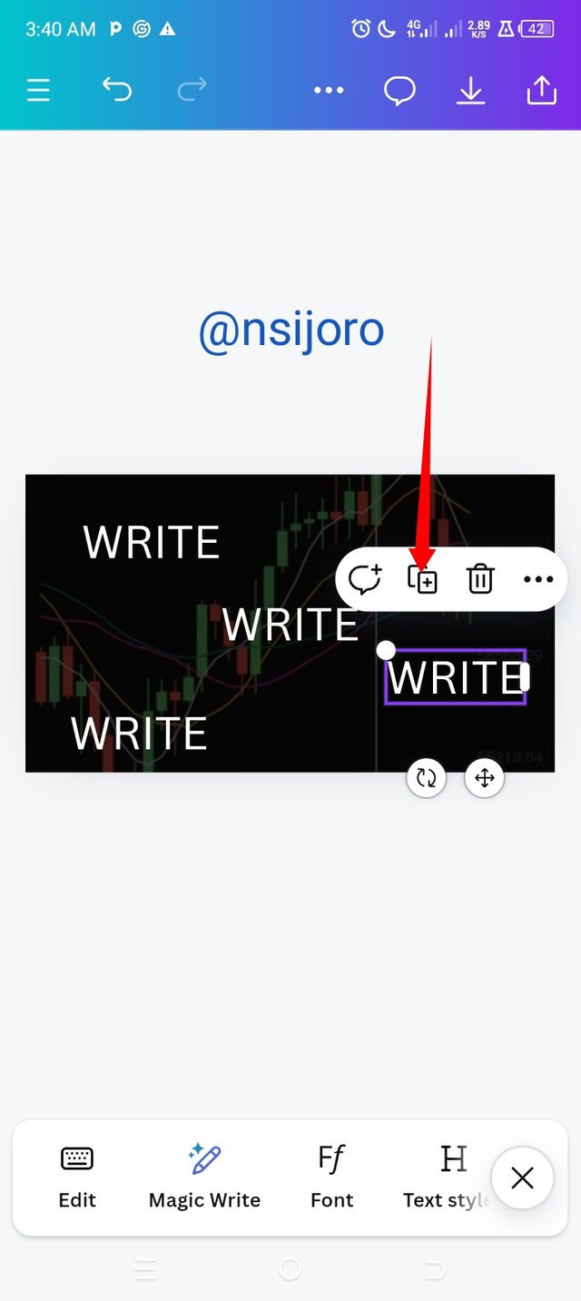
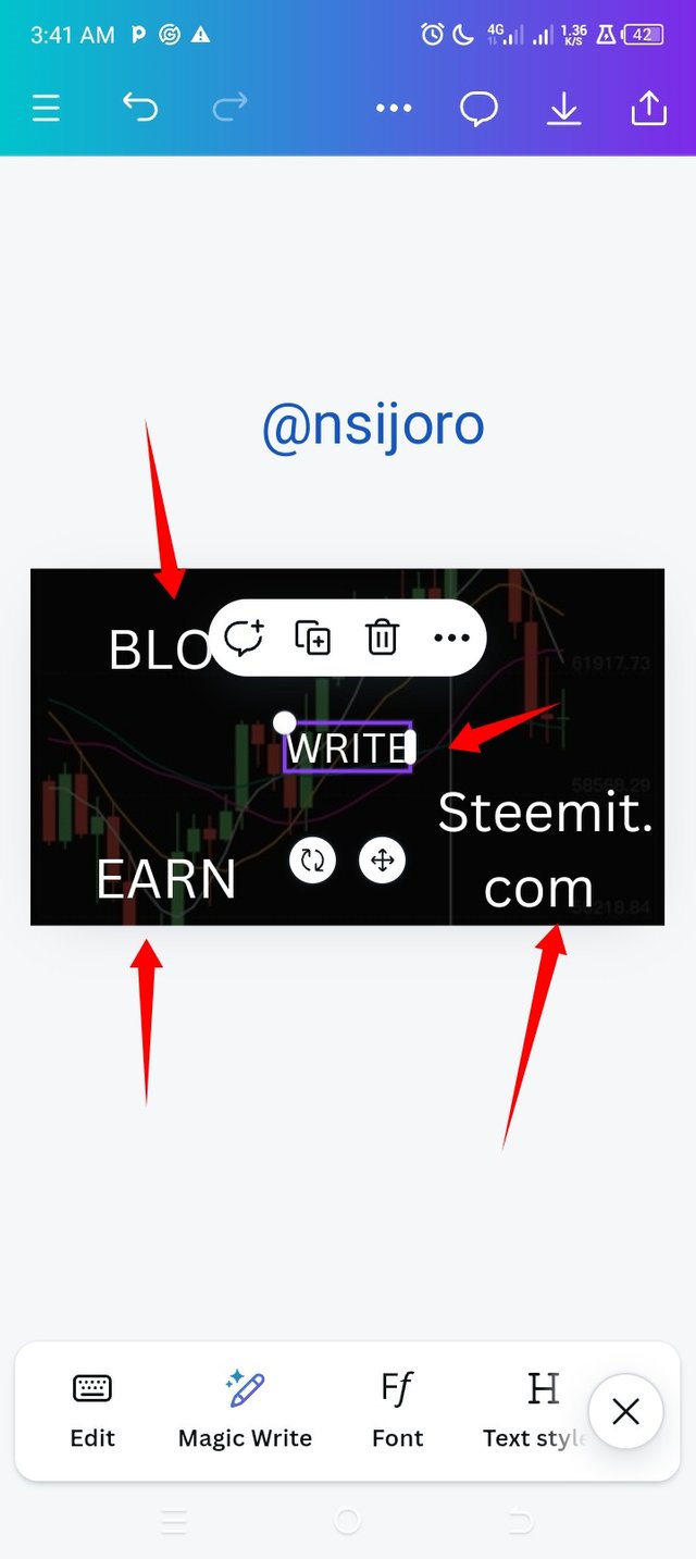
My background is now set, so I clicked on the add text button and added a text box; when the text box appeared, I clicked on it and added my text. To save me from the stress of always adding a text box, I duplicated the text.
You can always duplicate as many as you can depending on your targeted number of text to apply; each of these text boxes can also be deleted.
 |  |  |
|---|
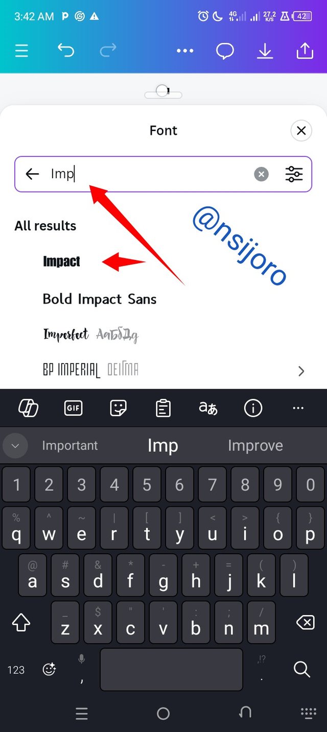
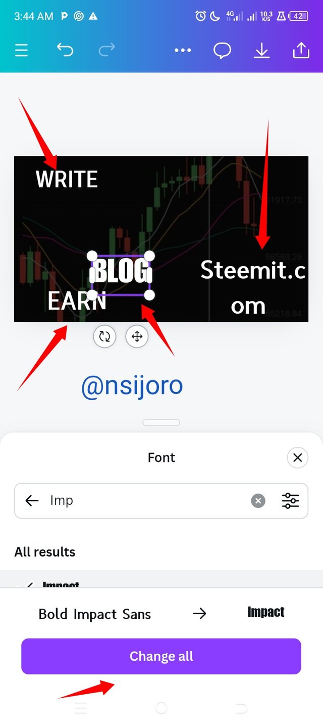
It was now time to select my font; I followed the creator's font type, which was the impact; it didn't come up, so I used the search button to make it pop up.
When it is now effective on the main page, you can see where you have changed and on pressing that, all images on the main page will automatically change to impact. Very time conservative.
 |  |
|---|
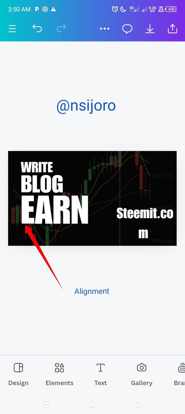
I expanded the image to the font size so that, with my eye view, it will look similar to the homework text size.
After this, the application of the principle came in, and that was alignment; I made the text align to the left, and also white space was applied here, which created a space in between images so that the beauty will be seen. In this case, the spaces are black.
 |  |  |
|---|
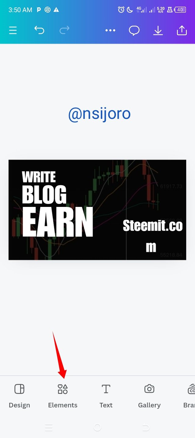
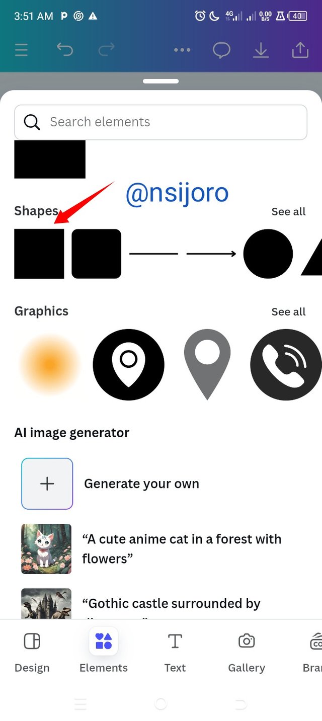
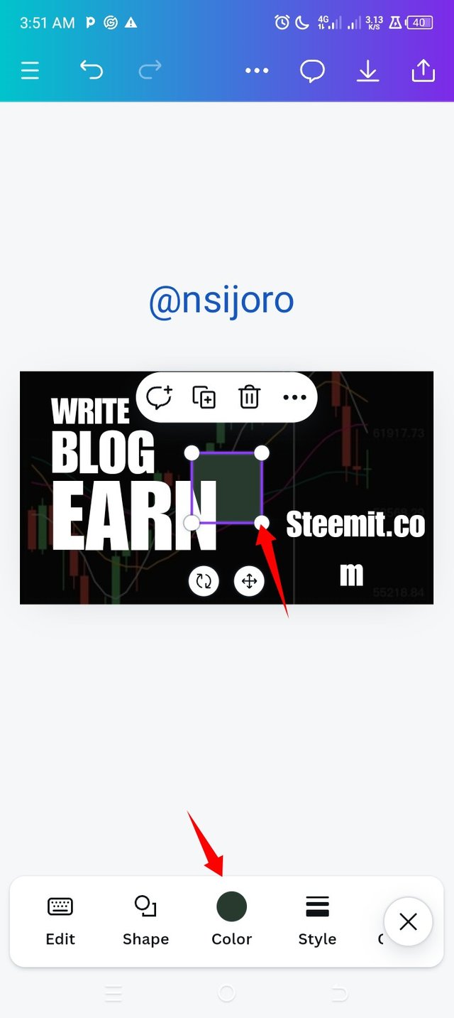
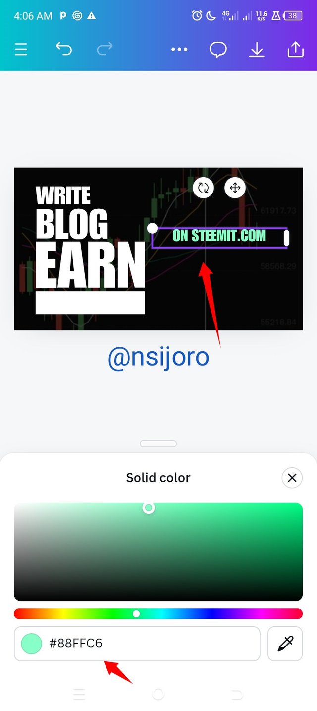
- Remember we had a text link, so I added a shape and resized it then I can the colour and also the colour of the text and at this juncture though these were not the original colours I intended to use I laid emphasis on the link text so that it will not get lost on the design.
 |  |
|---|
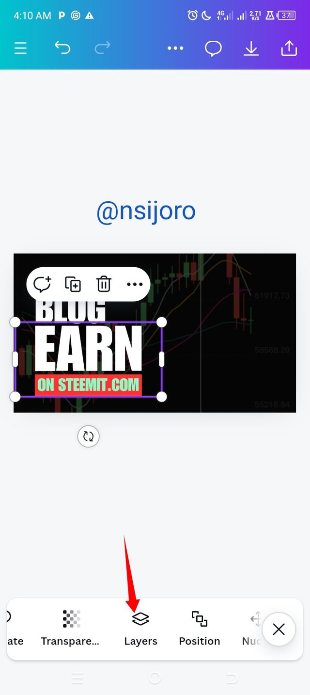
- I noticed something as my design proceeded, if texts and shapes get too close it might be very hard to click them and make use of them individually, so in other the note them, I click on layers and then on any space around the background and then with this I can change them to whatever I want.
 |  |  |
|---|
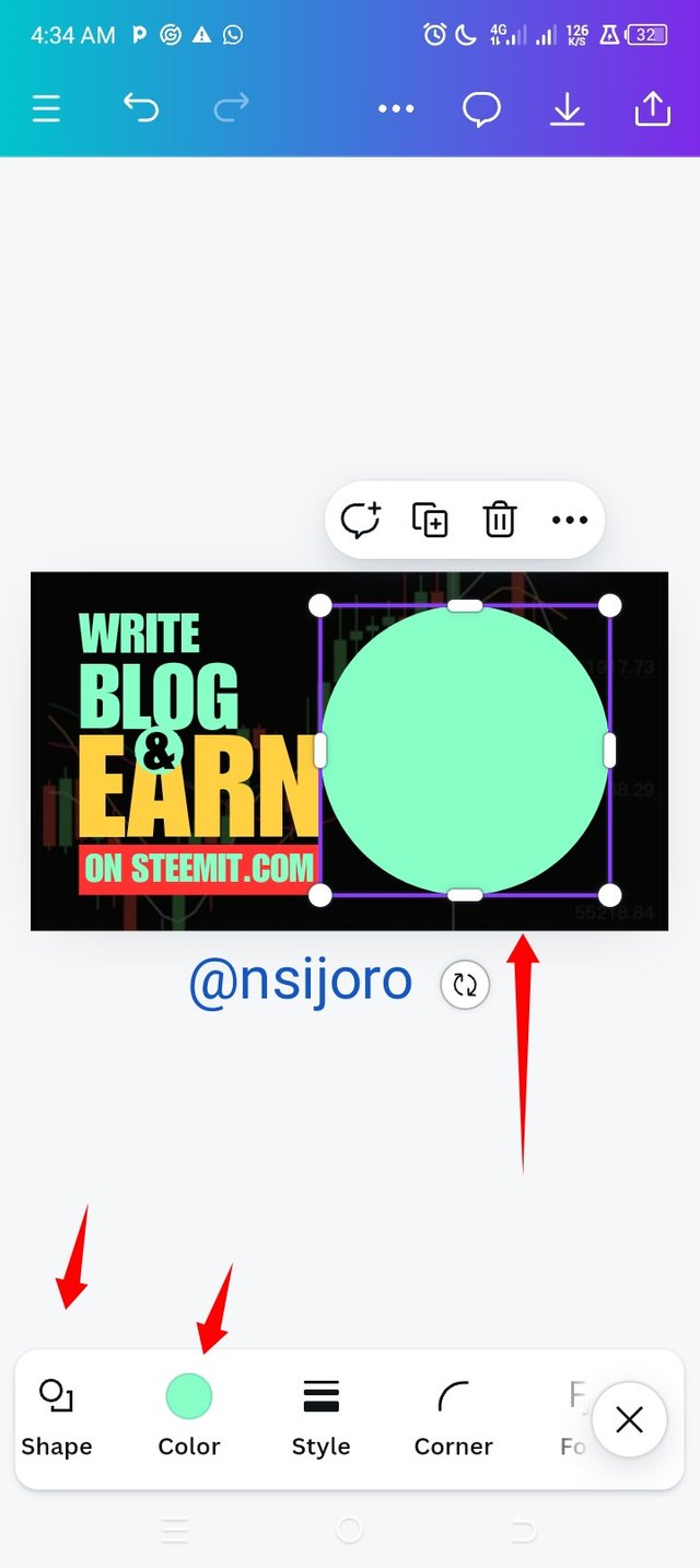
I went to the toolbar and clicked on where I have an element then I clicked on it shapes appeared and I clicked on the circle shape, when it displayed I duplicated it since my target was to make use of two shapes
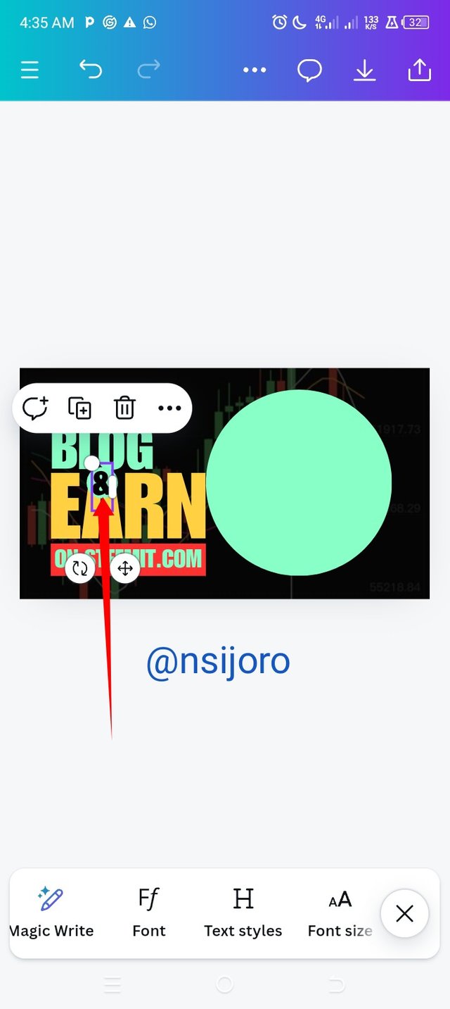
One is where I will place the photo of the lady with money, and the other is where I will add the symbol "&", so I resized the image and then added a textbox to it where I inscribed the symbol, I move my resized shaped to its position and then I brought the symbol and placed it in the centre of the shape, I am done with that the next thing I did was inserting my image.
 |  |  |
|---|
I didn't have to change the background of this image, since it was provided already, if it wasn't I had my pro version subscription still active so I would have done that with ease
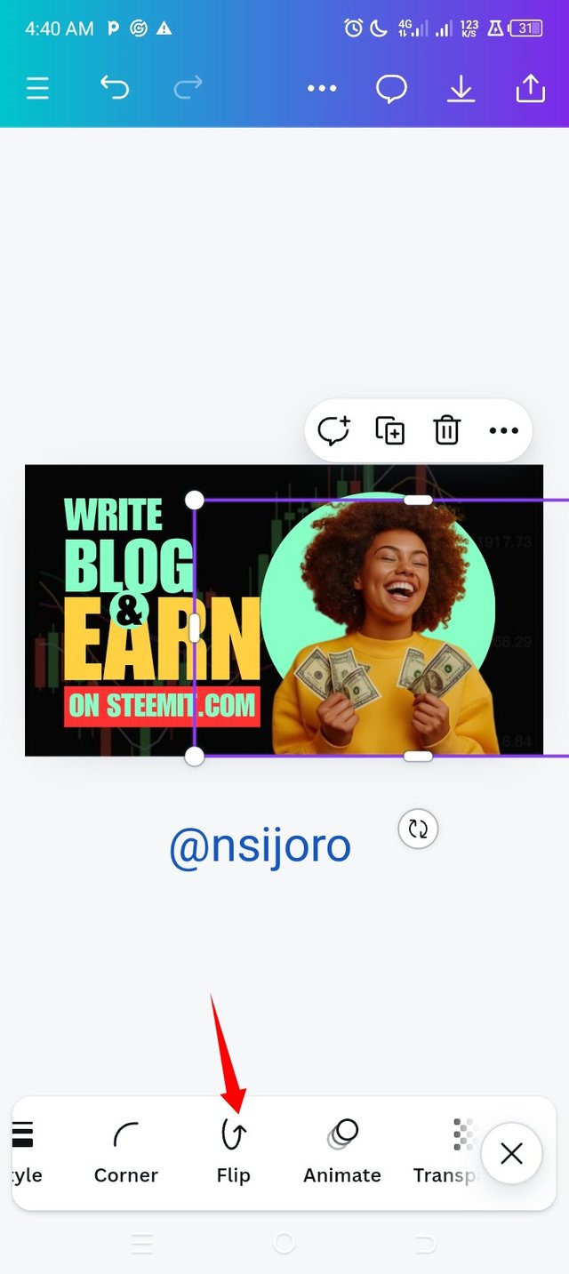
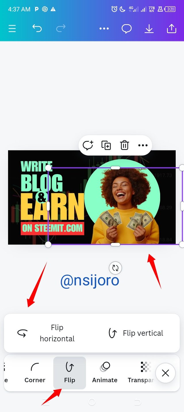
I added the image and then resized it to my preferred size and height; I made sure the bottom of the image was placed at the same point the background image bottom was.
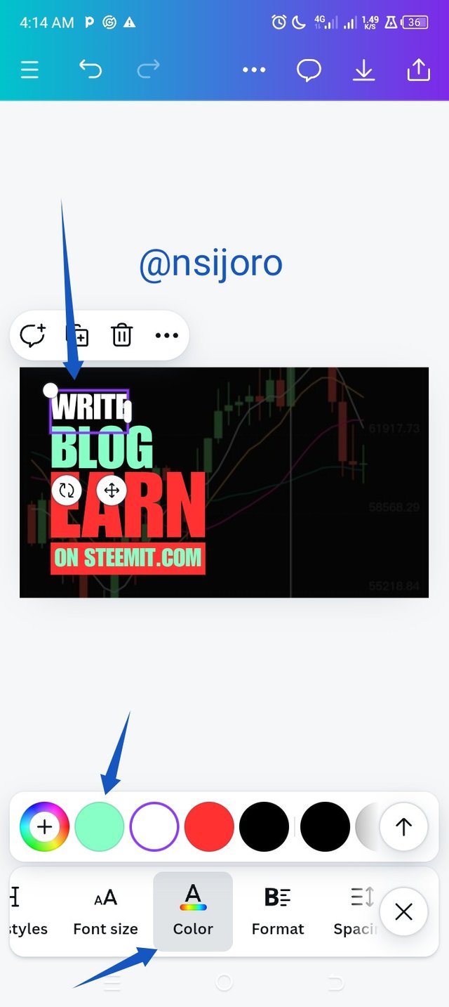
I then chose the preferred colour for all text, but I followed a pattern which the creator used, and that was most texts came with the same colour. That is what I did; I think that principle is unity and rhythm. In other not to have a colour riot.
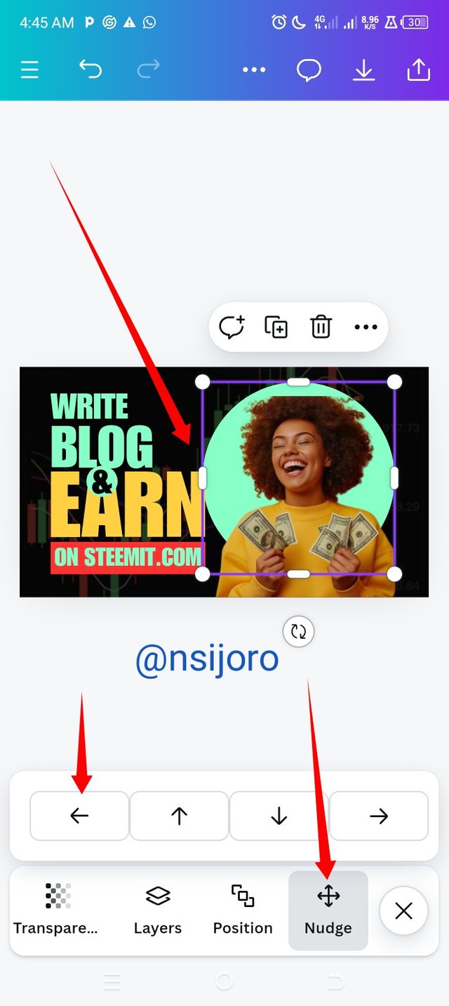
There is something I noticed while I was editing this image I was very hard to make the N on the EARN overlay a bit on the circle where the image is supposed to lie, so I found out the NUDGE button the enabled me to shift the shape by tiny picometers till a pinch of it was overlapped by the N.
 |  |
|---|
- I made different changes to the image I applied to see how it would look, and I believe it was amazing. I am thrilled by this.
I would love to see entries from @jess88 @joojoo78 @ciru2014 soon
Upvoted! Thank you for supporting witness @jswit.
Upvoted. Thank You for sending some of your rewards to @null. It will make Steem stronger.
X promotion link https://x.com/nsijoro/status/1842383366051475866?t=WqTvNH0gph_kCkUkdSgHrw&s=19
Thank you for publishing an article in the Steem4nigeria community today. We have assessed your entry and we present the result of our assessment below.
MODs Comment/Recommendation:
Your entry reminds me of when I used to promote steemit using virtual means and canvas as my backup design. You've practicalize everything to my understanding. Thanks.
Remember to always share your post on Twitter using these 3 main tags #steem #steemit $steem
Hi, Endeavor to join the #Nigeria-trail for more robust support in the community. Click the link Nigeria-trail
Guide to join
Hello @nsijoro thank you for participating in this week's lesson. We have assessed your entry and we present the result of our assessment below.
Feedback:
Let me start by commending you for the effort put into this practical work. Weldone. It's obvious you attempted following me right from top to bottom and I appreciate. I would just point out few things you need to adjust on subsequently.
Let me start by asking... what colour scheme did you use to arrive at this colour combination? The colours are all screaming and they didn't perfectly blend. To be on a very safe side, always use your colour scheme to carefully choose your colour from your colour wheel, you might need to revisit the colour theory lecture. In addition, I asked to replicate the design, you could have just do what I did to avoid mistakes.
Every other part of your design makes sense but you see, appearance and presentation is your selling point in graphic design. Always leverage on it so you can give you viewer a jaw breaking aesthetic design.
Regards
@lhorgic❤️
I will be back in 3 hrs from now to give you this reply thank you for the review
From the challenge post
I am sure what I have here is a replicate of your design and I follow according to the rules you gave, I only changed the image and the colours
I think I need to read the colour theorem again, but I choosed the same colour for all and as we know canva store all colour in the design on the colour tools bar so all I needed to do was to click the text and change their colour.
Thank you @lhorgic for the encouragement, learning never seize
Hi, @nsijoro
On behalf of the ᴀʀᴛ & ᴀʀᴛɪꜱᴛꜱ community team
Welcome to this space of creativity, promotion of art and generation of learning.
It would be very interesting to know about you and your relationship with the art world. Tell us if you dedicate yourself to it as a hobby or full time.
Show us some of your creations.
What topics would you like us to start covering?
Finally, remember that you are already part of this family, and we look forward to meeting you.
Would you like to make a post to introduce yourself to the Community?
#artonsteemit
Art is my hobby though I am not perfect in it, I abandoned art untill my continuity on this space, I decide to share some when I saw others sharing, I will delve into this area soon to improve,
Pertaining to the topic to cover, you can give me list to choose from my interest because I don't think I have anything in mind.
I would love to make a post showing my works of art after if get a reply to the second paragraph, I wish I get a reply, I appreciate your welcoming me to your community, Thank you
Hi @nsijoro
You are welcome now, you can start by introducing yourself creatively through your art/hobby .
I think you could also take a few minutes and think about what topics about art you would like to see from the community.
I'll leave you the link to the post with the Community rules.
Art & Artists Rule/s
#artonsteemit