SLC21/WK5: Hands-On Practical
 |
|---|
Greetings everyone and welcome to another week of excitement. This week has been a busy for me because I have so many events lined up that have taken my time a lot. However, I'm finally here to put to test the skills I've acquired in the cause of these studies as I look to try out my hands on a practical design. I trust you will stay through to the end as there is something for everyone.
Design A logo for your brand, if you already have one, this would be optional for you. |
|---|
For the cause of these studies so far, I've have been able to create some wonderful logos carrying out past week's tasks, ranging from Bounty Basket, Market Place and Travela.
 |  |  |
|---|---|---|
Design a promotional flyer/banner/poster for your brand using any design app/software of your choice. Kindly be sure to be very detailed, showing every relevant detail as this could be your leverage. |
|---|
So far in this class I've been mostly focused on Market Place and Bounty Basket, so for today I will like to try out that of Travela. Now, since Trevala is traveling agency, first I needed a good idea to sell, lucky me I had one. So let's go into the making process.
Step 1:
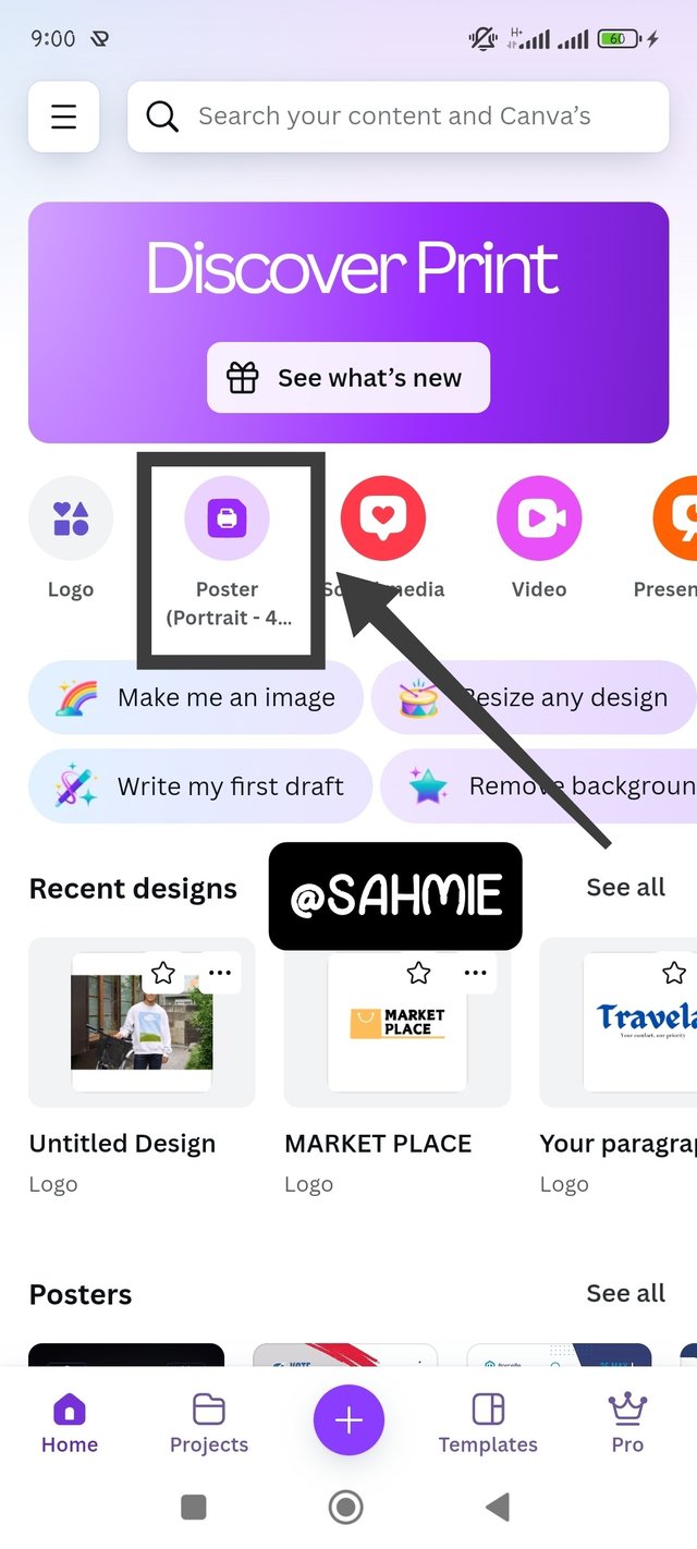
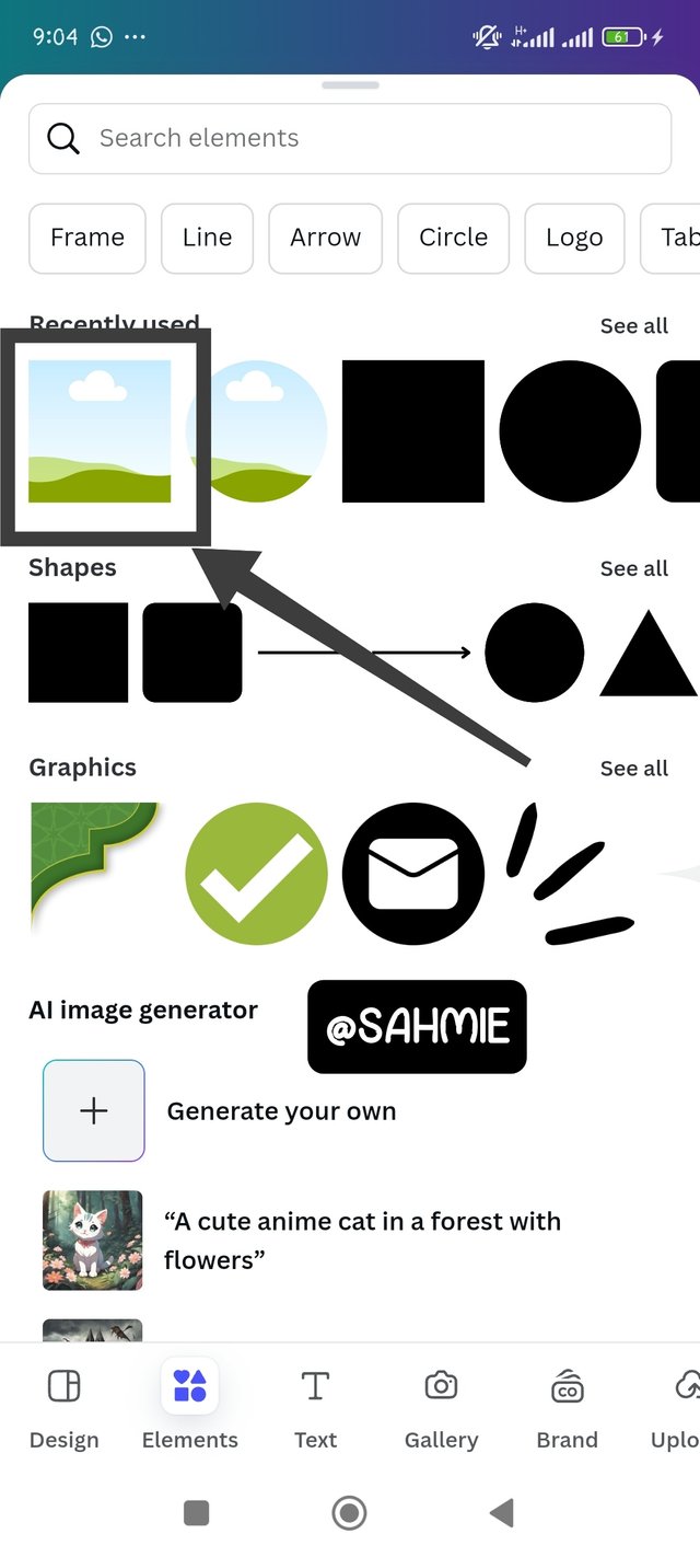
I opened my Canvas app, then went onto click on poster, which was on the homepage since I have used it before and it took me to a clean canvas. On the clean canvas, I clicked on elements and searched for frames, since I was looking to add images to my design. But then, since I already had it on the recent used, I just went straight to click on it.
 | 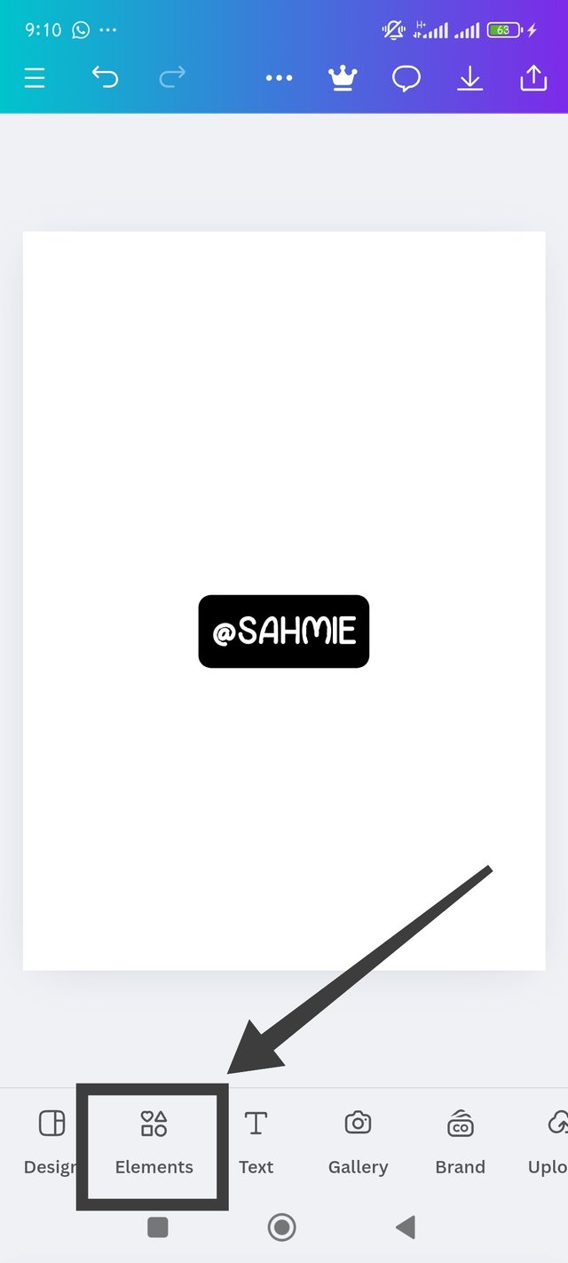 |  |
|---|
Step 2:
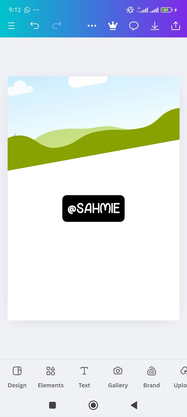
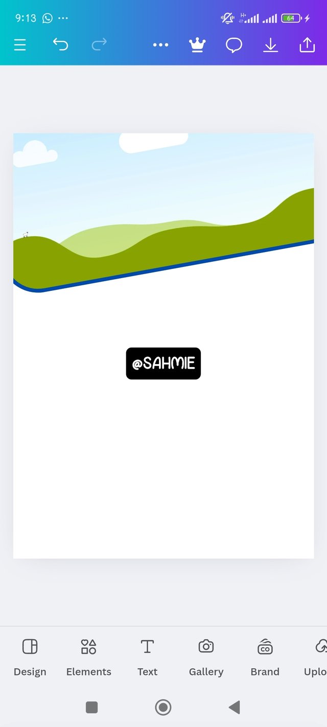
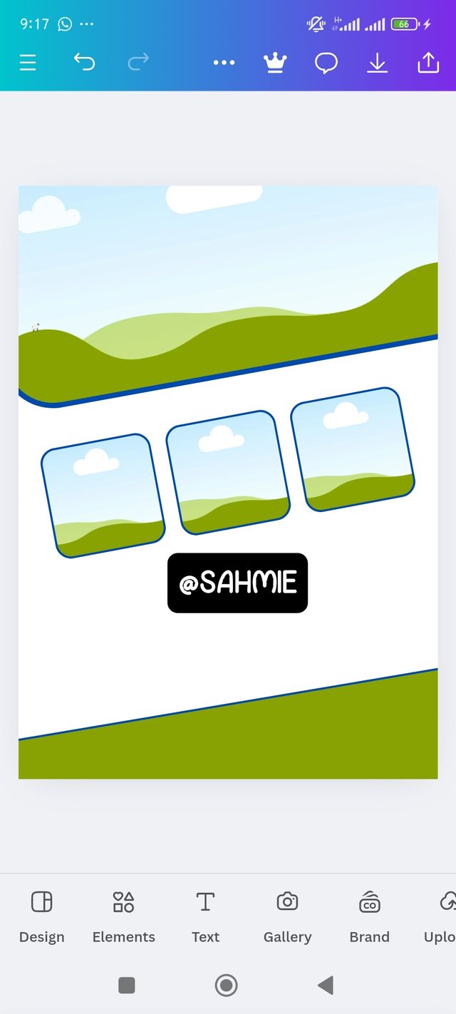
When the frame was added to my canvas, I adjusted it to my desired position, then added a stroke and color not forgetting curve to the frame, I also duplicated to make 3 more frames and arranged to taste. While also adding a footer below by clicking on elements, then picking a square shape, which I enlarged to cover the width of the canvas, then rotated to add elegance.
 |  |  |
|---|
Step 3:
Now it was time to add my desired images to each frame, so I clicked on the gallery button, then selected my images and placed them accordingly to the frames allocated while also changing the down footer color to deep blue. I used the same means to add my Travela logo, but then, I needed to lock the first image to its frame so the logo doesn't interfere with it.
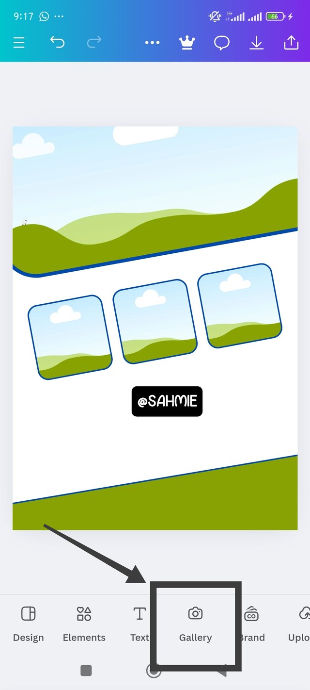 | 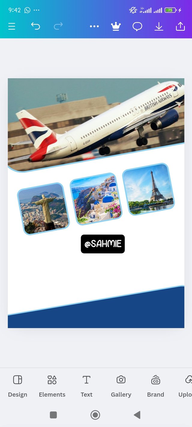 | 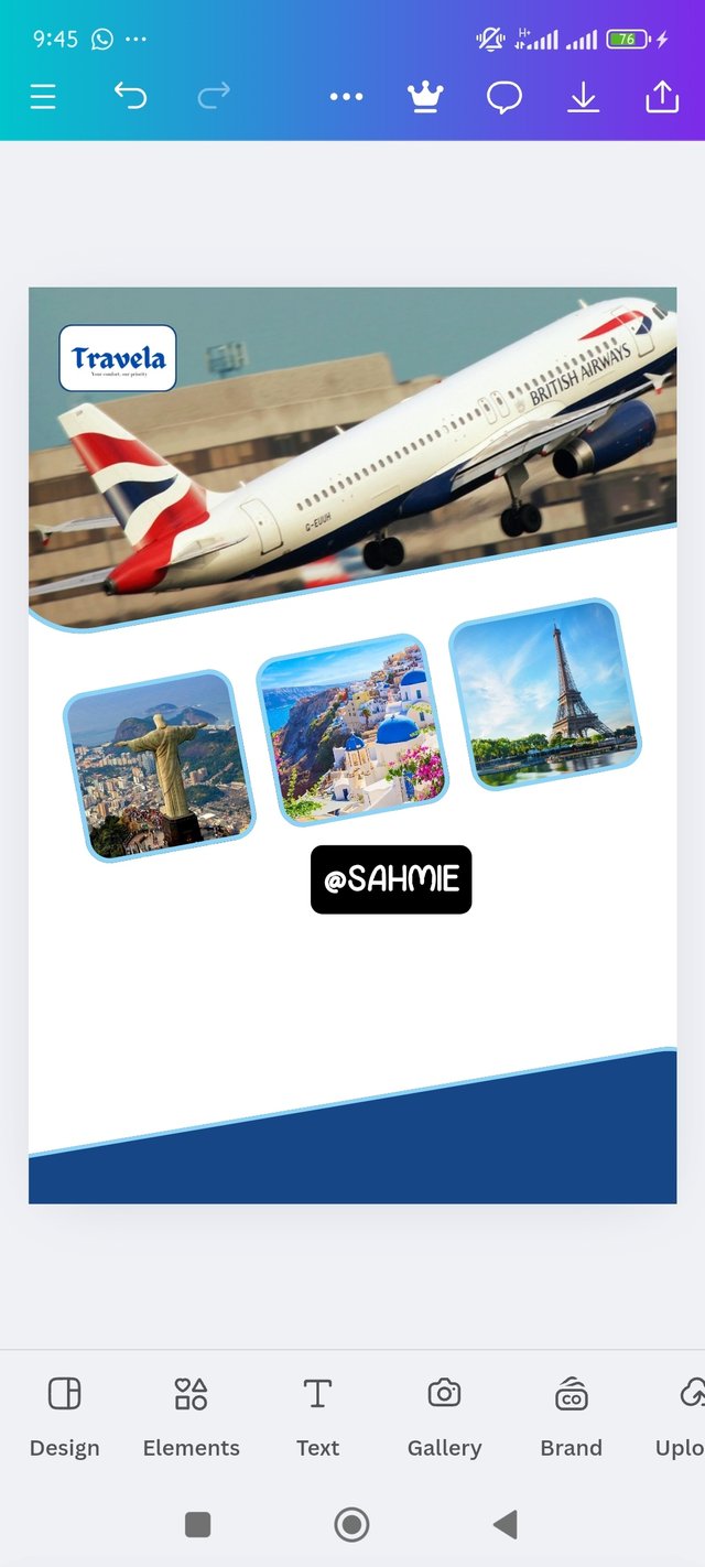 |
|---|
Step 4:
Next was to add text, so I clicked on the Text button at the bottom of the canvas to add my what I have in mind, while also using the same font, color and size for the body texts, and doing same for the subheadings as well. I added also the contact details and the discount offer, while also changing the white background to a contrasting color in light blue to fit perfectly with the footer.
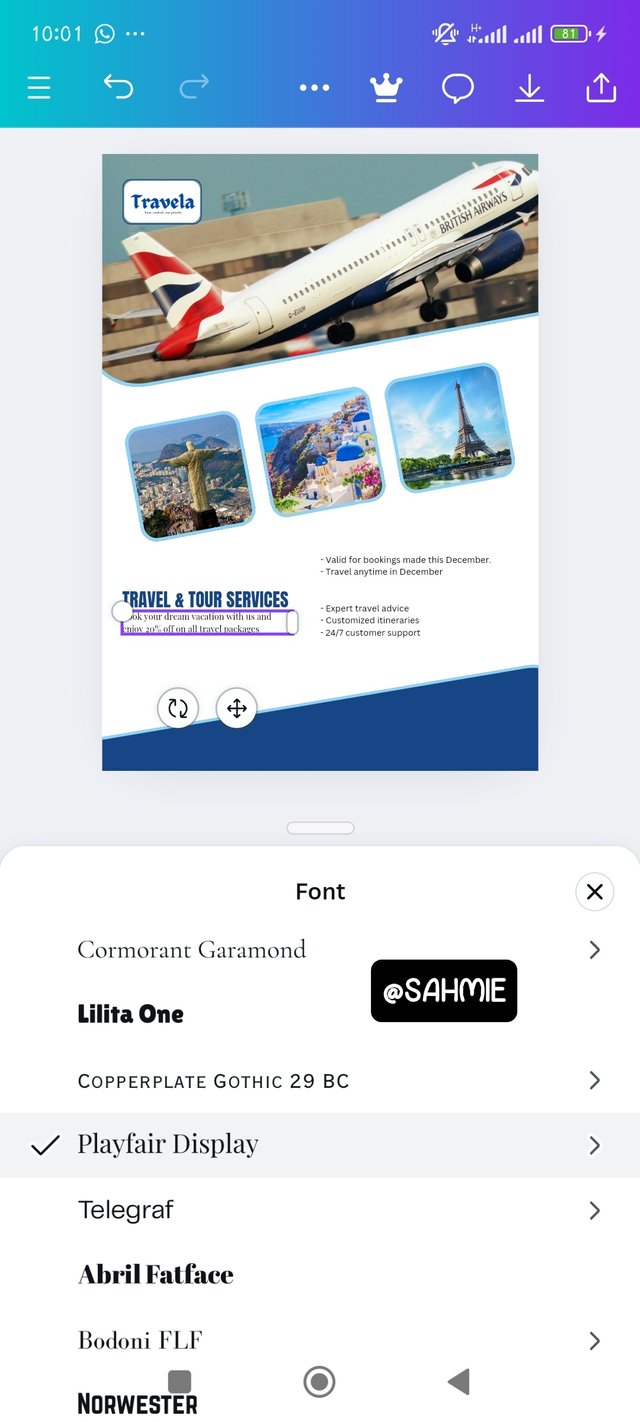 | 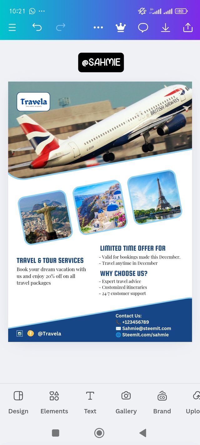 | 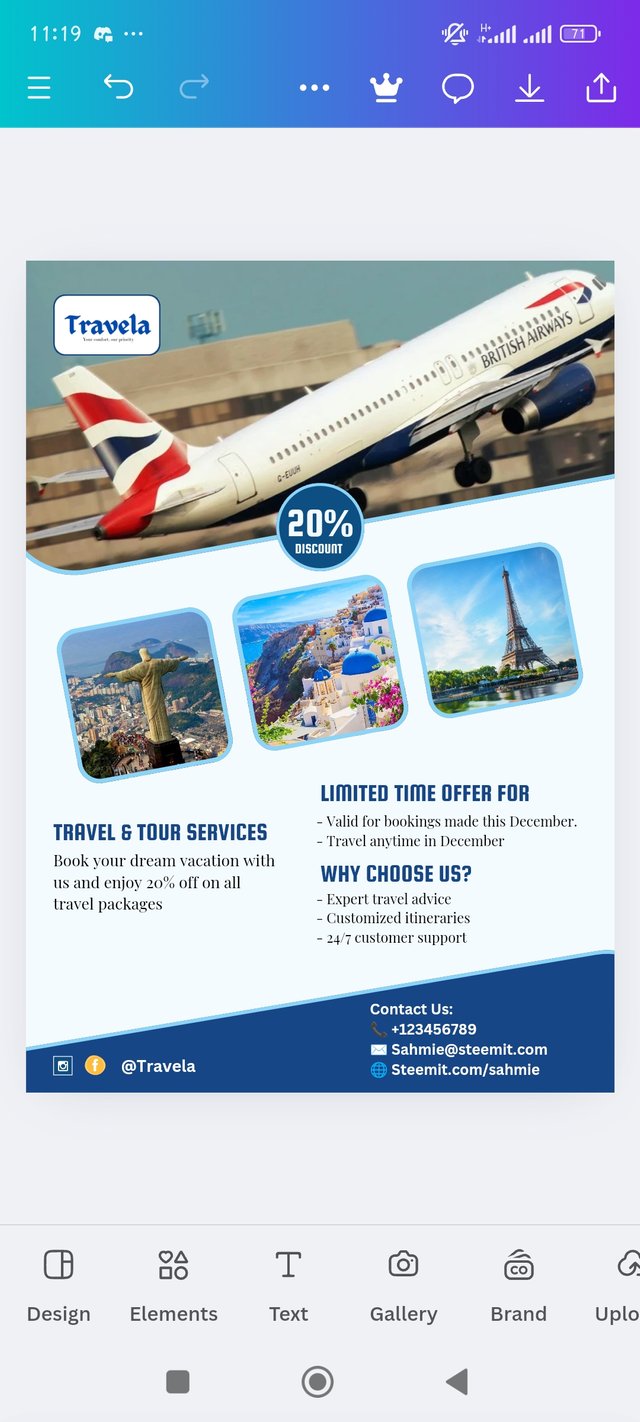 |
|---|
After all was adjusted to perfection in my eyes, I was certain it's the right design ready to be displayed as seen below;
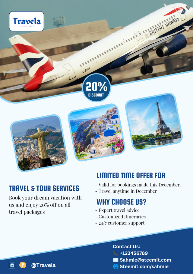 |
|---|
Dedicate a section to talk about the graphics design principles engaged in making your design. You might want to revisit the lecture on graphic design principles to refresh your memory. |
|---|
Okay, here is the breakdown of the principles that I considered important in creating my flyer design:
Balance:
Is one of my favorites, as it is all about distributing all elements evenly throughout the flyer. With this, anyone can achieve balance through symmetrical or asymmetrical layouts, ensuring that no part of the design feels too heavy or overcrowded.
Contrast:
We've learnt that having too many colors on a design is not so helpful, hence using contrasting colors and fonts helped me bring out the important information to stand out.
For example, a bold color in deep blue was used for the discount offer and contact background while, it was writing in white to help me catch the eye, while softer colors like the sky blue is used on the body as background and strokes of elements.
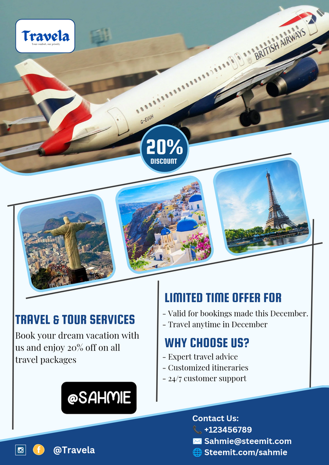
Alignment:
Alignment is all about making everything on the flyer neatly lined up, just as placing everything in an organized and connected format.
 |  |
|---|
Therefore proper alignment of text and images creates a clean and organized look on the flyer and everything is looking visually connected, making it easy for readers to follow the information.
Repetition:
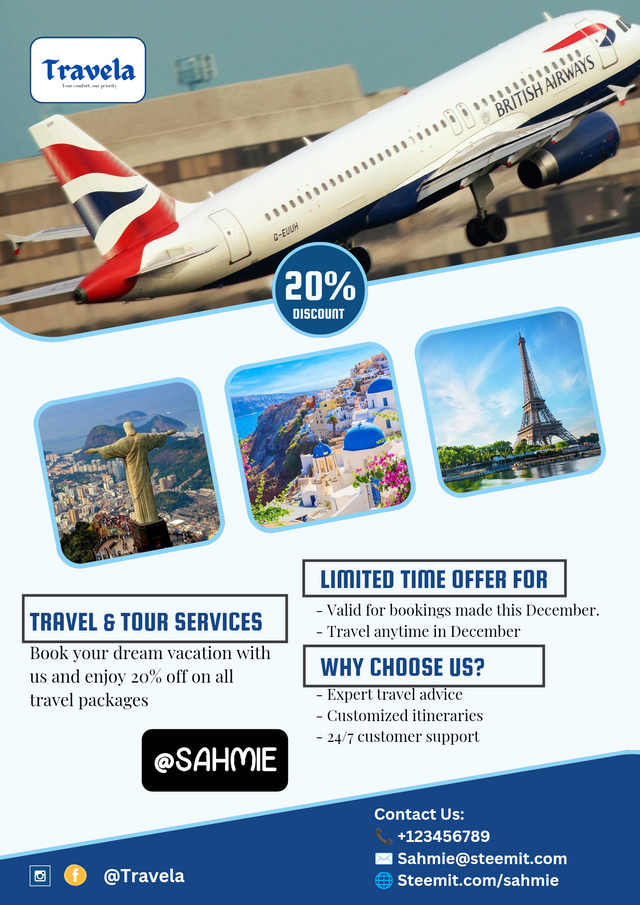
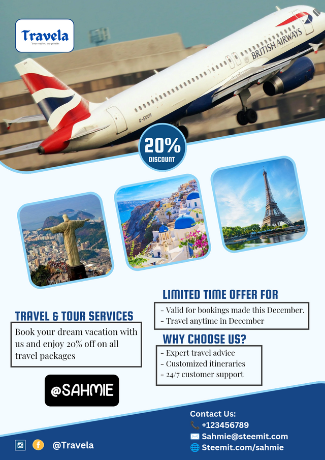
Consistency is key we are told is key. So I used the same fonts, colors, and styles for the headings and the body throughout the flyer to help reinforce my brand and make the design cohesive.
 |  |
|---|
Hierarchy:
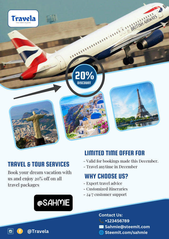
This saves as the guide for the viewer’s eye, taking them to the most important information first such as the discount and headings.
 |  |
|---|
Therefore I use larger fonts for headings and smaller ones for details, while also ensuring that the discount offer is the focal point.
White Space:
I wasn't afraid of the empty spaces, i.e., not packing everything in one place. This is because these white spaces (or negative spaces) helps to reduce clutter in the design, making my flyer easier to read and more visually appealing.
These were the design principles I used to make the flyer as beautifully as I can. I hope you liked it.
Once again use a suitable mockup to promote your design. |
|---|
To promote my design through mock-up, let's head back to Canvas app and carry the following steps.
Step 1:
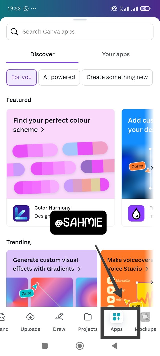
Open the canvas app, clicked on apps, on the next page search for mock ups, from the results, select mockups and click on the first option as shown below.
 | 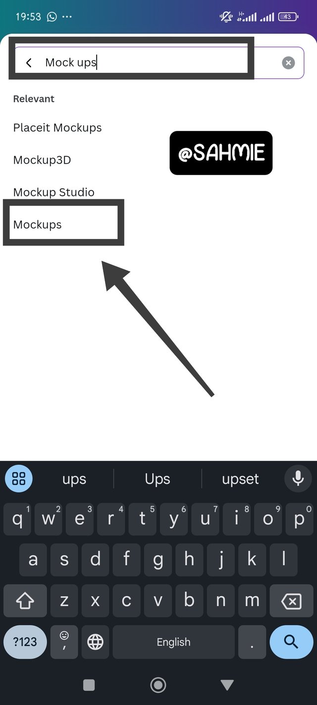 | 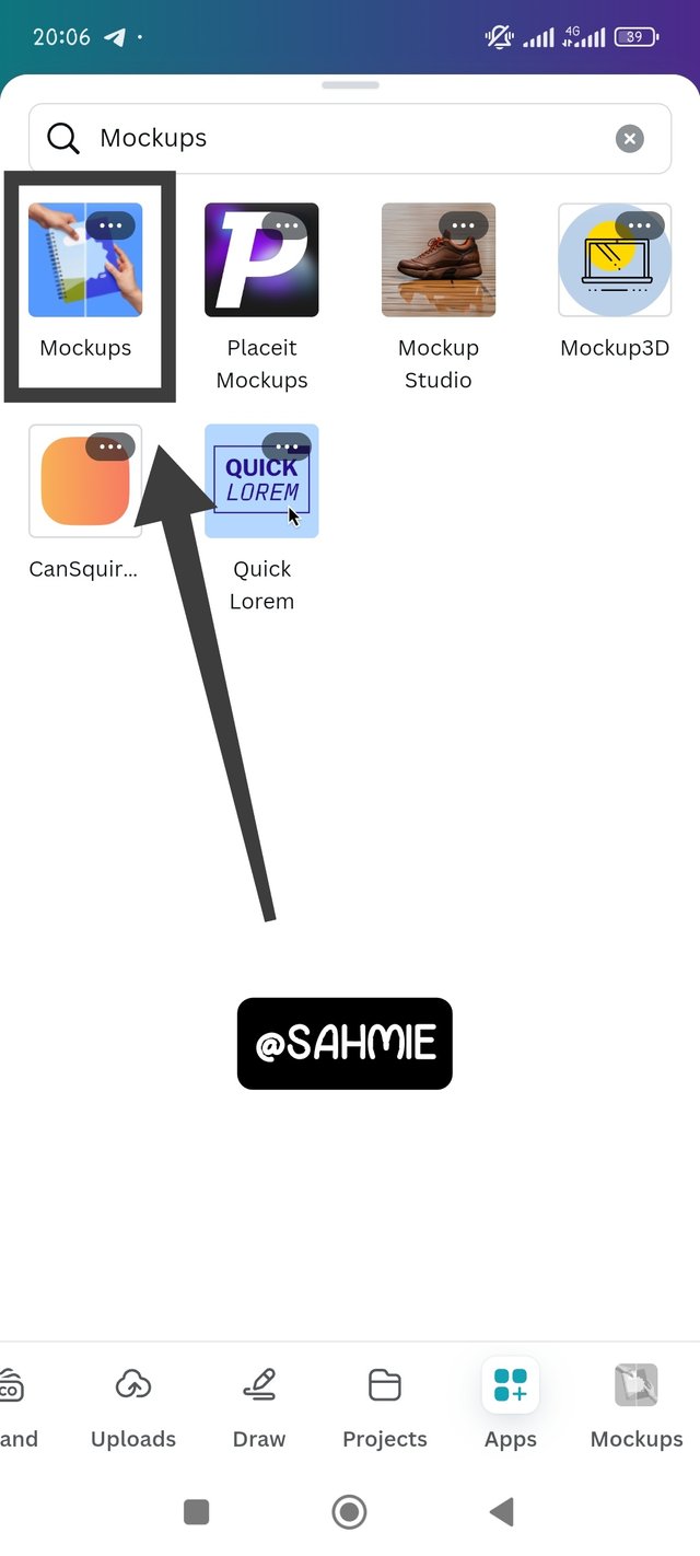 |
|---|
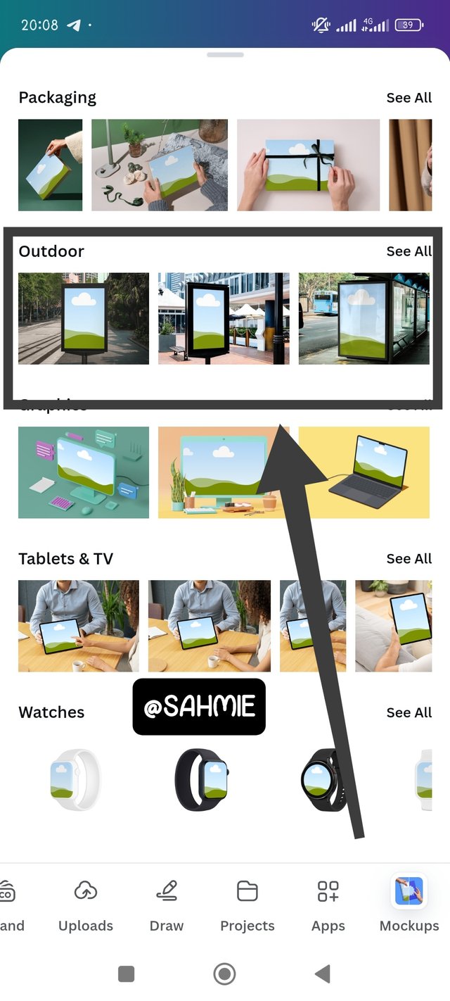
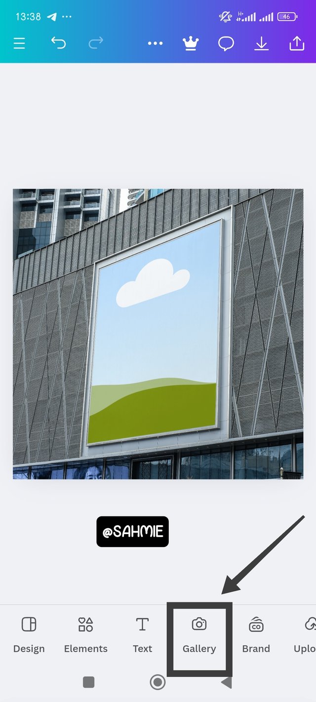
On the next page which carries different categories of mock ups, click on outdoor and select any choice of outdoor mock up to add the flyer. Once the mock up was on the canvas, click on gallery then select the flyer to add.
 |  | 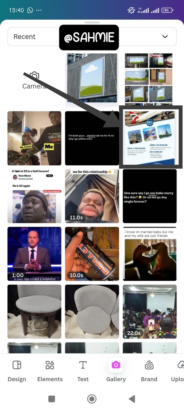 |
|---|
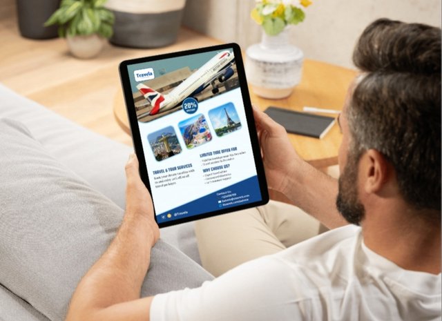
Once the flyer was now on display, I had to adjust it to the mock up, and the mock up absorbed it in, to give a wonderful display as shown below.
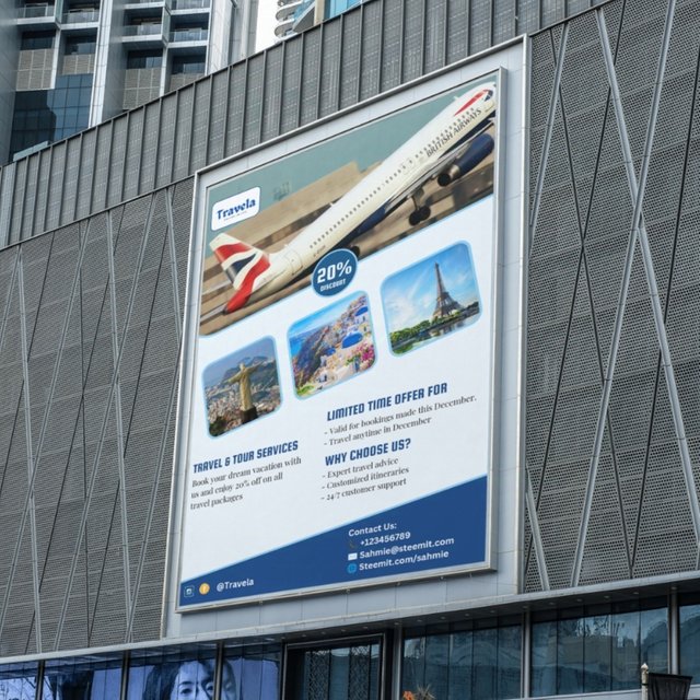
After which I kept playing with more and more outdoor mock ups as shown below.

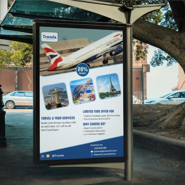
I want to take this opportunity to invite @ngoenyi, @bossj23, @ruthjoe and @bonaventure24.
Cc:-
@lhorgic
Thank You for your Time
NOTE: Always have a smile on your face, as you are never fully dressed without one.

Hello @sahmie thank you for participating in this week's lesson. We have assessed your entry and we present the result of our assessment below.
Feedback:
Welcome back to class dear student.
Let me start by commending you for a job weldone, the effort put in this work is quite commendable.
You're good man! I wonder what kept you away all these while, maybe the fear of stepping out of your comfort zone. The rate at which you grabbed all of these very fast using this tool is amazing. Weldone!
Your flier is nice,I think the word nice is an understatement, you maximized every bit of the principle of design, one can see it on display. I only wish fill up a little of the blank space under the "travels and tour services", it would have evenly distributed the elements in the design.
Your logos are are cool and you have clearly represented travella accurately with this flier.I must say, the outcome is lit. Weldone once again....Finally, the mockups you used are just superb and suitable for the design. Great Job!👍
Regards
@lhorgic❤️
This is Really beautiful! I love it 💯. You did a good job. Success my friend
Thank you so much for your kind words. I very much appreciate it, it wasn't easy but then I made it. I hope the tutor likes it as much as you did.
Every step in your post is explained so well that anyone can follow it and design it themselves. Best of luck for the contest my friend.
Thank you so much! I'm really happy to hear that you found the post easy to follow. Your support means a lot, and I appreciate the good luck wishes for the contest.
Me encanta este diseño. No tenía mucha fé del modo en que se ordenaron los elementos iniciales pero al final cobró sentido con la imagen del avión y la idea de los servicios que ofrece la empresa. El resultado es fantástico :) ¡éxitos!
Thanks you so much. I'm really glad you like the design. It’s great to hear that the final arrangement worked out well with the plane image and the services. Your positive feedback means a lot to me. Good luck to you too.
Gracias 😊