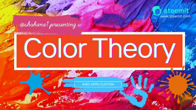
SEC20/WK2: Colour Theory and Application.
Selecting the right color for the figure or design is the most important part in graphic design. Now this become easy to choose colors and combine colors with the help of graphic design tools in our smart apps and webs. We can pick appropriate colors for our designs from a color wheel and this ease saved our time too.
Colorful things are more eye catchy and a color can express the class of a brand or product too. A perfect color blend or combination can give our design a high level. Wrong application of colors may have negative impact on our design or hard work so choose right color and applying it appropriately is most important thing in this field.
• Discuss Colour Theory according to the way you understand it.
Well, color theory for me is the correct use of colors, blending and combine it perfectly. This is not only about coloring objects but also about coloring text on our designs. A perfect color combination give good rating to a design and people shows more interest to it, on the other hand if somehow our color combination is wrong then it can be a red flag from our clients or viewers.
 |  |
|---|
Coloring text is equally important like coloring shapes and objects of a design. We can't use white text on off white backgrounds and black text on dark backgrounds. We can't combine wrong colors because it can spoil the design.
The aim of color theory is making designers understand what is the right use of colors. The color of mourn and grief is black and we can't use red there. Blood is red and we can't replace the color blue with it right?
• Choose "Two" from the colour scheme discussed, briefly talk about it and demonstrate with two examples each showing how to combine colours using that scheme.
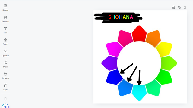
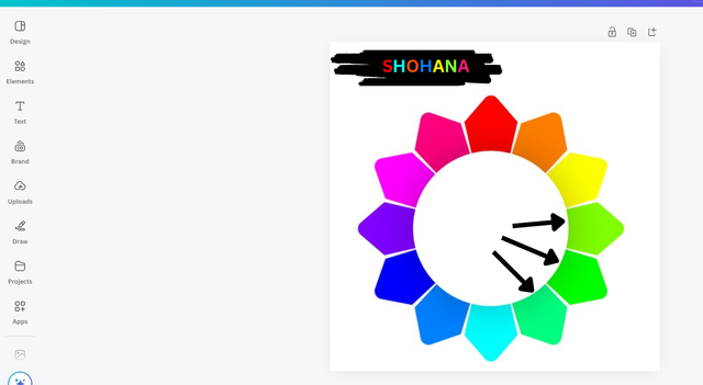
- Analogous colors:
After studying the color wheel and the guide from our coach I understand that analogous colors are those colors that close to each others and there will be one main color that will be supported by other colors that looks closer to it.
For example you can see the color wheel below there are three almost similar colors are together that pointed by arrows, among these three close colors. The main color is in the middle and the other two are supporting the main color. This is an important lesson to understand the color theory.
 |  |
|---|
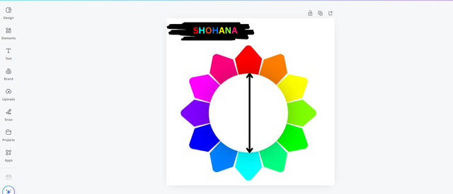
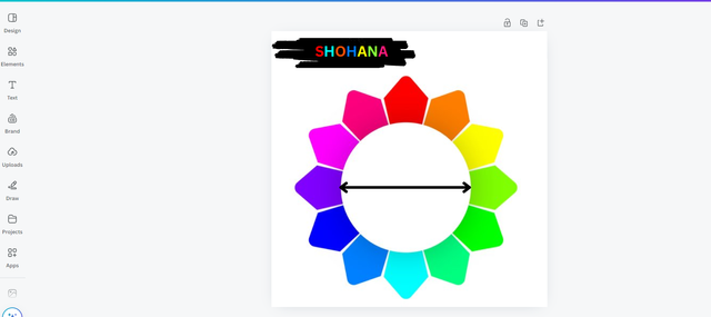
- Complementary colors:
Here I learn and understand that, two opposite colors (like north-south direction) in the color wheel are those two colors that complimenting each other. These color combination can give a design outstanding look, if designer apply it perfectly.
You can see in the image below where there I use arrow for two complementary. Red and blue are the two complementary colors as I indicate on the color wheel. Likewise, purple and light green color can be a perfect color combination. In short, complementary colors are those that compliment each others.
 |  |
|---|
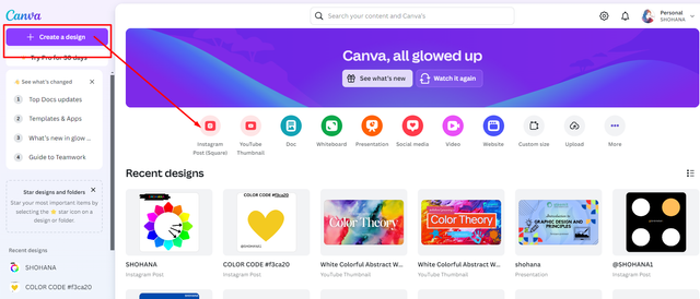
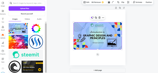
• Demonstrate how to get your colour Hex from external object using your Canva design app.
First of all I open my canva interface in my browser. I'm using canva web version on chrome browser, it is also available for mobile browsers and app. I choose Instagram post square shape background.
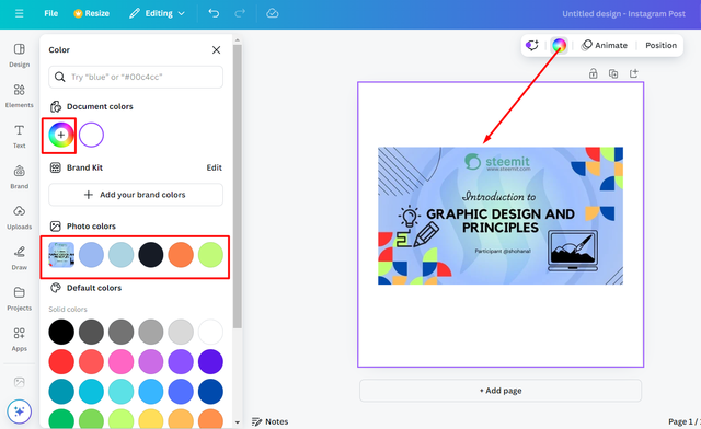
I took a photo from my uploaded photos and then I changed the color of background by picking color from the color wheel. You can see the process step by step in screenshots below:
 |  |
|---|
Picked a color from the image to color the background and I clicked on color wheel and got my hex color code there. My hex color code is #9bb9f2 and you can simply copy and paste this code if you want the same color for your design too.
In addition we can easily pick specific color from the image where the color already exist and we have a color picker there too to pick any color from any kind of image we want. For details see the process below,
 | 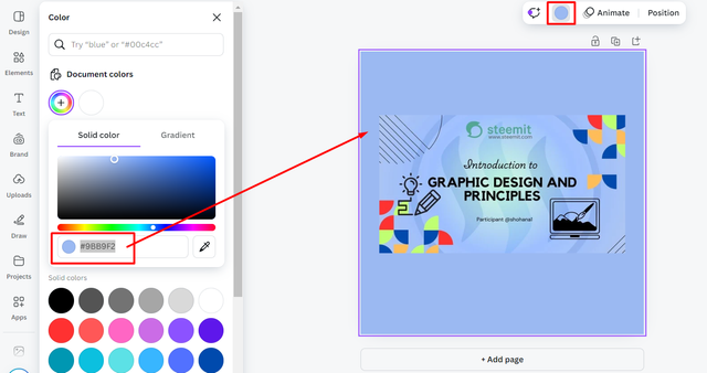 |
|---|
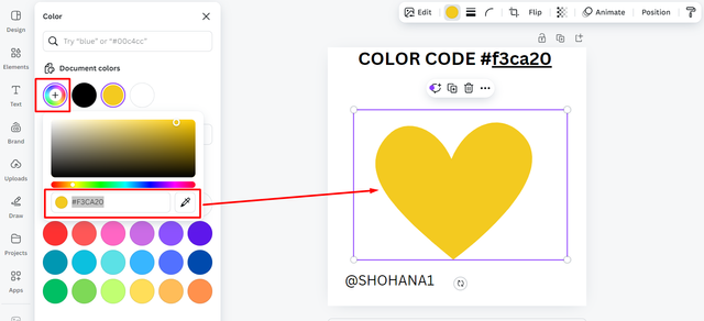
• Finally demonstrate how to get the colours behind the hex codes below.
Demonstrating to get the colours behind the hex codes below:
I took a heart shape and put the hex codes to color them accordingly,
a.#f3ca20
b.#000000
c.#ef9d10f
 a.#f3ca20 a.#f3ca20 | 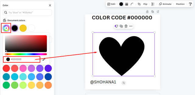 b.#000000 b.#000000 | 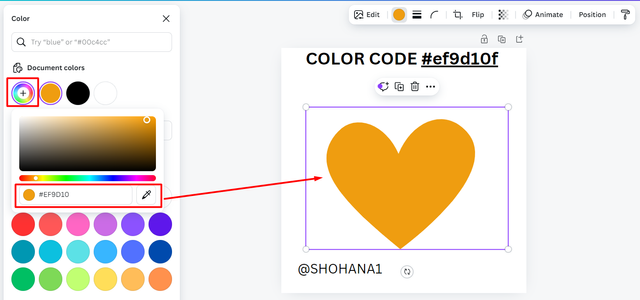 c.#ef9d10f c.#ef9d10f |
|---|
Sounds like I'm done with my homework and I'm glad that I learn more about the colors that playing a great role on graphic design field. The world is full of colors and the correct apply of colors can help us to design something great or eye catchy.
Moreover, the lesson was interesting and I would love to thank our coach @lhorgic for making this interesting to us. I wish I didn't missed any part of these tasks. Will wait for next round, till then good bye!
Thanks For Stopping By
Inviting to join the CONTEST friend @sushanta83 @fantvwiki @azwar82 if you already participated then pass it to others!
Love & Peace ❤️😇

Hello @shohana thank you for participating in this week's lesson. We have assessed your entry and we present the result of our assessment below.
Feedback:
• You have clearly defined Colour theory the way you best understand it and I appreciate the effort you put into it. It would have been more interesting if you had delve deeper into your explanation.
• Your selection on colour scheme. Good to see that you clearly demonstrated how much you understand the use of those scheme which is quite commendable.
• Finally, Your practical looks really nice in it presentation, looking very organized and comprehensive. However I could see from the process that a step or two seems to be missing for getting hex from external object. You'd agree with me if you carefully go through again to check.In all, you did a good job. I hope you keep up with the energy level. Weldone.
Regards
@lhorgic❤️
0.00 SBD,
0.10 STEEM,
0.10 SP
Thank you so much for the kind observation and grading. Have a nice day!
¡Holaaa amiga!🤗
Lograr una fiesta de colores de manera armónica es posible si utilizamos correctamente la teoría del color por ello, estudiar elementos como la analogía y complemento, nos permitirá seleccionar adecuadamente te nuestros colores.
Te deseo mucho éxito en la dinámica... Un fuerte abrazo💚
0.00 SBD,
0.07 STEEM,
0.07 SP
Thank you so much for such kind words! 🤗❤️
https://x.com/SHOHANA_ONE/status/1836209058275320284