A different Comments UI
Hi Steemiter,
Here is boylikegirl.club, Our latest development progress report.
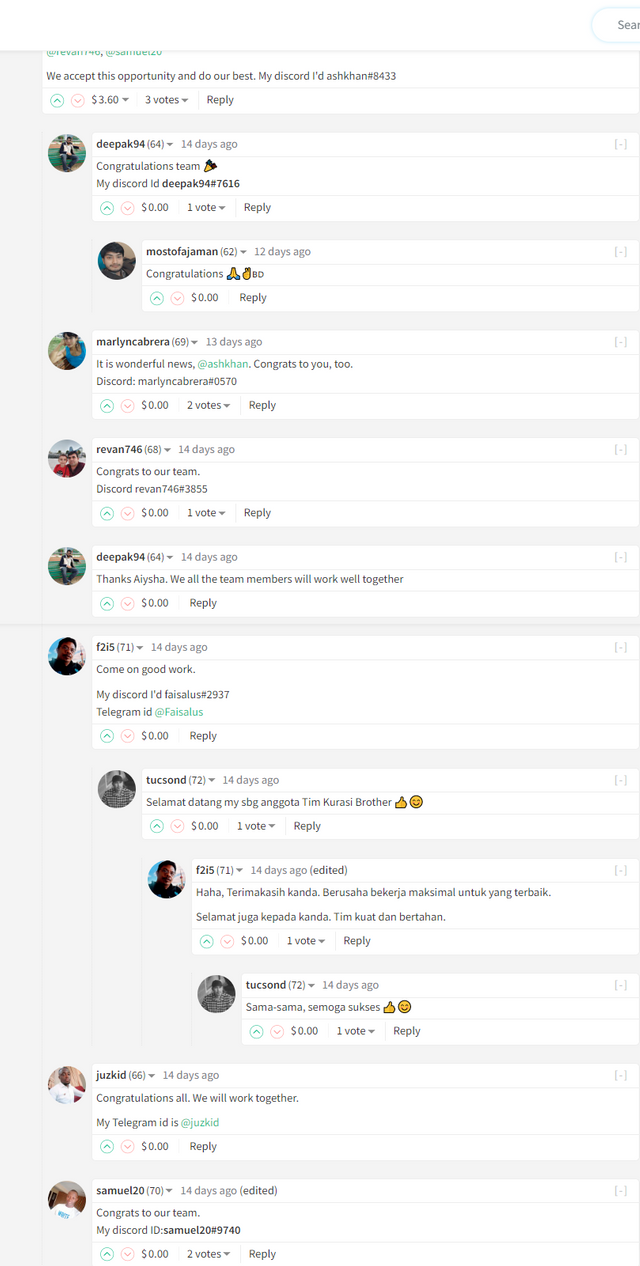
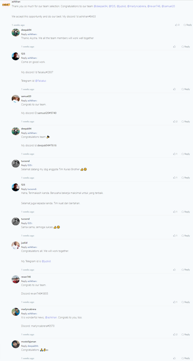
We pay attention to steemit's comments ui, the message box will become very narrow when there is a lot of communication,So on the page, we redesigned the UI.
Since there are many details on the article page, we will only intercept the comment part for the time being for you to compare.
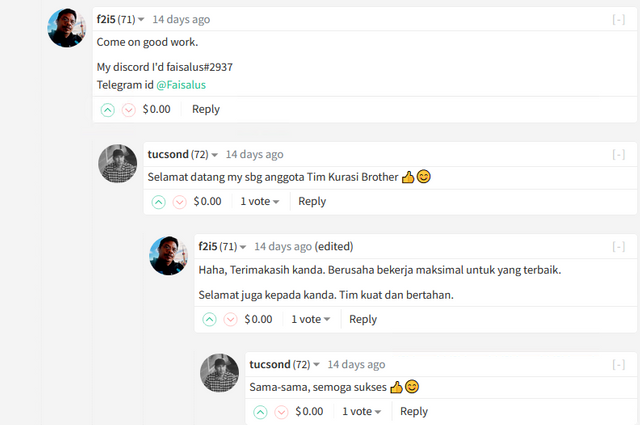
Steemit Ui


Boylikegirl club Ui

Both UIs have their own advantages, depending on your preferences,
Our reply function area is also different from the official one

Since the article page has many functions, we need to do more optimization processing,
There are actually more functions that can be displayed on the article details page. We will leave it for the next display. We will also strive to improve development efficiency
We hope that our work can be recognized by everyone, and we also hope that you can put forward your valuable ideas and suggestions. Under our established plan, we will also adopt new ideas. Let us create more bright futures for steemit.
Voted your Witness … do you send Liquid Steem rewards ?
Thank you!. Yes You will receive daily steem rewards, and post Upvote
2
test greate
test
test
test 123
etst
test 45645
1
teset
23