You are viewing a single comment's thread from:
RE: 👨💻 #Proposal-86: Communities Update
Hi, I have been seeing all you are doing and I really like what I see.
When you have time I would like to request to do something in the user’s profile.


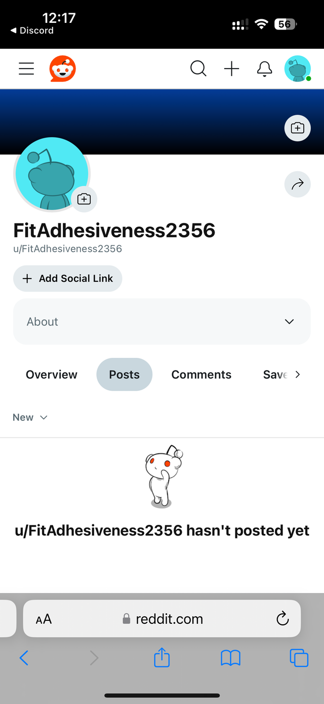
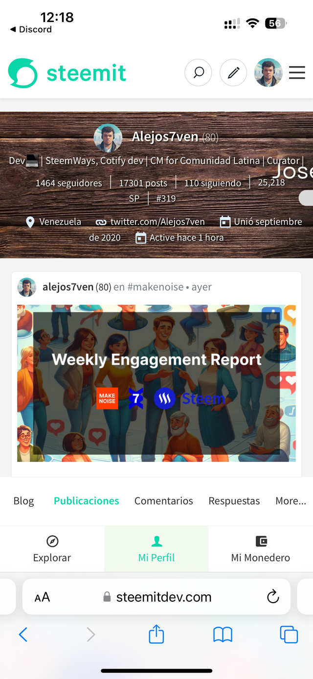
Check for example the current one with Reddit one together. I feel that now without the navigation bar the separation between the posts and the profile is too aggressive.
Maybe you could do something with this!
Continue the good job.
Hi @alejos7ven, thanks for your feedback.
I covered this briefly some time ago.
In particular, I spent quite a lot of time looking at Mobile Design Patterns.
Interestingly, my preference at the time was as you suggest (which was the Sky Sports example).
When experimenting though, the connection between the navigation levels felt appropriate and also interestingly, Sky Sports have also followed my design approach and updated their site too.
It's not a closed book - the current version is ready to be launched and whilst I've had good feedback during testing, it'll be interesting to see what the wider community thinks.