RE: 👨💻 #Proposal-86: Hide Resteems on steemitdev.com
I've wondered about the positioning of the "Hide Resteems" too. There's normally the "Order" dropdown in the area that you've highlighted which might be a bit confusing if something else appears there instead.
I've wondered about a longer term solution of introducing a "filters" bar or "options" for when additional functionality becomes available (if that happens)... regardless, I notice that the spacing could do with some adjustment.
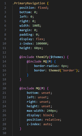
I'll have a look at the 1px top border... I've got a feeling I've removed that style in a previous release. If you take a look at the PrimaryNavigation.scss file, this section should look like this (lines 13 to 18):

This is it...
https://github.com/steemit/condenser/commit/0da5aa368f902cde01a02e36d6992a08e4875cc5
I removed that line with the communities release:

True, but not in the "feed" view.
That's a good idea. I would also favour that. But these would have to be quickly accessible. Clicking through to the profile settings would be too much.
Oh, that's right too! After your hint I saw that the line came back in one of my later merges... don't ask me how that happened. So the fault lies with me :-D
I agree. My current thinking with that is for a show/hide panel that's within the context of the feed. I've just looked and it appears that peakd do something similar already.
I'm currently implementing the "Pinned Carousel" for mobile devices so will postpone thinking too much just yet 🤯