SteemLeo Condenser UI Updates | Dashboard, Post Layouts, Shop & More!
Hey everyone! Over the weekend, we made a bunch of visual UI improvements to https://steemleo.com which are all aimed at enhancing the user experience of the site.
We are visual creatures and making tweaks to the visual experience of Steemleo will go a long way in enticing new and existing content creators to use our interface for their Steem(Leo)-based activities. Growing the Ad revenue on the Steemleo interface is one of our top priorities as it ultimately leads to LEO Token sustainability and higher burn rates.
Changes in This Update:
- Several Updates to the SteemLeo Dashboard (https://steemleo.com/@steem.leo/dashboard)
- Post Feed Layout
- Post Layout
- Templates Feature Added to “Advanced Settings” Under the "Create a Post" Page
- Shop Link Added to Nav Bar
- Sidebar Enhancements
- Icon Changes
SteemLeo Dashboard Updates
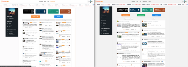
The SteemLeo Dashboard is by far one of my favorite pages of the site. I dreamed of making something along the lines of this ever since I got to Steem. We’re just getting started with the dashboard and there are so many features that we plan to roll out in 2020 including detailed user analytics, user recommendations, tooltips and more.
This version of the Dashboard, however, needed some serious visual improvements. Having 3 feeds displayed at the same time was cool, but it took up too much space on the webpage and caused the feeds to be nearly unreadable due to the font sizing.
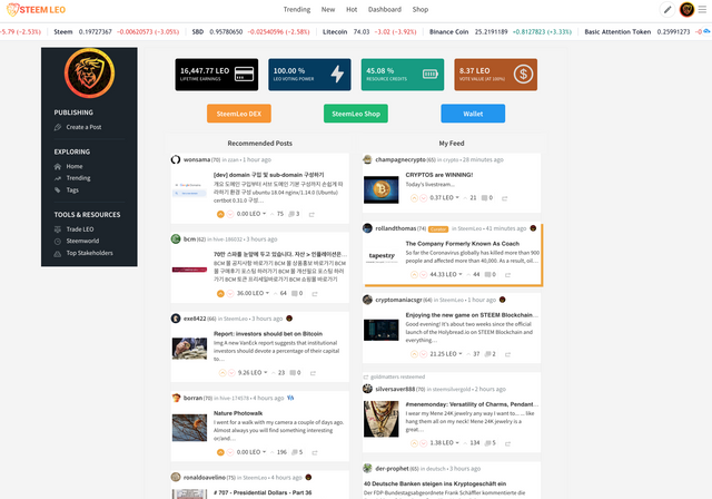
We took the “My Blog” feed off of the default dashboard page and now it will show “Recommended Posts” and “My Feed”. You can still select “My Blog” from the dropdown menu on smaller screen sizes (i.e. mobile/tablet).
The "Recommended Posts” feed also had several display issues in which it would show all sorts of comments and irrelevant content. We made some improvements to the recommendations given by this feed. It primarily shows manually curated Steemleo content with this new update.
Additional updates to the post feed layout makes the dashboard look way cleaner and we’ve also added the “SteemLeo Shop” button to the top of the Dashboard as well which allows for quick navigation between the Steemleo DEX, SteemLeo Shop and User Wallet pages.
A few speed improvements were also made. The dashboard often takes a bit longer than a normal webpage to load, this is normal as the dashboard pulls from several post feeds and API sources to display information such as your lifetime LEO earnings, your current LEO voting power and also the 100% vote value of your LEO upvotes.
In a future update, we’re going to make a better loading display to indicate that the site is pulling data (especially as we start to display more complex data). It will resemble something along the lines of the Steemworld.org loading screen when you first pull up that site.
See your SteemLeo Dashboard by going to https://steemleo.com/@steem.leo/dashboard (replace steem.leo with your Steem username).
Post Feed Layout
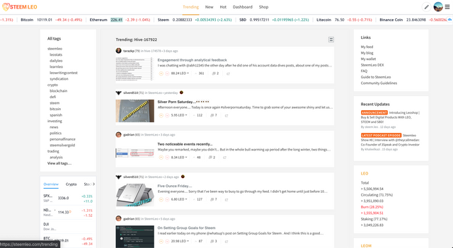
One of the major visual changes that we made is for post feed layouts. When you're viewing posts from any feed — the Trending page, Hot page, New Page, Dashboard Page, Feed Page, etc. — you’ll notice that the individual post boxes are spread out and have a slightly different styling. When you hover over a post box, it highlights it in orange.
To most, this will be a small visual effect, it won’t “radically alter” your experience of Steemleo, but I think it goes a long way toward a cleaner and more user-friendly UI. It modernizes the UI and in fact, this styling was modeled directly from the Beta.Steemit website.
Post Layout
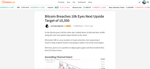
This new post layout is so clean and modern. If you look at sites like Medium and other major content-focused websites, this is the way that written content is starting to materialize. Modern and with a great contrast (it looks great when you’re reading from mobile as well).
Templates Feature Added to “Advanced Settings” Under the "Create a Post” Page
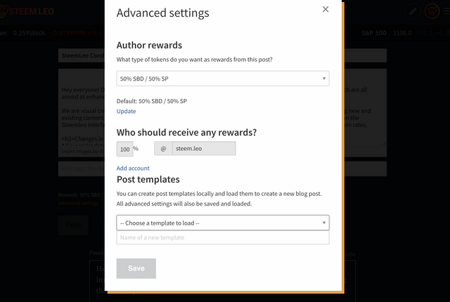
The templates feature has been one of the most requested additions to the Steemleo website. Thanks to some community work on the Steemit Beta condenser, we were able to pull in those changes and have our own version of the Post Templates on https://steemleo.com.
Post templates are simple: if you use a particular post layout regularly in your posts, you can add that layout into the Create a Post screen, then click advanced settings and then click save template.
The templates save locally in your browser. The next time you’re ready to make a post with a template you’ve saved, just go back to the Create a Post screen, select your template and then click load and it will fill out the markdown box.
The other changes were minor visual ones reflected across the entire site. We added the shop link to the top navigation bar which takes you to the https://steemleo.com/shop page that explains what Leoshop is and how to use it. We updated some icons across the site and also made a few sidebar enhancements.
The SteemLeo condenser UI is the face of the SteemLeo community. It houses Leopedia and links directly with our Dex and Shop (https://dex.steemleo.com and https://shop.steemleo.com). Our goal is to make continual improvements, even if just the minor bug fix or visual enhancement. Every little change that adds up to a better user experience is what will make our community’s interface more user-friendly and will ultimately lead to more cash flow from Leoads.
Some in the community have asked for a little sneak peak at “what’s next”. I won’t go into too much detail, but the current game plan is to:
Release a visual update to Leocondenser (https://steemleo.com)- Make several updates to the Leopedia page(s)
- Finish the update for Leoshop V2 (https://shop.steemleo.com)
- Finish building out the updated portfolio for Leoservices (https://dex.steemleo.com/services)
- Major update to the SteemLeo Dashboard page (https://steemleo.com/@steem.leo/dashboard)
- Leodex V4 update (https://dex.steemleo.com)

Posted via Steemleo

Go Leo!!!!love these improvements but most are evident on desktop screens..hopefully they cam be mobile optimised too,but no pressure at all. Go easy and steady
Simple, yet Sexy...great job. Would love to see in the future, a widget or some type of display of the Leo price on the dashboard...not in terms of the steem price, but based on the US dollar as I think that would have move value longer term.
Posted via Steemleo
Very nice!
I love the fact that you are creating a unique identity here; something that goes FAR beyond just being another Steemit clone with different colors. Well done!
=^..^=
Posted via Steemleo
Excellent to see this, I have been steadily buying Leo, a diamond in the making!!!👍😊🤗
Posted via Steemleo
Updates. Updates. Updates.
I love me some updates.
Great job team. This is becoming an incredible platform. The article is correct, each change enhances the user experience is moves things forward.
$1 LEO is just around the corner. Keep it coming.
Posted via Steemleo
You nailed it there. Leo at $1. How about if a leo app can be on the build with trading facilities, I think we could have more onboarding.
Posted via Steemleo
Nice UI update
!trdo
Posted via Steemleo
Congratulations @shitsignals, you successfuly trended the post shared by @steem.leo!
@steem.leo will receive 1.62998325 TRDO & @shitsignals will get 1.08665550 TRDO curation in 3 Days from Post Created Date!
"Call TRDO, Your Comment Worth Something!"
To view or trade TRDO go to steem-engine.com
Join TRDO Discord Channel or Join TRDO Web Site
This is indeed a great work and update on the Steemleo. Infact, I didn't see this aesthetic and technical devs coming from an investment minded interface of steem. Thanks for taking this lead.
Simply beautiful.
Posted via Steemleo
Posted via Steemleo
Congratulations @steem.leo! You have completed the following achievement on the Steem blockchain and have been rewarded with new badge(s) :
You can view your badges on your Steem Board and compare to others on the Steem Ranking
If you no longer want to receive notifications, reply to this comment with the word
STOPTo support your work, I also upvoted your post!
Vote for @Steemitboard as a witness to get one more award and increased upvotes!
Cool!