SLC21/WK1: Introduction to Gradients and Application.
This is my first-ever Steemit Learning Challenge Season Homework. I am glad that at least, I started my class at Steemit and I am glad about that. However, because of my first homework, I may have made some mistakes. Your guidelines will always be helpful to me. I will appreciate every single suggestion by you. Feel free to criticize my work.
What is Gradient?
The gradient is the combination of colors. Where you/I can control the blend of every single color and maximize or minimize the dominance of one color over another. A perfectly blended gradient of colors gives our eyes an animated satisfaction. We feel comfortable watching that thing.
There are various kinds of Gradients beyond Linear, Angular, and Radial gradients like Mesh Gradients, Diamond Shape Gradients, and Freeform Gradients.
Mesh Gradient
A mesh gradient is a smooth combination of colors between two or more points in an object. Geographical presentation, Weather updates, Density, and many more diagrams created with the help of mesh gradient.
Diamond Gradient
The diamond gradient is similar to the Radial gradient. But this time, instead of creating a circle, this is a diamond-shaped gradient.
Freeform gradient
A similar gradient of Mesh. But this has more freedom.
Creating 3 gradients using the guidelines provided in the Lesson post.
Open and Prepare the process of my Canvas in Canva App.
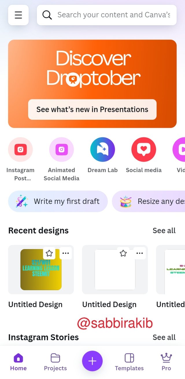
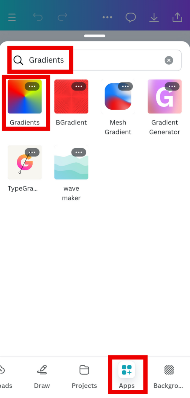
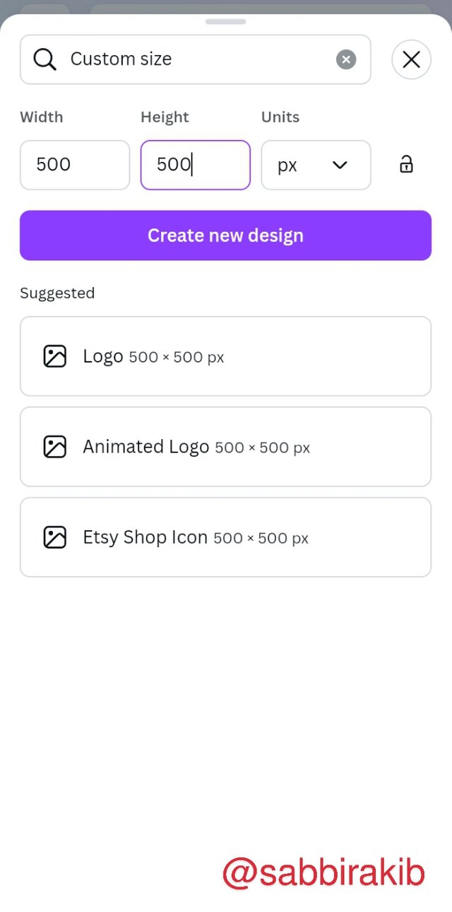
At first, I logged in to my Canva a/c. Then create a project with 500×500 Pixel. Go to the Application section, search Gradient, and select that.
A
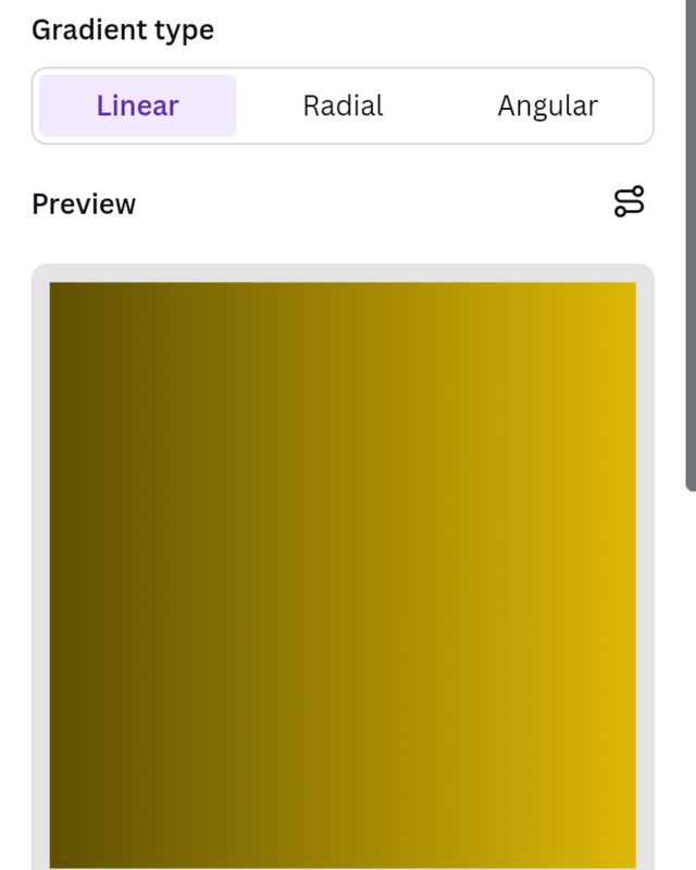
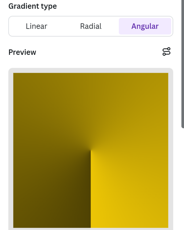
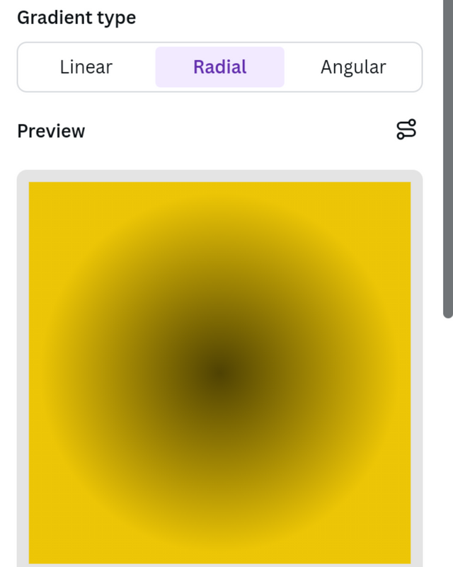
At first, I created a gradient background with one color but different shades; the hex codes are #504303 and #EDC606. I tried all three available gradients: Linear, Radial, and Angular.
B
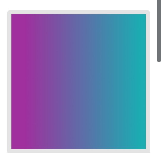
This time I created a gradient background with Two Different colors. The hex codes are #9F309E and #1BADB2. I tried all three above-mentioned gradients.
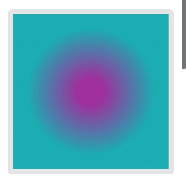
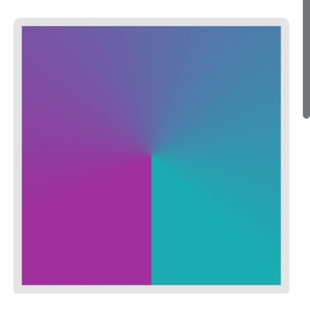
C
This time I created a gradient background with Three different colors. The hex codes are #CBB90F, #0FCB4F, and #2A1DBD. I tried all three above-mentioned gradients.
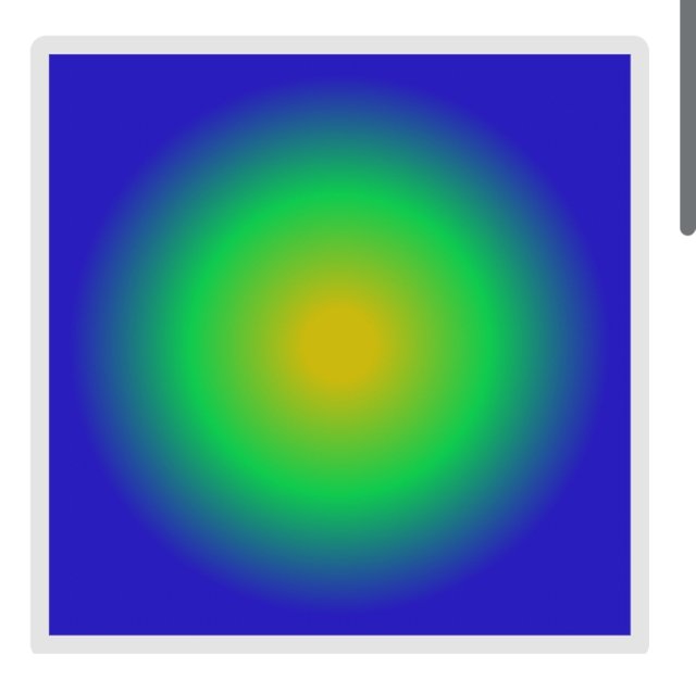
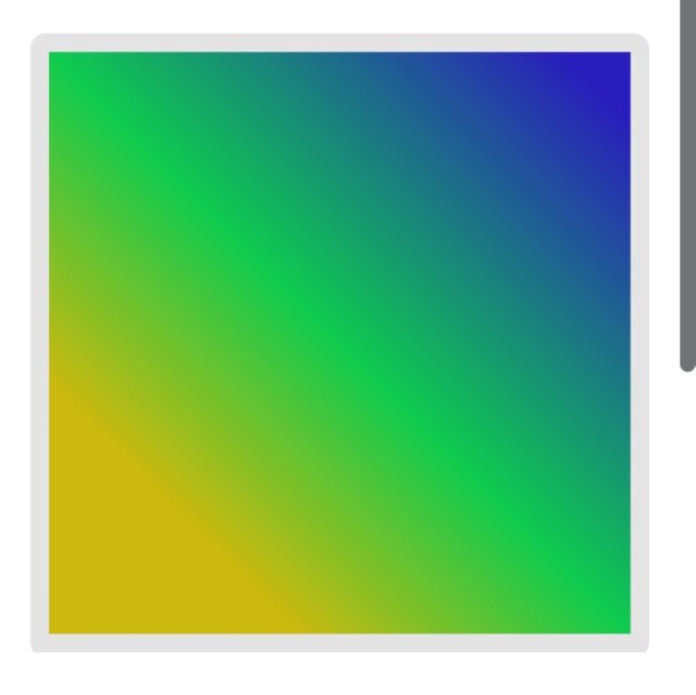
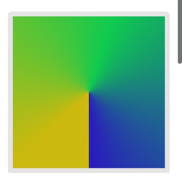
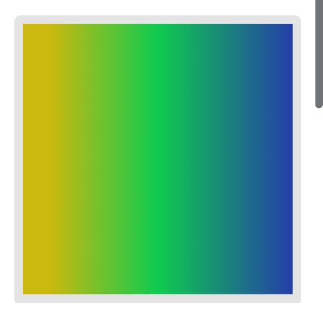
| Note | I didn’t use my sign in my Gradient work because Color Hex Codes are unique enough to prove it’s my work. I don’t think anyone will use the same color codes. |
|---|
Practical Application of Gradient in Flyer Design and Text.
Here, I used a girl's photo for one of my created Gradient backgrounds. I took this photo from Freepik and edited in Canva. I try to implement it perfectly as much as I can.

I used light colors for my text for a clear view over a dark-colored background.
I would like to invite my good friends @djanita, @fizabatool, and @junaidahmed to attend this season's lesson and complete their homework.
¡Saludos amigo!🤗
El degradado radial aplicado en tonalidades adversas puede arruinar terriblemente su función y, aquí es donde pienso que está su desafío para el diseñador porque, a través de esa adversidad podemos aprender a utilizar correctamente los códigos hexadecimales.
Te deseo mucho éxito en la dinámica... Un fuerte abrazo💚
Thank you for your suggestion. Thanks again.
You have created a very nice design, and presented it in a very nice way, I wish you success, I hope you will go further like this, thank you very much for sharing this beautiful post with us. Be well always.
Thank you, brother.
This was quite an informative post to look at . Not only does a reader can gain valuable insights from it but it can help with a lot of creativity with web pages along with designs and user experiences.
Love reading your post. Thanks for sharing it with us!
Thank you. Missing you for a couple of weeks. Good to see you back.
Awwh sweet!
Same here, I m back now :)