@joalsaro Logro 4: Diagramación de posts / @joalsaro Achievement 4 : Markdown .
Introducción.
A continuación, basándome en la lectura del post de las amigas @cryptokannon y @fendit, voy a tratar de agregar valor y cumplir con mi cuarto logro de la comunidad #newcomers, como lo es el de aplicar formatos a los contenidos en la plataforma #steemit. La elaboración y publicación de este logro está orientada hacia dos objetivos:
Que los recién llegados (newcomers) tengamos los conocimientos básicos necesarios para formatear nuestras publicaciones para de esa forma impulsar la calidad en su presentación.
Que los recién llegados (newcomers) podamos emplear formatos avanzados con los recursos presentados.
Publicar en #steemit requiere de ciertos requisitos de calidad en la diagramación del post con el fin de que la información mostrada sea agradable a la vista, divertida para la lectura y comprensible en el abordaje de los contenidos. Los #newcomers, debemos modificar, tanto el material como los formatos básicos de nuestras publicaciones para convertir nuestros blogs en sitios interesantes y que inviten a repetir la visita agregando valor a la vida de los lectores, que nos apoyan con sus votos y comentarios.
La amiga steemer @katerinaramm realizó una compilación realmente completa de todos los recursos simples y avanzados de formateo y diagramación de los posts en #steemit, los cuales pueden ser observados en este enlace - https://steemit.com/steemithelp/@katerinaramm/how-to-use-mark-down-style-for-an-appealing-easy-to-read-post-in-steemit. Este post está completamente en idioma inglés.
Introduction.
Next, based on reading the post from friends @cryptokannon and @fendit, I'm going to try to add value and fulfill my fourth #newcomers community achievement, like it is applying formats to the content on the #steemit platform.
The development and publication of this achievement is oriented towards two objectives:
1.- That we newcomers have the basic knowledge necessary to format our publications in order to boost the quality of their presentation.
2.- That the newcomers can use advanced formats with the resources presented.
Publishing in #steemit requires certain quality requirements in the layout of the post in order to make the information displayed pleasant to the eye, fun to read and understandable in the approach to content. As #newcomers, we must modify both the material and the basic formats of our publications to turn our blogs into interesting sites that invite repeat visits, adding value to the lives of readers, who support us with their votes and comments.
The friend steemer @katerinaramm made a really complete compilation of all the simple and advanced resources for formatting and layout of the posts in #steemit, which can be seen at this link - https://steemit.com/steemithelp/@katerinaramm/how-to-use-mark-down-style-for-an-appealing-easy-to-read-post-in-steemit. This post is totally written in English.
Manejo de los Títulos.
Los títulos de un post tienen como finalidad el subdividir el contenido en partes más simples para facilitar la comprensión y la lectura. Se pueden colocar títulos, subtítulos, temas, subtemas, asuntos y partículas de información dependiendo de la necesidad de quien esté escribiendo para publicar.
Para colocar estos divisores temáticos, existen dos procedimientos: el primero consiste simplemente en agregar el signo de numeral - # - al inicio de la línea donde se va a colocar el divisor. A mayor cantidad de numerales colocados, la preponderancia del divisor irá disminuyendo, es decir que al colocar un numeral, el divisor tendrá un tamaño y si se colocan dos, tres o más numerales, el tamaño del divisor irá disminuyendo proporcionalmente.
De esta manera, por ejemplo:
Si se coloca el numeral -#- seguido de un espacio y el título,
Si se colocan dos numerales -##- seguidos de un espacio y el título,
Si se colocan tres numerales -###- seguidos de un espacio y el título,
Si se colocan cuatro numerales -####- seguidos de un espacio y el título, se verán, respectivamente:
Título
Título
Título
Título
y así, sucesivamente. Pueden ser usados hasta seis (06) numerales para elaborar títulos.
Otra forma de colocar títulos, aunque esto es únicamente para títulos de primer y segundo nivel es agregando tres signos de igualdad (===) debajo del título en el primer caso o tres guiones (---) en el segundo caso, como se puede ver debajo:
Título
Título
Handling Titles.
The titles of a post are intended to subdivide the post into simpler parts to facilitate understanding and reading. Titles, subtitles, topics, subtopics, subjects and information particles can be placed depending on the need of who is writing to publish.
To place these thematic dividers, there are two procedures: the first is simply to add the pound sign - # - at the beginning of the line where the divider is to be placed. The greater the number of numerals placed, the preponderance of the divisor will decrease, that is, when placing a numeral, the divisor will have a size and if two, three or more numerals are placed, the size of the divisor will decrease proportionally.
Like this, for example:
If the numeral - # - is placed followed by a space and the title,
If two numerals - ## - are placed followed by a space and the title,
If three numerals - ### - are placed followed by a space and the title,
If you place four numerals - #### - followed by a space and the title, you will see, respectively:
Title
Title
Title
Title
and so on. Up to six (06) numerals can be used to elaborate titles.
Another way to place titles, although this is only for first and second level titles, is by adding three equal signs (===) below the title in the first case or three hyphens (---) in the second case, as shown below:
Title
Title
Manejo de las letras.
Letra itálica.
Si se desean colocar palabras, frases o párrafos en letra itálica, se debe colocar lo seleccionado entre asteriscos (*) sin espacio.
De esta manera, por ejemplo: * Este texto está en letra itálica *, al quitar los espacios entre los asteriscos y la frase queda
Este texto está en letra itálica.
Letra gruesa o negrita.
Si se desean colocar palabras, frases o párrafos en letras gruesas o negritas, se debe colocar lo seleccionado entre dobles asteriscos (**) sin espacio.
De esta manera, por ejemplo: ** Este texto está en letras gruesas o negritas **, al quitar los espacios entre los dobles asteriscos, la frase queda
Este texto está en letras gruesas o negritas.
Letra tachada.
Para colocar palabras, frases o párrafos en letra tachada, es necesario colocar la selección entre virgulillas dobles (~~) al inicio y al final, sin espacios.
Así, por ejemplo: ~~ Este es un ejemplo de letra tachada. ~~, al quitar los espacios entre las dobles virgulillas y la frase, esta queda
Este es un ejemplo de letra tachada.
Insertar subíndices y superíndices.
Puede que sea necesario insertar subíndices o supraíndices para dar alguna explicación u otorgar alguna información. En el caso de los subíndices, es necesario colocar el texto subindicado entre los comandos < sub> y < /sub>, así, por ejemplo, la formula del ácido sulfúrico que sin subíndices sería H2SO4, al colocar H < sub> 2 < /sub> SO < sub> 4 , resulta, sin espacios, en H2SO4.
En el caso de los superíndices, el comando consiste en colocar el texto superindicado entre los comandos < sup > y < /sup >, así, por ejemplo, el Teorema de Pitágorás, que sin superíndices sería A2=B2+C2, al colocar A < sup > 2 < /sup > = B < sup > 2 < /sup > + C < sup > 2 < / sup >, resulta, sin espacios, en A2=B2+C2.
Handling of letters.
Letters in italics.
If you want to place words, phrases or paragraphs in italics, you must place the selection between asterisks (*) without space.
In this way, for example: * This text is in italics *, by removing the spaces between the asterisks and the phrase results in
This text is in italics.
Thick or bold letters.
If you want to place words, phrases or paragraphs in thick or bold letters, you must place the selection between double asterisks (**) without space.
In this way, for example: ** This text is in thick or bold letters **, by removing the spaces between the double asterisks, the phrase results in:
This text is in thick or bold type.
Letters in crossed out font.
To place words, phrases or paragraphs in crossed out letter, it is necessary to place the selection between double leading characters (~~) at the beginning and at the end, without spaces.
For example: ~~ This is an example of a crossed out sentence. ~~, by removing the spaces between the double leading signs and the sentence, it's displayed as follows:
This is an example of a crossed-out sentence
Insert subscripts and superscripts.
It may be necessary to insert subscripts or superscripts to give some explanation or provide some information. In the case of subscripts, it is necessary to place the subscript text between the commands < sub > and < / sub >, thus, for example, the formula for sulfuric acid that without subscripts would be H2SO4, when placing H < sub > 2 < / sub> SO < sub > 4 < /sub >, results, without spaces, in H2SO4.
In the case of superscripts, the command consists of placing the superindicated text between the < sup > and < / sup > commands, thus, for example, the Pythagoras Theorem, which without superscripts would be A2=B2+C2, when placing A < sup > 2 < / sup > = B < sup > 2 < / sup > + C < sup > 2 < / sup >, it results, without spaces, in A2=B2+C2.
Manejo de los párrafos.
En #steemit, el texto que se escribe aparece por defecto justificado a la izquierda, sin embargo, para presentar los párrafos con distinta calidad y estilo, existen varios recursos de diagramación.
Justificado a la izquierda (presentación por defecto).
Justificado a la derecha.
Para justificar un párrafo a la derecha es necesario emplear comandos que reconfiguren la diagramación. Para esto se debe colocar entre los signos de "menor que" (<) y "mayor que" (>) el comando - div class="text-right" - (sin los guiones), quedando dicha instrucción de la siguiente forma: < div class = "text-right" >. Para finalizar esta disposición orientada a la derecha, se debe colocar al final del párrafo el comando /div entre los signos de "menor que" y "mayor que", quedando el comando < / div>.
Al quitar los espacios entre los signos y colocarlos al inicio y al final del párrafo seleccionado, el texto debería quedar como se presenta el siguiente ejemplo a continuación:
En este caso, se está presentando un párrafo justificado a la derecha. Puede notarse que al inicio de cada línea no se sigue un margen, mientras que el final sí está alineado. Este recurso, más que gramatical, es generalmente empleado por razones estéticas o de intención particular.
Justificado total.
En caso de desear mantener alineación a ambos lados del párrafo, puede colocarse un justificado total o simplemente un texto "justificado": para este caso se emplean comandos similares al caso anterior. Se debe colocar entre los signos de "menor que" (<) y "mayor que" (>) el comando - div class="text-justify" - (sin los guiones), quedando dicha instrucción de la siguiente forma: < div class = "text-justify" >. Para finalizar esta disposición justificada, se debe colocar al final del párrafo el comando /div entre los signos de "menor que" y "mayor que", quedando el comando < / div>.
Al quitar los espacios entre los signos y colocarlos al inicio y al final del párrafo seleccionado, el texto debería quedar como se presenta el siguiente ejemplo a continuación:
Puede verse aquí el ejemplo, cuando se coloca todo sin los espacios:
En este caso, se está presentando un párrafo justificado. Puede notarse que al inicio y al final de cada línea se mantiene el mismo margen. Este recurso, es empleado para darle un toque formal a lo que se escribe, impulsando la elegancia del tema presentado.
Colocar dos párrafos en columnas adyacentes.
En #steemit también pueden colocarse párrafos en dos columnas adyacentes: esto puede ser muy útil para hacer comparaciones o traducciones de ideas para que el lector pueda apreciar simultáneamente las dos fuentes.
Para colocar la columna de la izquierda, se debe colocar entre los signos de "menor que" (<) y "mayor que" (>) el comando - div class="pull-left" - (sin los guiones), quedando dicha instrucción de la siguiente forma: < div class = "pull-left" >. Para finalizar esta disposición justificada, se debe colocar al final del párrafo el comando /div entre los signos de "menor que" y "mayor que", quedando el comando < / div>.
A continuación, para colocar la columna a la derecha, se debe colocar entre los signos de "menor que" (<) y "mayor que" (>) el comando - div class="pull-right" - (sin los guiones), quedando dicha instrucción de la siguiente forma: < div class = "pull-right" >. Para finalizar esta disposición justificada, de igual manera, se debe colocar al final del párrafo el comando /div entre los signos de "menor que" y "mayor que", quedando el comando < / div>.
Este es un ejemplo de párrafo en columna a la izquierda. A medida que se va escribiendo, se va prolongando el párrafo respetando la orientación del contenido hacia el lado izquierdo de la columna principal del artículo.
Este es un ejemplo de párrafo en columna a la derecha. A medida que se va escribiendo, se va prolongando el párrafo respetando la orientación del contenido hacia el lado derecho de la columna principal del artículo. Se ve realmente ordenado.
Tabulaciones.
Para presentar tabulaciones de datos o información que se quiera presentar de manera esquemática se emplea el signo | entre los elementos a clasificar, seguido de guiones separados por el mismo signo, alternando datos con guiones, y así sucesivamente .
Por ejemplo se puede colocar Categoría 1|Categoría 2, debajo se colocan los guiones con la barra ----- | ----- y luego los datos con la misma separación del signo |, Dato 1 |Dato 2, seguidos de Dato 3 | Dato 4, siempre separando con el guión, dando como resultado:
| Categoría 1 | Categoría 2 |
|---|---|
| Dato 1 | Dato 2 |
| Dato 3 | Dato 4 |
Handling of paragraphs.
In #steemit, the text that is written appears by default justified to the left, however, to present the paragraphs with different quality and style, there are several diagramming resources.
Left justified (default presentation).
In this case, you are viewing a paragraph without imposed layout. #steemit takes care of placing the words with the left edge aligned or "justified", while on the right the end of each line is arranged in a particular way, regardless of the alignment. In most web pages this type of presentation is the one that has become popular, however, to give elegance and style, and also when it is necessary to express an intention or a specific order in the presentation of the paragraphs, resources are presented to be able to modify this type of arrangement of words, phases and sentences in paragraphs.
Right justified.
To justify a paragraph to the right it is necessary to use commands that reconfigure the layout. For this, the command - div class = "text-right" - (without the hyphens) must be placed between the "less than" (<) and "greater than" (>) signs, leaving said instruction as follows: < div class = "text-right">. To finish this right-oriented arrangement, the / div command must be placed at the end of the paragraph between the "less than" and "greater than" signs, leaving the command .
By removing the spaces between the signs and placing them at the beginning and end of the selected paragraph, the text should look like the following example:
In this case, you are rendering a right-justified paragraph. It can be noted that the beginning of each line does not follow a margin, while the end is aligned. This resource, rather than grammatical, is generally used for aesthetic reasons or of particular intention.
Total justified.
If you want to maintain alignment on both sides of the paragraph, you can place a full justification or simply a "justified" text: in this case, commands similar to the previous case are used. The command - div class = "text-justify" - (without the hyphens) must be placed between the "less than" (<) and "greater than" (>) signs, leaving said instruction as follows: < div class = "text-justify" >. To finalize this justified provision, the / div command must be placed at the end of the paragraph between the "less than" and "greater than" signs, leaving the command .
By removing the spaces between the signs and placing them at the beginning and end of the selected paragraph, the text should look like the following example:
You can see the example here, when everything is placed without the spaces:
In this case, a justified paragraph is being rendered. It can be noted that at the beginning and at the end of each line the same margin is maintained. This resource is used to give a formal touch to what is written, promoting the elegance of the subject presented.
Place two paragraphs in adjacent columns.
In #steemit you can also place paragraphs in two adjacent columns: this can be very useful for making comparisons or translations of ideas so that the reader can simultaneously appreciate the two sources.
To place the column on the left, the command - div class = "pull-left" - must be placed between the "less than" (<) and "greater than" (>) signs, leaving said Statement as follows: < div class = "pull-left" >. To end this justified provision, the / div command must be placed at the end of the paragraph between the "less than" and "greater than" signs, leaving the command </ div>.
Then, to place the column on the right, you must place between the "less than" (<) and "greater than" (>) signs the command - div class = "pull-right" - (without the hyphens), leaving said instruction as follows: < div class = "pull-right" >. Same as before, To end this justified provision, the / div command must be placed at the end of the paragraph between the "less than" and "greater than" signs, leaving the command .
This is an example of a left column paragraph. As it is being written, the paragraph is prolonged respecting the orientation of the content towards the left side of the main column of the article.
This is an example of a right column paragraph. As it is being written, the paragraph is prolonged respecting the orientation of the content towards the right side of the main column of the article.
Tabs.
To present tabulations of data or information that you want to present in a schematic way, the sign | between the elements to be classified, followed by hyphens separated by the same sign, alternating data with hyphens, and so on.
For example you can place Category 1 | Category 2, below the dashes with the bar ----- | ----- and then the data with the same separation of the sign |, Data 1 | Data 2, followed by Data 3 | Data 4, always separating with the hyphen, resulting in:
| Category 1 | Category 2 |
|---|---|
| Data 1 | Data 2 |
| Data 3 | Data 4 |
Inserciones.
En #steemit, también pueden insertarse de manera particular textos, imágenes estáticas y dinámicas (videos).
Citas.
En el caso de insertar textos o citas, simplemente se coloca el signo "menor que" y a continuación el texto que se quiere insertar de forma especial. Por ejemplo, al colocal > seguido del texto "Si alguna vez advierte que la miro a los ojos Y una veta de amor reconoce en los míos No alerte sus fusiles, ni piense: ¡qué delirio! A pesar de la veta, o tal vez porque existe Usted puede contar conmigo.", y luego se colocan dos guiones -- y el nombre del autor, sin espacios entre el signo y el texto, se muestra:
Si alguna vez advierte que la miro a los ojos
Y una veta de amor reconoce en los míos
No alerte sus fusiles, ni piense: ¡qué delirio!
A pesar de la veta, o tal vez porque existe
Usted puede contar conmigo.
-- Mario Benedetti.
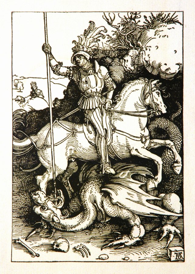
Imágenes.
Se pueden insertar imágenes implemente colocando la dirección web donde esta se encuentra alojada, sea estática o animada.
Si se desea inserta una imagen estática se coloca el enlace web de esta, como por ejemplo, el enlace https: //upload. wikimedia.org/wikipedia/ commons/7/79/D%C3%BCrer_St._Georg.JPG, sin los espacios genera la siguiente imagen estática:
En otro ejemplo, el enlace https: // media .giphy. com/media/ExMGjbktr4phe/giphy.gif., sin los espacios genera la siguiente imagen animada:

Las imágenes pueden colocarse a la izquierda o centradas, empleando los mismos comandos usados con los párrafos seguidos de la imagen. De esa manera, se sabe que por defecto la imagen quedará a la izquierda, mientras que agregando el comando < center > antes de la dirección de la imagen queda sin espacios
Para insertar videos de Youtube, por ejemplo, también se puede insertar directamente el enlace. Debajo puede verse el video de YouTube del enlace https://www. youtube.com/watch?v =-Vq7 zovdf-8, el cual sin espacios entre la dirección, se presenta directamente:
Espero haber cubierto las expectativas de calidad para la compleción de este cuarto logro, el cual realizo para aprovechar mi regreso a la plataforma luego de un hiato de escritura de más de un año, motivado a diferentes motivos de carácter académico, profesional y personal. Trataré de retomar el ritmo y la cadencia de mis trabajos aquí, para seguir progesando en la plataforma.
Mi saludo y agradecimiento a @cryptocannon y a @fendit por tener tan buenos e inspiradores contenidos, lo cuales me permitieron presentar este artículo. Quedo atento a las correcciones y consideraciones de quienes tengan la responsabilidad de revisar. Saludos para todos, desde Los Teques, Venezuela.
Inserts.
In #steemit, texts, static and dynamic images (videos) can also be inserted in a particular way.
Quotes.
In the case of inserting texts or citations, simply place the "less than" sign and then the text that you want to insert in a special way. For example, to the colocal> followed by the text "If you ever notice that I look into her eyes And you recognize a streak of love in mine Do not alert her rifles, nor think: what delirium! Despite the vein, or maybe because it exists You can count on me. ", And then two hyphens are placed - and the author's name, with no spaces between the sign and the text, is displayed:
If you ever notice that I look into your eyes
And a streak of love recognizes in mine
Do not alert your rifles, or think: what delirium!
Despite the vein, or maybe because it exists
You can count on me.
-- Mario Benedetti.
Images.
Images can be inserted simply by placing the web address where it is hosted, be it static or animated.
If you want to insert a static image, place its web link, such as the https: // upload link. wikimedia.org/wikipedia/ commons / 7/79 / D% C3% BCrer_St._Georg.JPG, without the spaces generates the following static image:
In another example, the link https: // media .giphy. com / media / ExMGjbktr4phe / giphy.gif., without the spaces generates the following animated image:
Images can be positioned to the left or centered, using the same commands used with paragraphs followed by the image. In this way, it is known that by default the image will be on the left, while adding the command
To insert Youtube videos, for example, you can also directly insert the link. Below you can see the YouTube video of the link https: // www. youtube.com/watch?v = -Vq7 zovdf-8, which without spaces between the address, is displayed directly:
I hope I have met the quality expectations for the completion of this fourth achievement, which I made to take advantage of my return to the platform after a writing hiatus of more than a year, motivated to different academic, professional and personal reasons. I will try to pick up the rhythm and cadence of my work here, to continue progressing on the platform.
My greetings and thanks to @cryptocannon and @fendit for having such good and inspiring content, which allowed me to present this article. I remain attentive to the corrections and considerations of those who have the responsibility to review. Greetings to everyone, from Los Teques, Venezuela.
Saludos @joalsaro
Has realizado un buen trabajo para cumplir con el logro 4, por ello, te invito a revisar el contenido de la consigna 1 del Logro 5 para cumplir con sus objetivos.
Le invito a participar en los cursos sobre Criptomonedas que el equipo Steemit han dispuesto para ti: https://steemit.com/hive-108451/@steemitblog/steemit-crypto-academy-update-january-3rd-2022-season-5-week-8-courses
¡Muchísimas gracias por su comentario, amigo @adeljose! Saludos cordiales desde Los Teques, Venezuela.