Some Games Just Don’t Vibe With You

There are a lot of games out there I’ll say have a bad first impression. Most of the time, I can get beyond those first missteps and fully get to see what a game has to offer. There are also those rare moments where not even I want to keep playing. With how many games there are out in the market we also live in an abundance of games and so we get to be a bit picky these days as well.
Free For A Limited Time

Recently a game called Inner Space hit the Epic Games free for the week offer. There are many reasons why a game might end up there. Quite a few of them have been gems. Some of them I’ve already owned in the past and I know they are amazing. Then you have those that no doubt have some issues and you can see why they are being offered up for free.
Inner Space itself does not have the best critic rating out there in fact even a lot of the “shills” are not even recommending it. I myself tend to ignore critic ratings for the most part. It is just one thing to keep in mind while moving forward where things start to pile on.
Their description page was also not that great. At first after watching a quick video I thought maybe this had to do something with planets and outer space. After playing some it did not. You are on a planet that is about it from my limited gameplay.
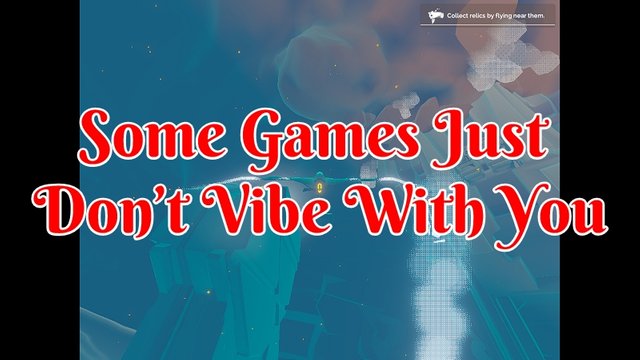
Their main selling point is going out and exploring and having moments you won’t ever forget. Which let’s face it, there are a lot of games out there claiming the same thing. They often miss the mark and this one oh I’ll never forget it for all the wrong reasons.
Add in the name of the game and some of the music it has. I thought I had a reasonable expectation of what it would end up being about. I knew at least for certain you would be moving flying around. Which in itself means the game needs to nail player control and movement so people don’t feel a bit ill and off-put with how they move around in the game.
Tutorial

With this game being about flying around to explore and moving in three-dimensional space. It’s at least nice to see they made a tutorial as these kinds of games do require them for most players. The player needs to learn how to move within the environment in an enjoyable manner that is not frustrating. There were lots of red flags that made me bail out of this game quite quickly. From Odd settings, the bad learning environment and even getting dizzy.

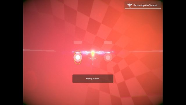
One of the first red flags was this game starting you out in a 1:1 aspect ratio. I was hoping just the menu system was going be like that. Where once you get in-game it takes you into full-screen non-black bar mode. While they do have better aspect ratio options on the menu. You end up spending the tutorial in this till you make the changes yourself. It’s 2020 I’m not running potato hardware there no reason I should ever again see this kind of aspect ratio in a modern era game. It was quite off-putting.

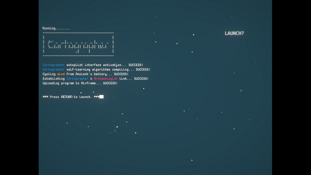
The second red flag was blurry or out of focus text that seems to also be lacking proper spacing. It feels like they in the part were trying to make the text fit the aesthetics of the game. I’d take readability over the game text trying to add to the atmosphere of a game any day of the week. This is just one game design that some developers think they need to go the extra mile on. Instead, it creates an awful user experience. Since after all you have quite a few lines of text to read to learn how to control the object you are flying.
At first, maybe I thought this blurry text was due to the strange aspect ratio the game started me out in. That theory, however, did not last long since I’ve had further issues with it. Once I fix things up on my end regarding the aspect ratio. I also could not really improve it after making some changes in my graphics card either which can sometimes be the culprit when game developers try to be too creative in wanting to be different.
While you could blame this overall issue on the gaming trying to be “retro” with how some of the game screens are set up. There really is no excess for the text being this awful. Oddly enough there is, in fact, a game by a similar name from the 1990s called Operation Inner Space. No idea if this is some kind of inspiration from that or what. For whatever the case there is only so much time I’m willing to mull over the why part of this being the way it is.
The third red flag I have is the entire tutorial area itself. It feels like it was done in a temporary manner where you would go back and make it better when you have time during the game development process but never did. It looks like we are in plain hallowed BSP (binary space partitioning) cube. With atmospheric fog maxed out trying to give an illusion of a huge area. Along with this very odd lensing effect around the player's camera that just makes it even worse.
This is further compounded by the fact that many of the tutorial instructions are either lacking or even broken. In some instances, they don’t tell the player what key to press on the keyboard and are instead using game terminology. In other places, they tell you which keyboard key to press and nothing happen.
This has led me to bash every key on my keyboard trying to stumble through this games tutorial. Thankfully due to my many years of playing space games some of the keys were similar such as pressing the space bar to accelerate. While others I felt like I was a barbarian just hoping to discover whatever key it was just to move forward.
After not too long in the tutorial, I hit a roadblock of sorts. The game told me what button to press which I had so many times. It did not progress the tutorial to the next step. I smashed the exit tutorial key as if it was aborting a nuclear missile and got the heck out of there.
The Final Nail

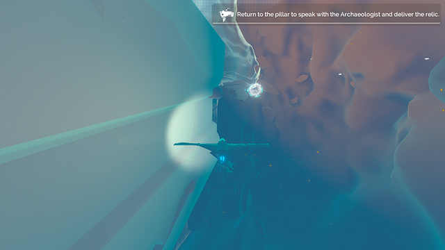
My biggest pet peeve of them all when trying to fly around in a three-dimensional space is bad movement. Now I understand with a keyboard and mouse there are going be some limitations. It’s not like I’m using some high-end joystick with a flight simulator mockup. I, however, should not feel dizzy and out of control just trying to do basic things.
With how the game looks and you speeding off often times spiraling out of control. I had enough of this game in almost no time flat. Just trying to reach a certain object as the game was telling me was a very unpleased experience. With me becoming dizzier as the time passed and getting frustrated with the controls.
The game can’t even let you hit the exit game button once and be out. Oh no, that be simple and expected. The exit option has its own little animation that needs to go a full cycle before it lets you escape. If only could see my face as I smashed the enter key threatening to close this sucker by other means if it did not release me from its dizzying grasp of hell.
Final Thoughts
Thankfully I received this game for free as it feels more like someone’s tech demo. I didn’t feel like I needed to force myself to keep playing to get up to a point where I could then “enjoy” the rest of the game to get my money’s worth. There were just too many missteps and what feels like either lazy or bad game decisions being made.
Not worth in my opinion the base price of $19.99. Perhaps that is why it’s free for a week. I’m not even sure it was worth the bandwidth to download this or the small amount of space it took up on my hard drive before I uninstalled it. An easy not recommended from me.
Other Gaming Content
- Game Development | Using BSP Method For Making A Zone In Unreal Engine 4
- Weekend Gaming Blockchain News | Issue 2
- Taking A Look At 0xuniverse
Information
Screenshots were taken and content was written by @Enjar about the game Inner Space
I received this game for free.


If you would like to further support this post you can do so on Twitter where I have shared it. #posh.
https://twitter.com/EnjarGames/status/1233656703645835264
Hi @enjar!
Your post was upvoted by @steem-ua, new Steem dApp, using UserAuthority for algorithmic post curation!
Your UA account score is currently 5.345 which ranks you at #766 across all Steem accounts.
Your rank has dropped 2 places in the last three days (old rank 764).
In our last Algorithmic Curation Round, consisting of 96 contributions, your post is ranked at #10.
Evaluation of your UA score:
Feel free to join our @steem-ua Discord server