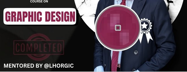
SEC20/WK6: Graphic Design Hands - On practical 3
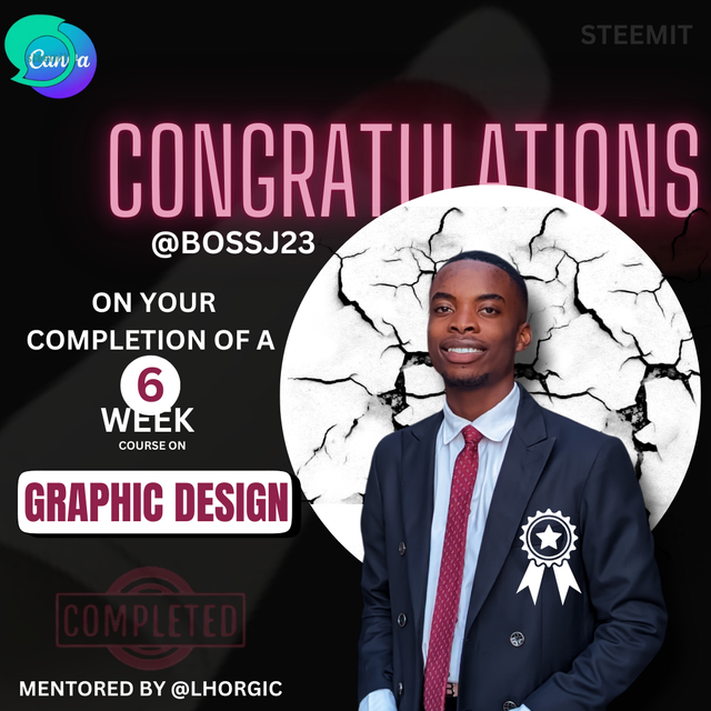
Edited using canva
It's with tears and hope that I'm writing this post because my free tutorial on Canva is coming to an end with the hope of being brought back again next season of this engagement challenge. Anyway, this hands-on practical seems to bethe most tempting as it involves a lot of brain work and application of principles.
It's now I know how graphic designers are very intentional about their use of colours to design because aside from the writeups, it is the most important first impression tool to use. This 6 -week course served as a map or guideline on how creating designs easily can be possible. The basics are at my fingertips, so watch as I make the applications in this design of mine.
For this post, I decided to be versatile in my representation of steps. I used both videos and written steps to help newbies and the pros see what I've been able to accomplish and also give room for corrections too. I'll start with the integration of written steps using all the principles taught in the course of this lesson.
Steps to creating my Design |
|---|
Everyone has a different taste of colours, size, appearance, and functional elements. You may see the integration of a circle element in a design with a black background as unappealing, while others may see it as appealing to them, or you may consider mixing white with gold as the best colour combination for your design, while I may dislike the colours and give preference to another mix.
These are examples of how people show different tastes to things, as I'll be showing you my tastes of colours and sizes in this design. Here are the necessary steps I took to ensure this.
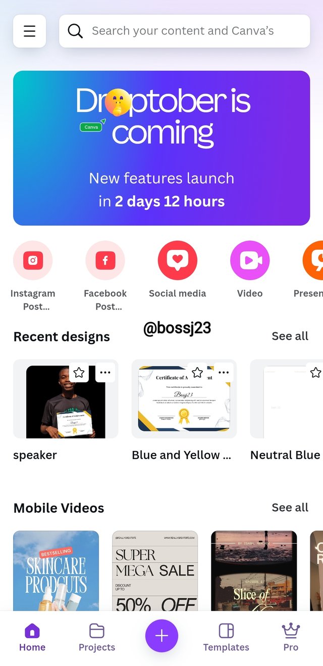
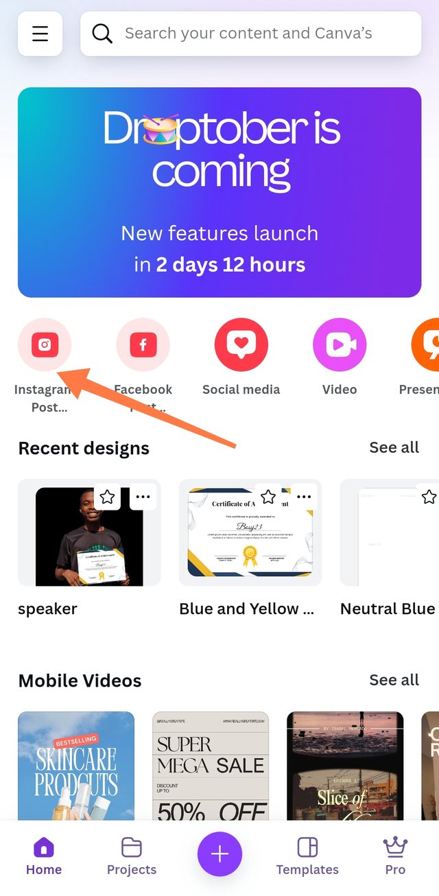
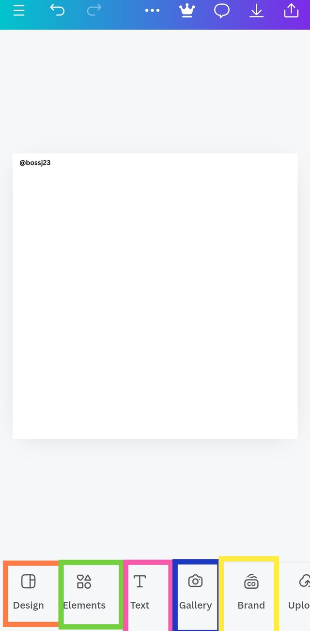
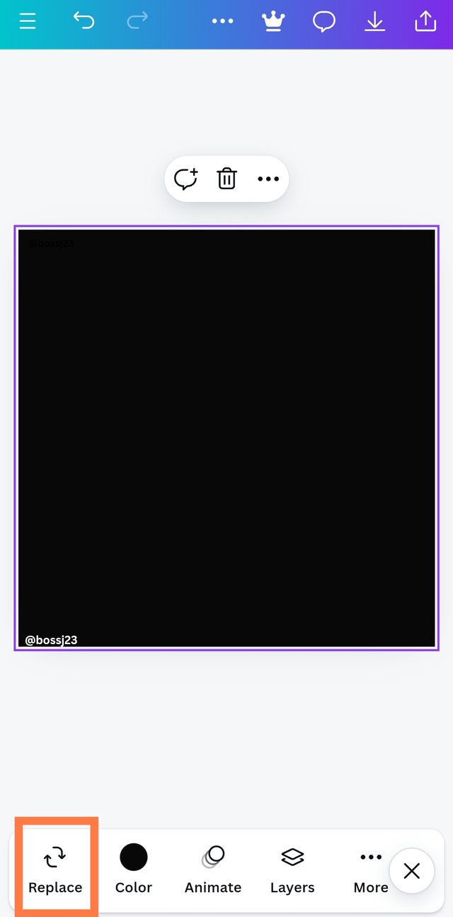
- Opening the Canva application, which is used as the backbone for our practicals, is what I did, and my opening brought me to the dashboard, where I can navigate the application from using ready-made designs to creating mine. I decided to create mine, so I took to heart the size and dimension of the blank space I want to work in. I had a taste for 1080×1080, which was perfectly reflected in INSTAGRAM POST, a seemingly visible representation of a landscape box-like view. I then clicked on it to get this blank space, ready to work on it.
 |  |  |
|---|
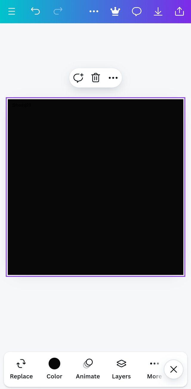
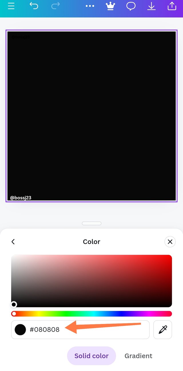
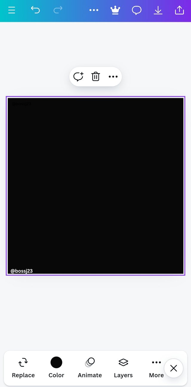
- Once the blank space is created, the first thing I did was to add background to my blank space in the form of colour. How? This is how I did this. I HIGHLIGHTED the blank box and then clicked on the COLOUR PALLETTE to select the colours I wanted using hex codes. My preference for the background is black because of the elements I would be using to avoid lots of contrasting colours.
 |  |  |
|---|
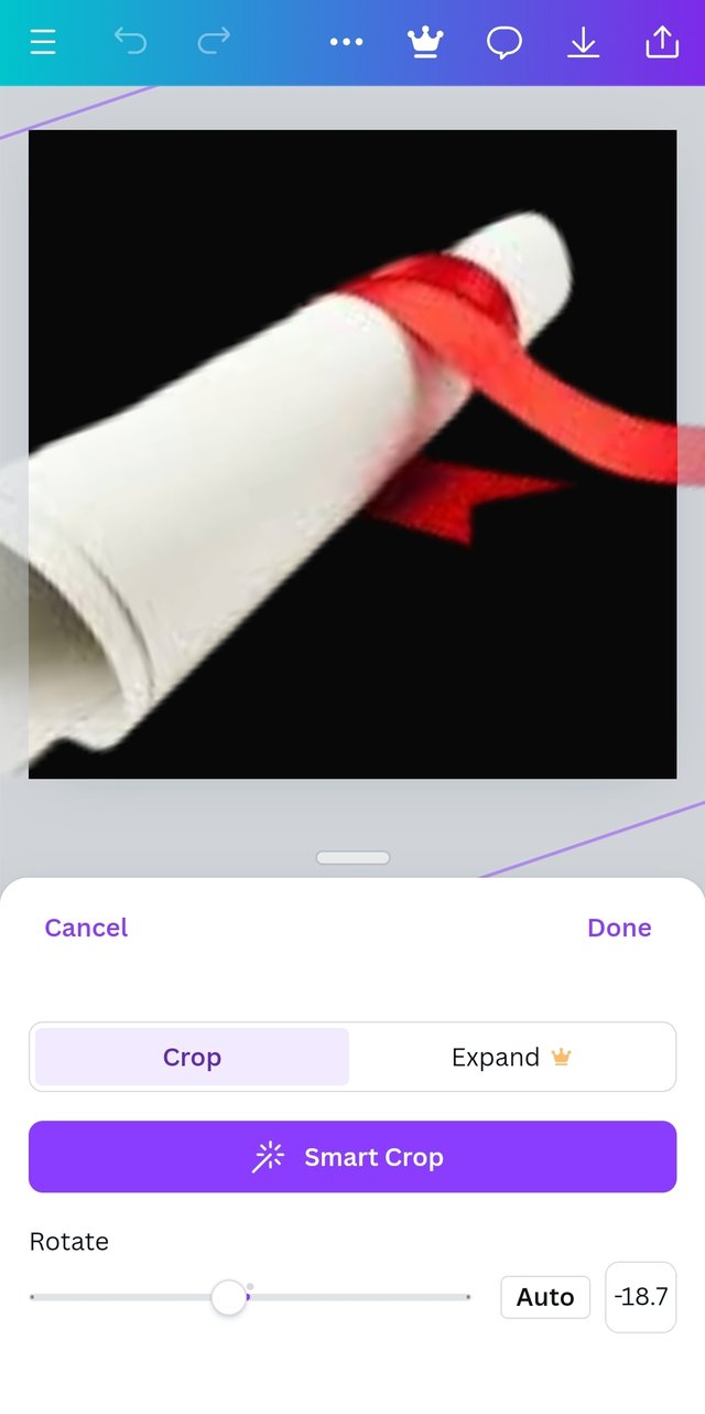
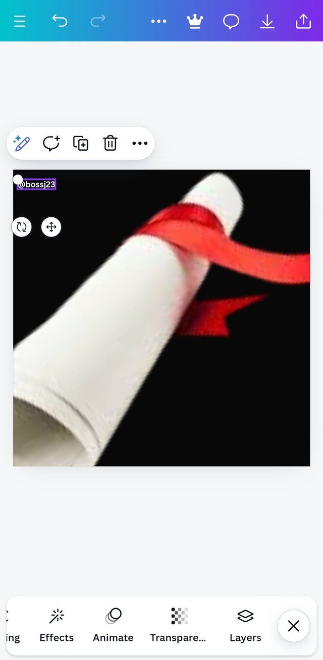
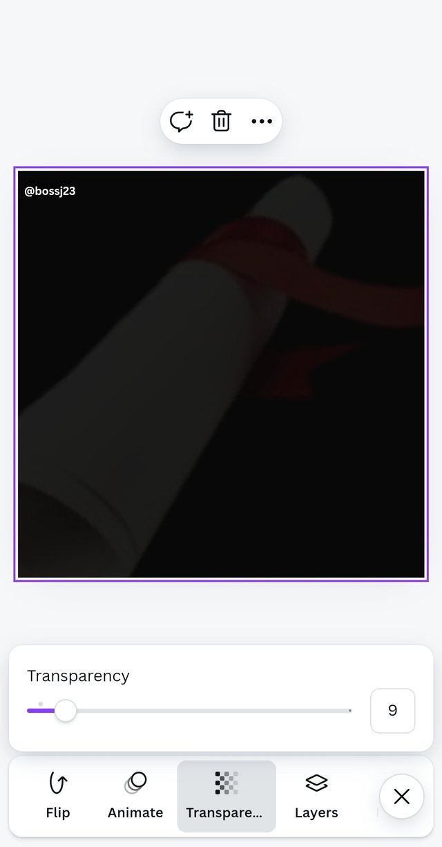
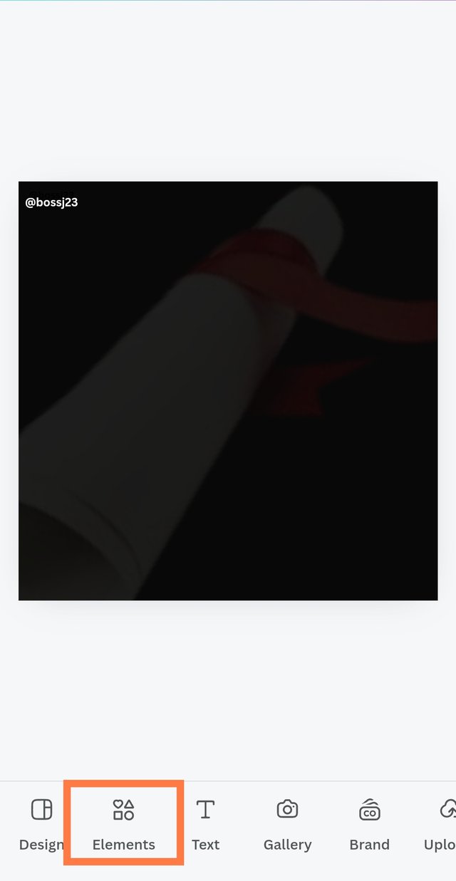
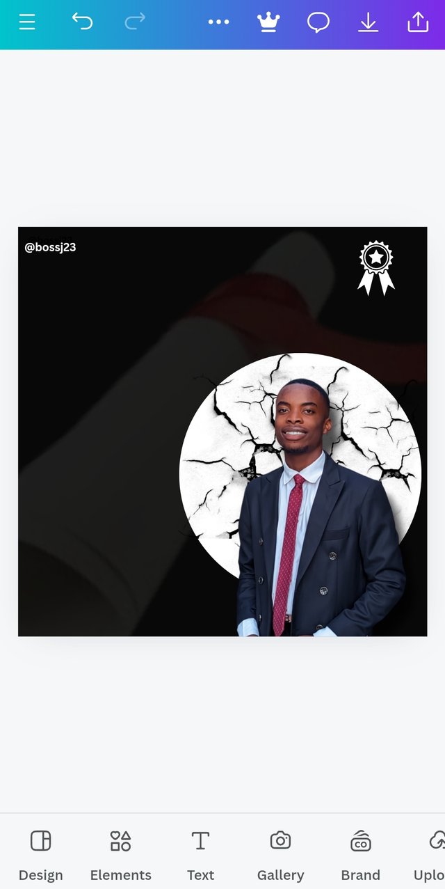
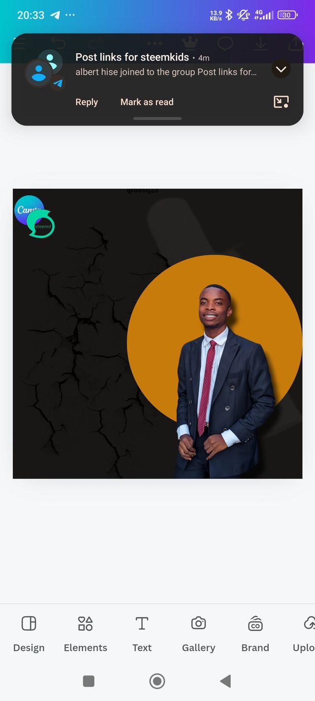
- After the background was installed, I took to creating a transparent background with a picture still on the black colour. How? I highlighted the box first and then clicked on REPLACE . It took me to my gallery, where I could access my pictures. I selected the picture I wanted, and boom, it was applied on the black background but more visible. This picture applied is a folded certificate with a red ribbon, which implies the design should be about certification or award. I didn't just stop there because the size was unappealing. I choose to reduce the size and change the position by Double tapping the picture and then playing around with the sliders.
 |  |  |
|---|
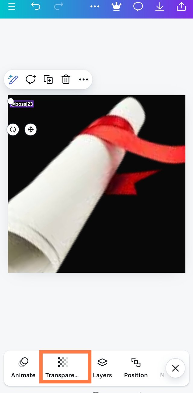
- I then choose to make this picture transparent to aid my work. I tapped on the picture that was highlighted and then scrolled to where I could find the TRANSPARENT ICON. Once it popped up, I clicked on it and adjusted the picture's transparency to the limit I wanted. Boom, it was reflected.
 |  |  |
|---|
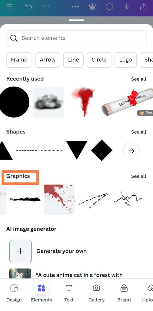
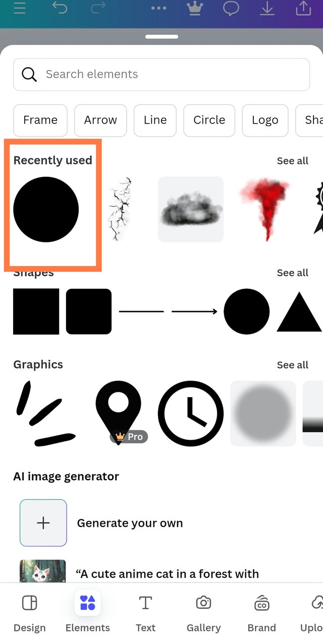
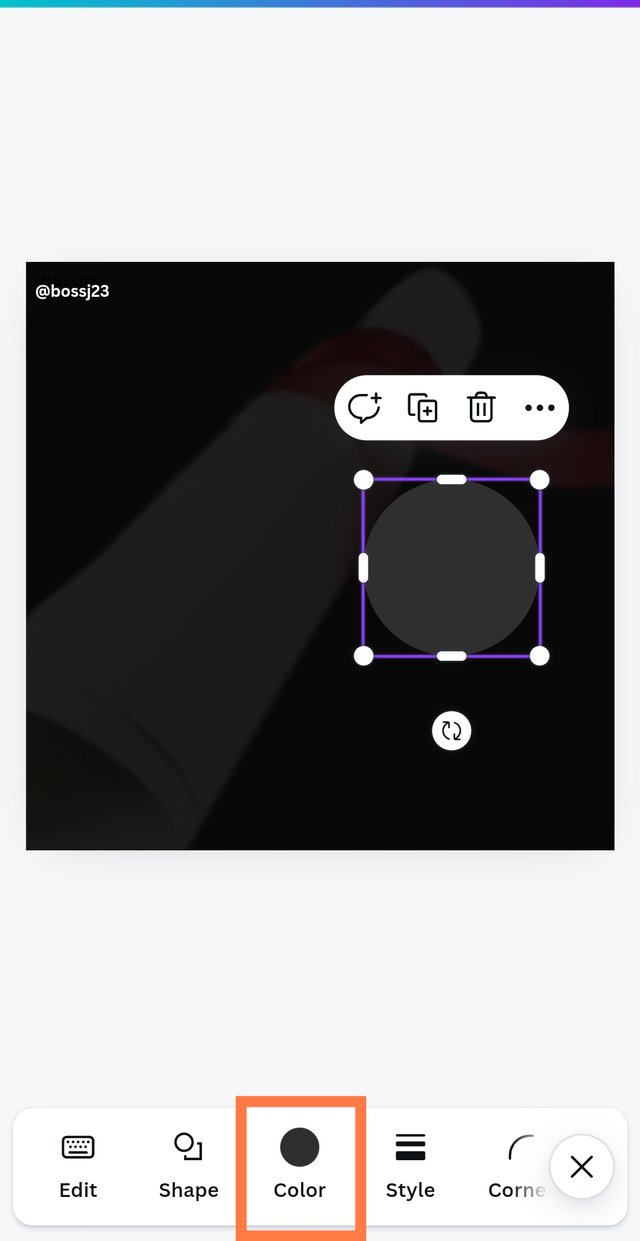
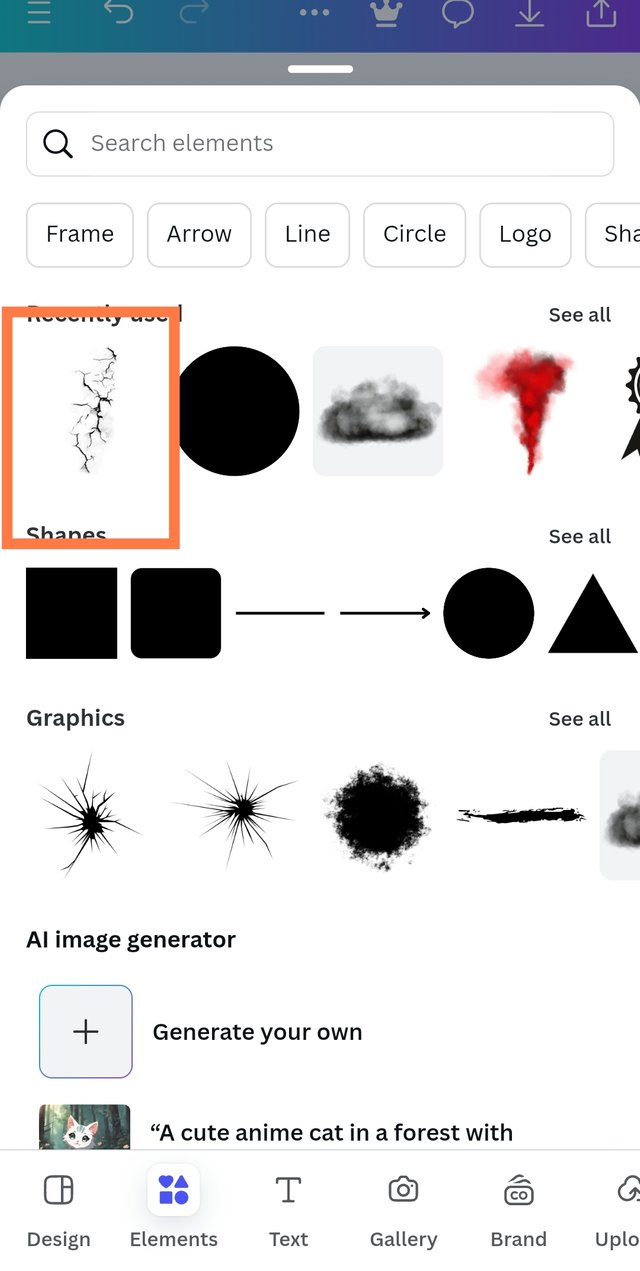
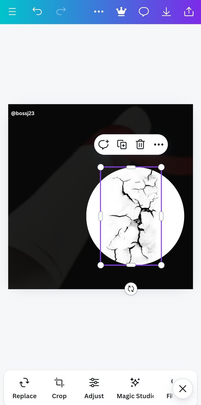
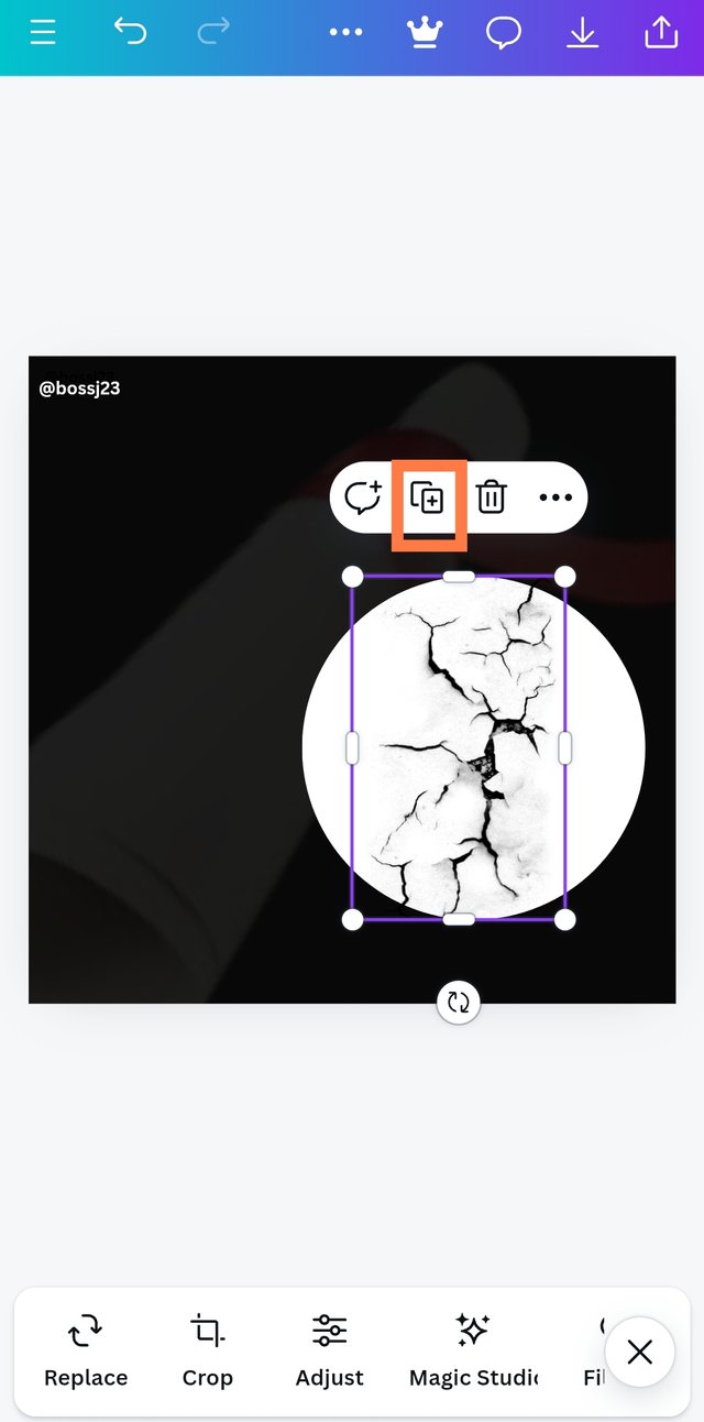
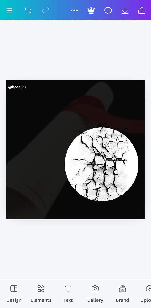
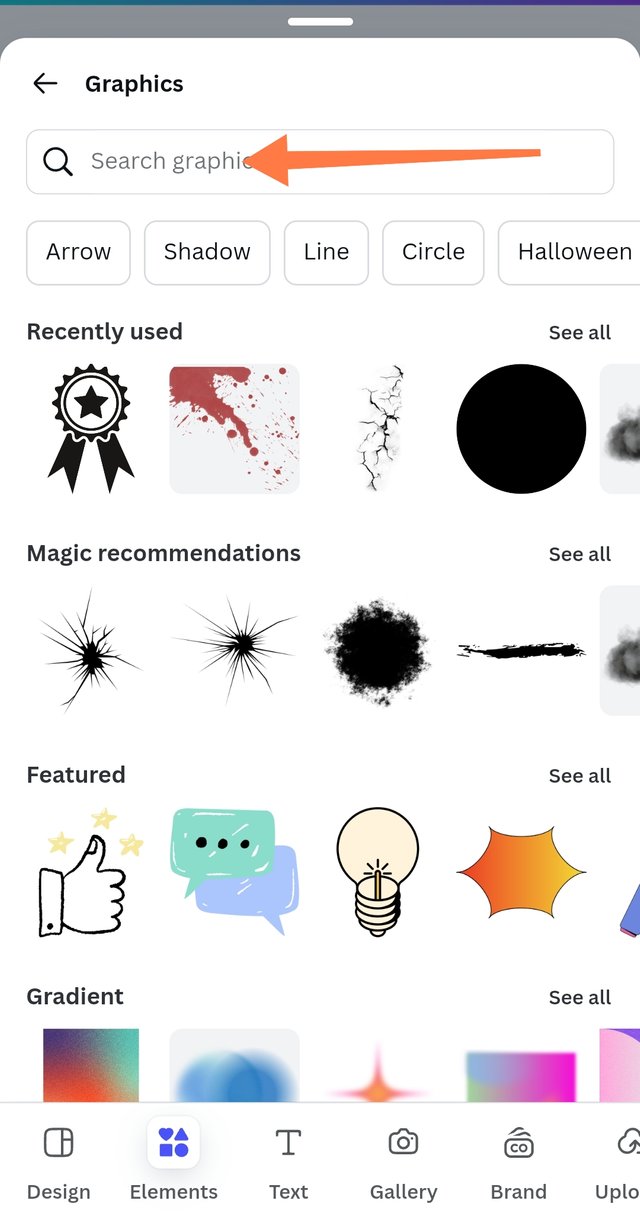
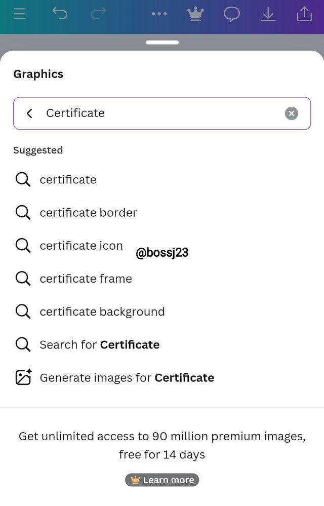
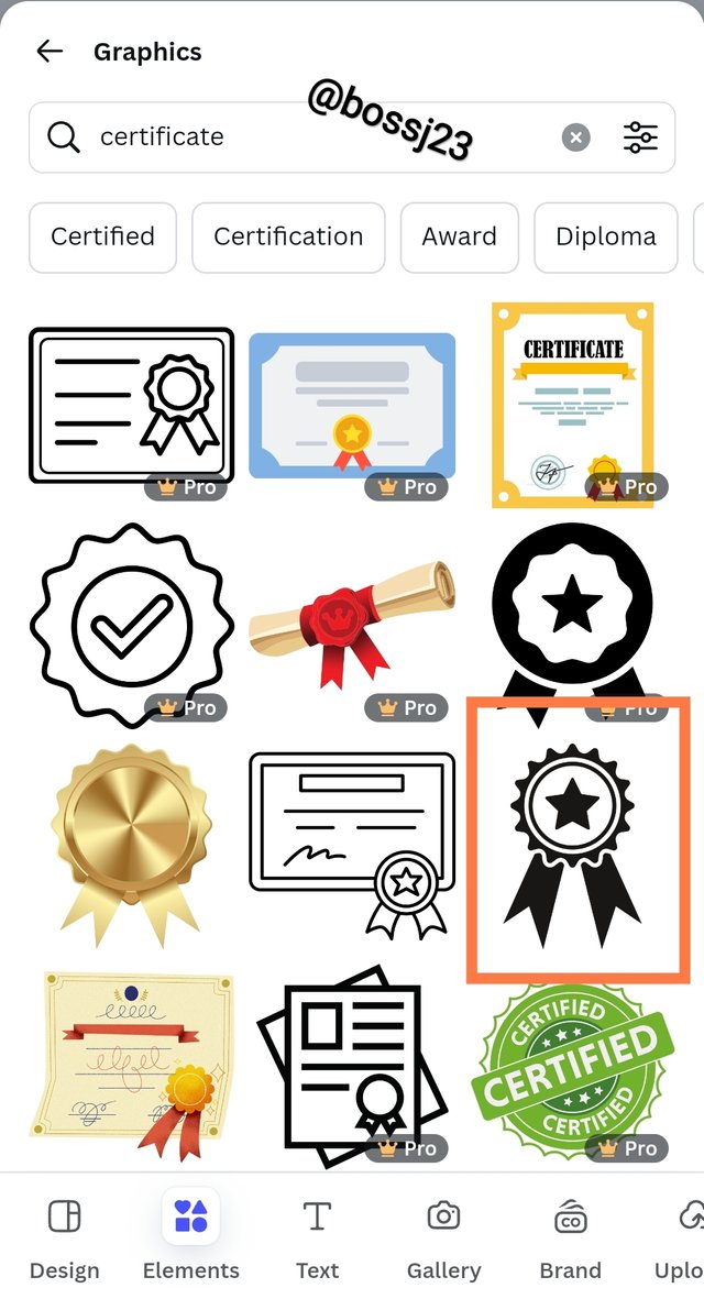
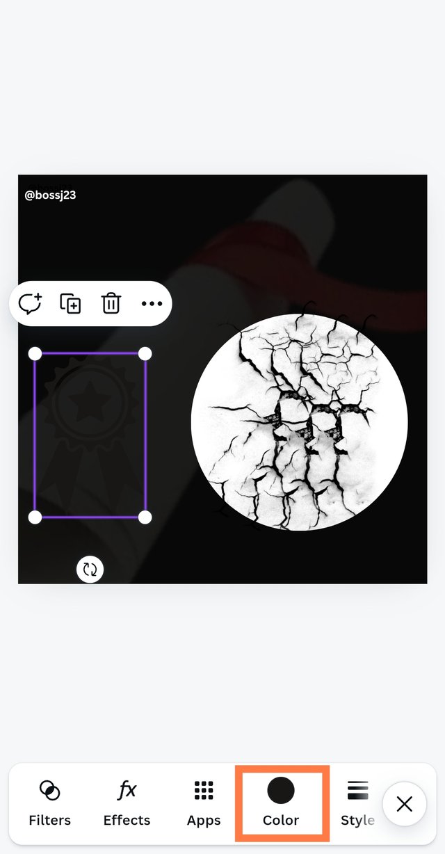
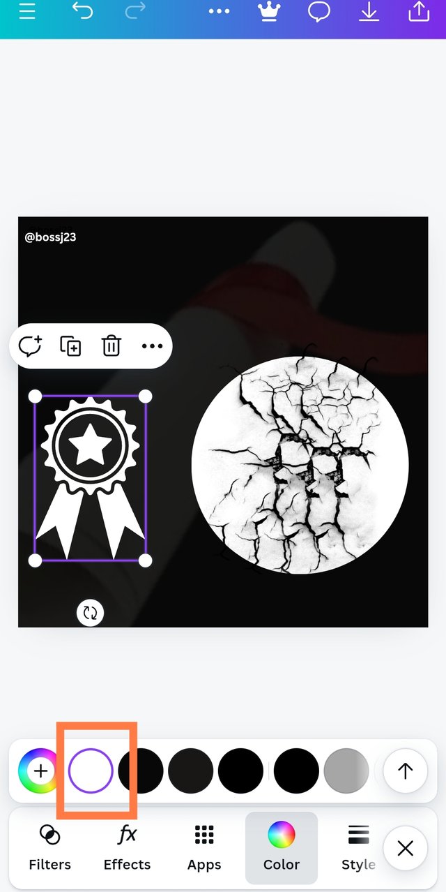
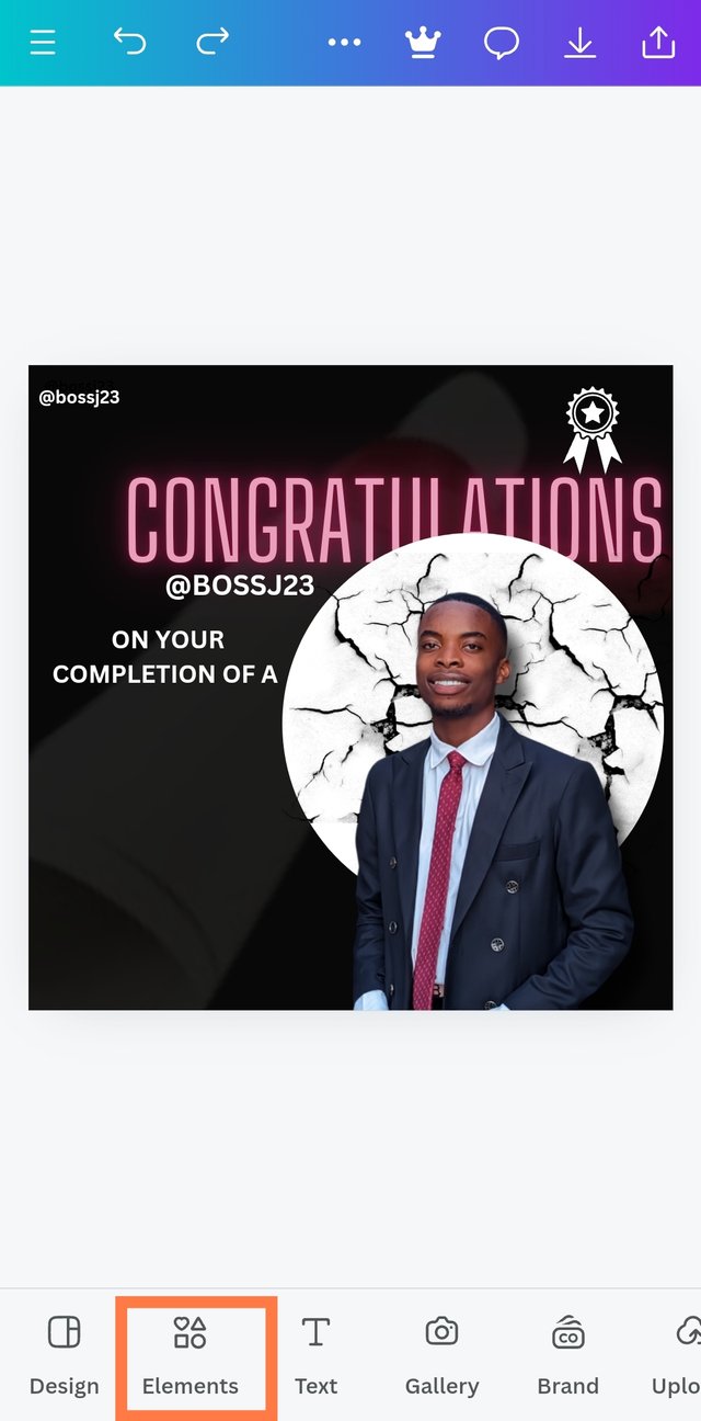
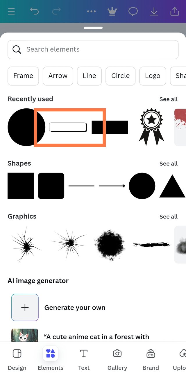
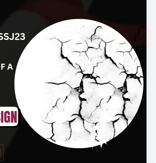
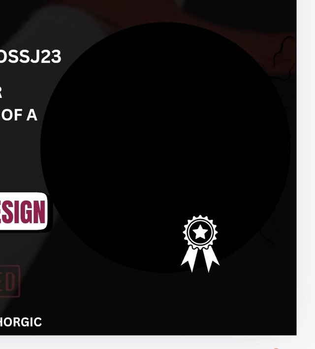
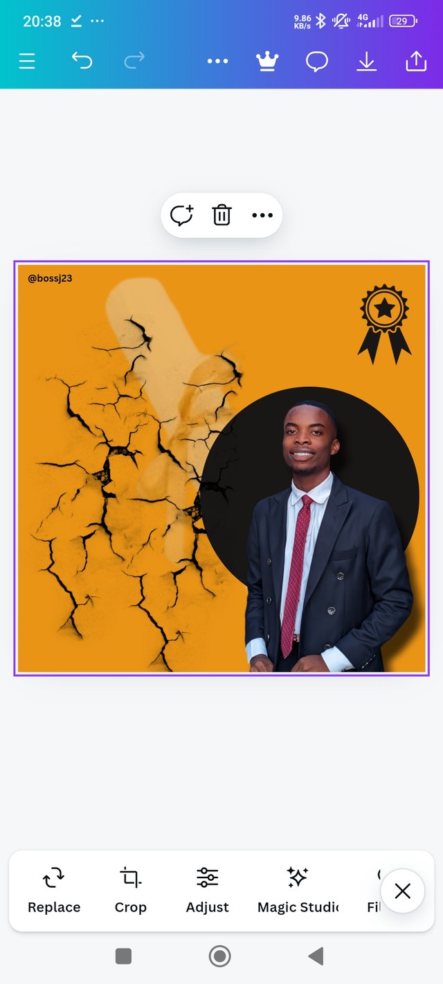
- Elements application was practically the next and the most difficult to design, which elements combine to create a perfect design. What helped me? The principle of contrast helped me discern which element and colour to use to fit my design. I'm not a fan of flashy things, to be honest. I would have thought of balloons, gold teesers, and the likes but I choose to keep my design appealing and cool, not shouting. These were the elements I had in mind to use. The circle, crack, rectangle, and certificate elements. All these could easily be gotten using the search button.
 | Elements box |
|---|
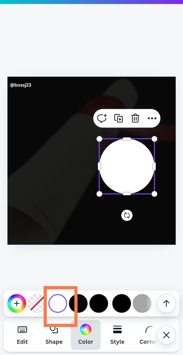
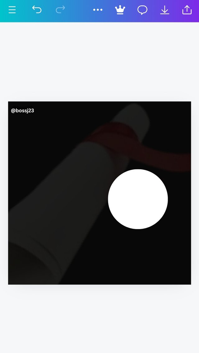
- Luckily for me, when I clicked on ELEMENTS, the first thing I saw was the Circle I wanted. So I applied the circle to the box and changed the colour using the colour palette from black to white to make it more contrasting than similar. How unappealing it would be on black.! After adding the circle, I used the same step to add the Cracks. I typed crack on the search button, and it appeared. I added it to the box and then to the circle to make it appealing and beautiful in a sense. I told you people have different tastes of elements and colours. Lastly, I added the Certificate batch by typing certificate on the search button of the Element Icon, and it appeared. I chose it and positioned it at the top of the box. I added white colour to it for visibility. I was done with my elements. It wasn't easy though, but these were what I could think of.
 |  |  |
|---|---|---|
 |  |  |
 |  |  |
 |  | |
 |  |  |
 |  |  |
- The colour theory really helped me integrate colours that are matching to my design and not ones that would be shouting. These were the colours I thought of using at first but had a change of mind.
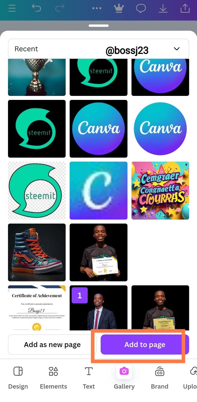
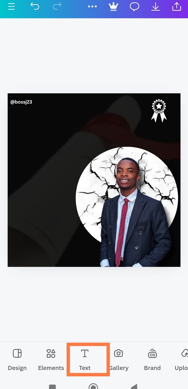
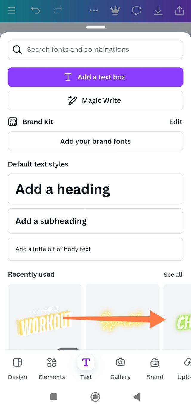
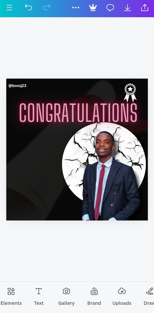
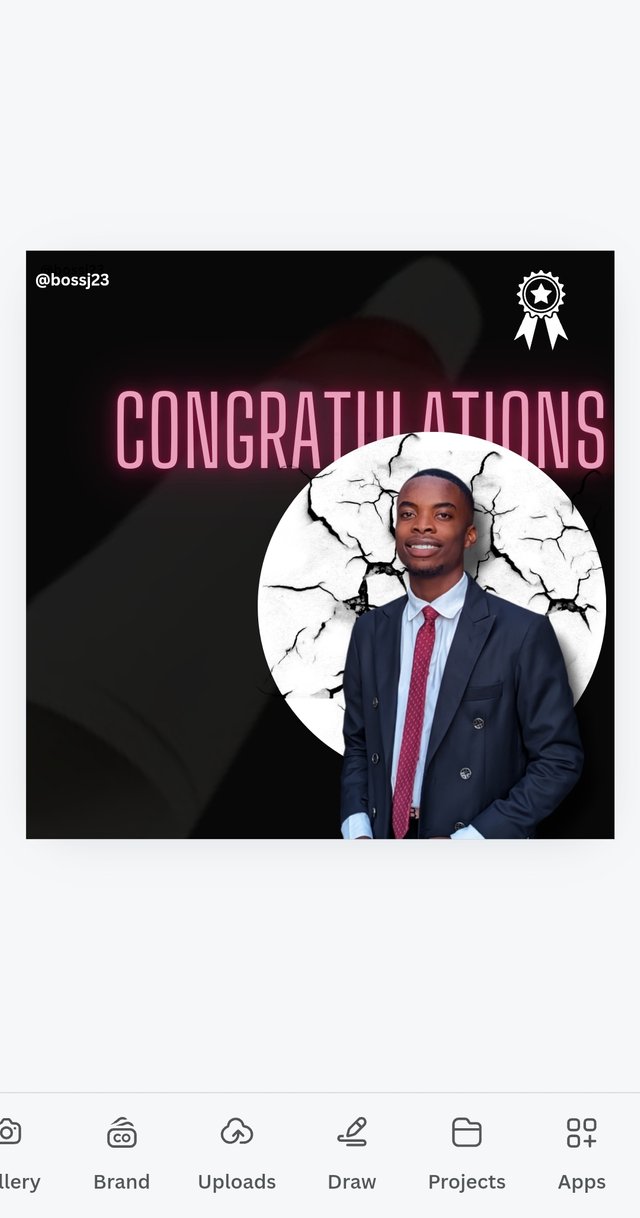
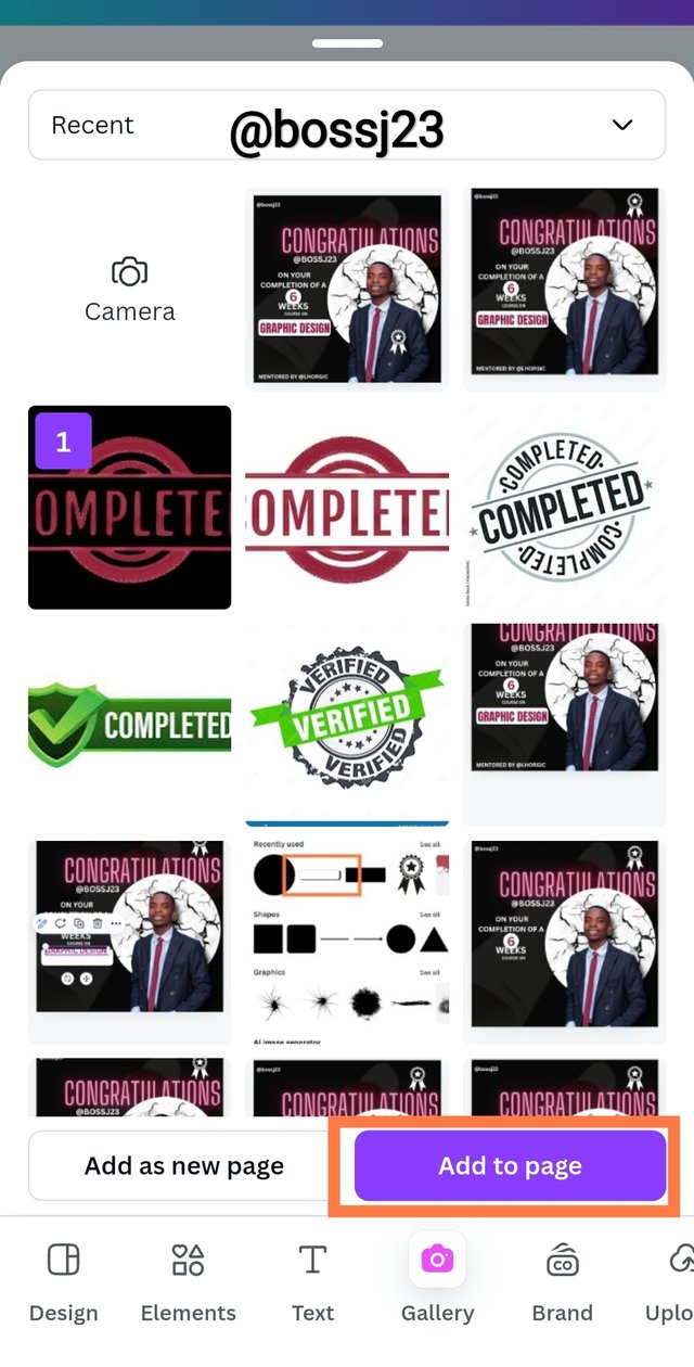
- Now, I'm done with the application of major elements. Over to integration of pictures. My first impression picture was added to show proof of study. I added this picture by clicking on Gallery and then chose the picture. I adjusted it to fit the circle element I used—not too full or shallow. After this, it was time to add TEXT to my design. I clicked on the TEXT ICON and looked for magic text to use for my design since my aim was to make it attractive.
 |  |  |
|---|---|---|
 |  | 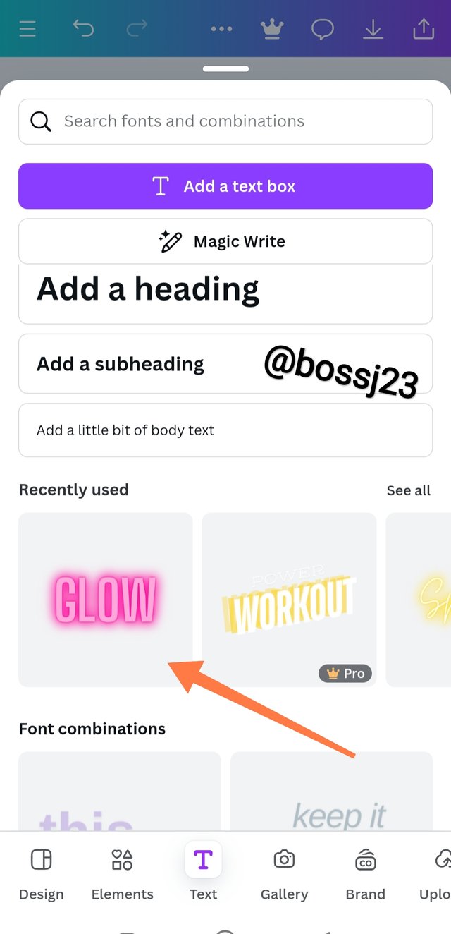 |
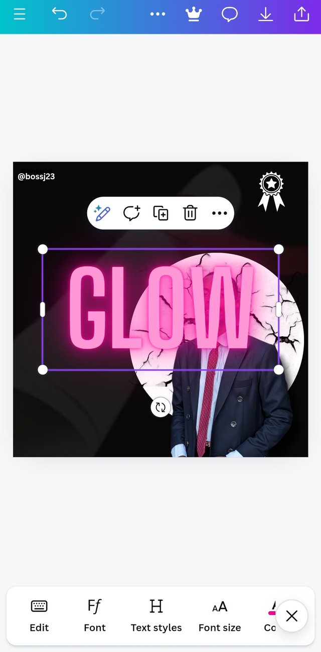
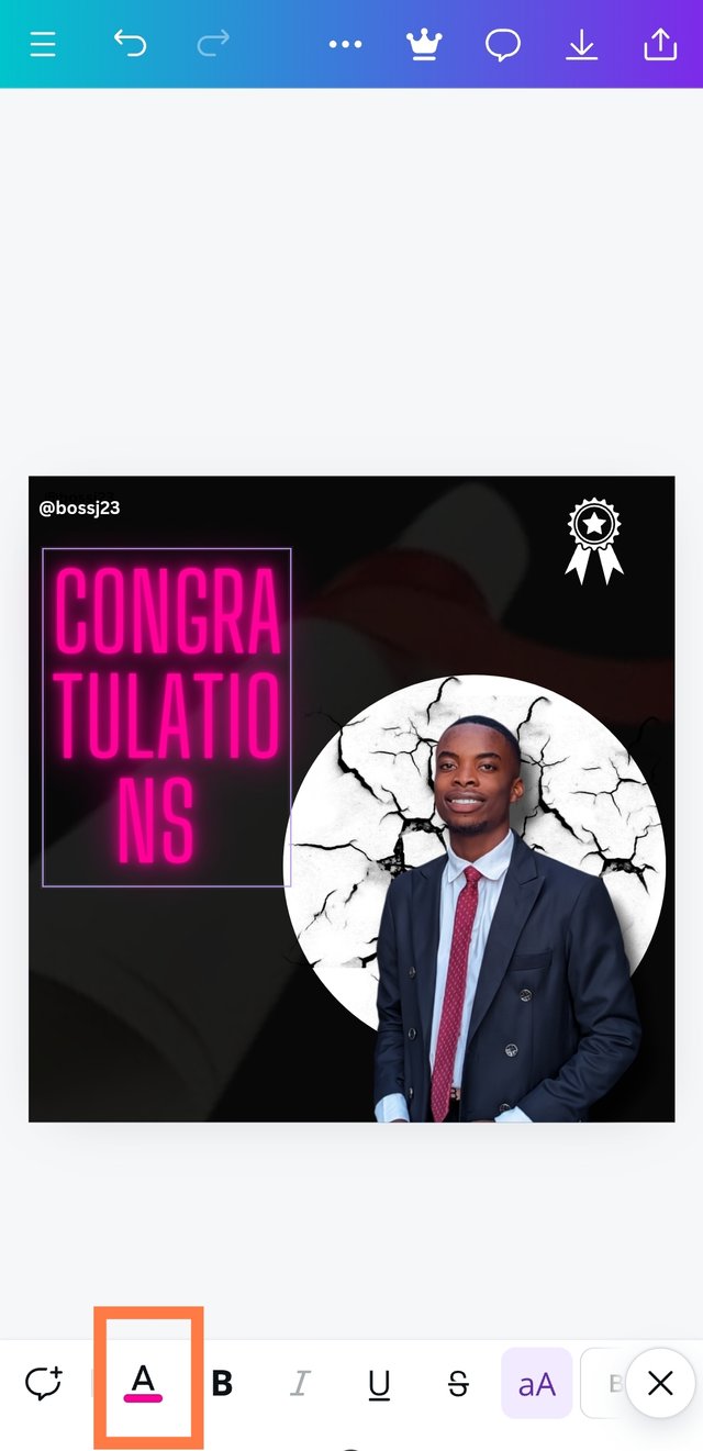
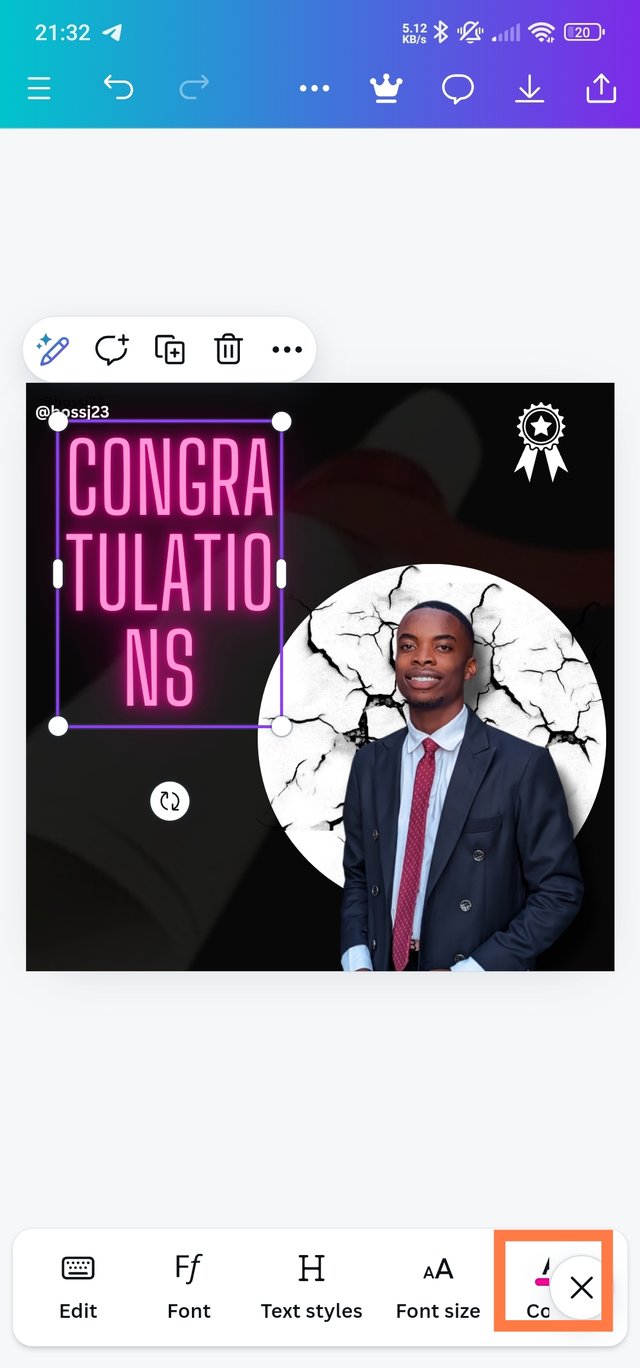
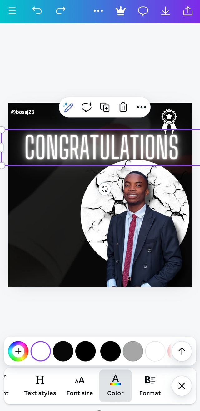
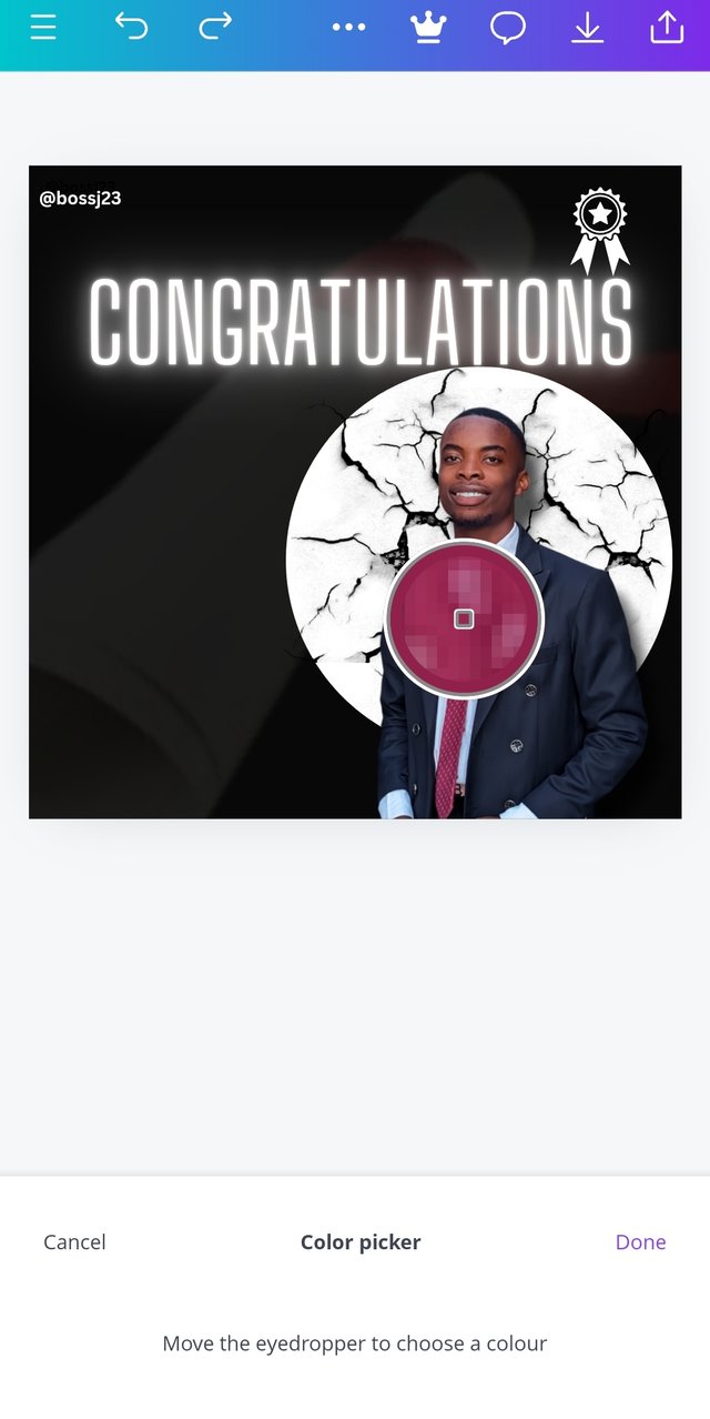
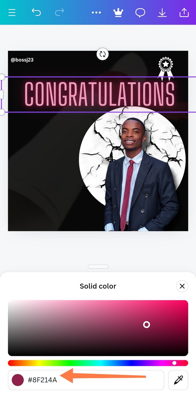
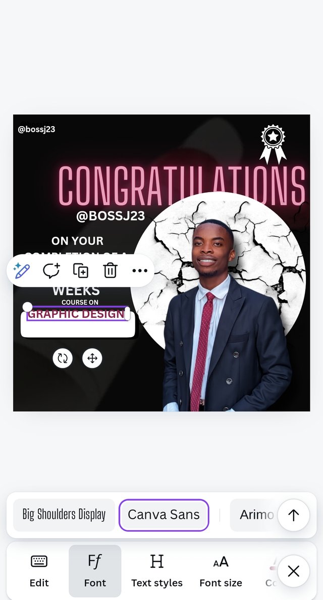
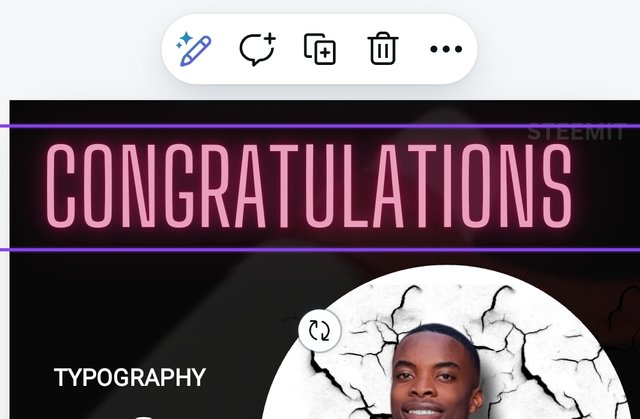
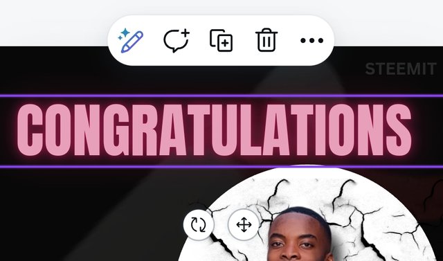
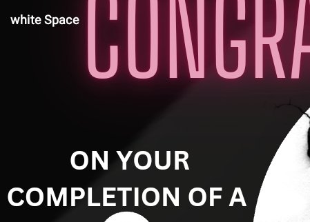
- I then clicked on a Glow text, and it got inserted and gave me space to type my own text in it. After adding this, I worked on the text element — CONGRATULATIONS. I was very conscious of the words I used to avoid grammatical errors. Adjusting this text to fit the style and shape I wanted it to attain was difficult for me as thoughts upon thoughts crossed my mind. I then thought of colour for my text. I added a colour gotten from the tie to the picture. I did this by highlighting the text and then clicking on colour which showed me the wheel of which I clicked. Now, there's a gradient or colour picker at the far right. **I clicked on it, dragged the picker displayed on the design to where the tie is, and as you can see, the colour is shown. I then clicked on DONE.
 |  |  |
|---|---|---|
 |  |  |
 | 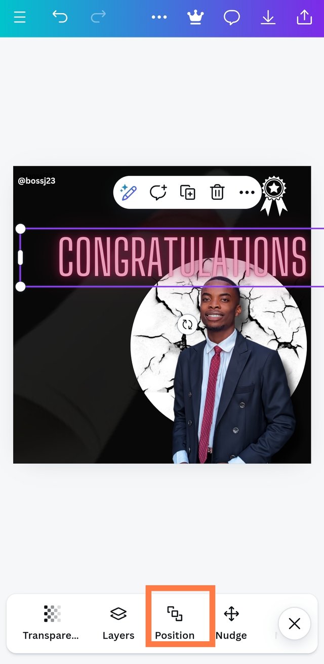 | 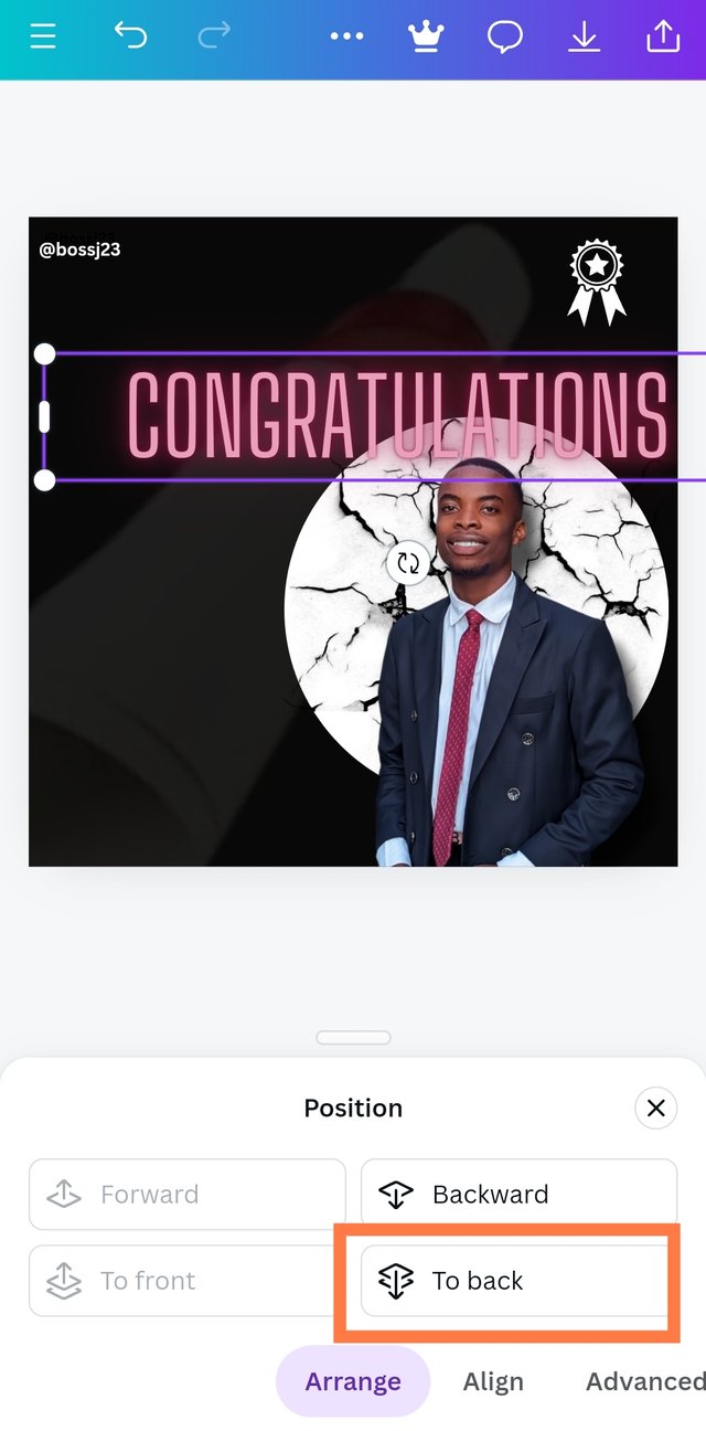 |
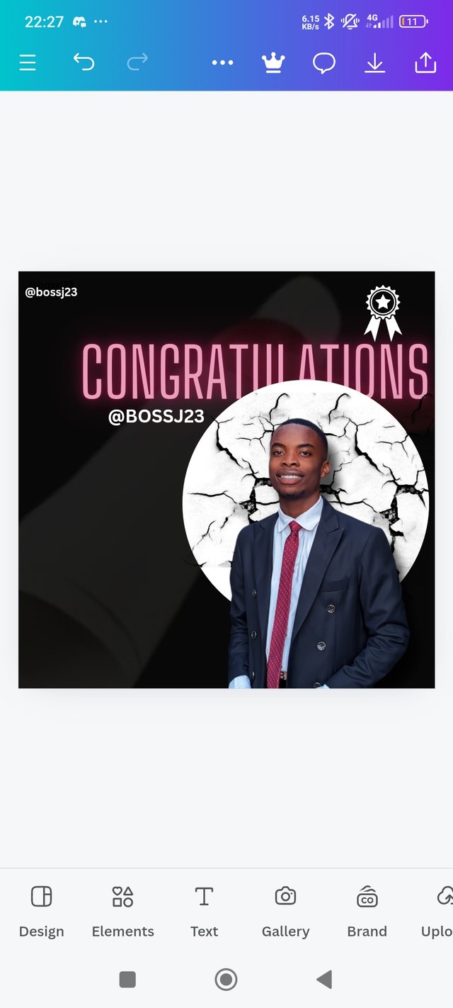
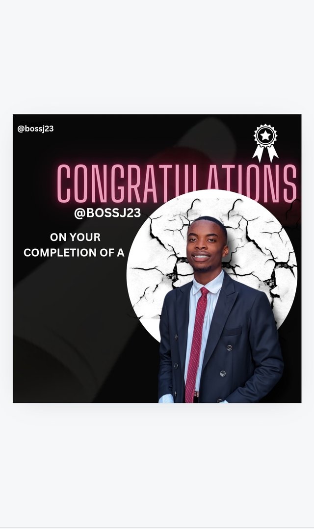
- Finally, I was able to position it behind the circle by clicking on the position icon and then took it backward. When this was done, I played with other texts with the descriptions....
|  |  |
|---|
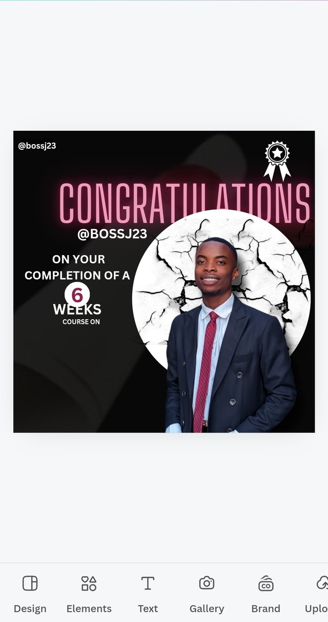
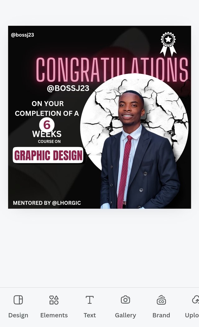
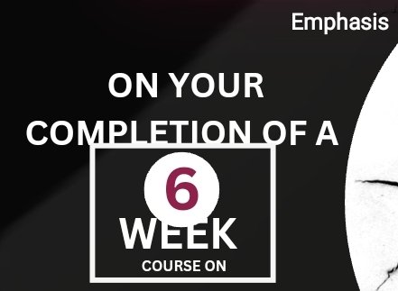
Congratulations on your completion of a 6-week course on graphic design.
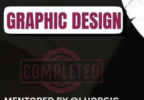
- I was careful to avoid blank spaces in line spacing of words, and I used the circle element to position the 6 in the circle as a branded style of mine, and the WEEK text was placed under the circle where the 6 was on top, and then I added a rectangular element to position the GRAPHIC DESIGN.
 |  |  |
|---|---|---|
 |  |  |
 |  |  |
 | 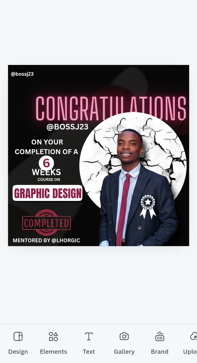 |  |
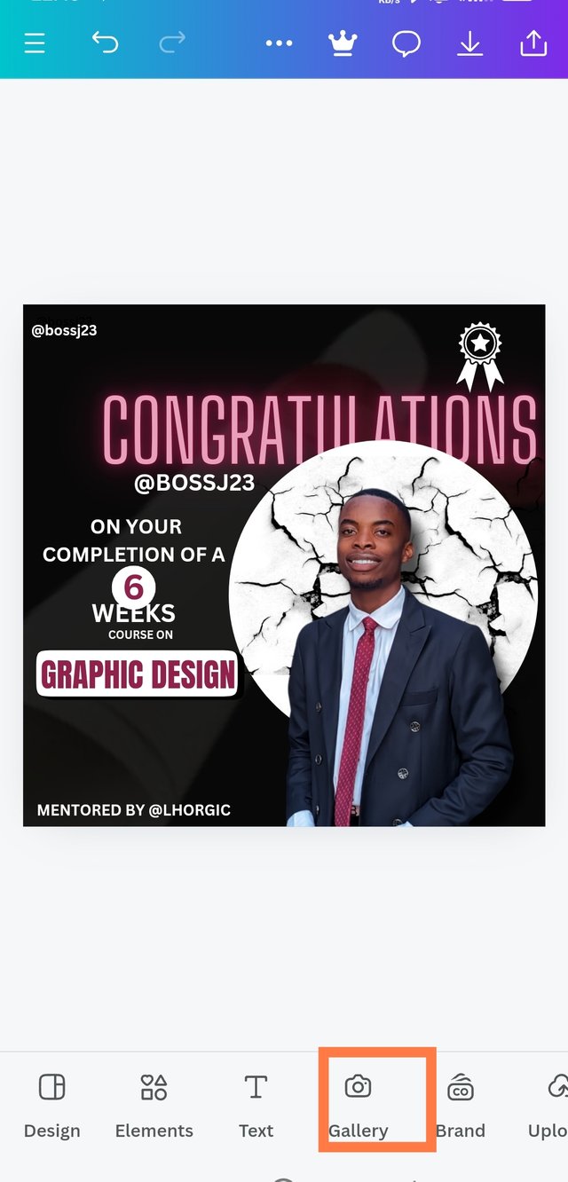
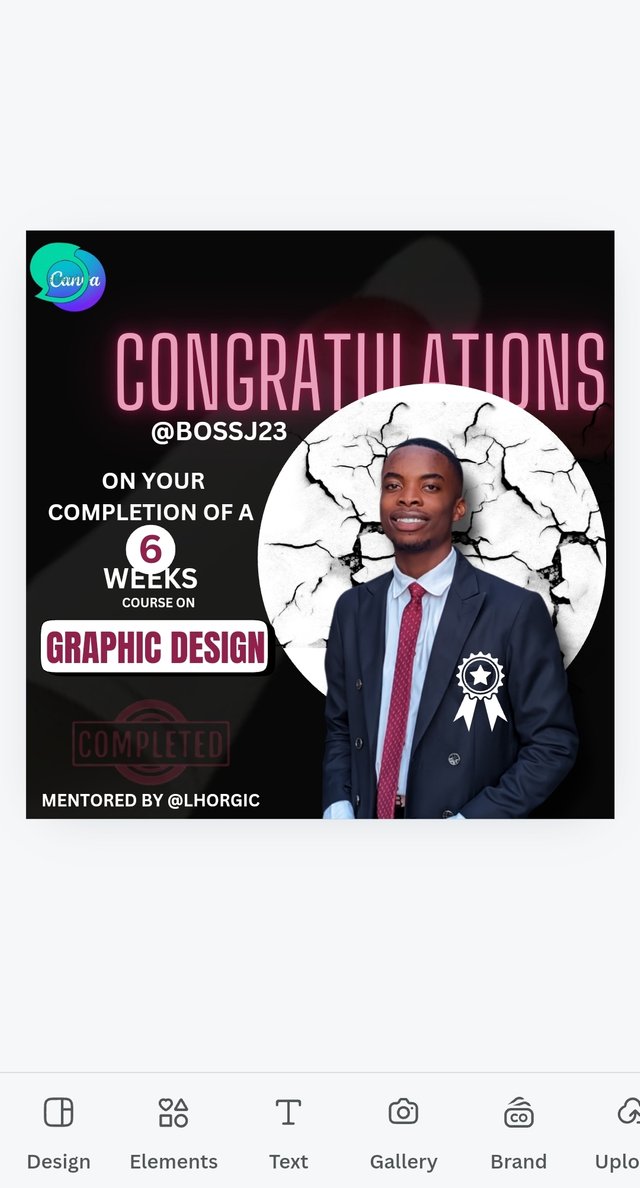
- I then completed it with other texts and then added the logo of Steemit, which is the social media platform hosting this course, and Canva, which is the application used to learn this course.
 |  |
|---|
That was how I was able to be flexible with my design and even made some watermarks too. You may be wondering what principles I used. I'll start from week 1. For correction sake which I discovered late, it's a 6-week course and not a 6 weeks course. So I'll remove the S from week and then use the double displacement as my hyphen as shown in this result. I apologise for not noticing this in time. 👇👇
Principles Used |
|---|
- Contrast is a very essential principle needed when designing a text. Elements and texts should have contrasting colours at some point to fit the design placed. Just imagine I used a black circle element on the black background; it won't be visible, right? The text or element would be hidden because the colours used are similar. Dormant colours don't make a difference in any design; that's why contrasting colours with the aid of the colour wheel gives so much preference.
 |  |
|---|
Take a look at the differences in the screenshots below. You'll see the contrast in colours and characters placed on elements to bring out the splendour in the design. Here are the ways I applied this principle of contrast.
- Principle of Emphasis comes to play when distinct characters are made to stand out not just with colours but also with good fonts. Messages are brought out and seen clearly with fonts, the font size, and the colour used. I'm this design; my emphasis was practically on Graphic design, 6-week course, Congratulations and completion.
I ensured that these words were emphasised with good colours made to stand out. For the Congratulations, I used glowing text on a peach colour, and I used a font that's not too enlarged and unappealing, and the font was taken into consideration. 6 WEEKS was also emphasised using a circle element as most people may be attracted to the design other than just the text.
 |  |
|---|
Another visible emphasis was placed on Graphic design on a rectangular element. It was also placed in a colour that attracts attention. This emphasis helps a lot in sending clear messages and making first impressions. Not everyone has the time to go through all you've written, but the emphasis on words, legible seen, gives them an insight on what the flyer is all about.
- Typography principle is set to guide us in our use of font styles. I observed that the use of Impact or Anton as my don't style will only make the text, deviate from the normal colour, vague and unappealing to me. That's why I used normal Canva text, which is more like a typed text in a normal writing font. Look at when I applied Impact font and the former. I can clearly see the differences. It's very important to give preference to the design.
 |  |
|---|
- Colour theory served as a guide to help me in colour grading. I made lots of colour combinations to see which would fit my design before using the colour wheel to balance my choice of colours. I decided to use what I wore in the picture to develop colours, i.e., black, white, and maroon colours blended together to give a striking match.
 |  |
|---|
- Transparency and White Space: Jam-packed words don't make them appealing in a design; that's why there's always room for line spacing so we can create a space between text. A transparent icon was used to place a background of certification on the box or design made. It was placed so away that it doesn't become unappealing and make the focus change.
These are a few principles I used to create this simple but complex design. I really want to appreciate @lhorgic for taking us through this journey to know how elements are used, the position icon, transparency, and many more tricks in Canva usage.
At first, I usually made use of readymade designs, as creating mine was a little more difficult, especially when you have to navigate how these things are done without a guide. It's been a successful 6-week program, and I hope this course will be brought forward again next season. I invite @whizzbro4eva, @basil20 and @01eh
| Graphic Design course | Canva Application |
|---|---|
| Organisers | Steemit Team |
| Mentor | @lhorgic |
| Mentee | @bossj23 |
| Course completed |  |
Upvoted. Thank You for sending some of your rewards to @null. It will make Steem stronger.
Hello @bossj23 thank you for participating in this week's lesson. We have assessed your entry and we present the result of our assessment below.
Feedback:
Let me start by appreciating you for coming this far with me on this six weeks course and also commending you for the effort put into this practical, I love the outcome of your step, your design looks cool.
Your design is cool, you took your time to put in every details into the design for clear visual communication although I expected more with your aesthetics based on the knowledge I perceive you have about design.
In all, you did beautifully well and I must commend you for a job weldone. Thanks for staying through the whole process, I hope we continue this journey together in the next season. I wish us the very best.
Regards
@lhorgic❤️