"SLC21/WK2: Introduction to Logo Design
Hello Everyone
This is @max-pro from, #Bangladesh
 Made by Canva
Assalamu Alaikum Steemian friends. Hope you all are well. By the grace of Allah I am also well. So today I came to take part in this "SLC21/WK2: Introduction to Logo Design voice, a wonderful learning competition organized by our graphic designer teacher @lhorgic. It is very nice topic competition where we can learn graphic design. Here I show step by step by answering few questions.
| Discuss Logo design based on your understanding about the topic. |
|---|
To elaborate on logo design, it basically serves as one of the means of expressing a brand's identity. Logo design is a visual symbol or symbol created by combining text, symbols, colors and images. It embodies our brand name, work and vision. The main objective of logo design is to create a lasting and impressive image in the mind of people which is easily remembered and easily recognized anywhere.
The Principles Of Logo Design are:-
It is very important to follow certain principles while designing a logo. The main principles of logo design are discussed below:
| Simplicity | A logo should be simple so that it can be understood quickly and easily. Simple logos last longer and are easier to remember. |
|---|---|
| Memorability | A good logo should be one that people can easily remember. For example, logos of Apple or Nike are easily remembered and recognized by people. |
| Originality | Originality is very important in logo design. It should not resemble any other brand logo. |
| Modern Yet Timeless | The logo should be in line with the times but not too trendy. |
| Balance & Complement | Each element of the logo should balance and complement the others. This makes the design more impressive. |
| Versatility | A good logo can be used in all types of media and materials. Like T-shirts, pens, bottles etc. |
Some Practical Tips for Creating Logo Design :-
Testing using upper and lower case letters and typefaces.
Using taglines, which briefly convey the brand.
Leave enough space so that the logo rests and looks nicer.
Choosing the right colors to match the brand.
| Discuss extensively the role and impact of logo to a brand. |
|---|
A logo is the key element in a brand that helps to recognize and remember the brand at a glance. It is not just an image but also succinctly conveys the brand's core message, vision and mission. Logos play an important role in building brand identity and creating a positive impression about the brand in the minds of consumers. We can learn more about the role and impact of logos in this brand in detail.
Regarding means of identity :- Logo conveys the unique identity of a brand. It differentiates the brand from other brands and acts as a visual symbol that represents the brand name, function and values. For example, when we see the Apple logo, we think of a certain high-end and premium technology product. Logo acts as the first impression of a brand and is able to create the first impression on customers. The right logo design helps to represent the brand properly and can attract customers. An attractive and memorable logo makes a strong first impression.
Concisely expressing the brand values and message :- A well designed logo can easily convey the core message and values of the brand. For example, the use of green in the logo of an eco-friendly product company conveys the brand's environmental awareness to consumers. An impressive logo makes the brand deeply rooted in the minds of customers. Simple and memorable logos create a long-term memory among customers. For example, when people see Nike's swish logo, they think of Nike shoes and sports equipment.
Credibility And Professionalism In Expression And Popularity :- A professional logo instills a sense of credibility and trust in the brand in the consumers. It presents the brand as a reliable and competent organization that instills confidence among customers. A good logo helps make the brand popular among the masses. When customers see a logo regularly in different places they are more easily attracted to the brand and can form an emotional connection with it. This helps in creating a long-term relationship between the consumer and the brand. So a logo is not only a symbol of a brand but also plays a role in conveying the brand's image, vision and values.
| Explain and demonstrate visually the do's and don't when it comes to Logo design. You can do more research to be outstanding and kindly ensure not to use my specimen logo. |
|---|
There are certain guidelines in logo designing that make the design more effective and professional. Below are some do's and don'ts for logo design. Following these guidelines will result in an impressive and properly functional logo design.
| Keeping Simplicity | The logo should be simple and clear. The simple design is quick to remember and easy to use in different mediums. For example, the Nike and Apple logos are very simple and memorable. |
|---|---|
| Correct Color Usage | Colors should be selected based on brand type and target audience. Use of specific colors makes it fit with the brand. |
| Balanced Design | Every element should be placed in balance. There should be a balanced relationship between colors, fonts and icons. A balanced logo looks more attractive and looks professional. |
| Creating a design to remember | The logo must be something that sticks in people's minds the first time it is seen. Avoid very complex designs and use simple elements. |
Here are the do's and don'ts in logo design
- Adding extra elements: The logo should not include too many images, symbols or text. This complicates the design and makes the logo difficult to remember. Complex logos can confuse consumers and fail to convey the brand's core message.
 ✅ ✅ |  ❌ ❌ |
|---|
Imitation Of Inspired Logo: Do not exactly imitate other organization's logo or their design style. This can lead to copyright issues and destroy brand authenticity. Maintaining uniqueness is very important.
Using Illegible Fonts: Logos should not use complex or difficult to read fonts. Font should be simple and readable. Illegible fonts can undermine the brand's professionalism and send the wrong message to customers.
 ✅ ✅ |  ❌ ❌ |
|---|
- Using too many colors: Using more than one color can complicate the logo. It is best to use two or three main colors. Using too many colors makes the logo confusing and difficult to reproduce in different mediums.
 ✅ ✅ |  ❌ ❌ |
|---|
| Design a simple logo with the knowledge you have gotten from this lesson by assuming that a client gave you a job to design for his brand (business). |
|---|
I always like to design practical graphics. That's why I think Steemit is our main goal in graphic design. Steemit mainly focuses on electronics. That's why I will design a logo for Steemit logo purpose. I will complete a design myself with personal creative skills from Canva Design app on my phone. I will try to autocomplete the logo design using my skills. In the beginning I assumed that a company called Electrowave asked me to design a logo with the Steemit logo. That is why I will create a design according to my client's needs and specifications. Below is the step-by-step screenshot of the design that I created with enough time according to my own skills.
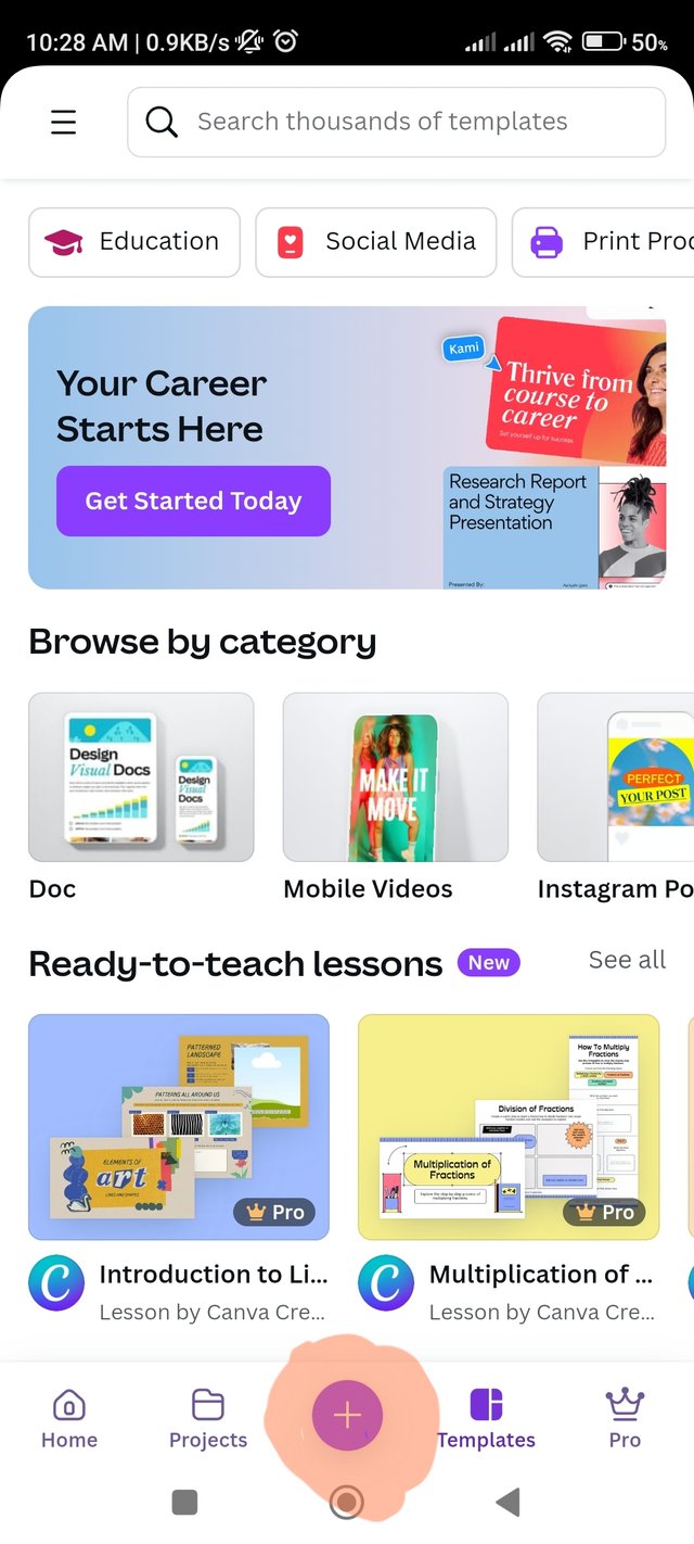
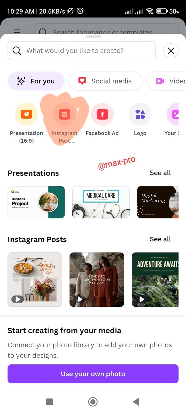
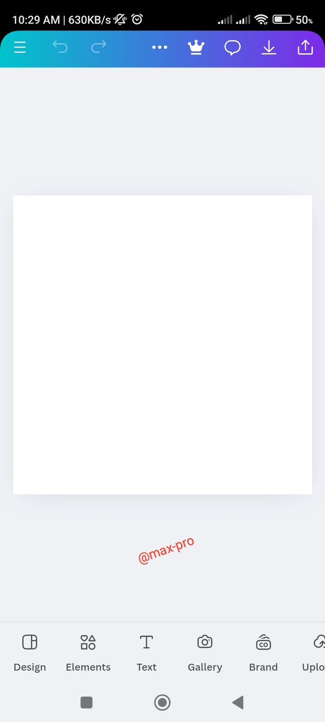
- Step - 1:- At the beginning I entered the canva app and clicked on the plus icon. Then I clicked on Instagram post option which means 1080×1080 as size, then white background came.
 |  |  |
|---|
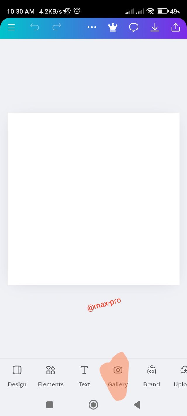
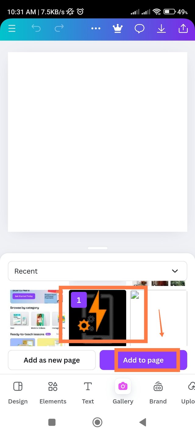
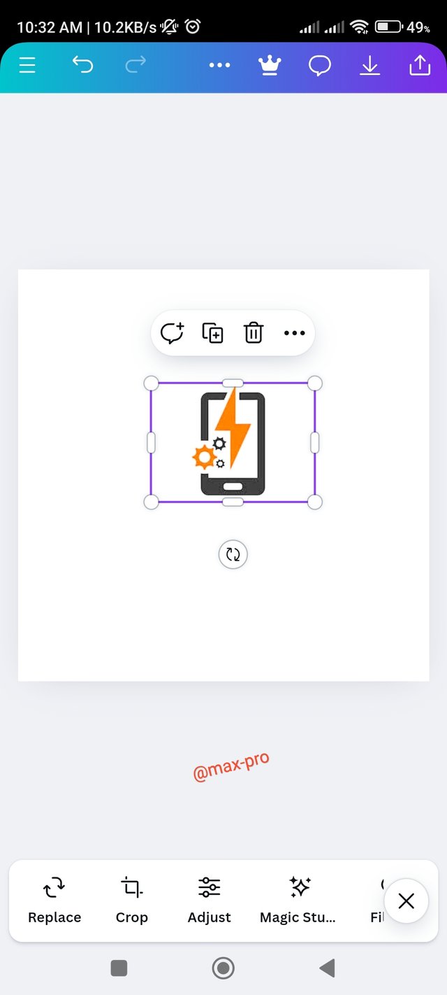
- Step - 2:- Now on top of that I will put electronics icons so I clicked on my gallery option. Then I clicked on the copyright free electronics logo and clicked on add to page option below, then came to my design.
 |  |  |
|---|
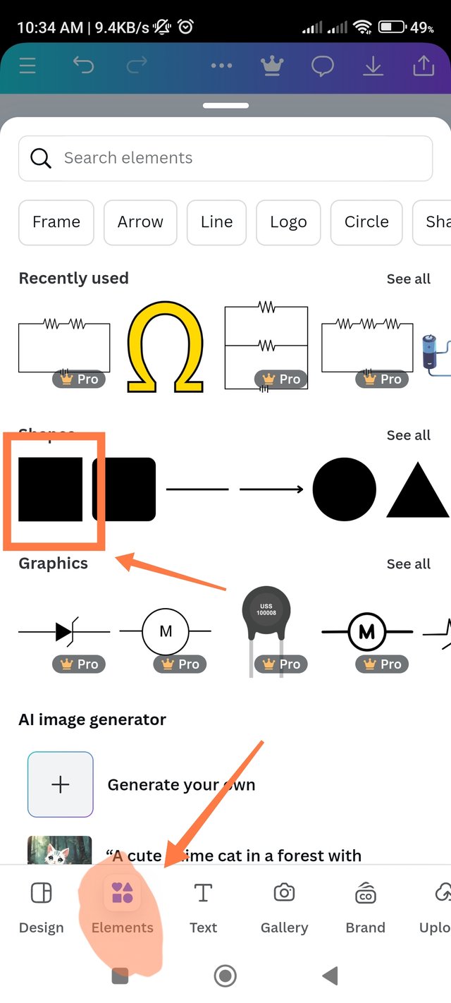
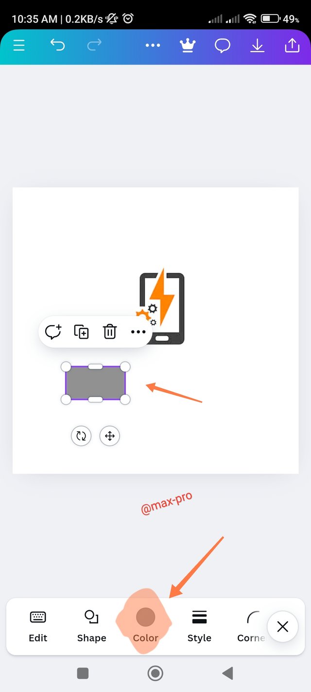
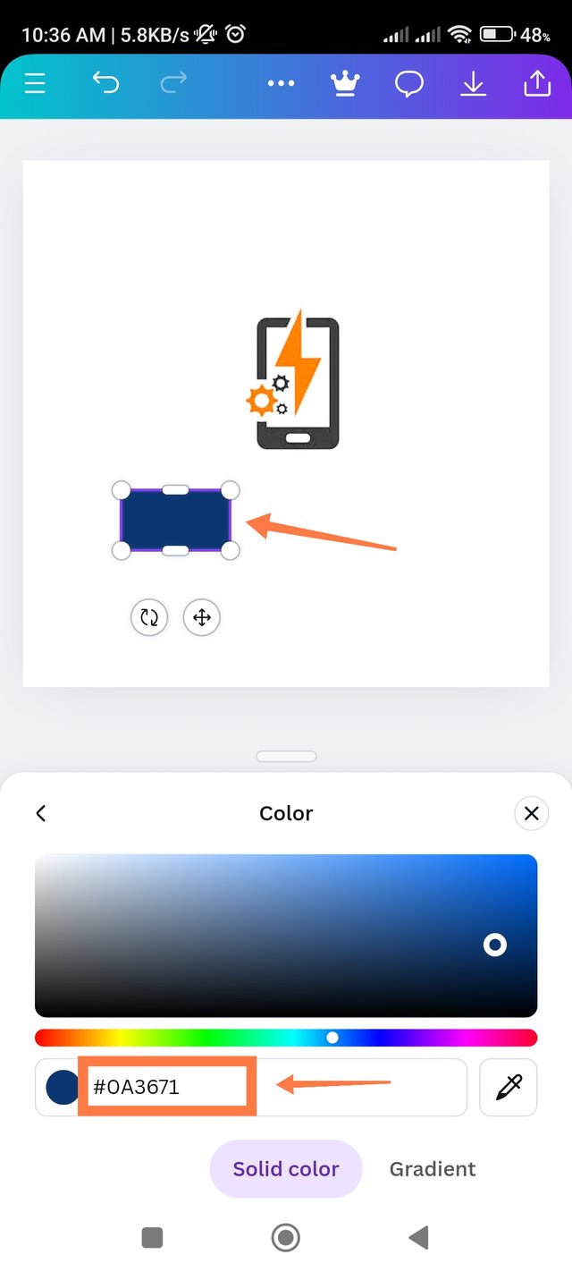
- Step - 3:- Then I clicked on the Elements option. After clicking here I took a square shape. In the beginning its color was gray. Now I converted it to blue color and below color hex code ed. The hex code of the screenshot below is #0A3671.
 |  |  |
|---|
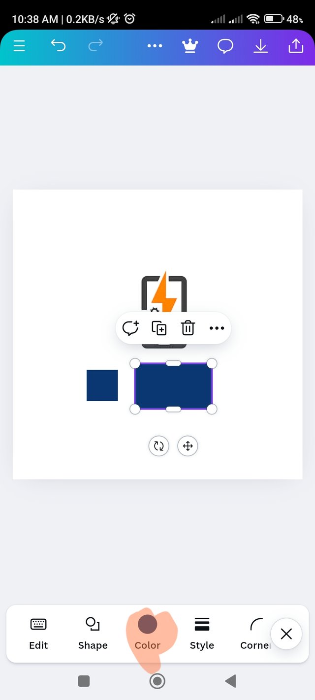
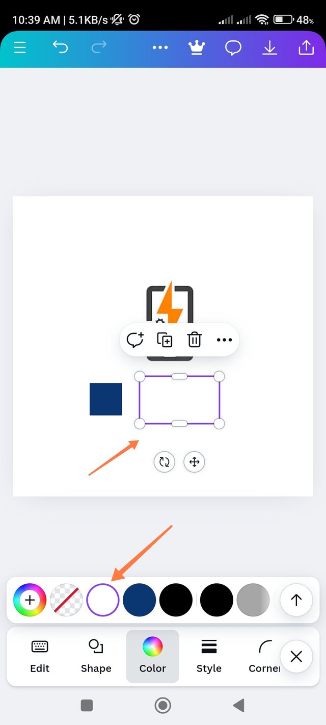
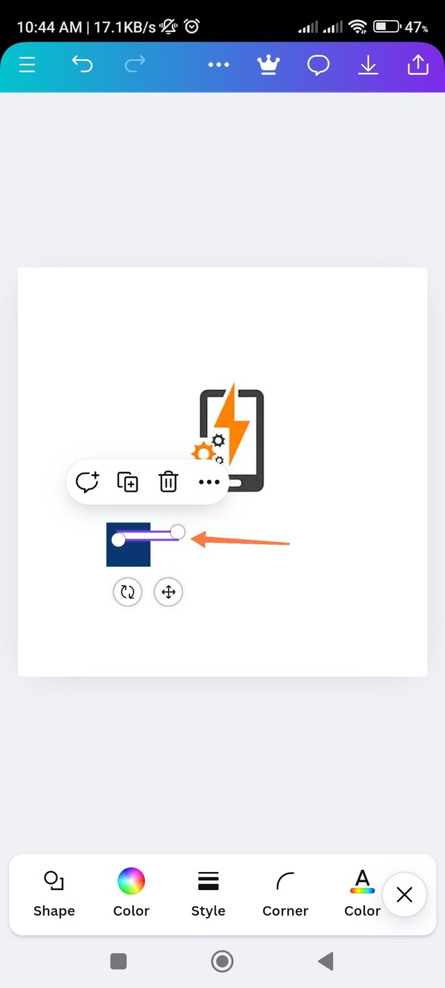
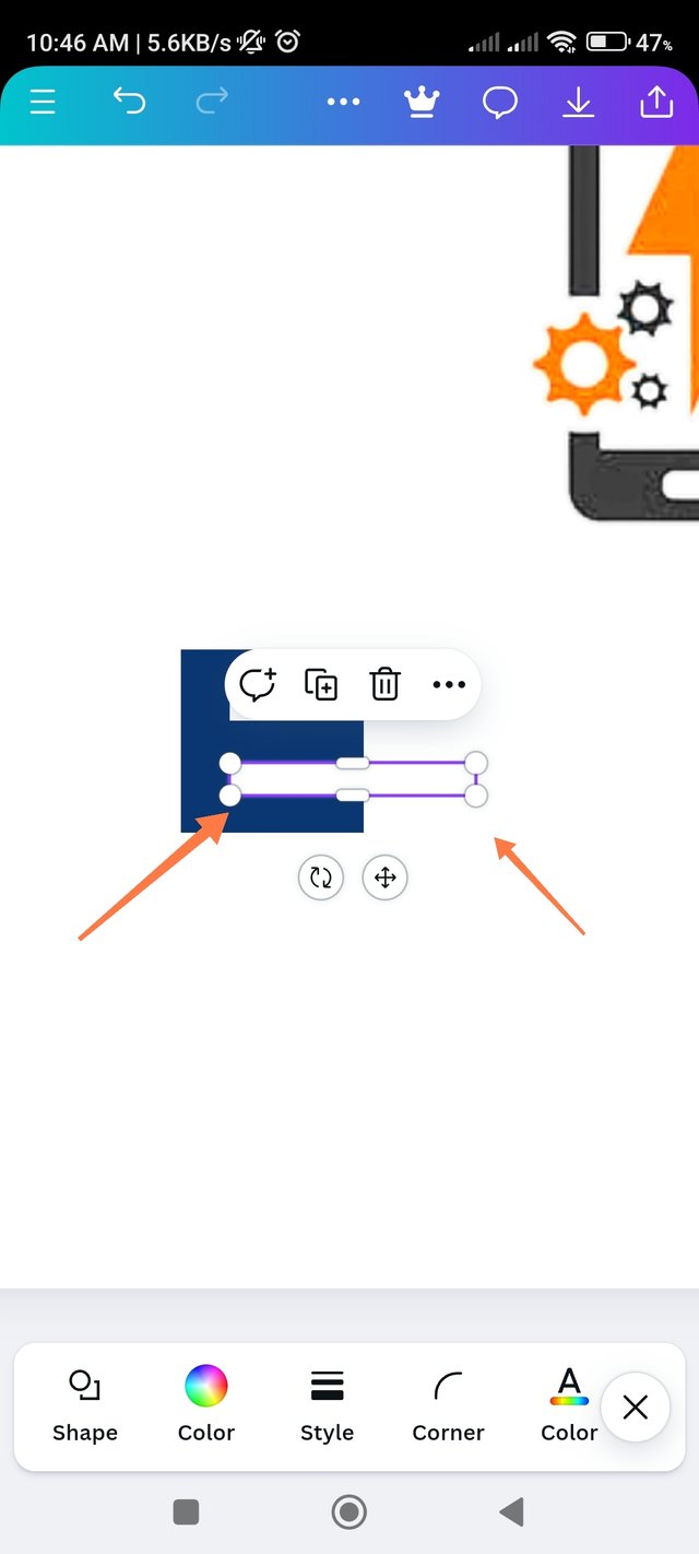
- Step - 4:- Then take another thin shape above the shape because here I will write the letter E. For this, blue color must be converted to white color. So I clicked on Elements again and took the new square shape and converted it to white color. Then I created a white column by clicking the icon next to it to resize it. See that in the screenshot below.
 |  | 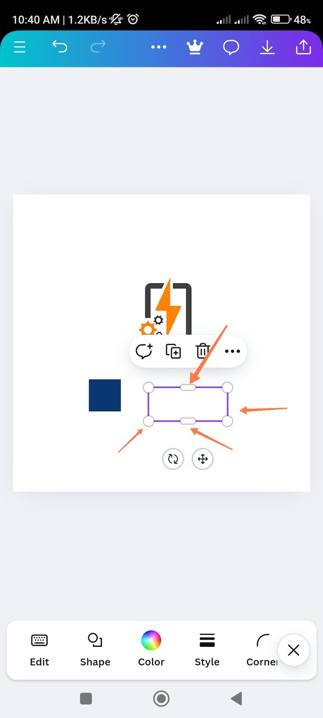 |
|---|
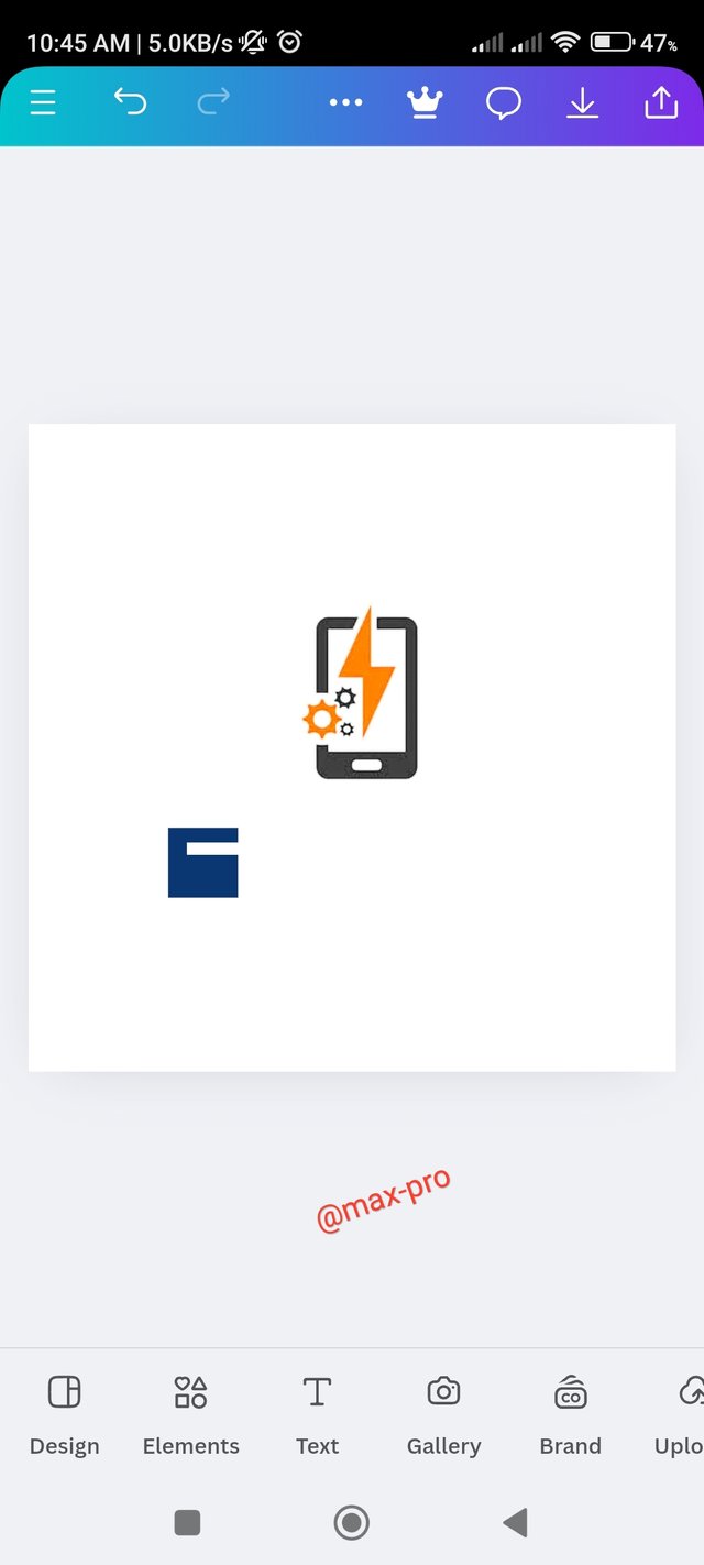
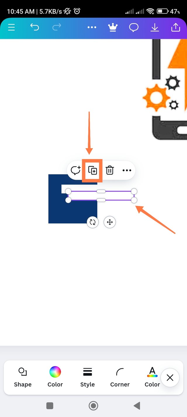
- Step - 5:- Then the column I placed next to the blue one on the top right. This becomes the first part of writing the letter E as you can see in the screenshot. Then I clicked on the top of the white column to create the bottom part of it. Where plus icon means copy option I clicked it. Another white column was copy.
 |  |  |
|---|
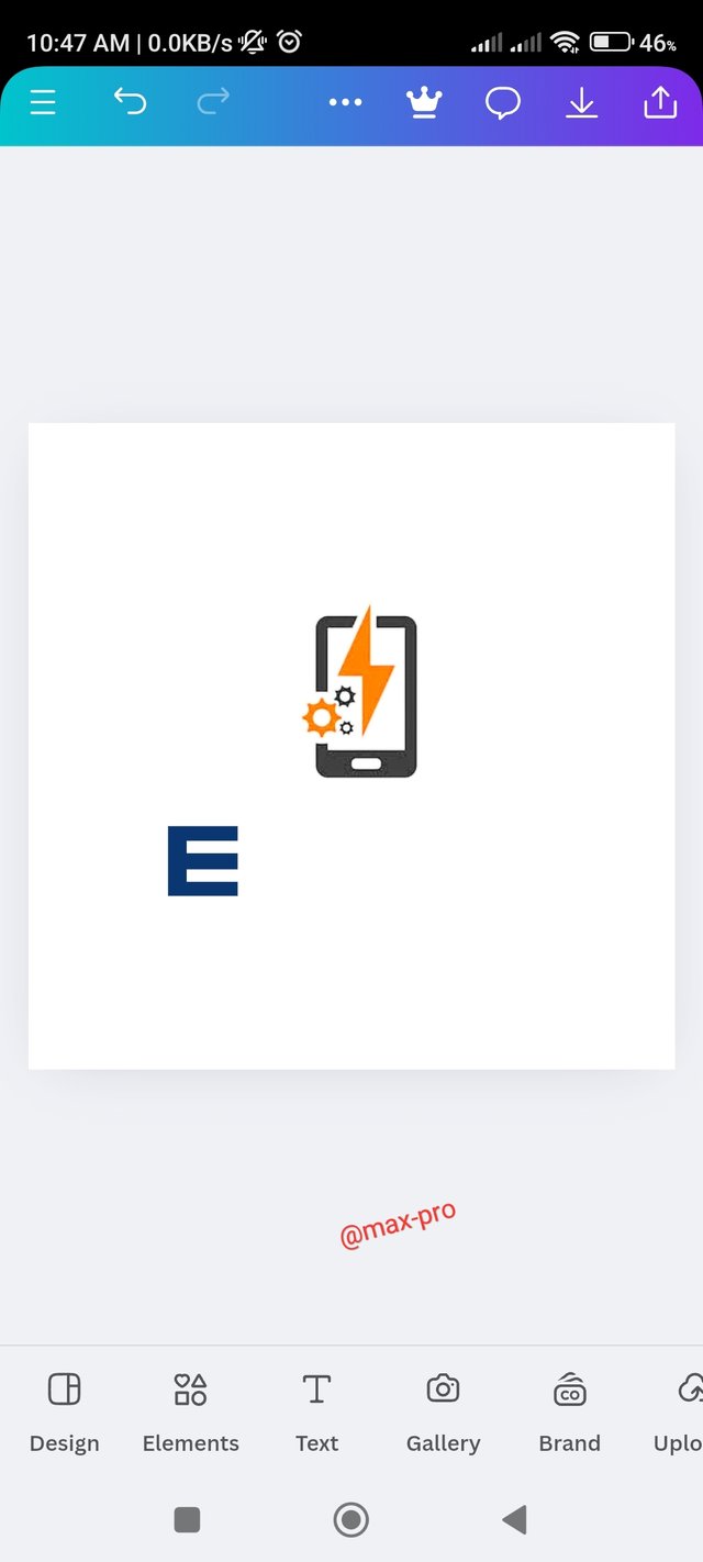
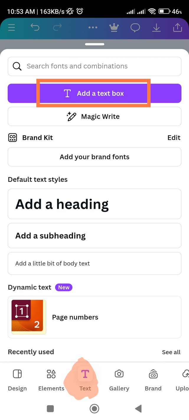
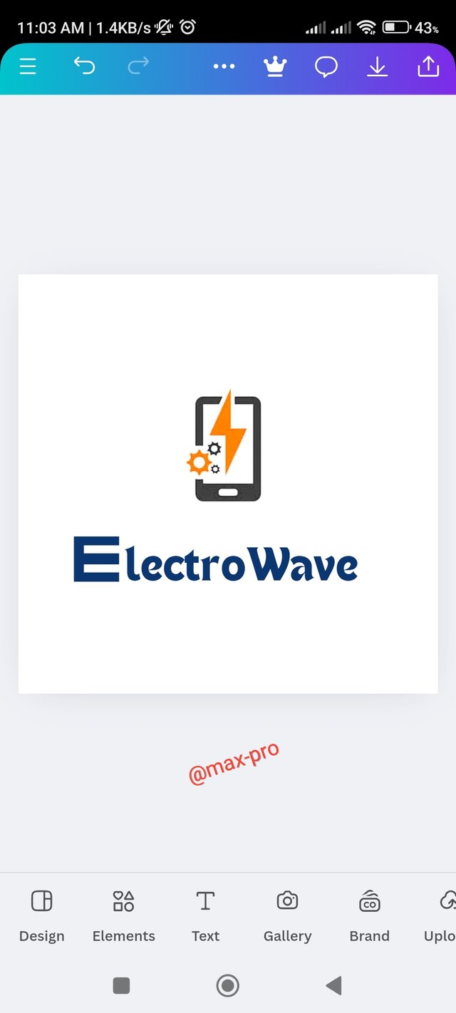
- Step - 6:- Then I set it down evenly. Now it's correct I resized it completely to form the shape of the letter E. Since I named it ElectroWave, I clicked Add To text box option to write the next part lectroWave.
 |  |  |
|---|
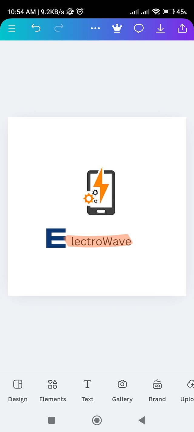
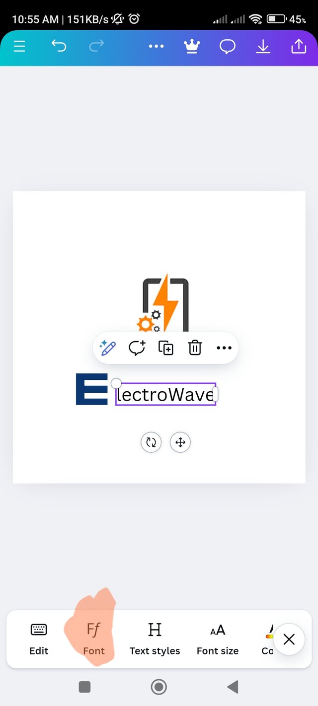
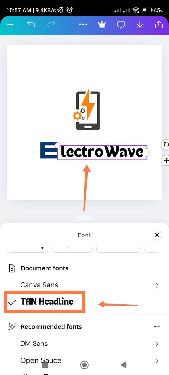
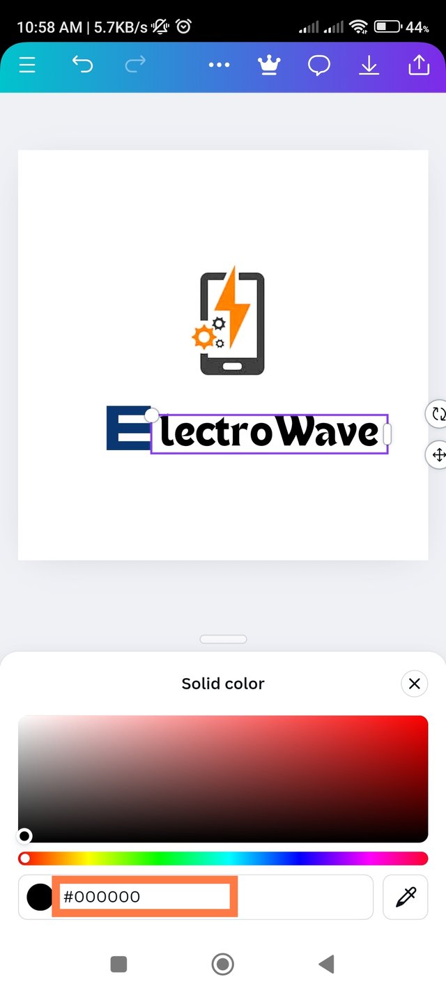
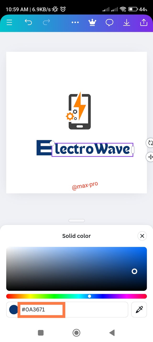
- Step - 7:- Then I wrote LectroWeb and selected this Tan headline font by clicking on the font option to convert it into a stylish front. Then I need to edit the hex code I got earlier to match this text with the previous text. So I added this #0A3671 hex code. Now the two colors are the same.
 |  |  |
|---|---|---|
 |  |  |
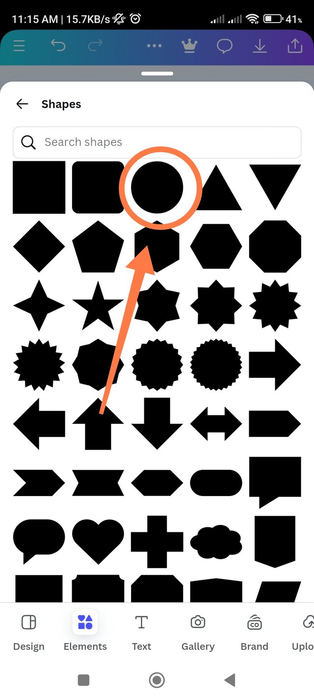
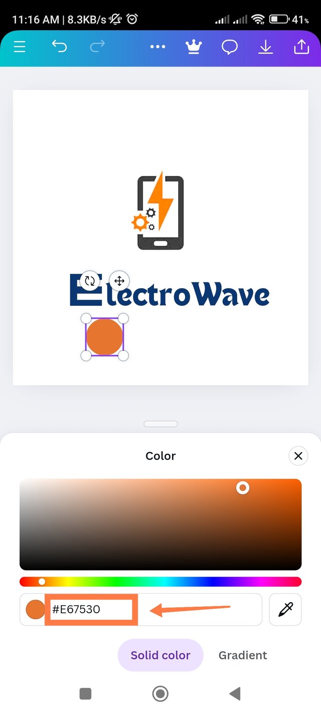
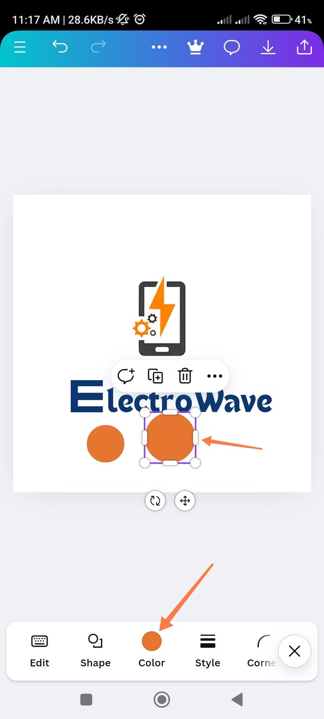
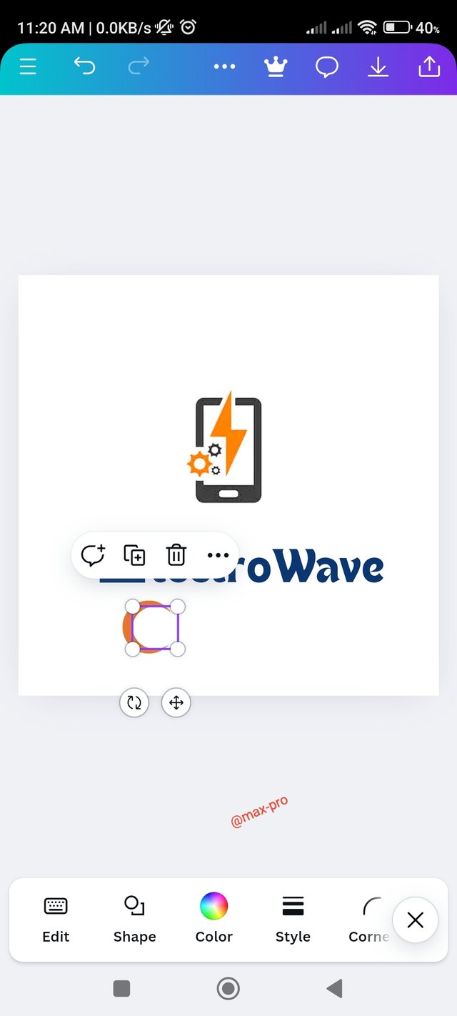
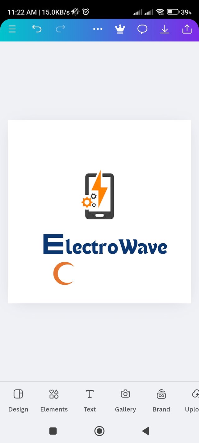
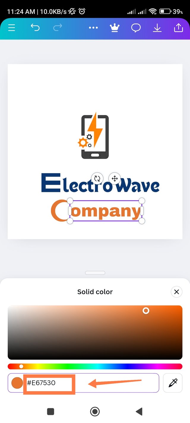
- Step - 8:- Now I will write the company option below. So I clicked on the element option again and clicked on a rounded circle shape. Then I took a shape and converted it to a light yellow color which has a hex code of #E67530. Then I took another round shape of it. Then I converted it to white color. Then resize it and insert it into the middle of the yellow circle so that it forms a C shape.
 |  |  |
|---|---|---|
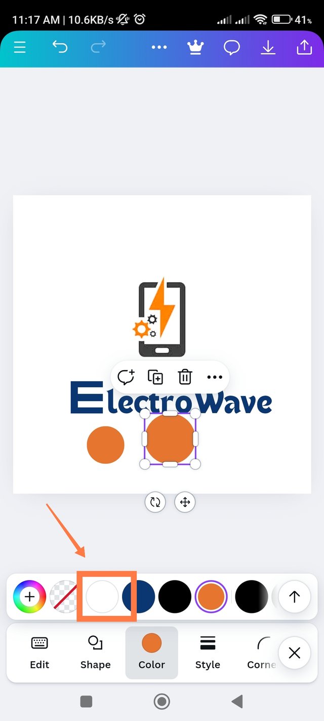 | 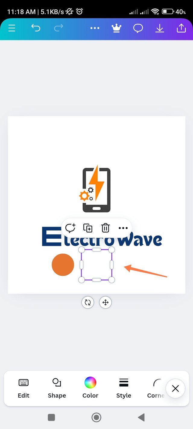 | 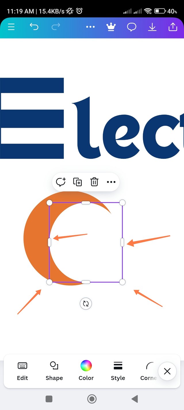 |
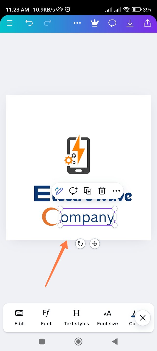
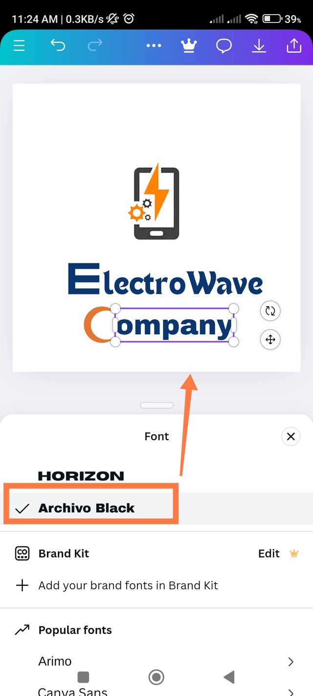
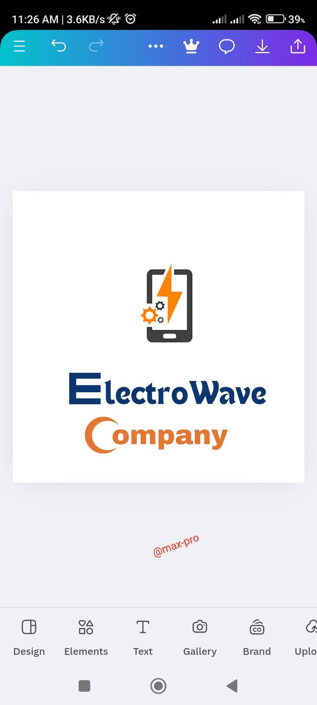
- Step - 9:- Now you can see that C is clearly written here. So now I have to write the next part. Now I wrote the next part ompany. Then to change its font, I went to the font option and changed it to Archivo Black font. Then I added the previous #E67530 hex code and matched it. Now the company entry is complete.
 |  |  |
|---|---|---|
 |  |  |
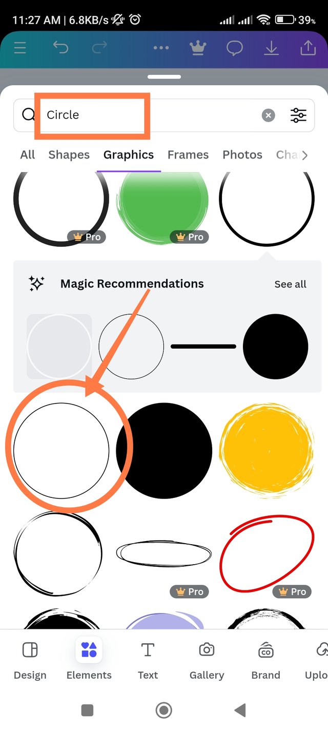
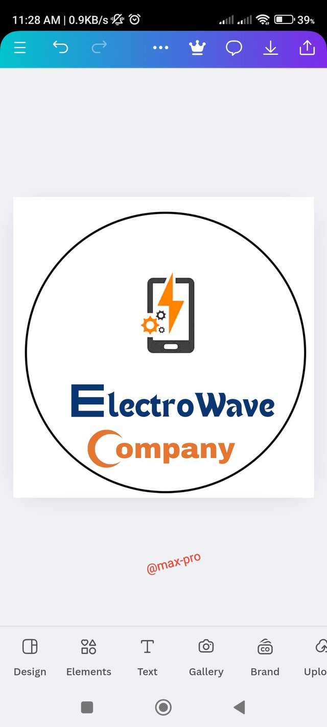
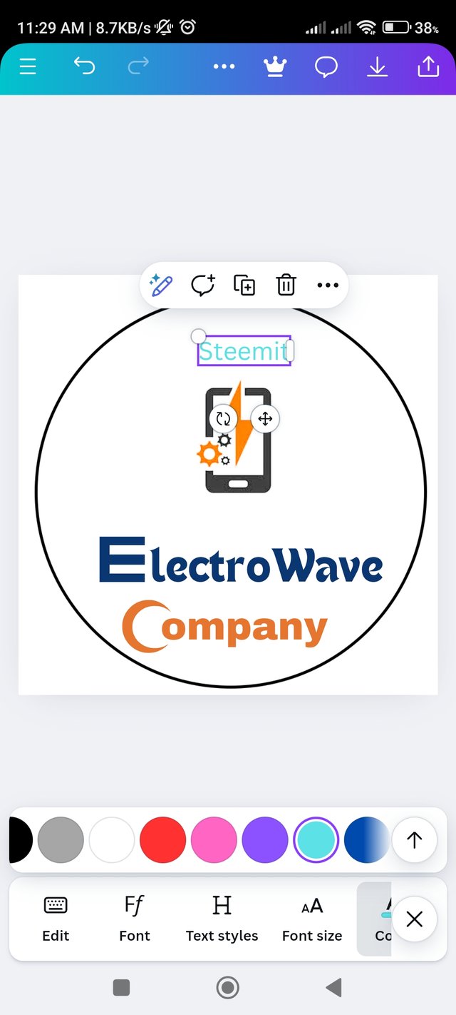
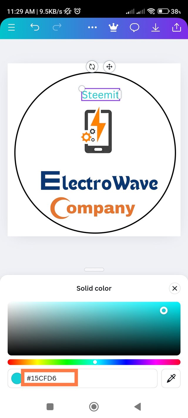
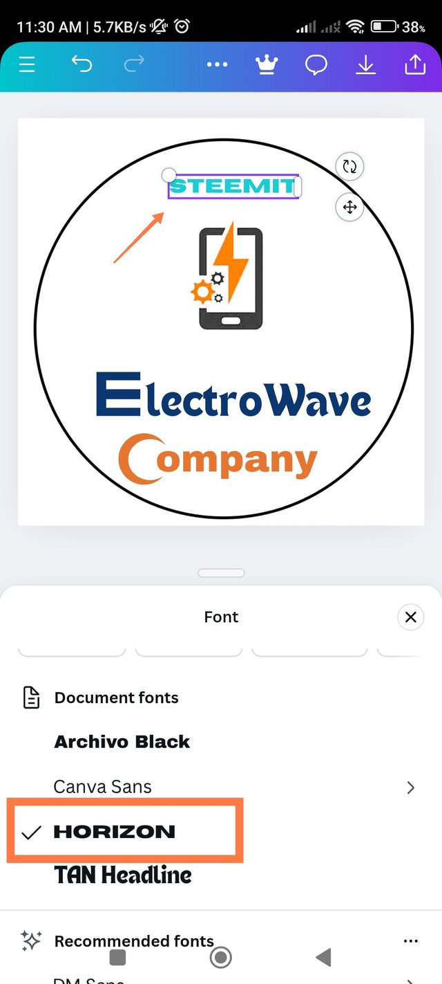
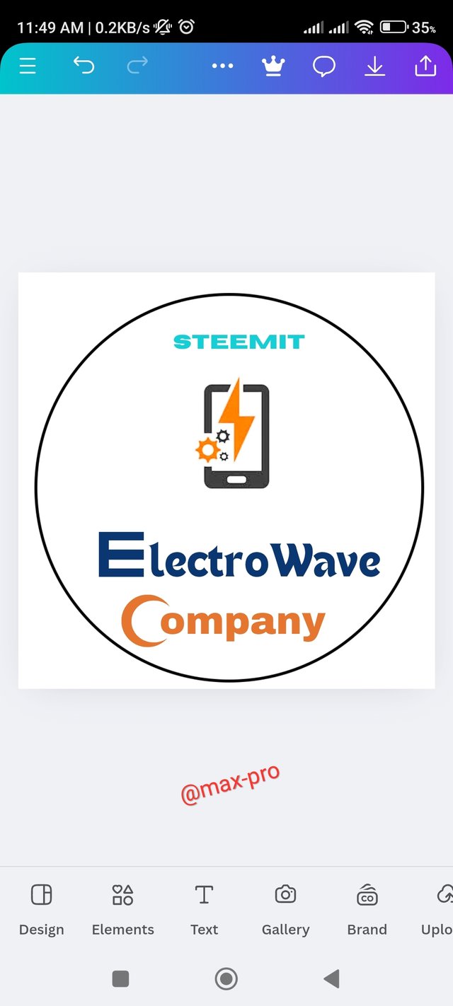
- Step - 10:- Now I have finished writing ElectroWave Company. So I will add a circle icon on top of it to make it more attractive. That's why I clicked on the element option and typed circle in the search box above. Then I selected this circle option below and added it to my design. Then found our main target Steemit and converted it to steemit color. Its hex code is #15CFD6. Then I changed its font to HORIZON font. That looked very interesting.
 |  |  |
|---|---|---|
 |  |  |
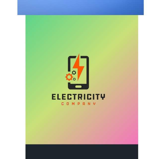
| Final Output |
|---|
 |
|---|
So here are all the steps of my design. At first I didn't know how to do it. But then after 2-3 times of practice I totally got the idea and was able to do it successfully. I have created this graphic design very skillfully from my own thoughts. I have tried to present this graphic design to you with my best effort, mind and heart. Hope you all like it.

So I am Inviting my lovely Steemian friends @stef1, @irawandedy, @kouba01, @selina1, @adeljose to Participate in this Competition.
Twitter share link : https://x.com/Maxpro51412/status/1854805397585973351?s=19