Color Guide 01 - Primary & Secondary colors - Ran Art Blog
Color Guide - Part 01
Primary & Secondary Colors

Primary Colors
Primary colors are colors you can NOT mix.
Therefore, you have to buy them.
There are 3 primary colors:
Blue
Red
Yellow
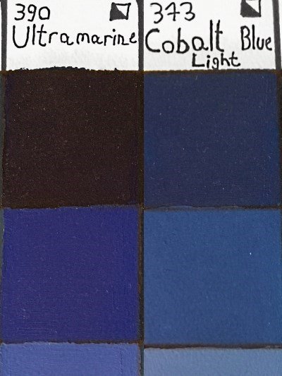
Blue
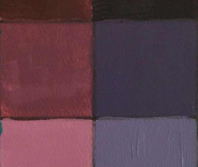
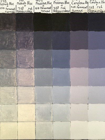
Blue can be neutral (like cobalt pigment), a bit greenish (like cerulean, phthalo, and Prussian pigments), or a bit purplish (like Ultramarine pigment).
Note:
You can add white to any color to create new brightness values of the same color (lighter values).
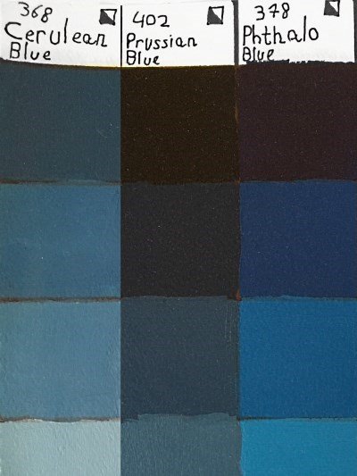
In the example below, I used Prussian blue for the background:
Good to know:
Phthalo blue is a staining color, meaning it will color your brush, even after you wash it.
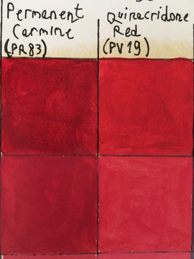
Red
Red can be a bit orangey, or a bit purplish (more about color temperature in an upcoming guide).
Red is a strong color. It grabs the observer's attention immediately.
That is the reason red is used for warning, important signs, and brake lights.
For that reason, it is best to use red sparingly, if at all, for the background, so not to give attention to the background and bring it forward, thus ruining the sense of depth.
Pink is a mixture of red and white:
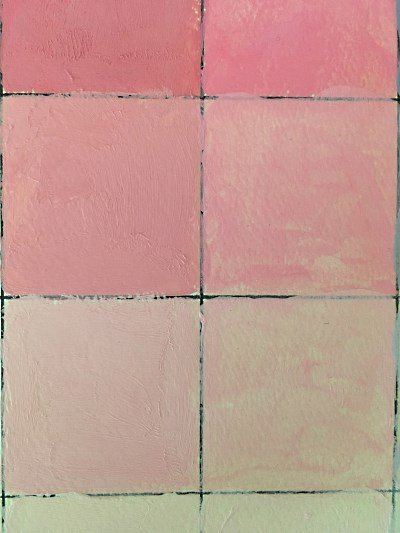
Peach is a mixture of pink and a bit of yellow.
Yellow
Yellow is unique in the way that it can also be used to lighten colors (though white is mostly used to lighten colors), yet keep them saturated.
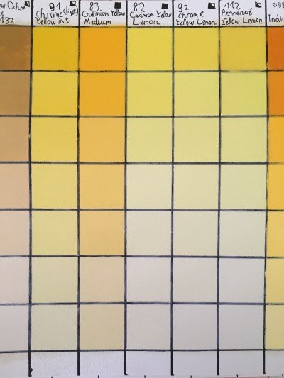
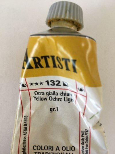
In addition, yellow ochre (also ocher), is one of the earth colors, and one of my favorite colors to use for landscape, and many other painting styles.
Secondary Colors
There are 3 secondary colors:
Purple
Green
Orange
Secondary colors can be mixed from the primary colors. I rarely buy secondary colors, I mix them from my primary colors.
Purple
Purple is a mixture of red and blue.
When mixing more red than blue, the result is purple (which is warmer).
When mixing more blue than red, the result is violet (which is cooler).
Cool red oil paints, like quinacridone or alizarin crimson, are best for mixing purple.
In addition, purple is quite dark, so you can mix it with white to make it lighter.
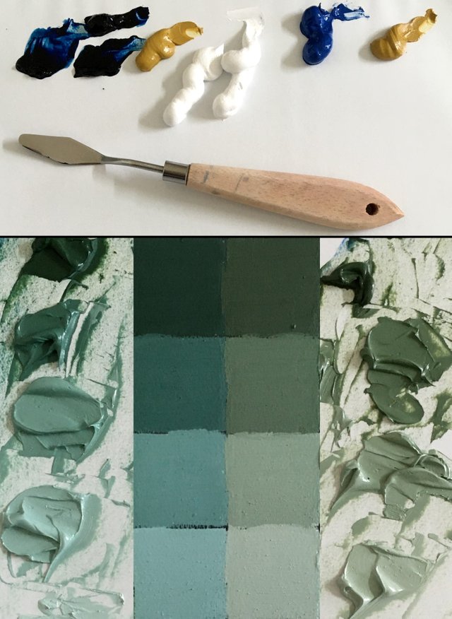
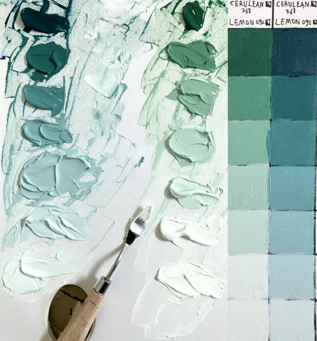
Green
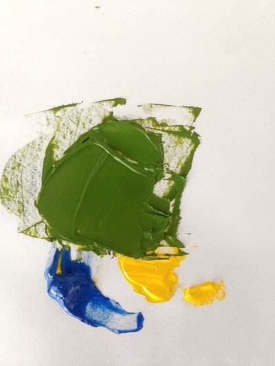
Green is a mixture of blue and yellow.
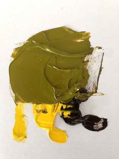
For khaki green, you can mix black and yellow.
Yellow ochre is great for mixing greens for landscape painting (but other greens too, depending on the amount of blue, and the pigment type).
When mixing colors, you can add more of any color.
For example, for mixing green, you can add more blue or more yellow, for different results:
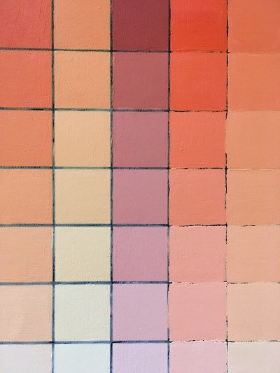
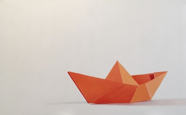
Orange
Orange is a mixture of red and yellow.
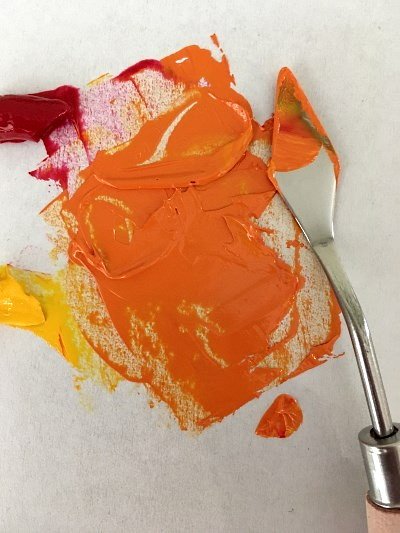
As usual, you can add white for lighter values.
In the next example, I used red and yellow to mix orange for this origami boat (oil painting on canvas 80/50 cm):
Important:
In some cases, of very saturated color (like saturated flowers, or man-made objects), these colors cannot be mixed.
Then you should buy them, and think of them as primary colors.
Summary
This guide is the first of more color guides to come.
It is part of my comprehensive guide for mixing colors.
Till next time...
Ran
Website: https://ranartblog.com/
Tutorials: https://ranartblog.com/blog.html
Instagram: https://www.instagram.com/ran_art_blog/
Pinterest: https://www.pinterest.com/ranartblog/
You've got a free upvote from witness fuli.
Peace & Love!
Thank you very much.
Why does it show (1) in red color?
Greetings friend @ranartblog
Excellent explanation, it has made it clear to me that to be a painter I must first familiarize myself with the different colors before I do it with the brush, it is interesting the characteristics of each group of colors.
Thanks for sharing your knowledge.
Thank you very much.
I am glad you liked it.
Yes, color is an important and complex fundamental of painting.
While other fundamentals, like drawing accurately, brightness values, perspective, etc. are more important than color, color gets the glory.
This is interesting, I'm just going to do a color change when post-processing photos :)
I am planning to continue my color guide, probably next one tonight, but it seems nobody is interested or see it.
This is strange.
I think we should just continue patiently. These are difficult times for the entire crypto world. And not just for him.
You have appeared here recently and few people know you yet. Just do what you know and what you're interested in. Over time, you will have your own audience.
When I started posting something here... I was nobody for about a year at all, then there were no support programs and other things. Gradually something started to change :)
I will.
Though my content can be important for some people, yet, after a week it is useless.
I will learn to get used to it.
Save links and paste them into fresh posts. If someone joins you later, he will be able to find what is necessary and important for him.
Yes, I will do that, especially in the color series.
Great, I'll be waiting :)
Your post is manually rewarded by the
World of Xpilar Community Curation Trail
STEEM AUTO OPERATED AND MAINTAINED BY XPILAR TEAM
https://steemit.com/~witnesses vote xpilar.witness