5 Fatal Mistakes to Avoid When Designing Android Services

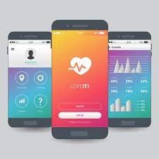
Developing an Android app requires a well-planned process that requires the developer to understand what the customer wants the app and for whom. The next step is to create a rough idea of how it looks, feels, and features. This is where, as a developer, you need to create a mockup. Simply put, a mockup is a black and white outline of every screen in your app, consisting of all the buttons and as much text as possible. In the Android app development service, the final mockup is done by an expert. However, even if you are a beginner, this blog will help you get off to a good start. Creating a mockup is the right way to critically evaluate an idea. Once the mockup is complete, you may find that the idea is not feasible at all. Therefore, an important factor to remember when creating a mockup is airtight logic. To help with this, there are five mistakes to avoid when creating mockups during Android app development services. # 1 Do not exclude the screen. Obvious. The mockup is supposed to represent every screen of the app.If you miss one screen, the mockup is incomplete. Confirmation screen after login-Yes, required. Password reset screen-Yes, you need it too! Even if the background screen changes, the mockup will need a different representation as a different screen. Therefore, all screens are important! # 2 Don't add a button that doesn't go anywhere Don't show anything that doesn't appear in the app in the mockup. This is the golden rule for creating mockups. When you are offering an android app development service, your customers will want to know where all the buttons connect. Therefore, all buttons and screens must be logically connected. # 3 Do not include inaccessible screens It is important to perform all possible user actions in your app. This helps keep all screens connected. Consider changing the screen. Did you find a way to reach it screen? If yes, adding a screen is fine. If no, add some buttons! #FourDon't add a screen that has no way away from it As an Android app developer, it can help you when thinking about user behavior Sticky screen detection. Earlier I mentioned that adding a button should bring up the screen. On the other hand, you also need a button to leave the screen. You may need to add icons to all screens as needed. Remember that users shouldn't get caught up in the screen without a way back. This also means that you need to be careful not to make the screen look cluttered. # 5 Don't forget to number pages Page numbering is one of the best ways to organize your mockups. It also guarantees good logic and flow. Organize pages in order of user behavior while using the app. Number the mockup screens in the same order they appear to the user. Page 1 should be the first screen If the user needs to access the home page to access the profile, the home page should be the first page. It's intuitive, but it's easy to get confused during an Android app development service. Avoid these serious errors and create a killer mockup. The only way to find problems with your app's ideas may be to create the screen exactly as the user experiences it.As an Android app developer, it's important to ask your internal team for a review of your app's performance before you release it. Mockups help you get real-time feedback from people. Instead of sharing your opinion about the final product, you can comment on the actual set of mockup screens. Mockups are the closest thing users will experience in an app. This is the key to becoming a successful Appreneur, as it helps developers provide better Android app development services. Mockups help you understand how your app transforms words-formulated ideas. Ideas that appear on your screen. You may not have enough space on your screen to display what looks great in your mockup and then decide to add them or add all the features and buttons you need.