- Retro Interior -
#55

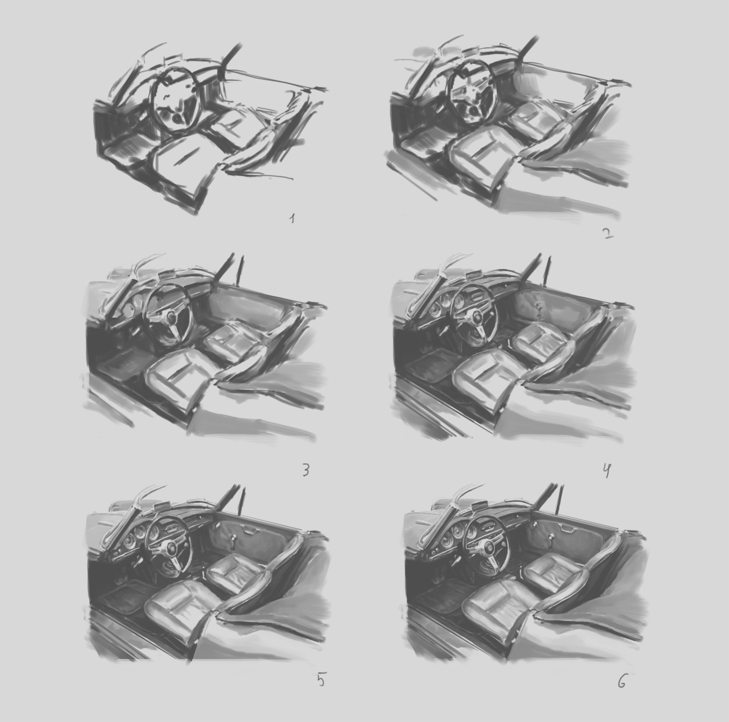
Hey guys ... this time it's a painting of an interior of a retro car, a step by step process
I start with the darkest areas or contours to establish the base and then just fill in the shading. This way it's easier to quickly get the proportions and basic shading in. Painting is more about abstracting what you see and I found this to be the best method for me to see shapes and forms and indicate them easily.
In the beginning the interior looks like shape design. It's not just lines, there are also almost solid color shapes that I would modify later, add shading and all that. I had to fix the proportions quite a few times. It's a kind of an awkward angle to paint(draw), there are subtle foreshortening changes that make it a bit of a challenge. Didn't take detailing too far, it takes too much time to paint all that juicy stuff, but I also like that painterly look.
Suggestions for my future posts are very welcome ... and thank you for you votes and resteems guys :)

@marin10 you are so amazing ! * __ * the details and the definition and the way you do different textures * __ * incredible!
upvotes and resteems
thanks
This is incredible arts Love it Up voted
Thx dude
Upvoted on behalf of @thehumanbot and it's allies for writing this great original content. Do not use bid bots for at least 1-2 days, as your post may get picked up by top curators.
Great Original Works are rewarded by top Curators, refer posts from my Step-Brother @humanbot for more details.If you like this initiative, you can follow me in SteemAuto and upvote the posts, that I upvote.
And remember to do some charity when you are rich by contributing to me. Check out my Introduction Post for more details. If you have any concerns or feedback with my way of operation, raise it with @sanmi , my operator who is freaking in Steemit chat or discord most of the time.
thank you