Blade Runner 2049: Best Visual Scenes
Blade Runner 2049 is gaining a reputation for its incredibly aesthetically pleasing visuals, and there's a reason for that. Director Denis Villeneuve created nothing short of a visual masterpiece and in my opinion, these are the best particular visual scenes from the film.

(Image Source: The Indie Wire)
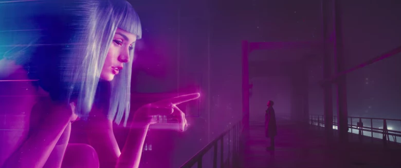
Scene 1: The holographic Joi scene
-This one is one of the most famous scenes from this film, and really intrigued me when I saw this in one of the previews. The color of the holographic depiction of Joi perfectly represents the vaporwave aesthetic that is sweeping the internet at the time, and this scene will bring out the retro nerd in any viewer. This scene in particular struck me as well because of the emotion that was involved and how that shows in the colors. Ryan Gosling aka "K", is at his lowest at this point and is in the shadows, while Joi, his former fake girlfriend is being shown as nothing more than a commodity that can be purchased, and is looming over him in bright colors.

(Image Source: Mens Fitness)
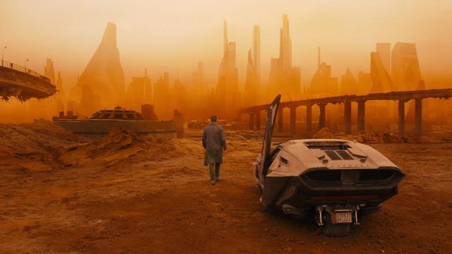
Scene 2: Post Apocalyptic Vegas
-Possibly my personal favorite, this scene highlights the post-nuclear-disaster Las Vegas and of course, shows the badass-ness of K as he walks alone through what would kill any non replicant (radiation, that is). Villeneuve does incredibly well to make Las Vegas look like an ancient Martian city. It was later revealed that the orange-ish glow was from the radiation that had destroyed the famed city, but it seems fairly obvious to any viewer that sees this scene.

(Image Source: Gizmodo)
Scene 3: Throwback!
-In a visual tip-of-the-cap to the original 1982 Blade Runner, Villeneuve includes the famous Atari advertisement on the side of a skyscraper. Somehow, in 2049, Atari is still alive and kicking, which we all know not to be true today. However, I had to include this scene because of the tribute it pays to the original, and also, it looks really cool. How can a movie make advertisements actually look pleasing and not just downright annoying? Blade Runner found out how.

(Image Source: Vox)
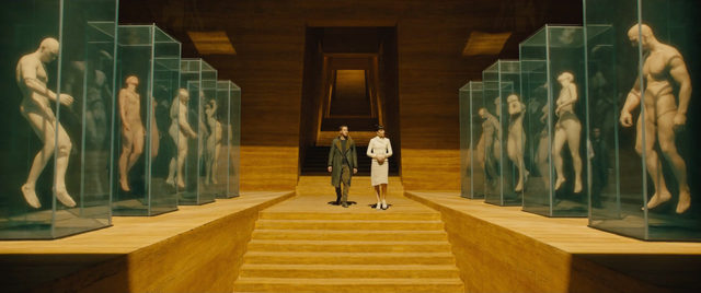
Scene 4: Wallace's Lab
-We get a good look at the replicant models in this scene, and wow, the visuals are stunning. The symmetry is what struck me when I first saw this scene. The wood paneling is simple yet striking, and the choice not to make the lab look like a traditional metallic futuristic lab was a nice touch that ended up making this scene great.
Overall, this film has some stunning visuals, and even if you aren't a fan of the first movie, the visuals alone are a reason to see this movie. I saw it in theaters which really enhanced the visuals for me, I would suggest that you do the same, or at least on a nice screen with limited lighting. Your computer screen probably won't do this movie justice.
This is going to be an amazing movie . You made me watch the trailer and definitely will watch it. When will it be out in cinemas?
excellent keep going
This post has received a 1.90 % upvote from @buildawhale thanks to: @hood400. Send at least 0.50 SBD to @buildawhale with a post link in the memo field for a portion of the next vote.
To support our curation initiative, please vote on my owner, @themarkymark, as a Steem Witness
Congratulations @andrewmarks! You have completed some achievement on Steemit and have been rewarded with new badge(s) :
Click on any badge to view your own Board of Honor on SteemitBoard.
For more information about SteemitBoard, click here
If you no longer want to receive notifications, reply to this comment with the word
STOPYour post had been curated by the @buildawhale team and mentioned here:
https://steemit.com/buildawhale/@buildawhale/buildawhale-curation-digest-10-25-17
Keep up the good work and original content, everyone appreciates it!