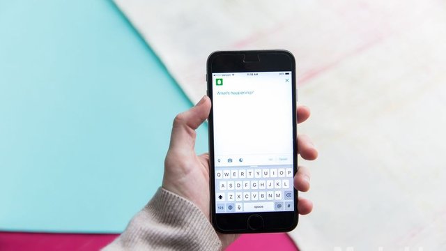
Twitter test redesigns how you compose new tweets
Twitter is experimenting with a new look for the tweet composer in its iOS app.

The test, which users first began to notice Wednesday, moves the app's tweet composer to the top of users' timelines. Previously, the app's tweet composer was a separate part of the app.
The new look causes the app to behave more like Twitter's website, which also has both a compose window and button. The redesign puts the tweet composer at the top of your timeline, along with the camera icon for adding a photo, video or live stream.

Other media, like polls, GIFs and location info, are still available when you tap into the composer itself.
A Twitter spokesperson confirmed the experiment, saying it was meant to make it easier for iOS users to tweet while browsing the app.
“We want to make it easy for anyone to Tweet. To that end, we’re experimenting with ways to make the Tweet compose bar easier to access on Twitter for iOS, similar to the experience on Twitter.com.”
It's not clear if Twitter plans to expand the test to its Android app or whether it could become a permanent feature. Twitter, like other social networks, often tests new features and design changes with small groups of users before making them available more broadly.