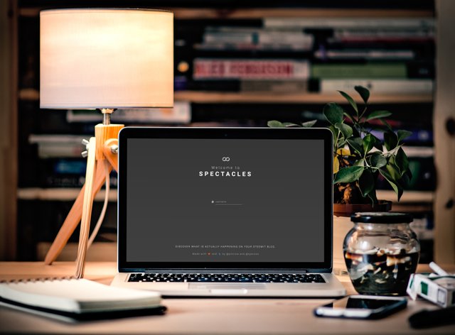
Sneak Peek - Welcoming page 1.0
SPECTACLES is slowly coming closer and closer to our launching date, but that doesn't mean we can't tease you ;)
That's why we want to proudly present you our new sexy welcoming page.

In our initial design, we simply had an inputfield in which you would type your username which leads you into the app. However, according to our BETA Bunnies, we should make this more appealing. So we went for sexy.
Let us know what you think!
 |
| 
That icon at the bottom looks happy :D
Haha! Crazy how a simple icon can look happy, huh? :D
yeah it looks great! And its just the right amount of info on the welcome page. Not too much, not too little!
Thanks! We are glad you like it :D
Thanks for the update! I'm looking forward to this.
Looks amazing, any date to beta launch?
The beta testing is already going on, we got a lot of great feedback and are trying to incorporate the most important parts of it before launching. I don't want to make any promises I can't keep but we're trying really hard to get the first version live ASAP.
Is this open source?
Yes! I'll write a post about the codebase and how to contribute when it goes live, then everyone can help out if they feel like it.
It looks just great now! You guys are awesome as you are always listening to the suggestions of the Beta Bunnies!
Ofcourse! Our BETA Bunnies are very precious to us <3 Without our Bunnies, we'd be only guessing :o
Can you explain how exactly this will be different from http://steemreports.com/ ?
You'll see ;)
I like it so far! good job!!
Thanks!
When Polo?
You've got to be kidding me. I've been further even more decided to use even go need to do look more as anyone can.
Lol, yeah. Sorry, couldn't help throw that in ;0)
Very sexy!
Clean and uncluttered!