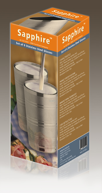
Packaging Design concept, completely done in Photoshop in 2007
This is my concept project for packaging design for Steel glass packaging in 2007 while i was working as graphic designer, from milk to rose, background to bar-code and all 3d modeling is done in Photoshop only. Only photography is used for steel glass which is real product, other than that all created in Photoshop only with help of some reference images.

Please let me know how do you like? Don't forget to comment and subscribe.
Thanks
Thanks @cryptopizza for the photo post.
I am really a bad designer. Need you get better at this. But think its to hard to get it done. When i start in Photoshop but after i make some layers i always get bored and keep fucking up.
I will try some youtube guides
Have a greet steem day, best regards
Hope to see more post
Please follow at @mrstaf
Thanks, Really appreciate, Yes, it needs some good layer rendering and masking skills, in 2007, the photoshop does not have 3d rendering features, I remember I have used more than 100 layers in this 16 hrs concept, it is not perfect, though quite close..
Good Design.
Thanks !
Followed and upvoted expect same from you
Thanks ! yup done.
Thanks for liking and following.
Congratulations @cryptopizza! You have completed some achievement on Steemit and have been rewarded with new badge(s) :
Click on any badge to view your own Board of Honnor on SteemitBoard.
For more information about SteemitBoard, click here
If you no longer want to receive notifications, reply to this comment with the word
STOPBy upvoting this notification, you can help all Steemit users. Learn how here!
Hey :)
I'am a studiant in design ( in france ) ! And i think you did a really good job, i guess that photoshop was really less functionnal in 2007 !
If you want some critics, i would say that maybe, under the glasses, it miss some texture, to feel it less "in the air".. but i know how much that is hard :O !
Also, i would maybe had used some more of white, and less of brown, as it's something to buy for the kitchen. I am scared that we could more think about a medicine ! But in all case i'm not specialised in packaging, and it's not my vocation in graphism and visual com'. But you've still done a really good job and realisation :)
we could share some of our work if you wan, even if i'm a studiant :)