Breaking Down Your Photo Composition
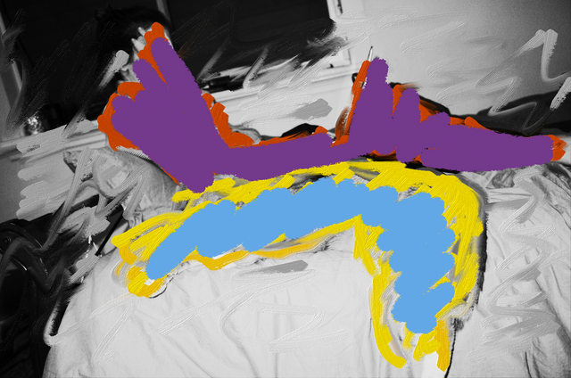
A photos composition can be more beautiful than its subject, and when the subject and the composition is beautiful you end up with a really eye catching image!
This post somewhat follows on from my Finding Beauty In The Mundane post where I talk about capturing well composed images of simple things.
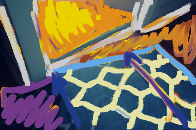
Last night I was playing around with FreshPaint, a free program that came with my Windows computer. It lets you do a whole lot of things, one of which is import images and paint over them. So I thought I would import a few of the photos I'd taken and break them down to their simplest and most abstract forms as a way to look closer at the composition.
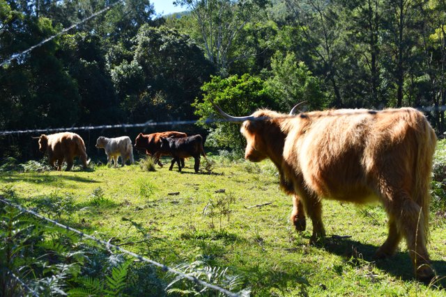
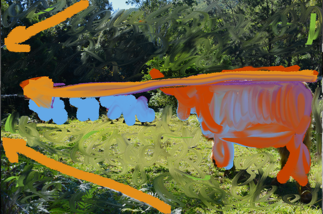
I used simple colours to show the general shapes of the subjects, and using painted arrows to show the leading lines in the shot which pull your eye through the photo to give it more depth and have you look just a little longer.
After painting over the photos I actually had a whole new appreciation for them. Being the first time doing this however I definitely feel their is room to improve, but in future when making photos I'm going to do my best to imagine what it would look like when broken down into simple shapes and how they fill the frame, regardless of the subject or scenery.
Whether the subject is a heard of cows or a hallway rug
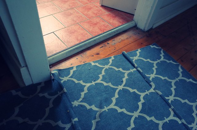
If you're looking for other fun, creative ways of looking at photos give this a go! You don't even need to use a computer program, you can always just look at the image and sketch out the main forms and composition elements to get a better understanding of why you like the photos you take as well as help make better photos in the future!
@harrynewman
Positive Thinker
An Adventure Awaits Us
I should know all this jargon an technicalities about leading lines and whatnot but...I don't XD
True about composition and subject though, my partner is really into photography (he prefers film to digital but that's hard work these days, and he hasn't done a lot lately due to time constraints and tv series) and once when he was researching something or other he showed me this amazing photo taken by some professional photographer who was explaining that if you could nail composition it didn't really matter what your subject was. The amazing photo was of a random toilet block in a park XD
It's so true! If you make a great photo of the most boring thing it can still look so interesting. There are so many different aspects to composition though. One of my favourite is the "golden ratio" or the Fibonacci circle when use to photograph. I added an example from Henri Cartier-Bresson below which shows this perfectly.
source
I love your imagination and attention to details and totally agree that the real art of a photo can be found in any aspect of life. I also really love the use of the Fibonacci spiral creatively. This is a great post. But where have you been. More posts please... love to see your creativity! 🌈🦋💛🌴❤️
Hey Sally! Glad you like the content sorry I haven't bee as consistent though. It's coming to the end of financial year here in Australia so I have been working loads and Krystal and I haven't been able to get away on weekend. I'll put up a few little bits and pieces this week though!
Congratulations! This post has been upvoted from the communal account, @minnowsupport, by harrynewman from the Minnow Support Project. It's a witness project run by aggroed, ausbitbank, teamsteem, theprophet0, someguy123, neoxian, followbtcnews, and netuoso. The goal is to help Steemit grow by supporting Minnows. Please find us at the Peace, Abundance, and Liberty Network (PALnet) Discord Channel. It's a completely public and open space to all members of the Steemit community who voluntarily choose to be there.
If you would like to delegate to the Minnow Support Project you can do so by clicking on the following links: 50SP, 100SP, 250SP, 500SP, 1000SP, 5000SP.
Be sure to leave at least 50SP undelegated on your account.
Interesting and entertaining to play with colors! Good job!