Simple Interactive Graphs with Clojure
Hey everyone back with a coding tutorial using my favorite programming language!
In this post I am going to go over creating awesome graphs using my Clojure library called jutsu. The power of jutsu lies in its underlying library plotly. plotly is an open source graphing library written in JS. plotly allows the user to create professional, interactive graphs with just JSON. jutsu takes this a step further by providing a server to host your graphs. The benefit of this is that jutsu works exactly the same locally as it does remotely. I'll show you how to host jutsu on a remote machine later in this post. jutsu also does the work of translating EDN data into JSON. This way you can use native clojure data to configure your graphs.
If you have never coded in Clojure before, and don't know what a REPL is, make sure to check out my latest post on Steemit.
To begin, make sure you add jutsu to your list of dependencies.
[hswick/jutsu "0.1.1"]Now open up a REPL so we can get started with some coding!
We will start by requiring jutsu:
(require '[jutsu.core :as j])Now we need to start up the jutsu server. We can do this easily by calling this function:
(j/start-jutsu!)This should open up the jutsu environment in your default browser automatically. Now we will create a function to generate random numbers.
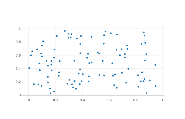
(defn rando-nums [n] (take n (repeatedly #(rand))))We will use this function to create dummy data for our scatter plot, lets configure our graph using this function.
(def scatter-graph [{:x (rando-nums 100)

                     :y (rando-nums 100)

                     :mode "markers"

                     :type "scatter"}])
This is all we need to configure our graphs for jutsu. Give it a list of values for x and y coordinates, specify the type as scatter because that is the kind of graph we want, and tell it to use mode markers so it doesn't draw lines between the points.
We now can pass this data into jutsu's graph! function to visualize the data. We also pass in a name for our graph to function as an id. This is helpful if we want to make realtime changes to our charts.
(j/graph! "scatter-foo" scatter-graph)And wazam! You should see a sweet graph pop up in your browser! This works by sending the data through a websocket from the jutsu server to your browser.
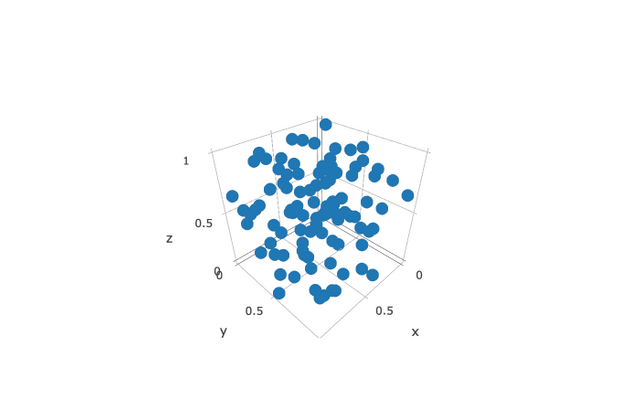
Let's take it up a notch by making a 3D scatter plot.
We will start by configuring our data like last time. Notice we added an extra dimension z, and then changed the type to scatter3d.
(def scatter-graph3d [{:x (rando-nums 100)

                       :y (rando-nums 100)

                       :z (rando-nums 100)

                       :mode "markers"

                       :type "scatter3d"}])
And just like last time we pass it to the jutsu server with our graph! function.
(j/graph! "scatter-foo3d" scatter-graph3d)Voila! You should see another graph in your browser. Easy right?!
Now you may be wondering why is our map of data inside of a vector? And you may also be wondering how do I make my graph different colors? Well, it turns out those two questions are related! The reasoning begins with the fact that plotly expects an array of JSON objects as its input. It will then automatically assign different colors to each JSON object.
Lets try an example.
Start by creating a new function that returns a configured data set for a 2d scatter graph. Notice we are not wrapping the dataset in a vector.
(defn make-scatter-graph [n name]

  {:x (rando-nums n)

  :y (rando-nums n)

  :mode "markers"

  :type "scatter"

  :name name})
Now we will use this function to create a more complex configuration and then plot it in one function call. Notice we are also using the option to set the name of our dataset. Plotly automatically creates a legend using these names.
(j/graph! "scatter-foo2" [(make-scatter-graph 100 "foo")

                          (make-scatter-graph 200 "bar")])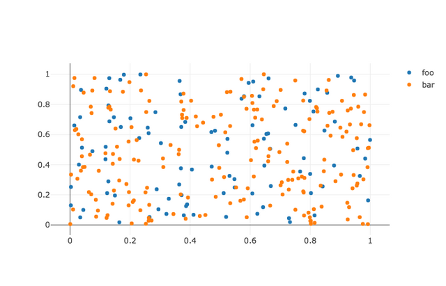
Now in this plot we should see twice as many points of bar as we see of foo. Note that plotly also automatically chooses a color to differentiate the types of points.
Now that we have become pro-ninjas at jutsu on our local machine, lets try running it on a remote machine!
Go ahead and setup a vm on any cloud service. I find DigitalOcean to be very beginner friendly. You are going to want to setup a similar environment on the vm as you were using locally to use jutsu.
Once you have everything setup like installing boot, adding jutsu to dependency.
Open up a new ssh tunnel like this:
ssh -L 9002:localhost:4002 USER@IP_ADDRESSAnd go ahead and open up repl in your remote project. Once you have the repl, start up jutsu just like we did earlier except add a couple more options.
(j/start-jutsu! 4002 false)4002 is the port number that jutsu will be serving locally on your remote machine, the second argument we set to false because we don't care about opening up a browser on our remote machine.
Now because you ssh'ed to your machine specifying the port 9002 as the incoming port, we access the jutsu environment by putting "http://localhost:9002/" into the browser. You should see the jutsu environment that is hosted on your remote machine there.
Now in a repl connected to the remote machine we can do the exact same things as we did earlier and the graphs will appear on your browser. This is useful when you are often doing analytics work on a large vm which is crunching a lot of data.
Hope you find this post useful in your cybernetic adventures.
Would a Clojure STEEM API client be a very tall order?
I've been following the development of SteemJ. Once 0.4.0 drops I might make a wrapper for it, because I have an app idea I would like to do in Clojure.